Much of the news this week is dominated by either underwater ship wrecks or inflation. After doing a little research about an early 20th century literary magazine that came across my bench, I discovered that one advertisement serendipitously intersects both of those topics.
This copy of The Bookman came in for some minor repairs before going on exhibit. The covers are the main advertising spaces for this publication and mostly feature some pretty dull descriptions of books available from George H. Doran or Harcourt, Brace and Company. It being June, the image of a steam ship and “Ideal Summer Vacations” advertised on the back really caught my eye.
Eight days in Bermuda for only $90 sounds really nice, but was it a good deal in 1924? The Bureau of Labor Statistics’ CPI Inflation Calculator estimates that sum to be the same as around $1600 today. That seems like a reasonable amount to spend on a long cruise; however, after a quick search I discovered that many of the major cruise lines today are offering the same voyage for less than half of that price. Cruises (at least to Bermuda) have beat inflation!
I’m sure the accommodations on the modern vessels are a lot more comfortable than a hundred year old steam ship, too. In reading about the ships listed in the advertisement, I discovered that they both ended up sinking. The Fort St. George was destroyed by British aircraft during WWII, while the Fort Victoria only sailed another 5 years from the date of this ad before being struck by another ship and sinking in New York Harbor. The wreckage was later dynamited to prevent it damaging to other boats. Luckily all of the Victoria’s passengers were rescued by the Coast Guard before she sank.
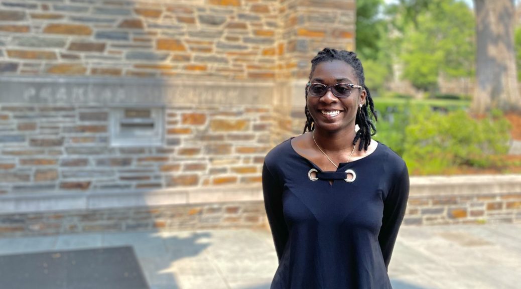
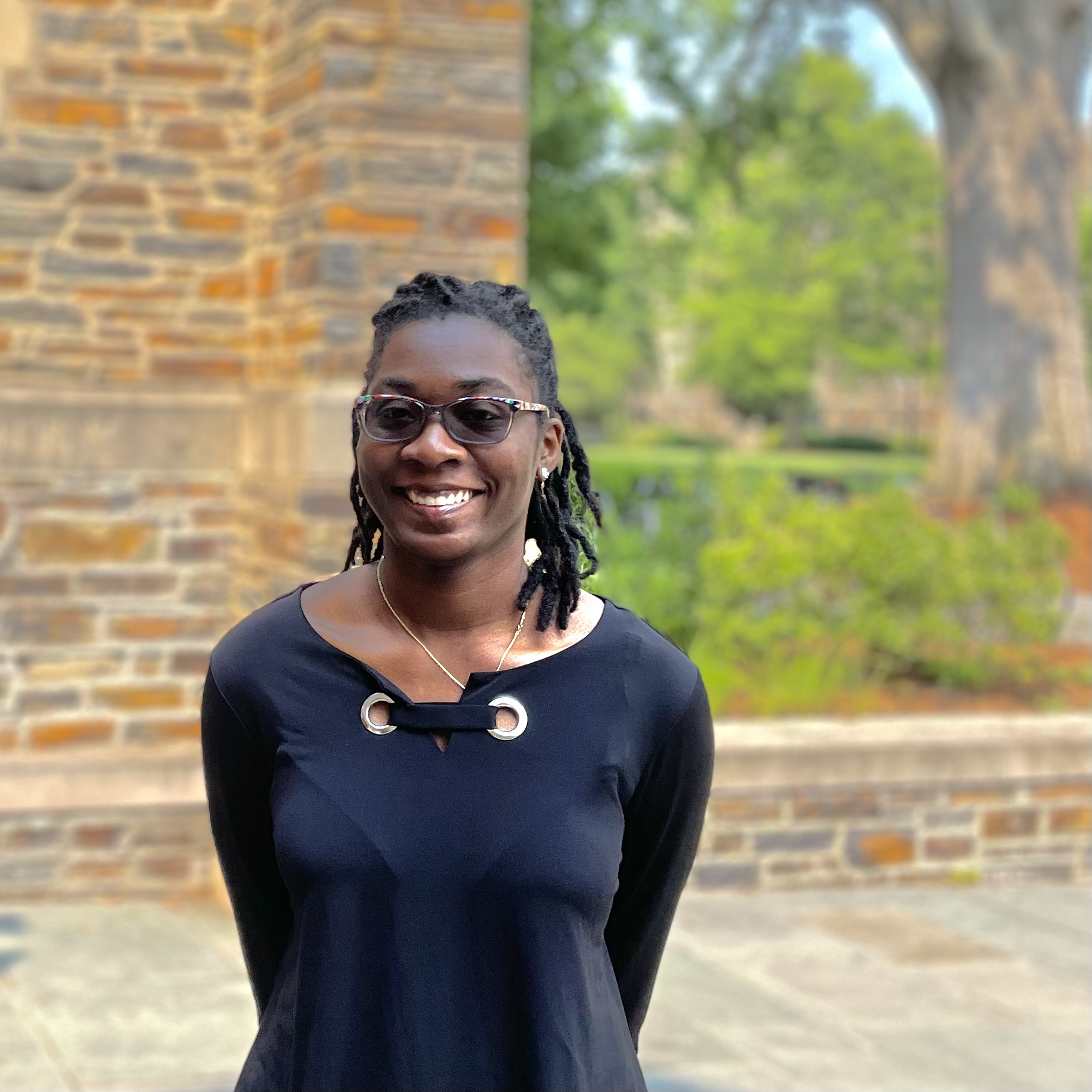
We are delighted to welcome our sixth HBCU Library Alliance intern, Angela Nettles, to Duke Libraries. Angela is a rising senior at Bennett College where she is studying Africana Women’s Studies. She is also one of eight students studying preservation this summer through the University of Delware/HBCU-LA internship program. As a part of the program, she will spend four weeks with us learning everything from binding pamphlets to conducting condition surveys.
After two years of presenting this program online, it’s refreshing to have our intern onsite again. So far, this first week has been a busy one. In addition to her bi-weekly cohort meetings, Angela has dived right into work here at Perkins Library.
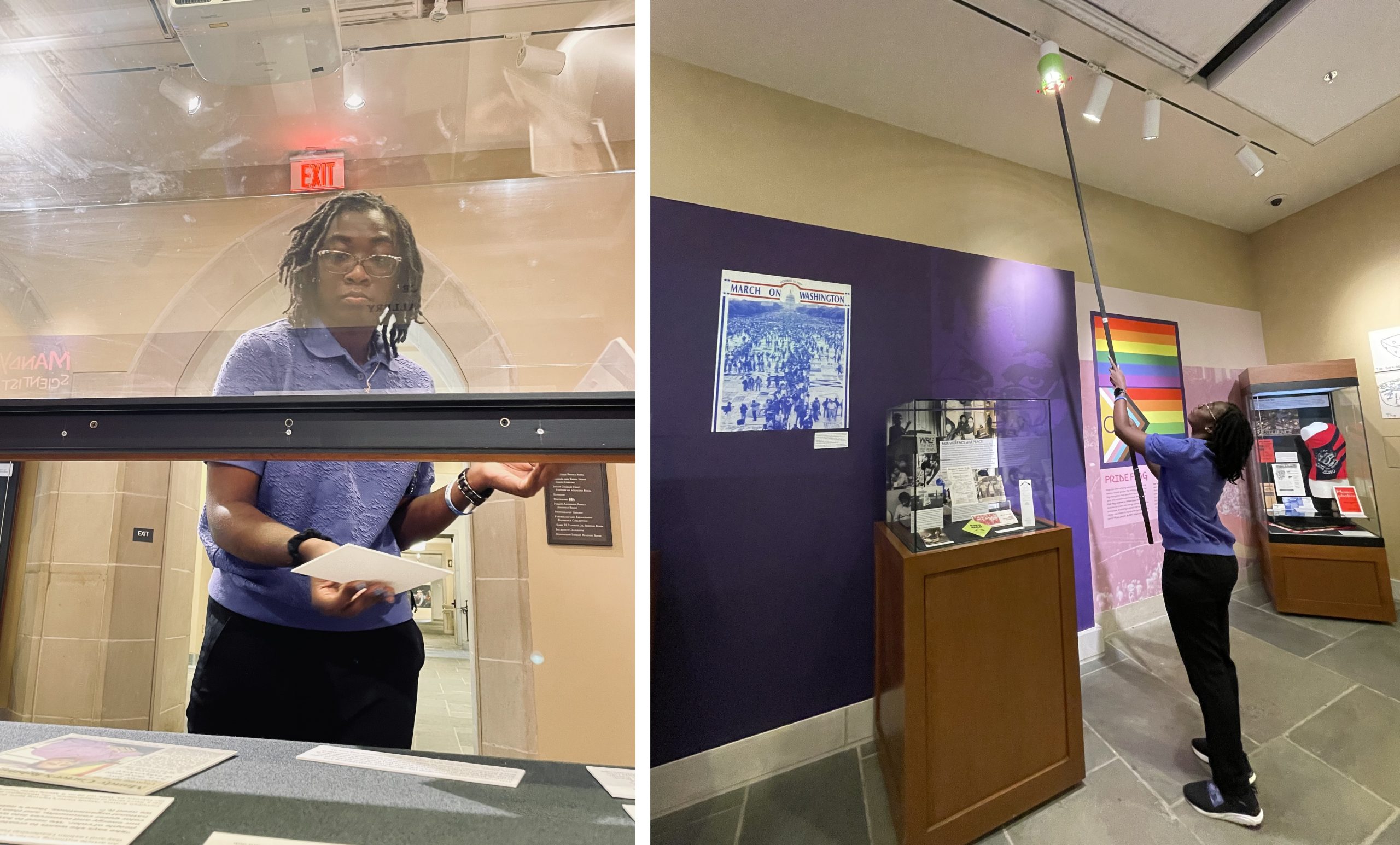
From left to right: Meg Brown (Head of Exhibition Services), Angela Nettles, and Yoon Kim (Senior Library Exhibition Technician) after working on the Mandy Carter exhibitPlacing case labels and adjusting exhibit lights.
As you can imagine, there was a lot to be done. Regardless, Angela was up to the many tasks at hand. From sanding the walls to setting up exhibit cases, she eagerly took part in every step of the process.
Left: Sanding the walls to prep them for the new Phototex graphics that were going up. Right: Meg Brown showing Angela how they measure light in exhibitions for preservation purposes.
Additionally, the second half of the week was spent introducing Angela to my work in the conservation lab. She learned about how we make treatment decisions for general collections, and has already started doing treatments herself.
Angela finishing her first pocket (left) and binding music scores into pamphlet binders (right).
So far she is a quick study and has already picked up how to do tip-ins, pockets, and pamphlet bindings.
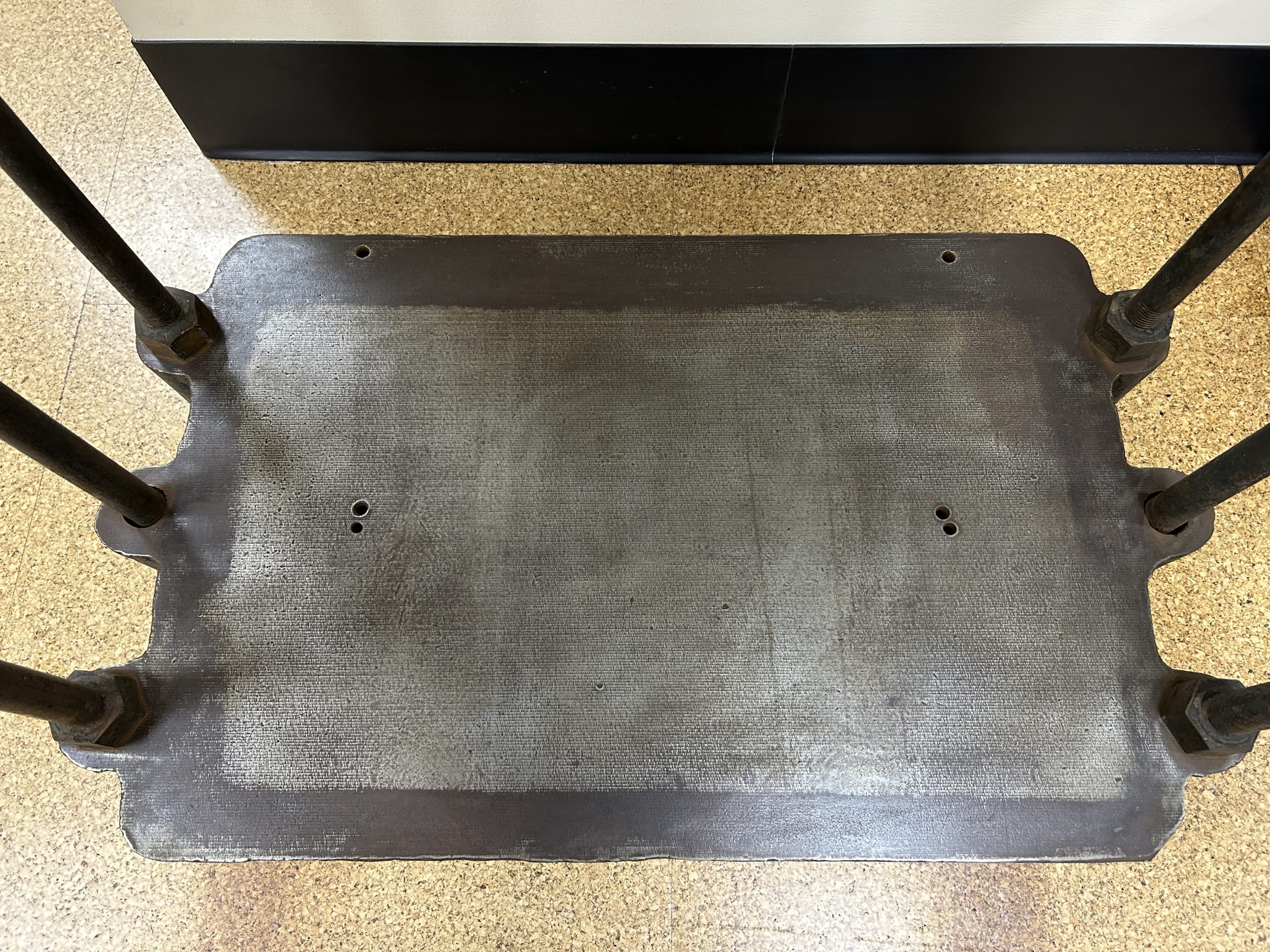
This spring has been pretty busy and keep forgetting to post an update on “Large Marge“, our new standing press. She had been in storage for a while before arriving here and needed a bit of TLC before we could start using her. We also needed some help from our colleagues in Facilities to create a modification for the base.
After vacuuming off the cobwebs and giving all the parts a quick brushing, I wanted to address the rust that had started accumulating on the base and support rods.
BeforeAfter
The rust was pretty superficial, so I was able to remove it with steel wool. I applied a thin layer of Bowling Alley Wax to all of the surfaces to prevent further oxidation.
Before and after scrubbing and waxing.
The next thing that needed addressing was lubricating the threads of the large screw. The grease inside the threaded flange was still functional, but all of the lubricant exposed to air had completely dried out. I found the easiest way to remove it was to scrape it off the threads with a micro-chisel.
Scraping off the old grease
Once the screw was clean, I added some new lithium grease and then raised and lowered the platen a couple of times to spread it across the threads evenly.
The most important addition to Marge was a modification to the base. These presses were designed for edition work with many books being stacked between pressboards and loaded in at once. This means that with the platen in its lowest position, there is still about 30″ of daylight between the base and platen. Since we are only pressing one item at a time, we needed to raise that bottom surface up.
Thankfully one of the carpenters in Duke’s Facilities Management Department was able to build a box that fits exactly inside the gap. The box is reinforced to withstand the full strength of the press, even when someone is using the extended arm to tighten it. An added bonus is that all of the pressboards can be stored inside.
I’m looking forward to putting this press to use, particularly for building clamshell boxes for folio and double folio-sized books. Books of that size are often very heavy and difficult to move around, so they can benefit from the added protection of a cloth-covered enclosure.
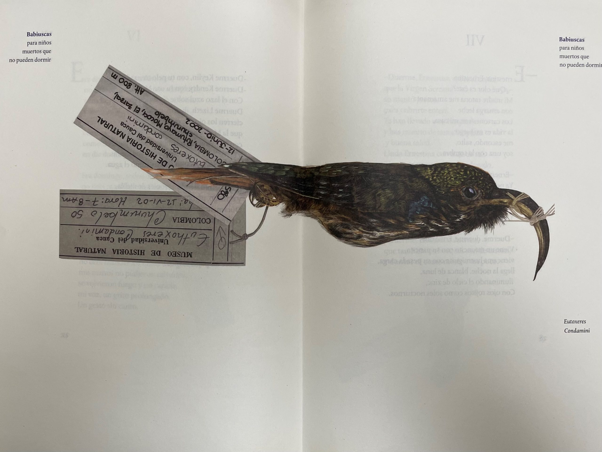
Spanish is not my native language. Luckily, I can read it well enough to appreciate this compelling and solemn work by the Columbian poet Francia Elena Goenaga. The cover image does not reveal much about the nature of the book. However, the title reads “Babiuscas Para Niños Muertos Que No Pueden Dormir”, which translates to “Lullabies For Dead Children That Can’t Sleep”.
The title sets a tone that is quite somber. This is further highlighted by the subheading on the title page, which reads “Para los niños Colombianos que han sufrido violencia y sus madres”. This translates to “For the Colombian children who have suffered from violence and their mothers”. As dedications go, this is a specific and sentimental one. It inspires one to be pensive as they delve deeper into the book and read the poetry within.
Accompanying said poetry are a set of 14 illustrations that create an intriguing juxtaposition with the text.
Colorful studies of various dead birds appear throughout the book in striking detail. There is something to be said about comparing the visual of something dead to something sleeping. And since this is a book of “lullabies” in the form of poems, I find the choice to combine them with these illustrations remarkably provoking.
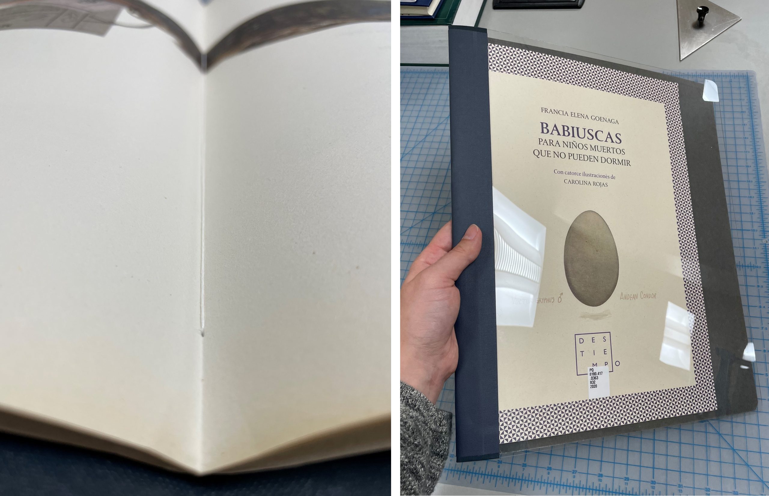
When a book this delicate and artistic come across my bench, I want to treat it delicately as well. As you may have noticed, this book was not originally bound.
It is too risky to send a book like this to the stacks since pages could be lost. The best solution for a book like this is to sew it into a pamphlet binder. Now our patrons can request this book and enjoy its artistry safely.
A close up on the sewing inside and the final product.
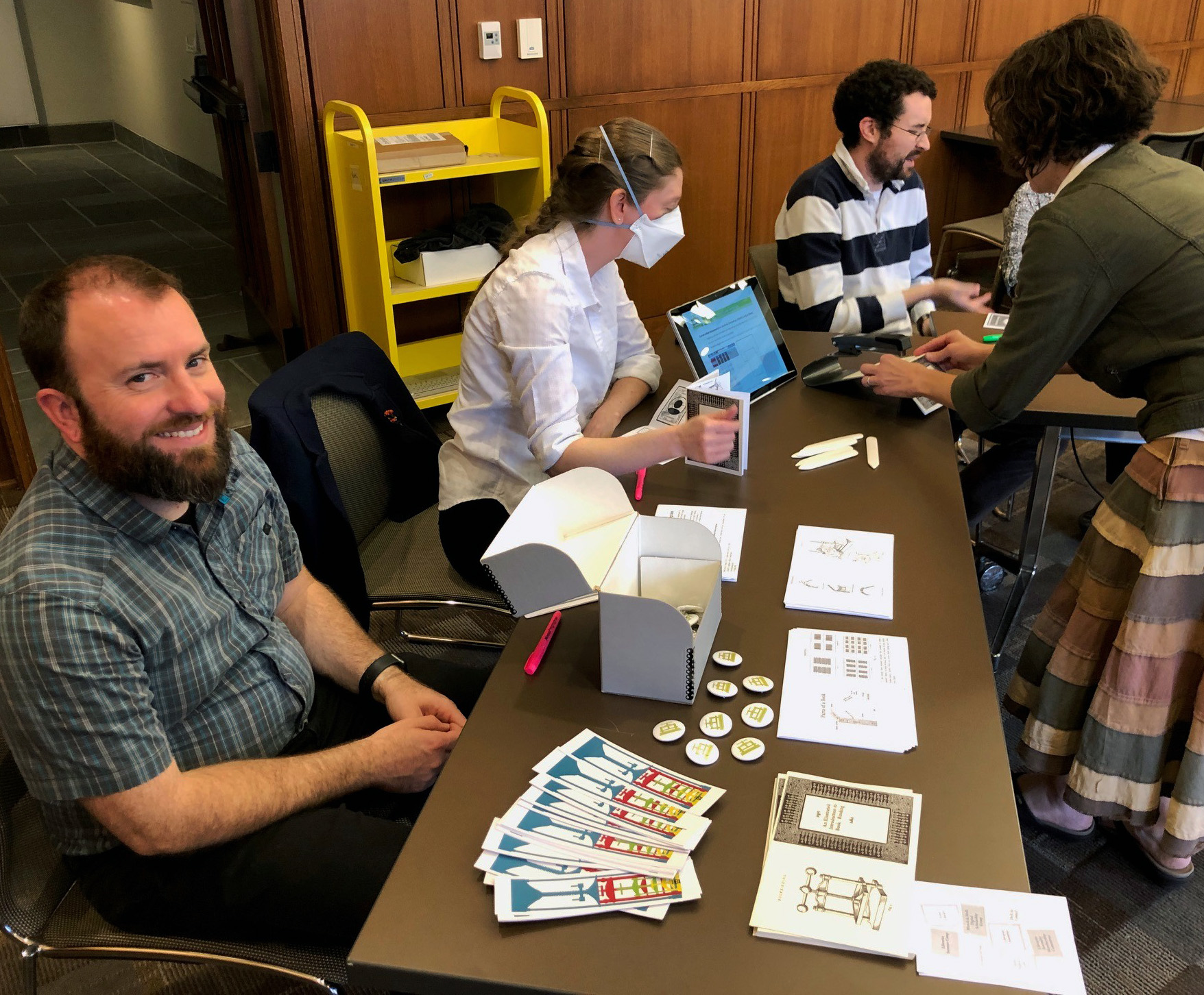
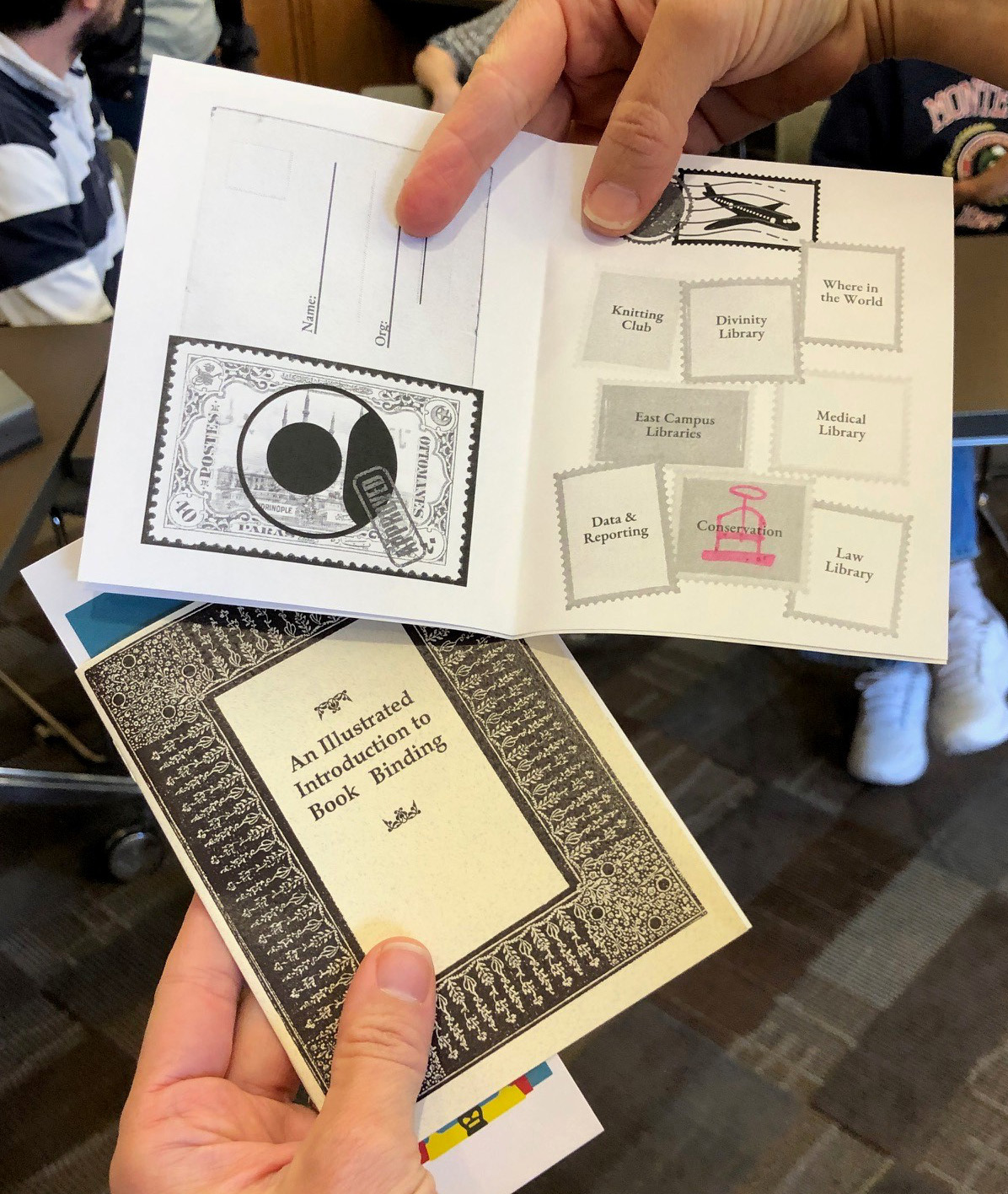
On Tuesday, Libraries Assembly put together a really great passport event for staff to learn more about the different departments and groups within our organization. Eighteen groups volunteered to set up a table with information and activities:
Adopt-a-Highway Team
Center for Data and Visualization Sciences
Conservation Services
Data and Reporting Learning Group
DivE-In Council
Divinity Library
East Campus Libraries (Lilly and Music)
Family History and Genealogy Research Guide and the Genealogy@Duke Team
Ford Library (Business)
Knitting Club
Law Library
Libraries Assembly
Libraries Summer Camp
Medical Center Library and Archives
Munch & Mull Digital Scholarship Group
Where in the World am I from (International Area Studies)
We were there to distribute our new bookmarks, branded buttons, and instruct visitors in simple pamphlet binding.
The library staff who attended were given a passport with space for each group to stamp (or in our case draw a little doodle in highlighter). They were then able to enter their completed passport for prizes in a raffle.
It was a really great way to spend an hour and interact with our peers. We have welcomed many new staff over the last year, so it was nice to meet some of the new folks. It was also a great opportunity to catch up with colleagues from all of the different libraries around campus. Hopefully this will become an annual event!
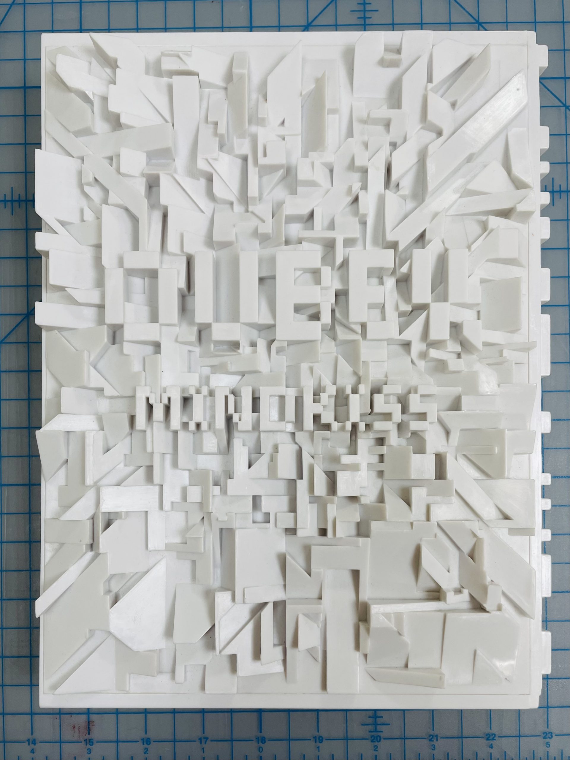
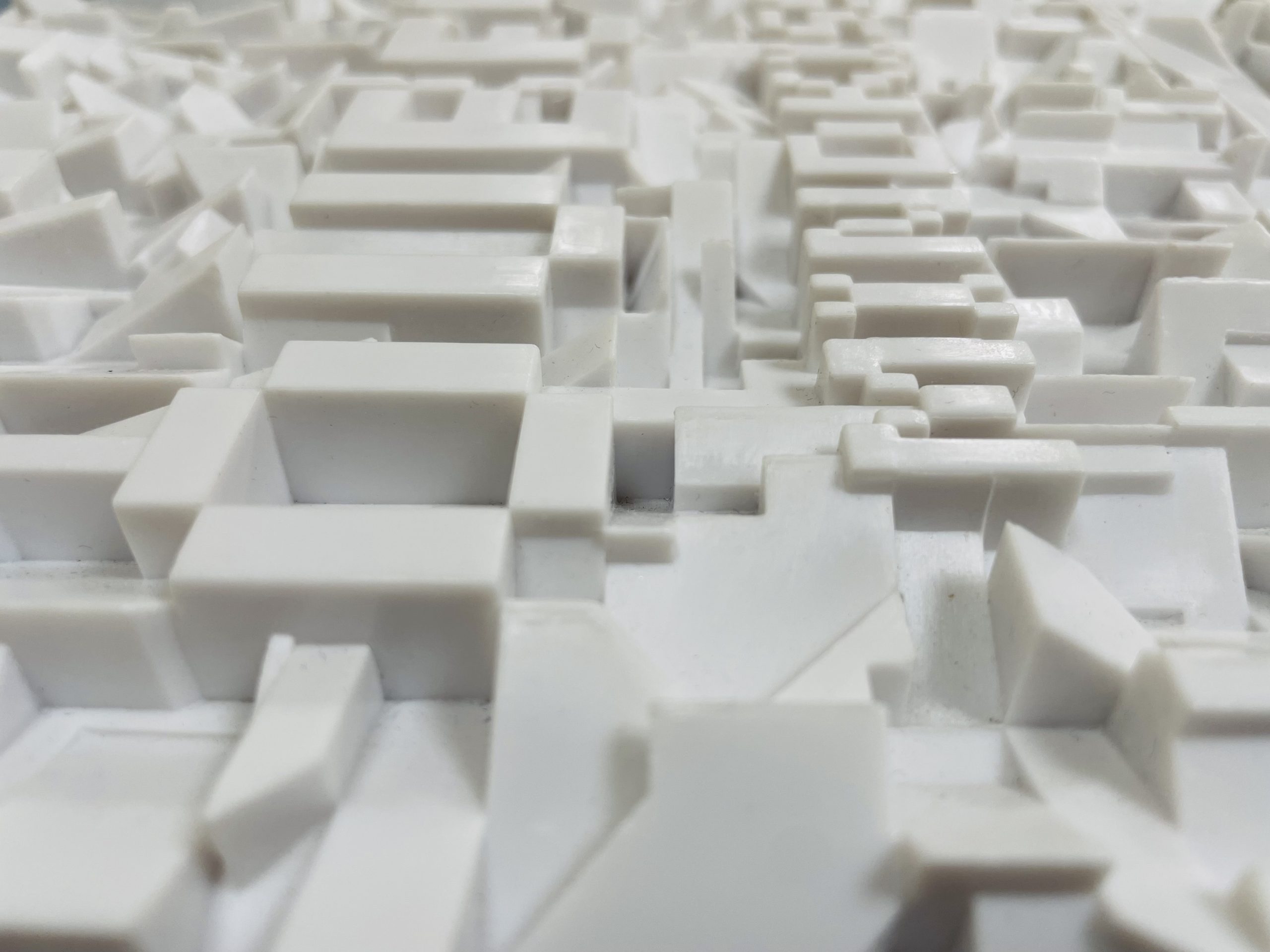
Here at Duke University Libraries, we’re fortunate to have a stunning collection of artist books from all over the world. Just like a regular book, artist books can come in a range of shapes and sizes. Some, however, come in more unusual shapes than most, which in turn can pose some interesting conservation questions.
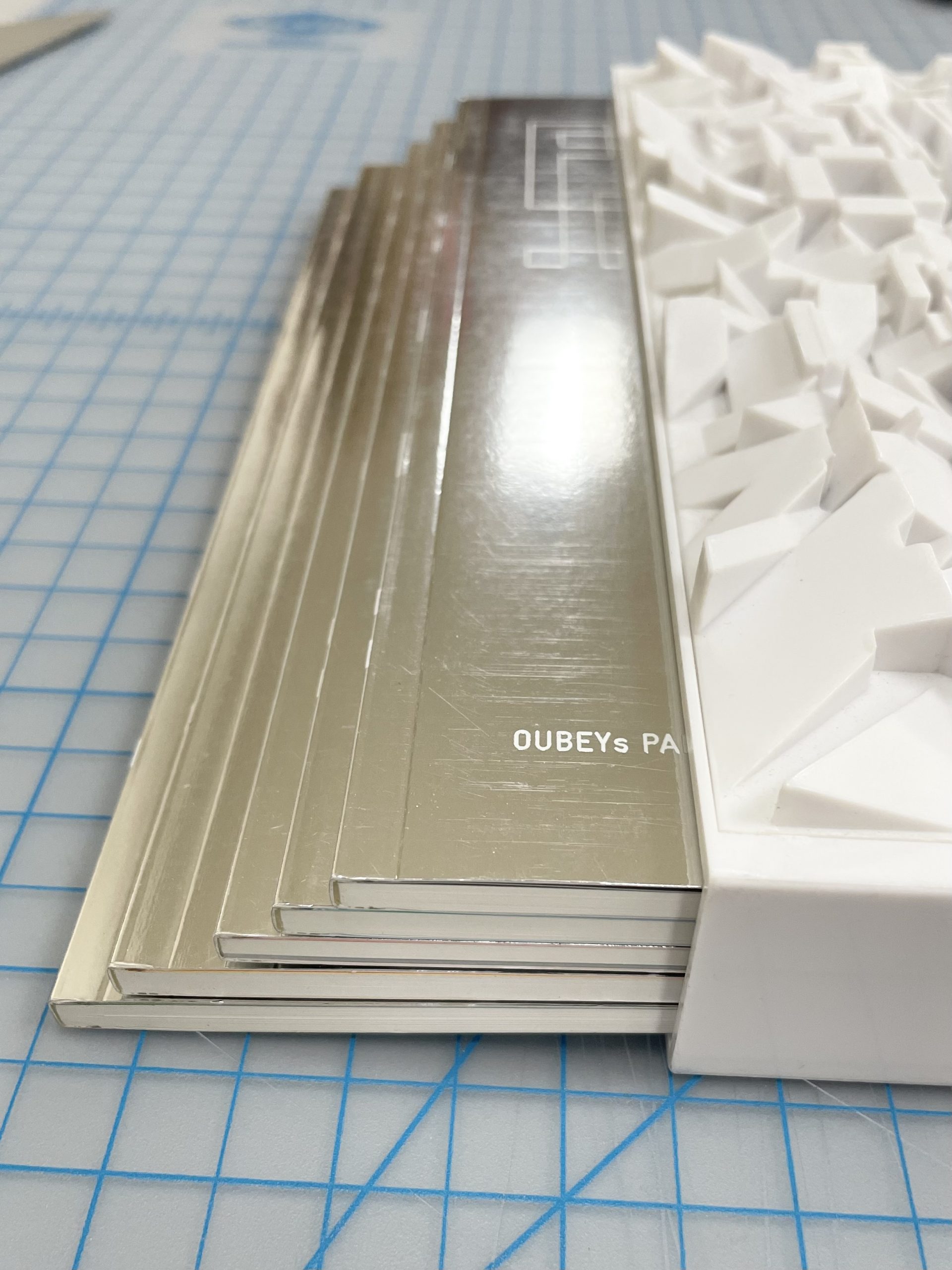
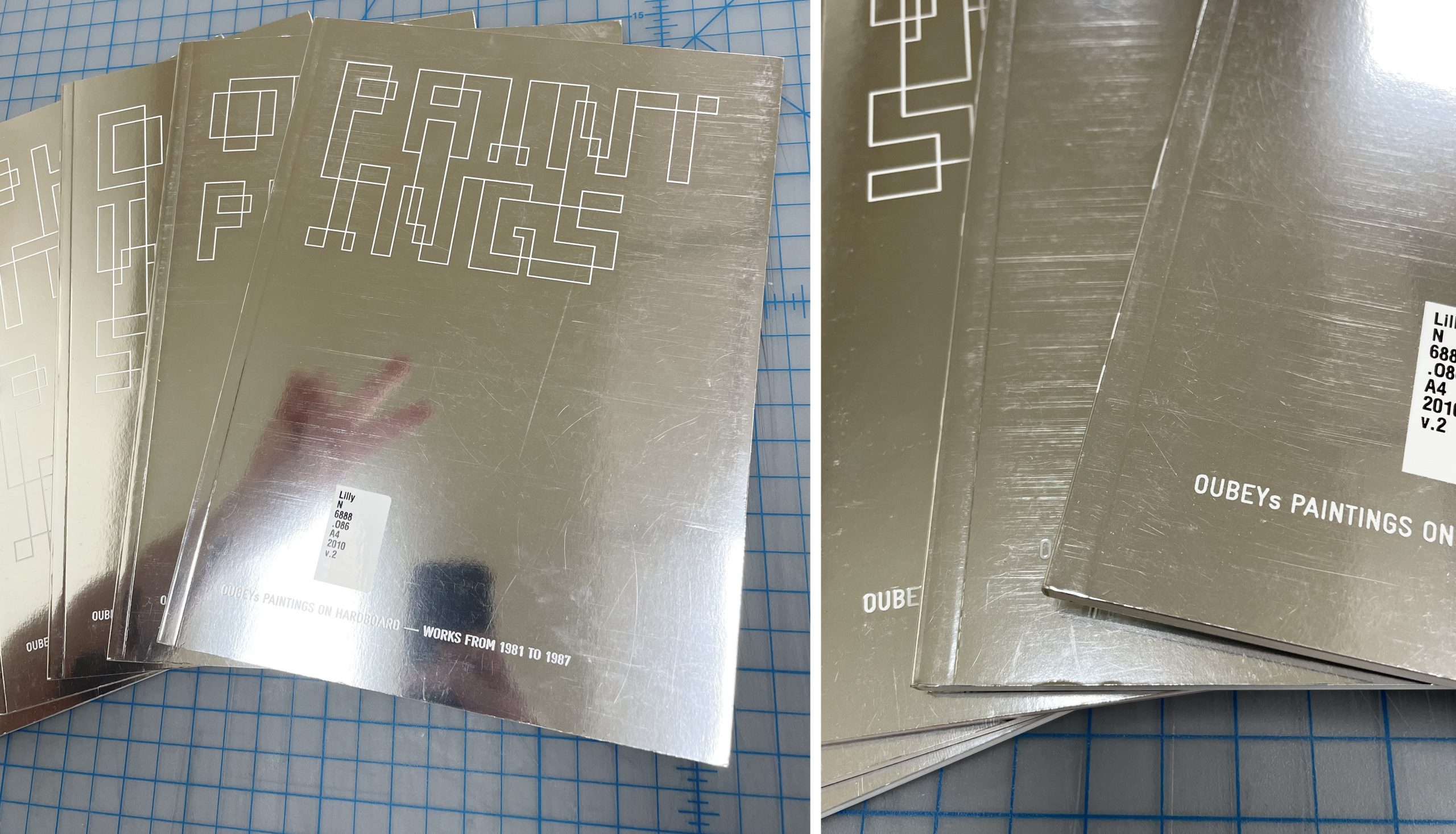
As you’ve probably noticed, this is not simply a book. “Oubey: Mindkiss” is made up of a sculptural slipcase containing five separate books.
Each book is devoted to the work of t late artist Oubey and is organized by the medium of the work or the time period the work was made.
The piece is clearly a work of art in itself. This is all the more evident by the fact that it has won multiple awards for its design. However, there are features of this item that have to be addressed from the view of a conservator, rather than one of an artist.
The Concerns
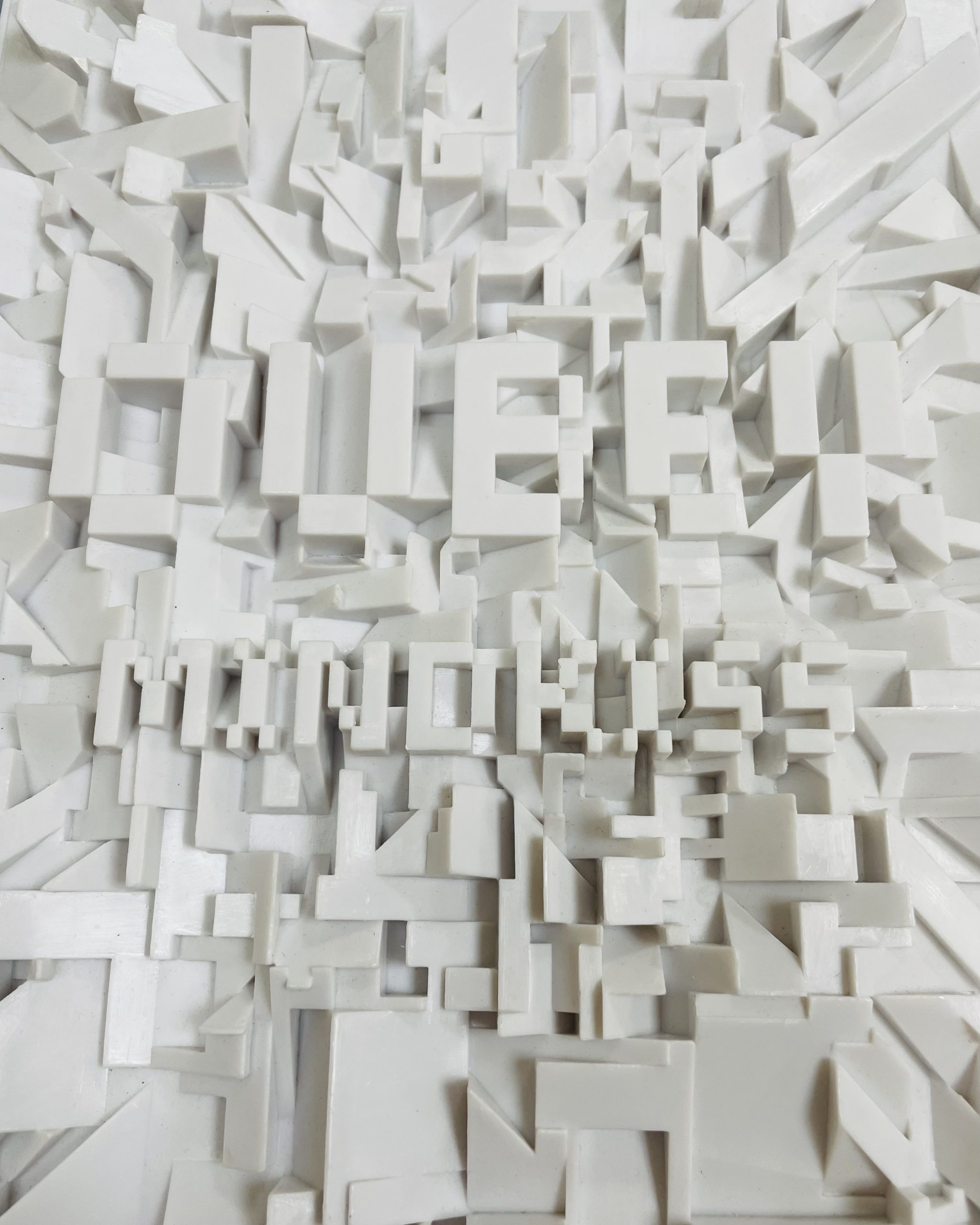
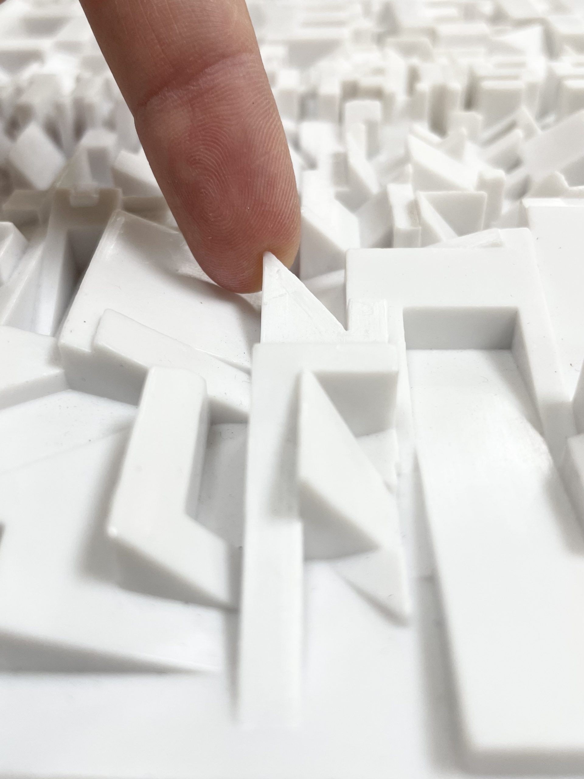
For one, the sculptural top of the slipcase consists of shapes and edges that are noticeably sharp. Pair that with the hard plastic material it’s made of, and you have an item that is bound to do some damage.
I am mostly referring to the damage the slipcase would do to any object placed beside it, but honestly this slipcase could probably hurt your hands as well if not handled carefully.
One of many pointy bits
If this item were to sit as is on a shelf next to other items as normal, there is no way the stiff plastic edges wouldn’t eventually catch, snag, or tear the item beside it.
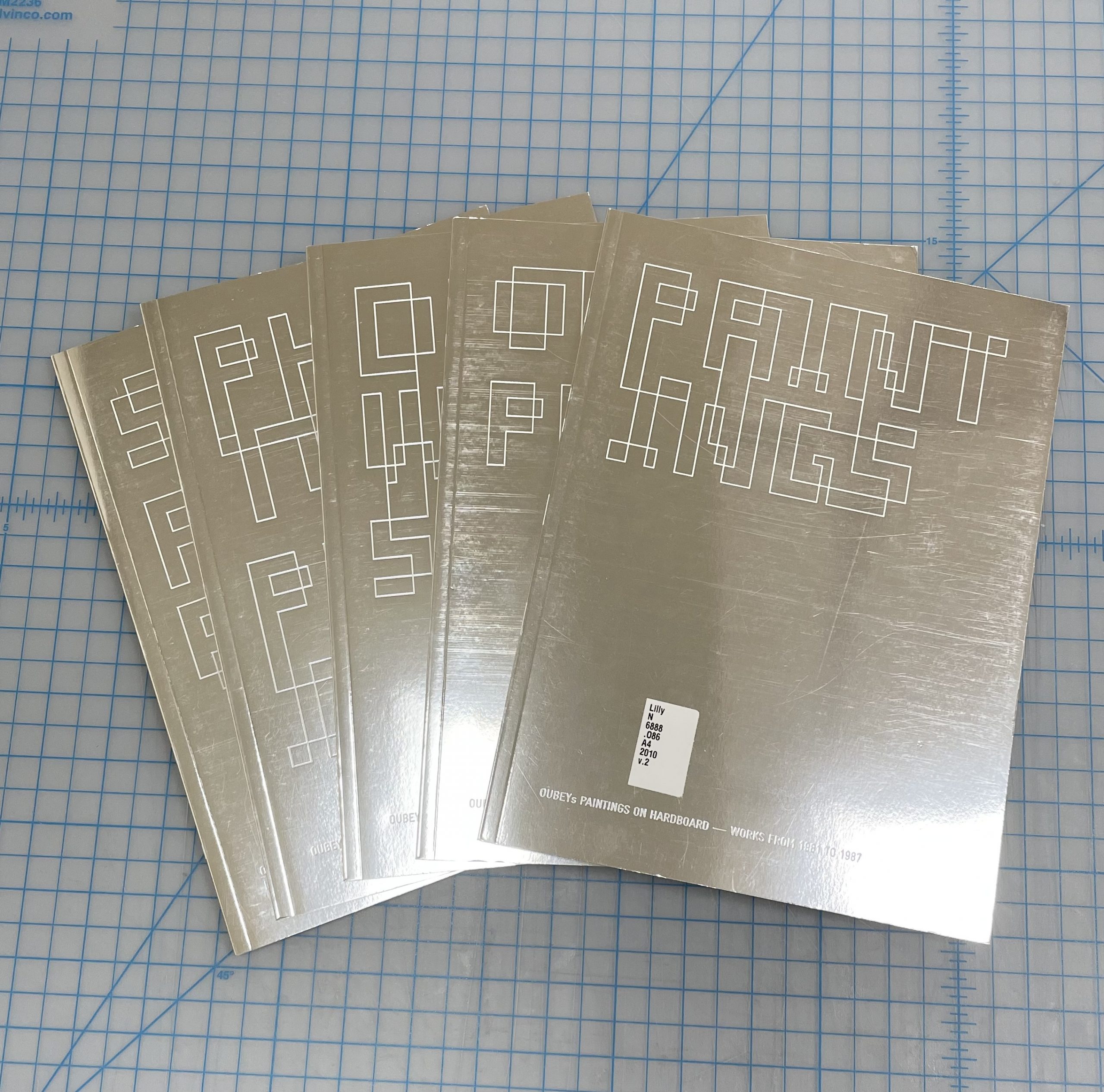
Another common problem with slipcases is how easily the books within them can fall out. These books are no exception due to the slippery, metallic material they are covered with. That combined with the equally slippery plastic case means the books have an especially high risk of sliding around.
Additionally, the plastic of the slipcase might be doing damage to the books inside of it over time. Although the books are still reflective and metallic (I provided proof in the following photo), if you look at the covers more closely you can see many horizontal scratch marks across the surface of each cover.
Still a decent mirror
This observation is more of an assumption than a proven fact, but my guess is that these scratch marks are the result of the repetitive in and out motion of the books when they are removed or inserted in to the slipcase. The books fit rather snugly into the case, so they could be rubbing up against the inside whenever they move.
So, what can a conservation specialist do?
The Conclusion
Unfortunately, I can’t fix the issue regarding the covers of the books. Even if I knew how of a way treat metallic coatings (which I certainly don’t), something would still have to be done about the material of the slipcase rubbing up against the covers in the first place. An extreme solution would be to refrain from taking the books out of the slipcase at all, but then future readers would lose access to a significant portion of the information this item has to offer.
On a more positive note, something can be done about the nature of the slipcase. Luckily that solution is simple. We just make a box for it.
Does it feel a bit like hiding away a piece of art? Sure. However, as a library, one of our priorities is maintaining our collections while providing access to them. Making a box will protect our collections while also insuring that “Oubey: Mindkiss” is safer to handle for future patrons. And that’s a win for everyone.
Back in early 2020 Henry gave a little peek into a project I was working on. When four architectural drawings of the Benjamin N. Duke House on 5th Avenue in New York City were acquired by the Rubenstein Library they were removed from their frames in order to incorporate them into the Semans family papers. After the drawings were removed from their frames the staff in the Rubenstein Library Technical Services department found they had been mounted directly onto a non-archival foam-core backing. The drawings were sent to Conservation to see if we could remove the poor quality board.
Drawing mounted to foam core before treatment.
These drawings were created by a reproduction process called aniline printing which was used in the late 1800’s to the early 1900’s and is identifiable by the distinctive green background color and blueish-black lines. These prints are not on paper but on drafting cloth; a cotton or linen fiber fabric that is heavily starched and rolled to give a smooth surface. Aniline prints fade quickly with exposure to light and are sensitive to heat, humidity, alkalinity, and a number of solvents including alcohols. The starches and additives in the drafting cloth can also be very sensitive to heat and water, and the acidic process of aniline printing degrades the cloth over time making it fragile. So my toolbox of conservator tricks to remove the backings was really limited: no heat, no humidification, and few safe solvents.
I could tell there was another layer between the foam core board and the architectural drawing but it was hard to tell what was going on back there. The backing board was attached with long 2” wide strips of a very sticky, waxy adhesive. I managed to separate the board by hand, lifting it away with a thin spatula and discovered something I have never seen before.
Back of drawing after foam core removed and contact paper revealed.
The entire back of every drawing was covered with big sheets of cream colored, self-adhesive plastic like you might use to line your kitchen shelves. It’s commonly called contact paper, though there’s nothing paper about it. The plastic used in these products is usually polyvinyl chloride which degrades very quickly and destructively over time so it needed to be removed before it caused further damaged to the drawings. Although the adhesive on this product is weak in order to allow you to lift and reposition it during installation on a kitchen cabinet, the drafting cloth was too fragile in many places to just peel it away. I needed to find a way to more gently remove the contact paper but my options were limited. After a lot of solvent testing and experimentation I found that timed application of a small vapor chamber of solvent would soften the adhesive on the contact paper enough to gently lift it away without leaving an adhesive residue behind and without damaging the print or the drafting cloth.
Contact paper being removed with solvent chambers in a fume hood with a pile of removed contact paper on the right.
Working slowly across each drawing I softened the contact paper backing and gently peeled it away to reveal lots of self-adhesive tape had also been applied directly to the back of the drawing. This object was like an onion: full of layers! Some of the tape came off along with the contact paper but the rest I removed with a small spatula and a crepe eraser. I then repaired the tears with a very thin, green toned archival paper. Whoever put the tape down was heavy handed and I often found there were no tears or damage beneath the tape at all.
Many pieces of tape revealed below the contact paper during treatment.
The same area with all the contact paper and tape removed and new archival mending in place.
This treatment was a good example of how sometimes less is more. Whoever applied hundreds of inches of tape, layers of contact paper, and huge areas of sticky adhesive to attach foam core backing board surely thought they were helping to protect a valued item. Instead they created a mess that took weeks to undo.
Diagram of the many layers in cross section.
Front of drawing after treatment completed.
Back of drawing after treatment completed.
The best part about removing all of those layers was revealing a manufacturer’s mark printed in pale purple ink on the back that reads:
Copied by
Peerless Blue Print Company
122 East 14th New York
Phone 168-18th
This mark helps us to date when and where these drawings were created and would have been lost if all those layers weren’t removed.
Manufacturer’s mark previously covered by all the layers.
The property shown in these historic architectural drawings has recently been restored and is now on the market. The 8 bedroom, 10 bathroom, 20,000 square foot home which is directly across the street from the Metropolitan Museum of Art can be yours for just $80 million. Hopefully it’s not also held together with tape and contact paper.
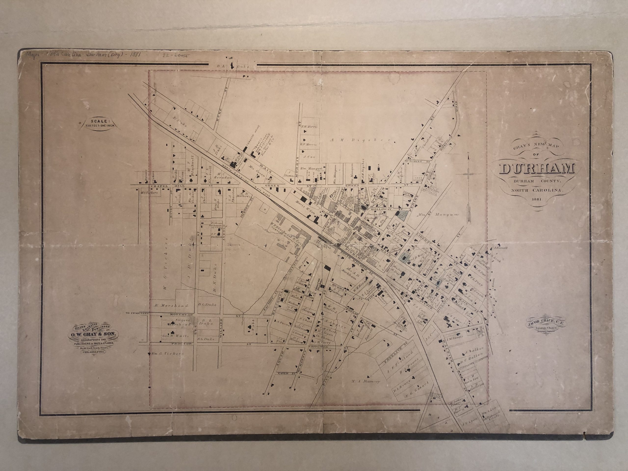
We recently got this 1881 map of Durham in the lab and spent time comparing old streets and buildings to what’s currently on those locations.
We were especially interested in the large plot of land on Dillard Street owned by Julian Carr. The map shows many little winding paths on the property.
We wondered if it was a park or a cemetery, but no, it was just a huge personal estate. We found some great information on the Open Durham website including pictures of the beautiful original homes built on that site.
Waverly Manor (Courtesy Durham County Library, via Open Durham)
The original large homes are long gone, replaced by a number of commercial buildings in the 1920s, then a surface parking lot in 2008, and now a large hole in the ground.
A mixed-use development is currently planned for the block. Likely not as handsome as some of the previous structures, but at least a residence once again.
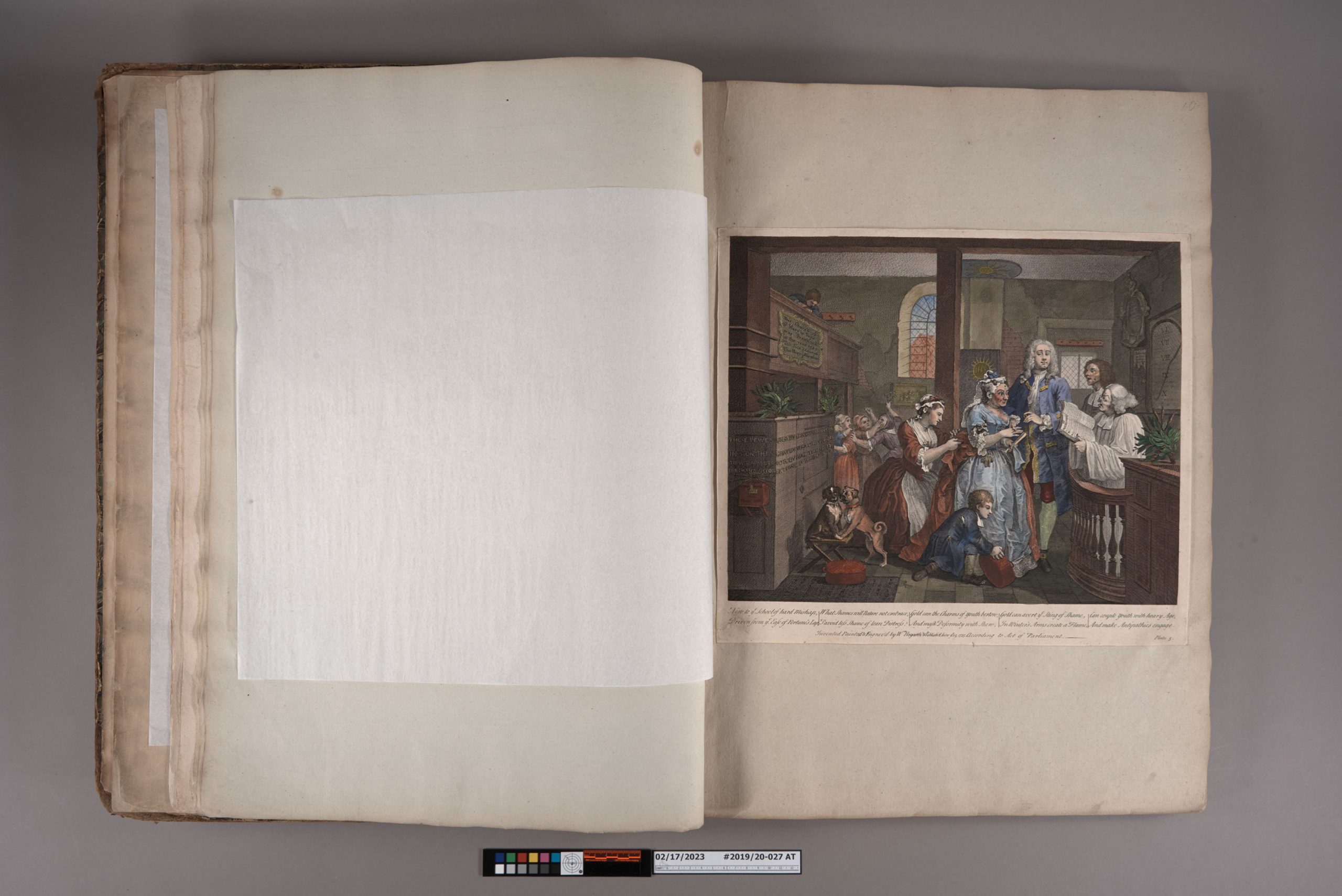
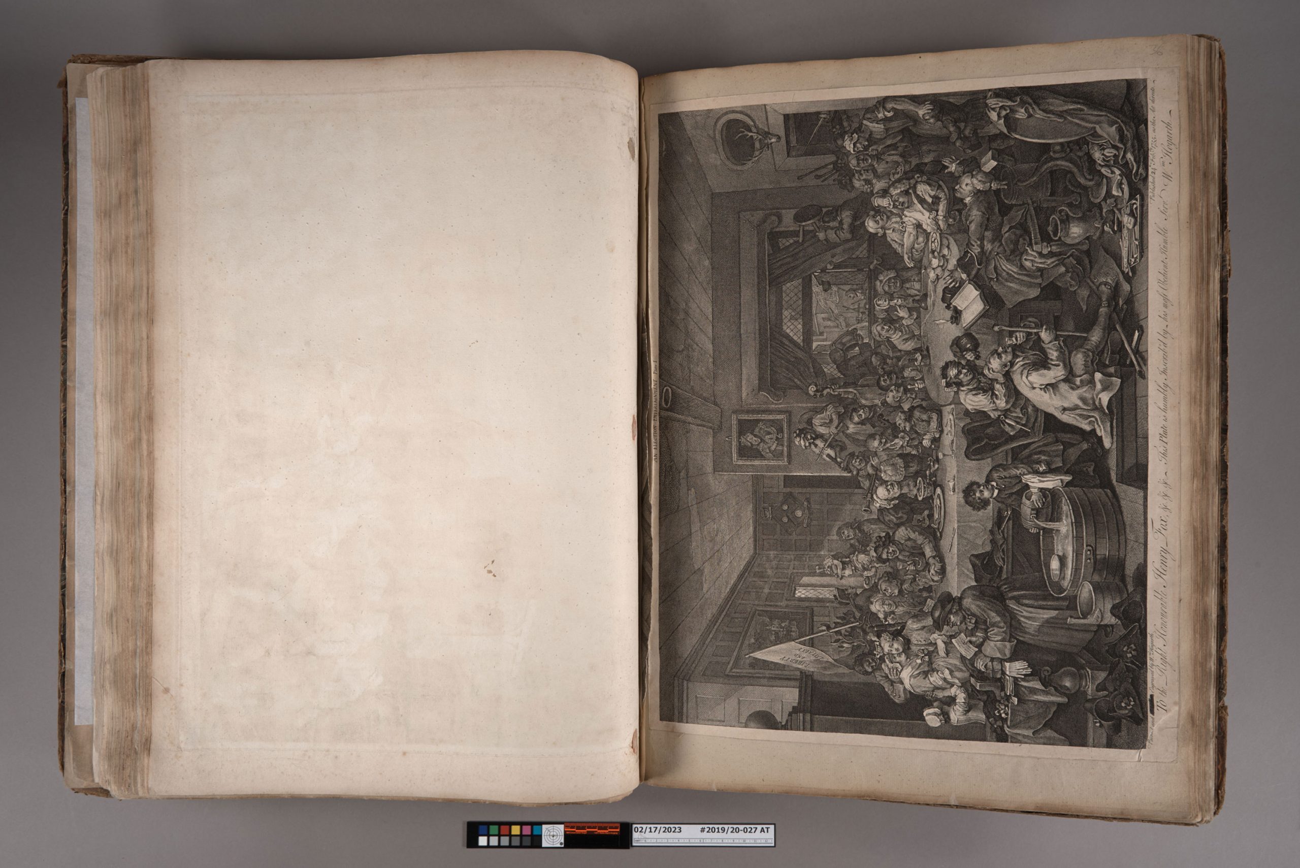
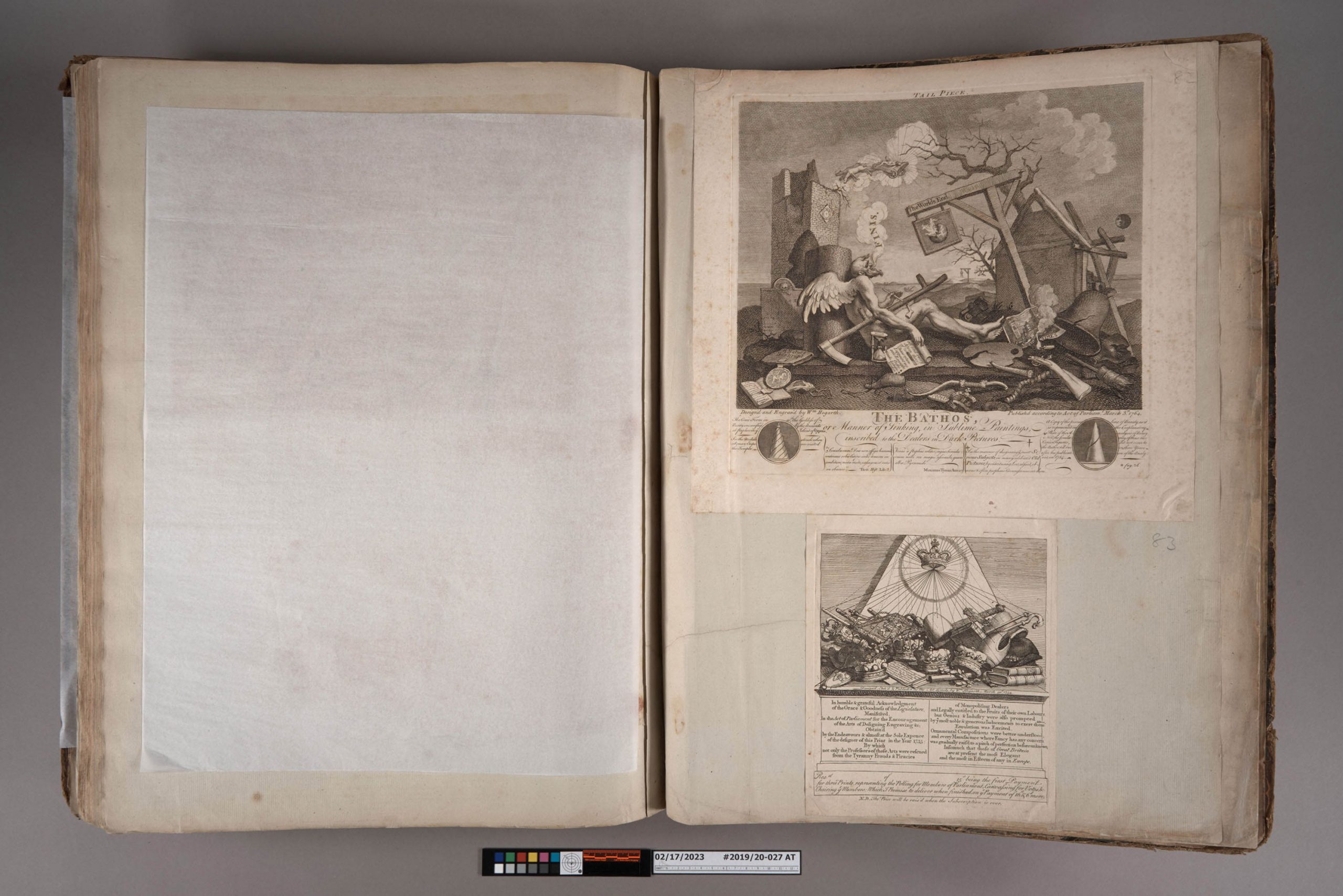
For the last few months, I have been working on cleaning and stabilizing a very large (25″ x 19″) and fascinating book.
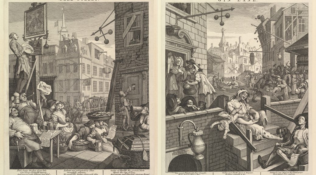
This binding contains a collection of 83 engravings, in various sizes, by William Hogarth (1697 – 1764). This item was formerly owned by Frank Baker (1910-1999), a faculty member at Duke. Hogarth was an English artist known best for his satirical works depicting morality and social criticism. These works were first executed as paintings and then sold as engravings by subscription. The prints are remarkable and capture so many small details of English life in the 18th century. Interestingly, Hogarth’s work was so widely pirated that he fought to obtain copyright protection and the Copyright Act passed by Parliament in 1735 is known as the Hogarth Act.
In order to make these prints available to patrons, the book needed quite a bit of cleaning and mending. Several of the pages at the front and back were detached.
Before and after surface cleaning
The paper was so covered in surface grime that your fingers would become black from just turning pages, so I spent several weeks just surface cleaning everything. The resulting change was pretty dramatic.
With the tears along the edges mended, and the loose sheets reattached, this items is a little less daunting and safer to handle.
Many of the prints are large enough that they are simply sewn into the binding, but the smaller prints are mounted at the corners to larger sheets. Some of the smaller prints had become detached. Only a few of the prints in the volume have hand-applied color like plate 5 from ‘A Rake’s Progress‘ (above).
Loose prints were reattached with wheat starch paste.
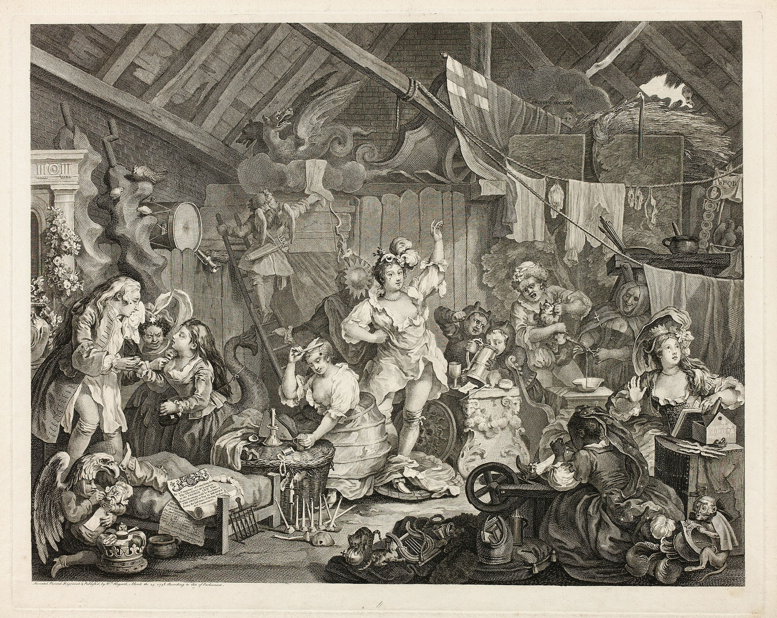
During my initial review, I thought that the first of four plates in the Election series was torn along the top (or gutter of the binding).
Upon closer inspection though, I discovered that the Election plate was whole – this torn stub was from something else.
Dr. Baker’s typewritten inventory doesn’t list another print in this location and the numbers penciled on each page aren’t interrupted, so it seems like this one has been missing for quite a while. Looking at the details of exposed wooden rafters that are depicted, this fragment could be from one of Hogarth’s more famous works, “Strolling Actresses Dressing in a Barn”.
It is hard to know for sure, but we will be noting the fragment’s location in the catalog record.
Apart from mending and reattaching the prints themselves, I also spent some time flattening the original interleaving. The binder had included sheets of thin, laid paper by affixing them to the verso of each leaf using dots of red wax. The interleaving had become very badly creased, torn, and in some cases was missing entirely.
During treatment, I flattened and repaired the interleaving as much as possible. New loose interleaving sheets were added for the openings where original interleaving was missing or had major losses.
The top engraving above, titled “Tailpiece, or The Bathos”, is Hogarth’s last engraving, published just eight months before his death. It depicts the figure of Time exhaling his last breath among ruins. In the advertisements for this print that ran in the St James’s Chronicle for April 14, 1764, Hogarth wrote that it should “serve as a Tail-Piece to all the Author’s Engraved Works, when bound up together”.
The previous owner who had these prints collected and bound honored Hogarth’s wishes.
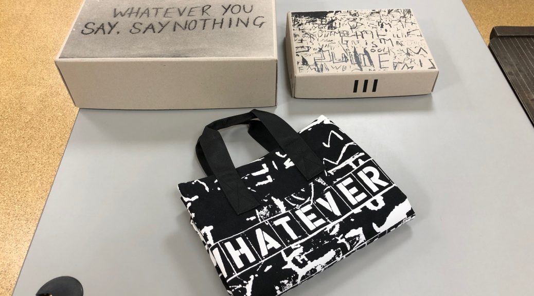
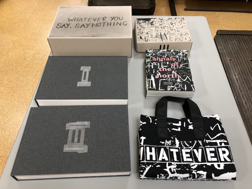
We have been on a Big Book Box roll lately. Last week you read about a boxing project for two large “boxed withs” (is that a real term in library land?). This week we bring you another multi-piece set that posed some challenges. “Whatever You Say, Say Nothing,” by Gilles Peress, consists of three books, two boxes, and a canvas bag. You can read more about this project and watch an interview with the author at Steidl Books.
Prepare for boxing!
Artist books are often a challenge for shelving in library stacks. Rarely are they shelf-ready due to their materials or construction. How do you shelve a bag full of books? Do you separate the pieces for easier shelving and retrieval? Or box them all together to keep the items together? Did we mention this weighs a total of 27.5 pounds?
Time to box the boxes and bags.
We decided to take the boxes out of the canvas bag, and box all the parts in one enclosure that will include a label warning of the weight of the object. This makes it easier to shelve, and easy to put back together in its original form when it is used or exhibited.
All together now…
Now we need to find a bigger bin to send this over to Lilly Library. If your library has this title, let us know how it went to the shelf. We would be really interested in hearing about it.

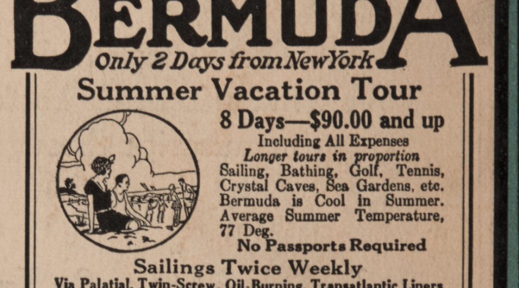
 This copy of The Bookman came in for some minor repairs before going on exhibit. The covers are the main advertising spaces for this publication and mostly feature some pretty dull descriptions of books available from George H. Doran or Harcourt, Brace and Company. It being June, the image of a steam ship and “Ideal Summer Vacations” advertised on the back really caught my eye.
 Eight days in Bermuda for only $90 sounds really nice, but was it a good deal in 1924? The Bureau of Labor Statistics’ CPI Inflation Calculator estimates that sum to be the same as around $1600 today. That seems like a reasonable amount to spend on a long cruise; however, after a quick search I discovered that many of the major cruise lines today are offering the same voyage for less than half of that price. Cruises (at least to Bermuda) have beat inflation!