Category Archives: What’s In The Lab

Cast Composite (AKA Synthetic Texture) Technique

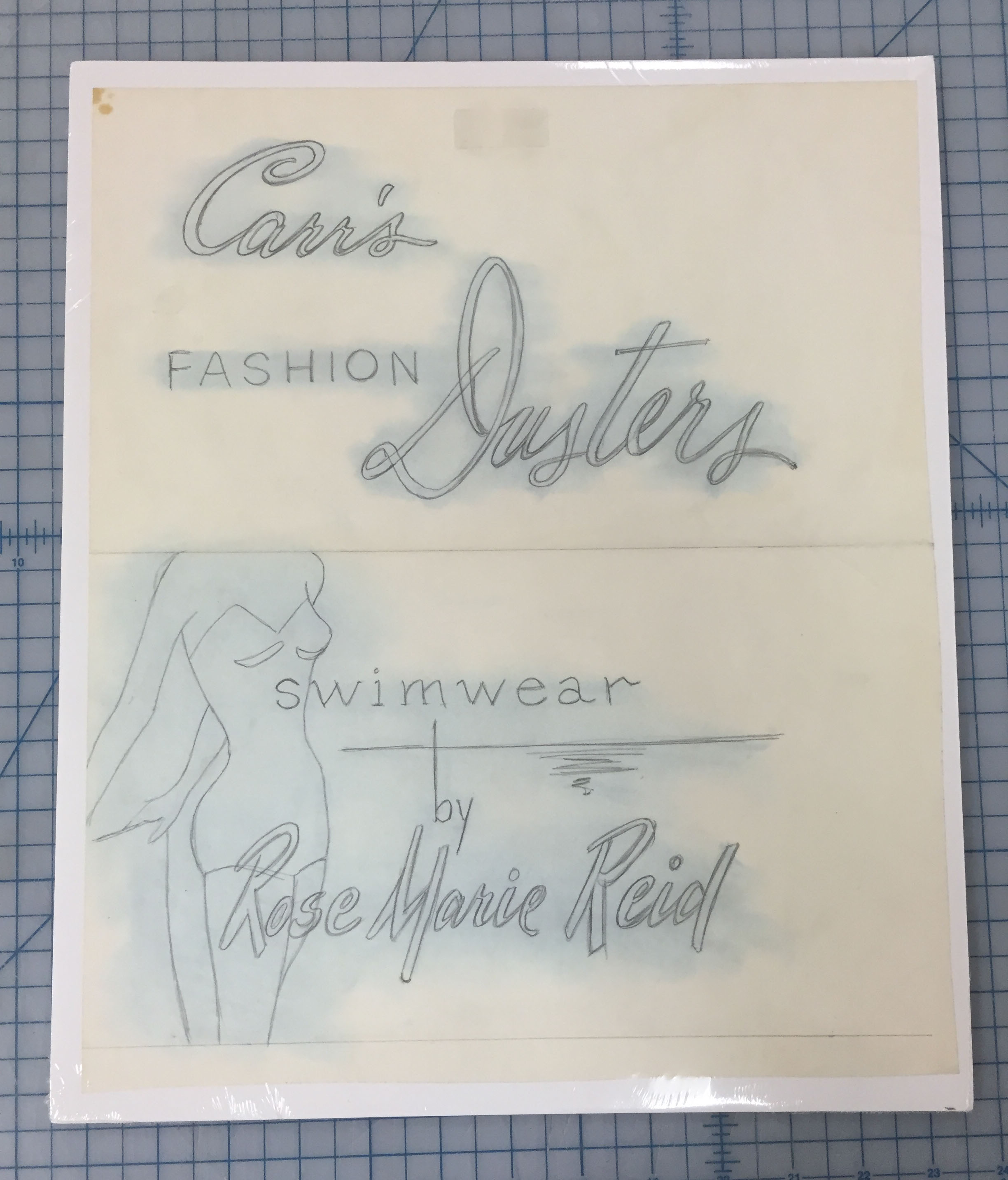
While we are always trying to maintain an awareness of new techniques and materials for conservation through the literature, sometimes it can take a while to experiment and actually put them to use. Recently, I have finally gotten around to trying my hand at making and applying cast acrylic films for book repair; a technique which I had originally seen presented by Grace Owen-Weiss and Sarah Reidell at the Library Collections Conservation Discussion Group of AIC back in 2010 (See the Book and Paper Group Annual Vol 29, p. 92). Using a silicone mold, a blend of acrylic gels, and a paper or textile support, one can employ this technique to create a thin, reversible repair material that matches both the color and texture of the object.

Penny Magazine - Before and after treatment
(click images to enlarge)

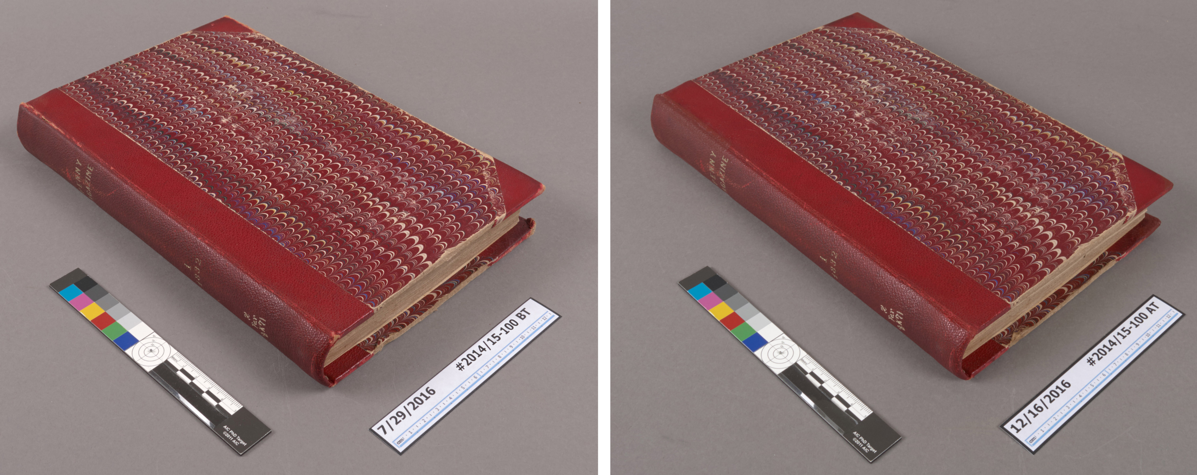
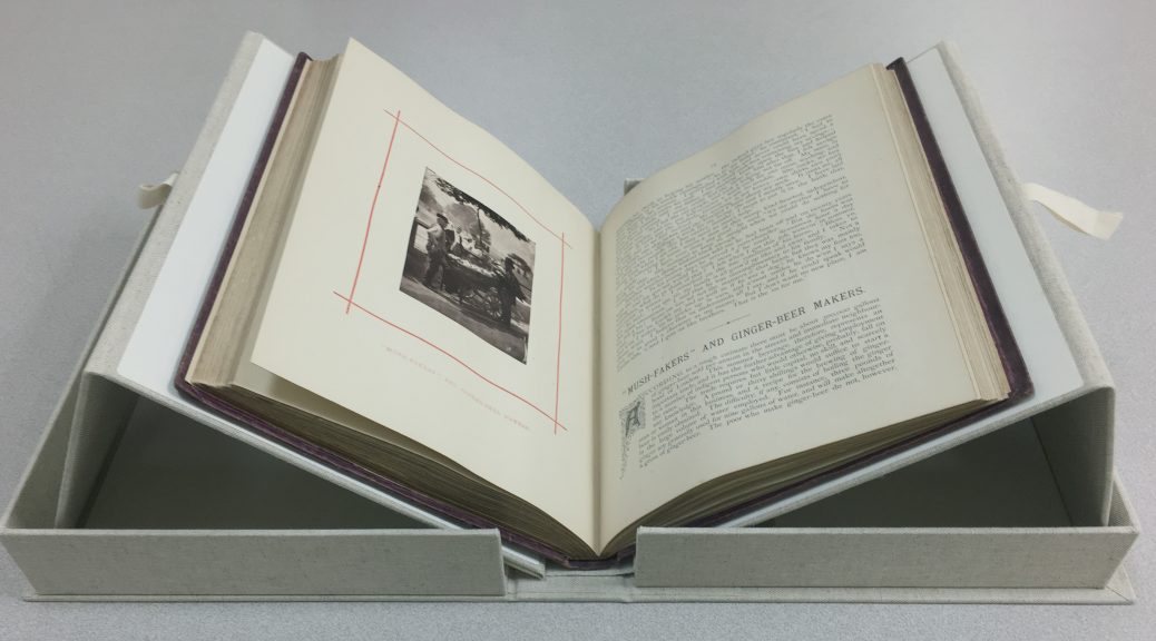
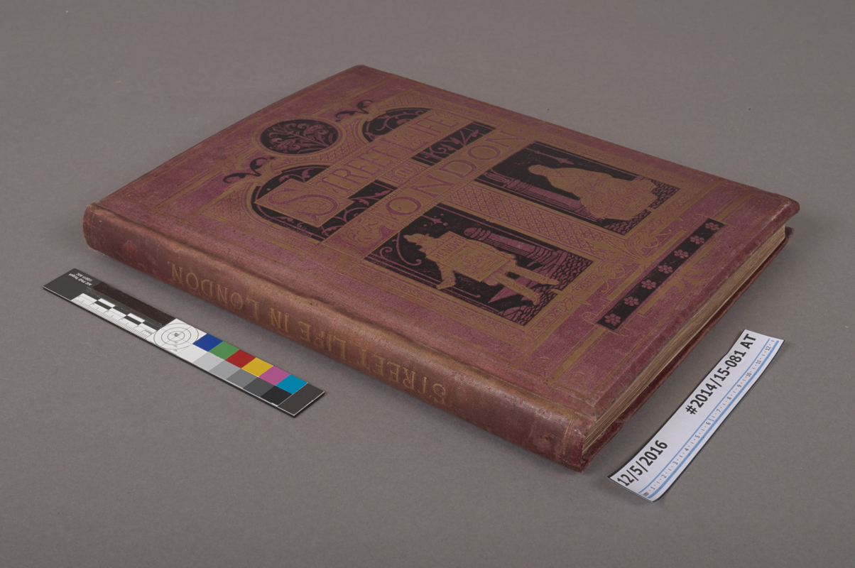
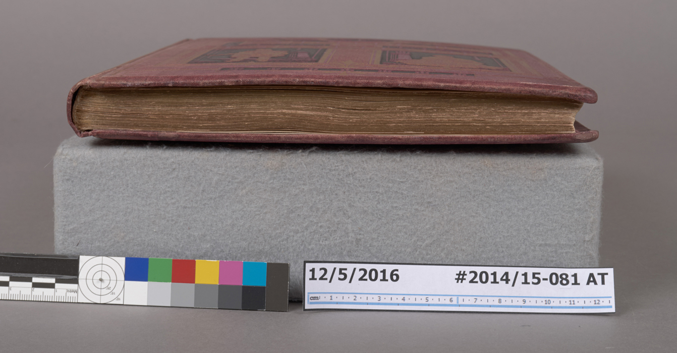
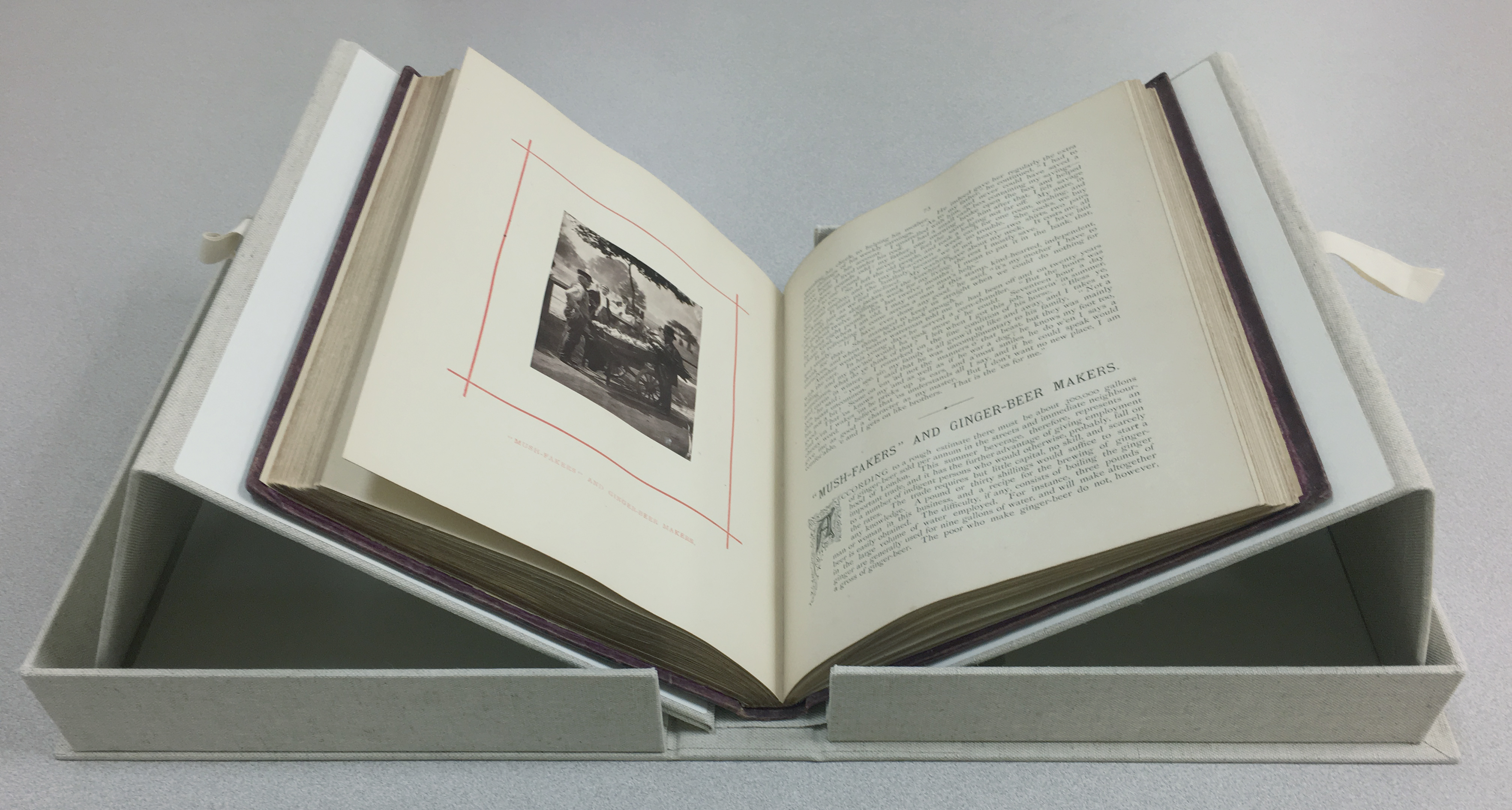
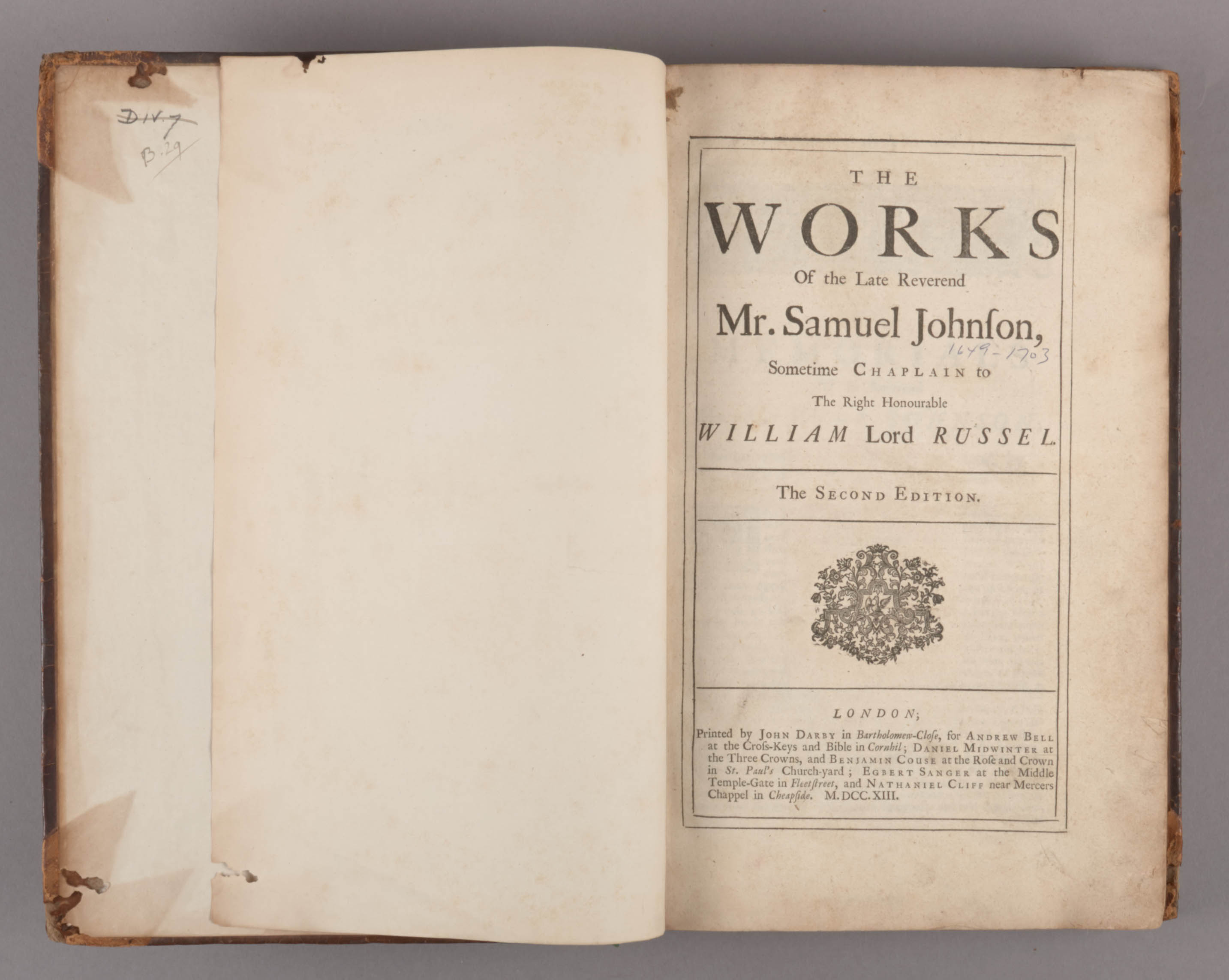
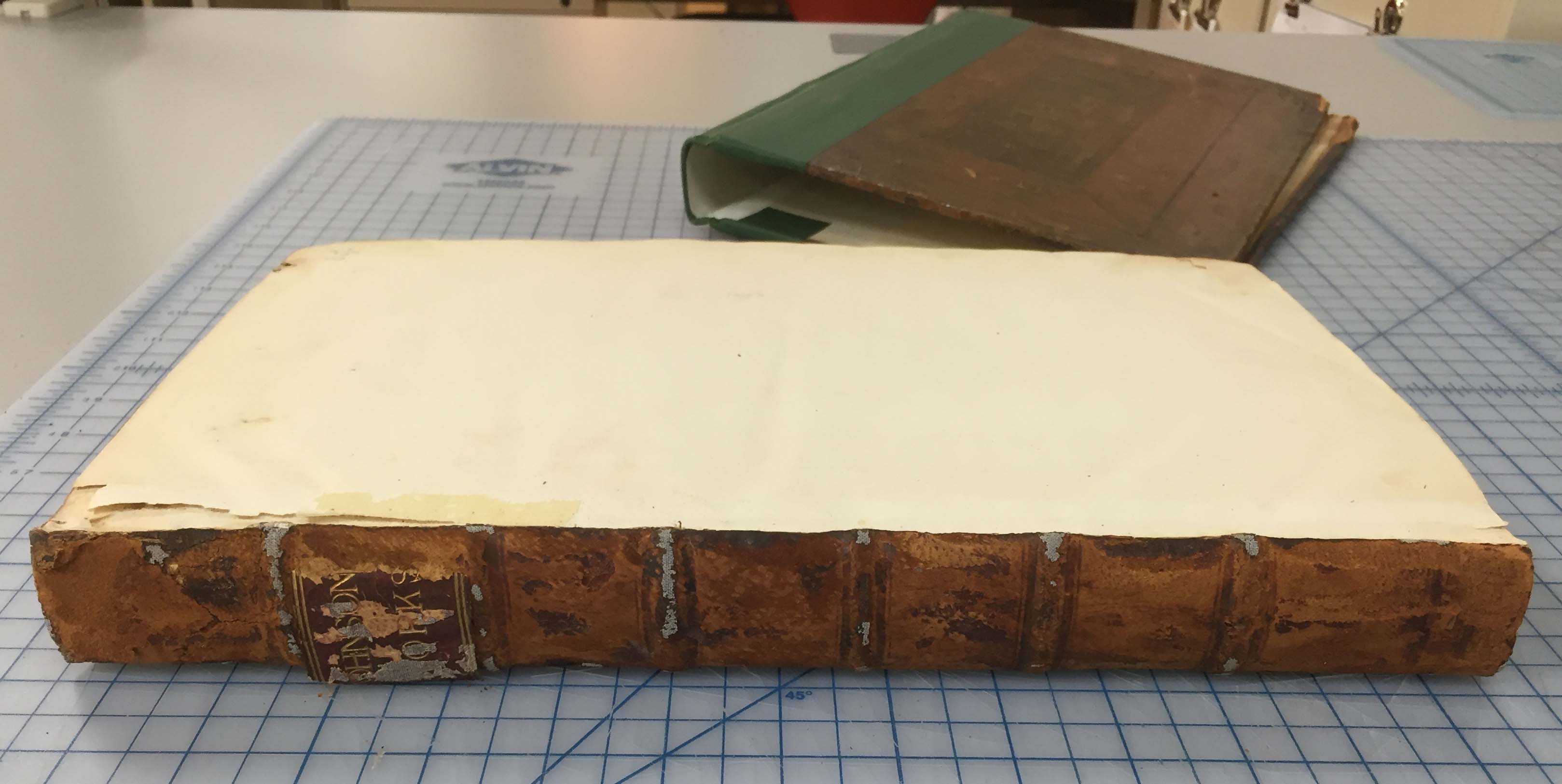
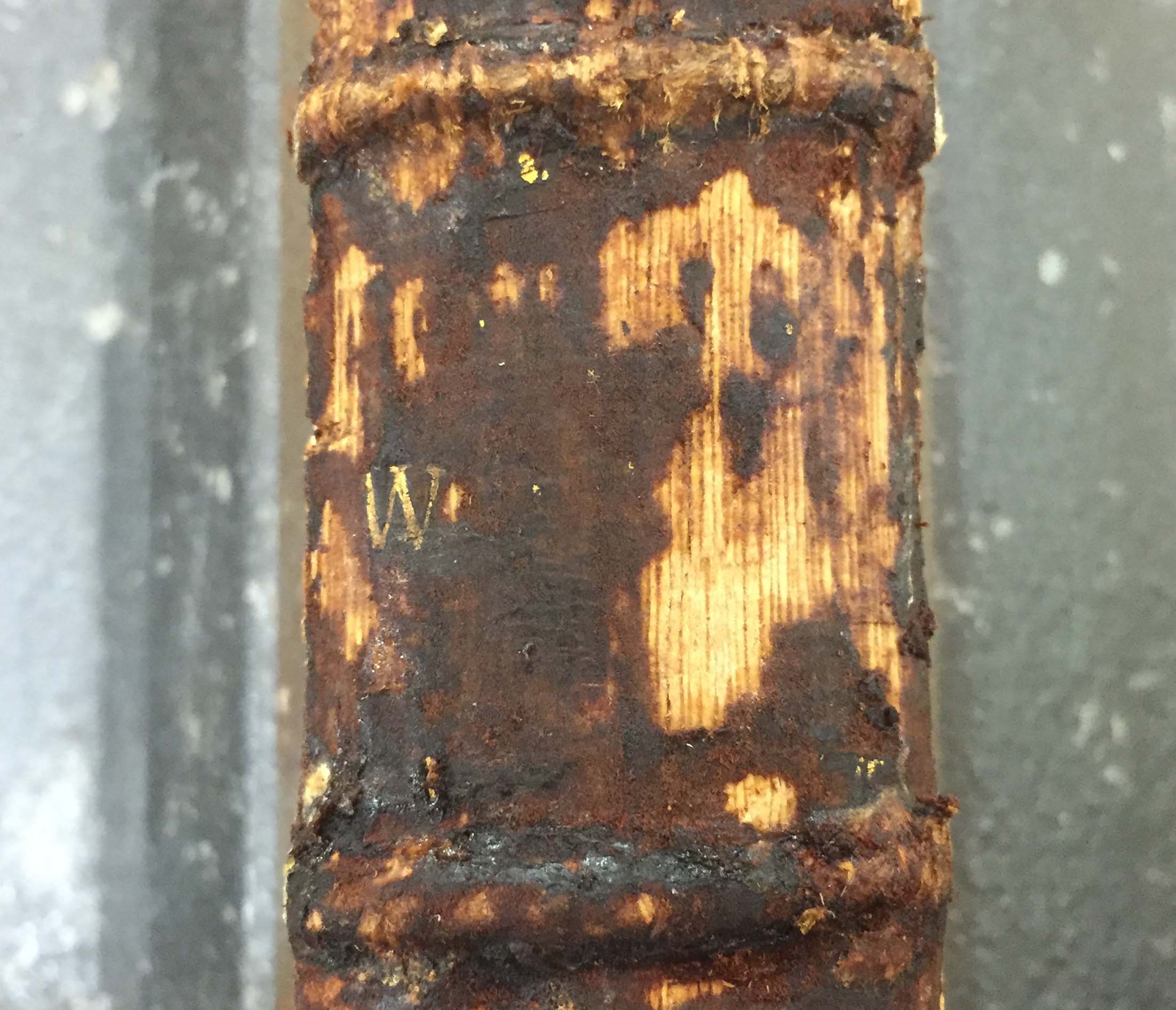
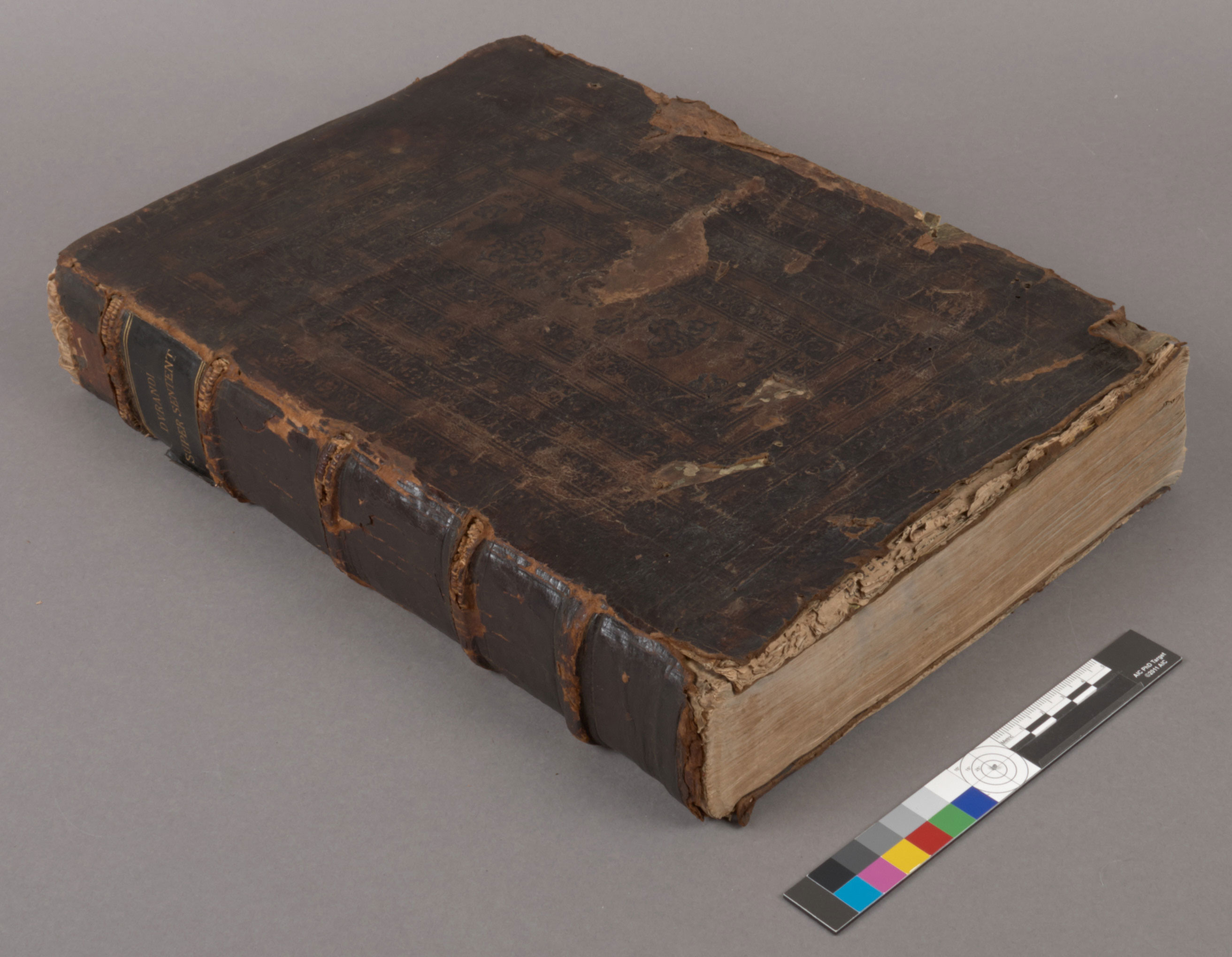
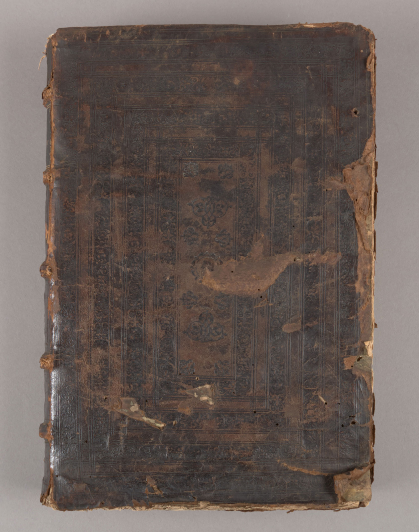
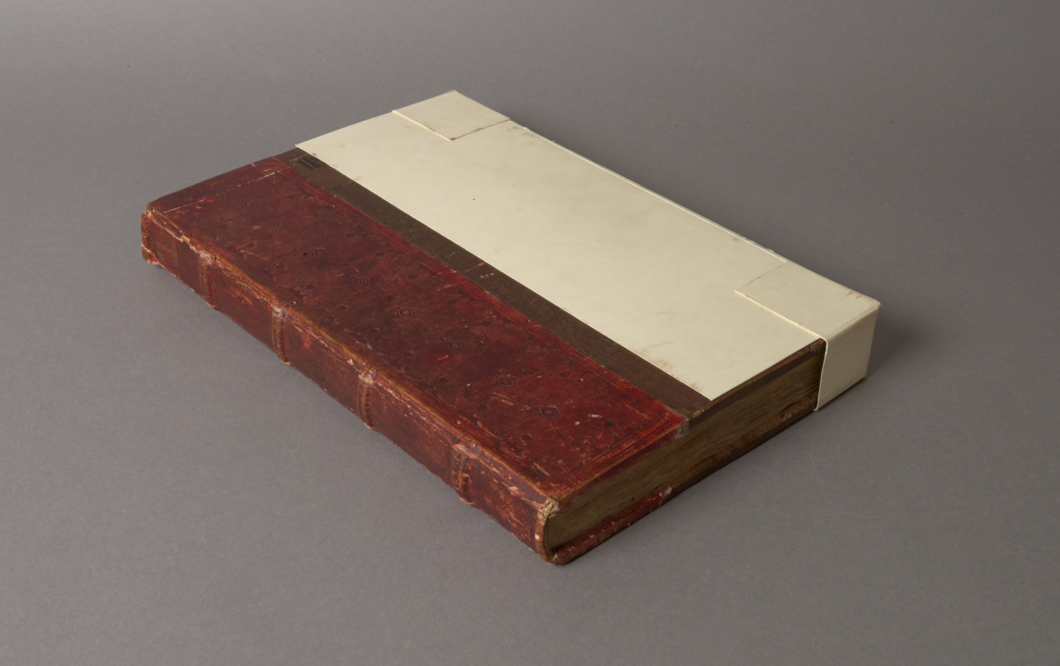
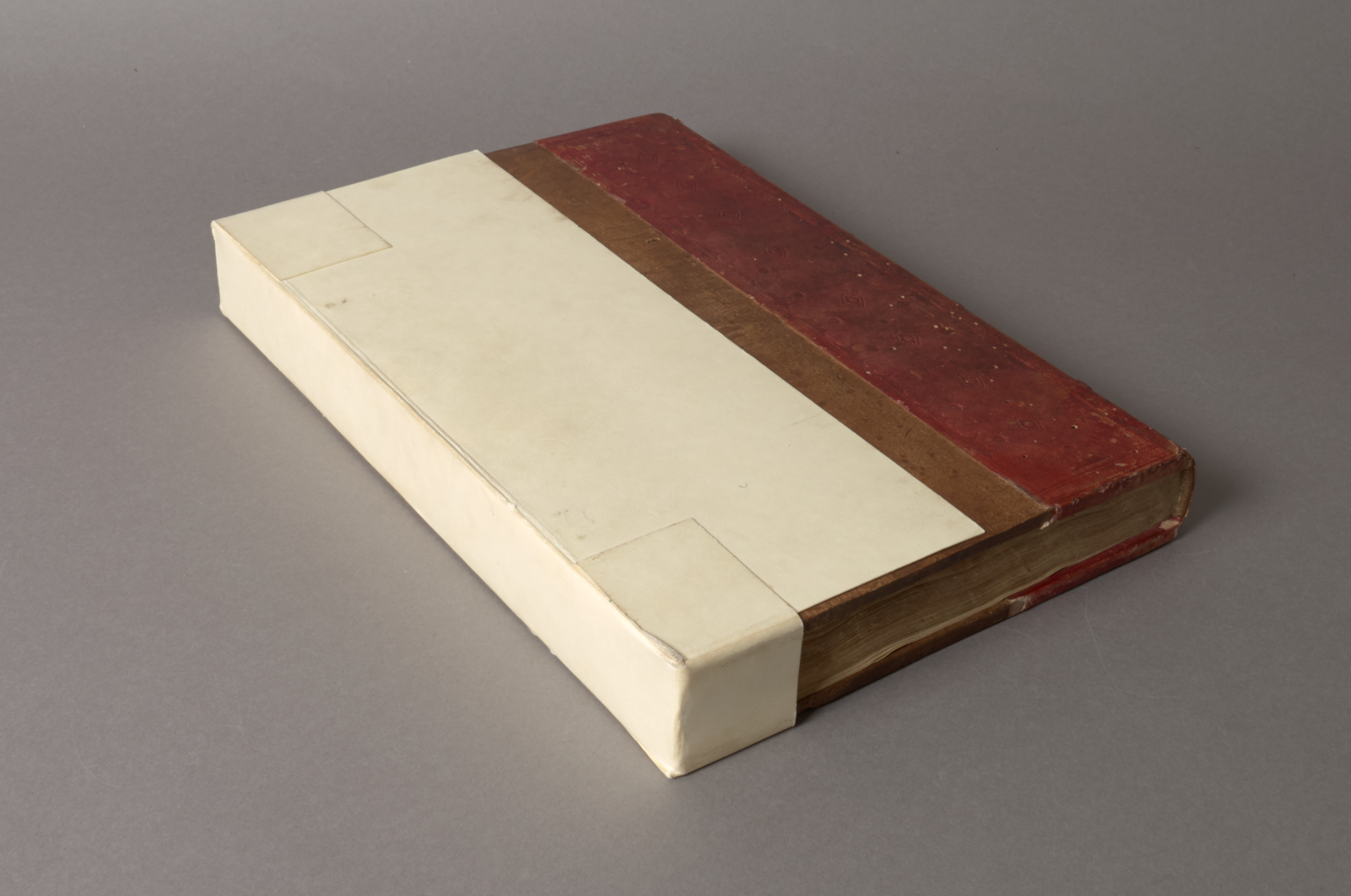
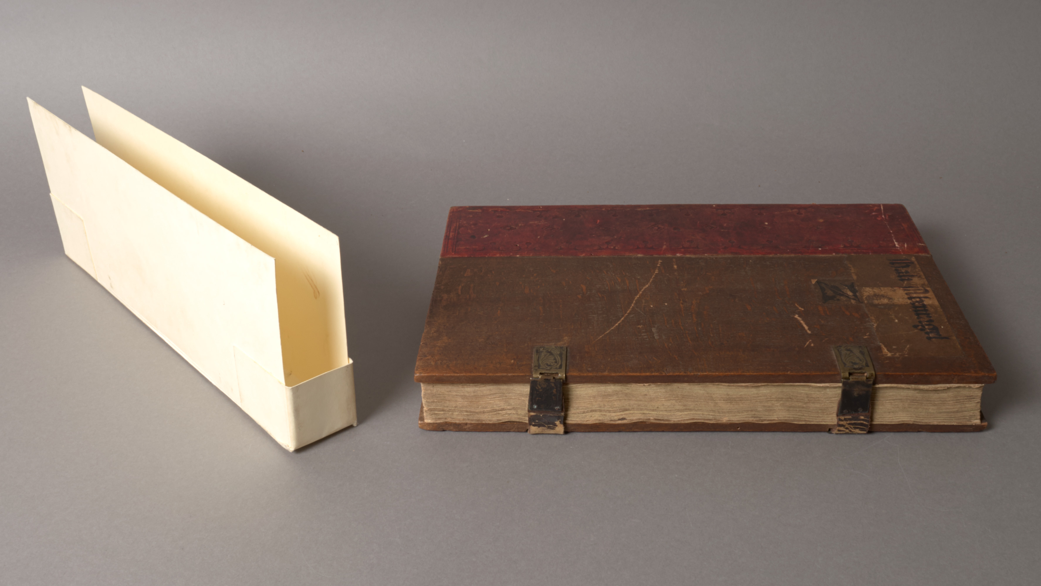
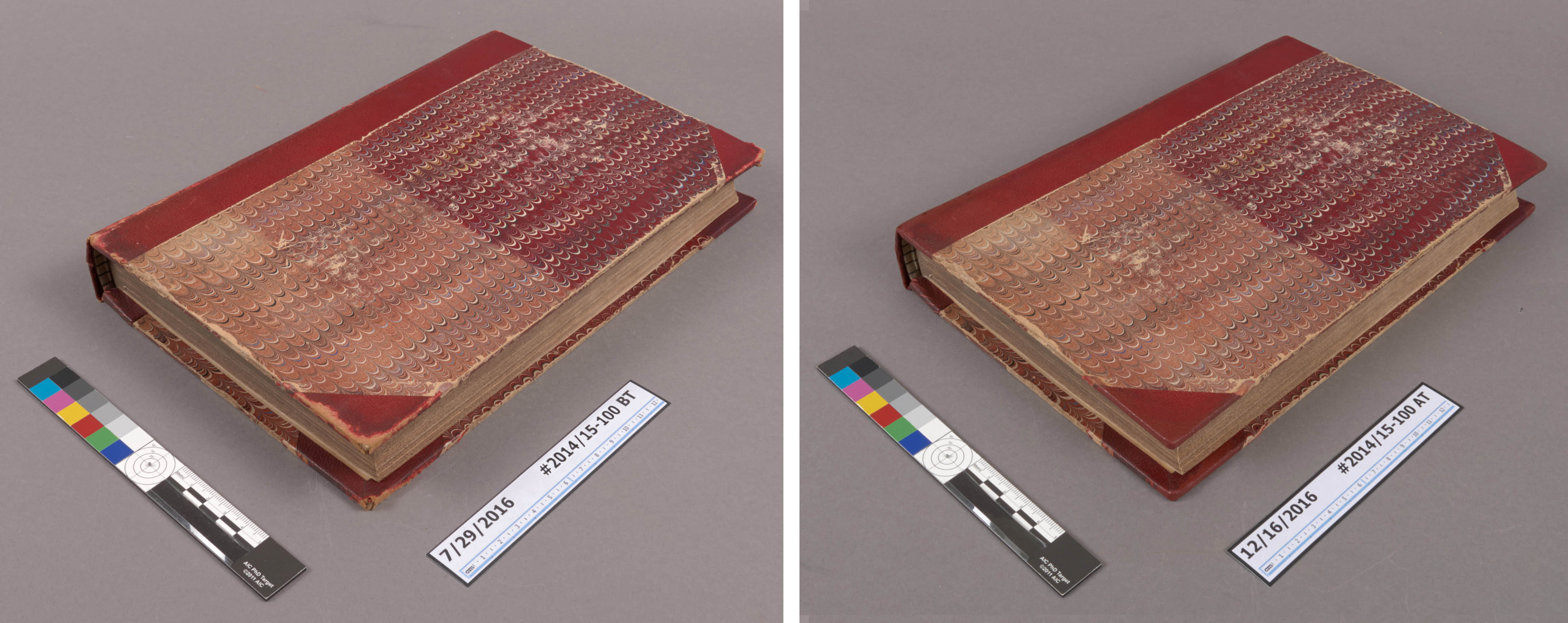
This bound serial came into the lab several months ago, exhibiting some splitting of the leather at the joints and corners. Luckily the boards were still firmly attached, so it just needed some minor, stabilizing repairs to reduce the potential for further damage or loss. There is a lot of variation in the color of the red leather, either from light damage (evident on the marbled paper on the back board), pollution, or handling, which gave me the opportunity to make several different samples of film to match the various colors.

Penny Mag - Before and After TreatmentBookbinding leathers come in such a variety of grains and surface textures, so I started by making a silicone mold with two different grains. The brown leather on the left is a piece of goatskin from Harmatan, while the black piece on the right is actually fake leather from an old backpack. These were adhered to a piece of davey board, placed in the bottom of a bristol board tray, and then the 2-part mold material was poured over the top.

Leather Mold

Interestingly enough, the fake leather grain was a better match for this book. After applying the acrylic mixture to the mold, a thin Japanese paper support is applied on top. After drying, the film can be peeled away from the mold. Sarah Reidell has a really wonderful bibliography on her website, where you can find step-by-step instructions for creating the acrylic films, so I won’t go into more detail here.

(Under normal lighting at bench)

This technique produces a repair material that is quick and easy to apply, but visually blends much better than a toned Japanese paper repair. There are so many opportunities for experimentation using this technique, with the support materials, the application methods of the acrylics, and textures of the molds. I’m very excited to add this to our stable of techniques that we can employ here in the lab.

Street Life in London

By Erin Hammeke, Senior Conservator for Special Collections

This fall I had the opportunity to try out some new treatment and housing techniques. We recently acquired Street Life in London. Published in 1877, it is considered an early work in what would become the field of documentary photography. Throughout the text are mounted Woodburytypes depicting London street figures in somewhat staged vignettes and in archetypal roles: Italian Street Musicians, London Cabmen, The Street Locksmith, etc.

Before Treatment

The text was formed from single sheets of various weights and made into an early adhesive binding called a caoutchouc binding which is not too dissimilar from today’s paperback binding structures and uses a rubber-based adhesive on the spine. Our copy had breaks in the text, with pages and groups of pages coming loose with every handling. It can be difficult to repair an adhesive binding in a way that results in a sturdy structure, ready to hold up to instructional and reading room use. Luckily, Gary Frost and others have developed a technique of pasting an overhanging tissue guard to each leaf and consolidating these overhanging guards into a binding structure. This repair technique has been discussed on The Book & Paper Gathering. Their blog post, along with some very helpful guidance from Sue Donovan, a conservator who has recently researched and explored this technique in depth, inspired me to try the repair.

Mailing tube under fore-edge

I found the repair technique to be quite effective, albeit time-consuming. Each leaf had to be guarded, and after forming a slight round in the spine by jogging the fore edge into a curve (I used a mailing tube), I elected to glue each guard down one by one.

Spine guards

An alternative approach involves mashing the overhanging guards together with adhesive, which would likely have been a quicker but less controlled approach. The reformed text fit perfectly back into its original embossed cloth case (thankfully!)

Cover after treatment

Tail edge after treatment

The text functions well, but because of the heavier-weight, slightly brittle text paper, I decided I wanted to control the opening angle of the book during use by making a custom cloth clamshell with a built-in cradle. The cradle is attached to the inner tray of the box and folds out to support the book. I used Jeff Peachy’s instructions.

5_cradle-box-composite

I’d like to extend a big thank you to my generous colleagues for developing and sharing their innovative treatment and housing approaches with the rest of us! I’d also like to thank conservators Jan Paris, Annie Wilker, and Catherine Badot-Costello for their assistance.

6_open-in-cradle


All Made Up

Every once in a while we come across a book composed of parts from multiple copies of the same edition, commonly referred to as a made-up copy (Carter, 2004). It can be very difficult to tell if a book is made-up, depending upon how the different pieces were assembled and treated.  An item that recently came into the lab provides a fairly obvious example.

Made-up book
Visibly smaller section on the right.

This incunable in a 19th century binding contains two gathering (one at the front and another towards the center of the textblock) that are noticeably shorter at the tail and fore-edge. Shorter leaves can indicate a number of things about the production of a binding, including proof (Roberts & Etherington, 1982) that the leaves were not overly trimmed by the binder. In this case, though, other evidence suggests the section came from another binding. It may be difficult to tell in the image above, but the paper of the section on the right is significantly brighter than the sections before and after.

Different edge treatment
Red and blue edge decoration

Additionally, the edges of the shorter section have been treated differently. The image above shows that the edges of the smaller section (left) are colored red, while the rest of the texblock (right) has been sprinkled with blue pigment.

In-filled tail edge
In-filled tail edge

It appears that the binder infilled the smaller section at the front to match the size of the surrounding leaves. Similarly toned and textured laid paper has been adhered to the tail edge and at the gutter of each leaf to make them larger. Since the red edge decoration is still visible on these leaves, this was probably done to reduce the risk of handling damage, rather than an attempt to disguise the added gathering.

While the added sections appear somewhat out of place in this binding, I appreciate that the binder did not attempt to hide them by over-trimming the entire textblock or obscuring their red edge decoration. The clear diffirences between paper size, color, and edge treatment provides additional information about the life and use of this object.


Carter, J. (2004). ABC for book collectors (8th ed.). New Castle, DE: Oak Knoll.

Roberts, M. & Etherington, D. (1982). Bookbinding and the conservation of books : a dictionary of descriptive terminology. Washington, D.C.: Library of Congress

Persistent Picture Props

By Rachel Penniman, Senior Conservation Technician

Philena McKeen
Philena McKeen

Recently part of the McKeen-Duren Family papers was brought to the lab. Two boxes of approximately 40 daguerreotypes and ambrotypes were in need of better housing. Most of the photographs are of the close family of Silas McKeen. Silas was born in Corinth, Vermont in 1831 and was a Congregational Minister in Bradford, Vermont for much of his life. At some time, a family member had attached slips of paper inside each of the cases with a description of who was depicted in each photograph. Inside the case of a photograph of Silas’ daughter Philena was a longer caption:

Label

“Philena McKeen-
1st photo ever taken in
our family – taken by
Southworth of Boston
when Philena was there
taking music lessons.”

The name Southworth jogged my memory. Back in May we were treating True Flag, a newspaper published in Boston from 1851-1908. While encapsulating an issue from Saturday July 15, 1854, I had noticed an advertisement for daguerreotypes and taken a photograph of it.

True Flag Quote

Southworth & Hawes was a prominent photography business active in Boston in the mid-1800’s and well known for their portraits of notable people of the day, including Henry Wadsworth Longfellow, Ralph Waldo Emerson, and Harriet Beecher Stowe. The daguerreotypes of Albert Sands Southworth and Josiah Johnson Hawes are held today in the collections of The George Eastman House, The Metropolitan Museum of Art, and the Museum of Fine Arts Boston.

Curious to learn more about Messrs. Southworth & Hawes, I requested a couple of books from Duke Libraries and noticed something repeated in their images:

3updaguerreotypes01

3updaguerreotypes02
(All images above from Young America: The Daguerreotypes of Southworth & Hawes by Romer and Wallis)

Like the backdrop on class picture day, it looks like certain props and settings were used repeatedly in the studio of Southworth & Hawes; A table with a floral patterned cloth, a potted plant, and a book seem to have been an especially popular combination of props. The specific fern-patterned cloth draped on the table beside Philena even makes an appearance in a number of other photographs. A daguerreotype of Harriet Beecher Stowe at The Met looks especially similar.

harriet-beecher-stowe10
Harriet Beecher Stowe (Metropolitan Museum of Art)

Along with celebrities, Southworth and Hawes took a number of photographs of their own family members. Although not the best example of their work, in this photograph of Nancy Southworth Hawes (wife of Josiah Hawes and sister of Albert Southworth) at the MFA in Boston, she appears to be holding the same highly decorated book as Philena.

Nancy Southworth Hawes
Nancy Southworth Hawes (MFA Boston)

Unlike the fern-patterned cloth and potted plant that popped up again and again, the photo of Philena and the photo of Nancy are the only two I found where this specific book was identifiable. I wonder if the book was just another prop sitting around the studio for patrons to use, or if it held some greater significance. Interestingly, Albert and Nancy Southworth grew up on their parent’s farm in Fairlee, Vermont; less than 10 miles from Philena’s childhood home in Bradford. Is it possible these two families knew each other before meeting again in the Boston photographer’s studio?

Quick Pic: Hidden Writing

MssUV

Some recent acquisitions are in the lab this week for rehousing. We thought it would be interesting to peak at this small piece of illuminated parchment under ultraviolet light and a palimpsest became clearly visible.  You never know what information may be hidden under normal lighting! For more  examples, see previous posts on Preservation Underground and Bitstreams on multispectral imaging.

Spine After Spine*

*sung to the tune of Cindy Lauper’s Time After Time

Older bound volumes in a research library collection have often been subjected to multiple interventions or campaigns of repair over the years. If a leather-bound volume has not been completely rebound, it has often been repaired in some visible way. One of the more common repair practices is rebacking, in which either new material is added underneath the leather covering the spine and boards or the spine is replaced entirely. In preparing the book for rebacking, original covering material may be removed, obscuring evidence of previous repair efforts. This second edition of the works of Samuel Johnson, printed in 1713, is more like an onion with many layers of repair material.

Works of Samuel Johnson, Spine #1

The current binding appears roughly contemporary to the text. It is covered in full brown calfskin and decorated with sprinkling and blind tooling in a style commonly referred to as the “Cambridge Panel“.  Many decades ago, this book was actually part of Duke’s circulating collection and was repaired using the typical techniques employed by libraries at that time. A strip of green buckram was adhered to the boards and spine with an acrylic adhesive and the inner hinges were repaired with strips of white textile. The repair is doing it’s job by keeping the boards on, but it is a little awkward. What used to be a tight-joint binding, now has a space between the shoulder of the textblock and the spine edge of the board. This pushes the boards out at the fore-edge and creates an unnaturally large square.

Title Page

In my initial examination, it was clear that the book had been repaired before the green buckram, too. The endsheets had been replaced with a smooth, wove paper and somewhat crude sheepskin corner repairs were visible through the pastedown (see above). There is some obvious insect damage  at the corners of the front board, but interestingly the insects appear to have only liked the new repair materials. The original text and calf leather are un-chewed.

In discussing treatment options with the curatorial staff, it was clear that the unsightly cloth repairs should come off of this book. When I separated the binding from the textblock, though, I found another leather spine underneath.

Spine #2

This is not the original spine of the binding. It appears to be a reback using the same sheepskin as the corner repairs. Most of the red leather label remains in the second panel, but the leather is quite powdery and large patches of the grain layer have peeled away. After further deliberation, the decision was made to also remove this spine material, since it was not original and in very poor condition. During removal of the second spine, however, something else was revealed.

Spine #3

A gilt ‘W’ and a tiny piece of gold line are visible in the second spine panel. Could this be the remains of a third (and possibly original) spine? It is unclear.  While it does not appear that a full calfskin spine is underneath the sheepskin reback, it is possible that the reback was applied on top of small remains of the original spine. It is also possible that titling was added directly to the reback leather, but then because  of error or damage a red leather label was added later.

The textblock spine will be cleaned and lined with strong, high quality materials like Japanese paper and unbleached linen to create a better functioning book. The results will certainly be better than just following tradition and adding another spine on top.

The Road to the Conservation Lab…

… is (often) paved with good intentions.

Last year the John W. Hartman Center for Sales, Advertising & Marketing History acquired a small collection of fashion design drawings from the 1940s and 50s by Vivian Gauld. Gauld was West Coast-based commercial artist whose drawings were used in retail advertising campaigns for companies like Rose Marie Reid, Jantzen, and Carr’s Fashions. Some of the drawings are currently on display in the Michael and Karen Stone Family Gallery, highlighting recent acquisitions to the collection.

Hartman01

Before coming to Duke, each drawing had been mounted to foam-core board with double-sided tape and then shrink-wrapped. I can see why this packaging method was done. While it does reduce the risk of mechanical damage from handling and shipping, the tape and sealed package are not the most stable environment for long-term storage. Curators and conservators always assess items with our Exhibitions Coordinator before they go on display. Because the items going on exhibit needed to come out of their shrink wrap anyway,  the team made the decision to rehouse the whole collection.

Hartman02

I was able to carefully cut and remove the shrink wrap from each package. The few drawings with friable media (like pastel or charcoal) actually have it applied to the back of the thin drawing paper, so there was little risk of disruption from the static charge of the plastic film. I was able to separate each drawing from the backing board by heating a very thin metal spatula with a hot air pencil and passing it between the drawing and the tape carrier, however, residual adhesive still remained on the verso of the drawing and needed to be removed prior to rehousing (image below, left).

HartmanBeforeAfter

The double-sided tape appears to have been applied fairly recently and had not yet penetrated the paper or crosslinked. I was able to remove it without disturbing the paper fibers by gently rolling the adhesive off with a crepe eraser (image above, right). 

HartmanBeforeAfter2

These drawings will now be stored in either clear polyester L-sleeves or paper folders, depending upon the drawing media. The collection had been placed into two metal edge boxes, but removing the foam-core backing has significantly reduced the required storage space. We can now fit them all into one box. While the shrink wrap package probably seemed like a good idea at the time, I am glad we were able to rehouse the drawings before they were visibly affected by it.

Book Structure Made Visible

A damaged binding can present the opportunity to examine the interior structure and composition of a book without the use of advanced imaging equipment. This copy of Durandus of Saint-Pourçain‘s four books of commentaries on the Sentences of Peter Lombard from 1539 offers an interesting look at some common elements of early book structure. Many books from this period have been rebound or drastically altered over the years, so objects like this are quite exciting to examine in detail. 

Durandi (3/4 View)

The binding is fully covered in brown tanned leather, tooled in blind over the boards in a multi-panel design that is common for the period.

Durandi (Front Board)
Front board

You may be able to make out the first few letters (“DVRAN”) of the author’s name written on the fore-edge of the textblock in ink, which probably served as the original titling. Early storage and labeling practices for books were very different from the upright, spine-facing-out shelving method we use today. Henry Petroski, Professor of Civil Engineering at Duke, has a wonderful book on design and book storage, titled The Book on the Bookshelf, which describes this in more detail. I highly recommend it.

Durandi (Fore_edge)
Fore-edge

Two labels were later applied to the spine of the volume. In the image below, you can see the remains of a paper label in the top spine panel and a leather label in the second panel. Some of the damage here offers an interesting glimpse into the structural elements of the binding. The textblock was sewn on double raised supports of twisted leather, rather than vegetable cord.  The sewing pattern is pretty clearly visible here. Damage to the headcap has exposed a spine lining of parchment manuscript waste, as well as the tie-down threads of the sewn headband.

Durandi (Sewing Supports)
Sewing Supports

The most interesting part of this binding (for me at least) is the boards. It is common to see 16th century bindings with thick wooden boards, but this is a nice example of early pasteboard, a technique for making stiff board by laminating pieces of paper together with adhesive (Etherington & Roberts, 1982). Pasteboards tend to be much softer and more flexible than other types of book board. The adhesive between many layers of the paper has failed and the leather has split all around the edges of both boards, so the boards now freely “open” in places and allow a look inside.

Interior of board, head
Interior of board, head/fore-edge

In the image above, you can clearly see some of the print waste which was used to make up the board. You can also see the remains of two leather fore-edge ties, which laced through the boards. While the the majority of that leather tie has broken off and is now gone, the ends are visible inside the board and through the rear pastedown (blue arrows below). You can also clearly see the holes where they exited the boards in the image of the front cover near the top of this post.

Rear Pastedown
Rear Pastedown

Both print and manuscript waste are visible in the exposed layers of the front board, but there is another very interesting element here: The arrows in the image below point to a thin strip of paper, which laces through one of the board’s constituent sheets. I cannot say for certain, but this could be part of a laced paper binding, which got chopped up and added to the pasteboard.

Interior of front board, tail

While the condition issues of this binding present a risk of further damage and loss, they also provide the opportunity to learn more about its structure and means of production. These raise some interesting questions about the best approach for treatment and rehousing, and will inform our discussions with the curators.

Name That Enclosure!

There are many different options for protective enclosures or wrappers for books and you can find a variety of examples in a typical research library collection. Occasionally I will find something that I have never seen before and this week I encountered a 15th century binding with a very simple, but novel form of book wrapper. I am not quite sure what to call it.

Wrapper01

The wrapper is constructed of thin card (similar to 10 pt Bristol board) and fits snugly over the fore-edge. The wrapper is held together by cut tabs, which are folded over the board edge and glued down.

Wrapper02

It slips on and off the book fairly easily and offers some protection to the exposed wooden boards and fore-edge clasps. It’s certainly a very quick and economical option, but has it’s own problems.

Wrapper03

Rachel Penniman has suggested calling this a “book bikini”, which I think has a nice ring to it. I’d be interested to know if a more established name exists, though. Regardless, I believe that this particular book deserves some more protection, so I will be replacing the wrapper with a full enclosure.

Quick Pic: Tiny Tin

We currently have a small collection of late 19th and early 20th century cosmetic samples from our Advertising Ephemera Collection in the lab for stabilization and rehousing. The majority of the samples are little paper envelopes with loose powder inside, but one of them contained a fun little surprise.

Paper packet

This sample of Charles Meyer Exora Rouge was quite a bit thicker than the others and I could feel a tiny, rigid container inside. The adhesive on the envelope flap was easily released and inside was the smallest tin I’ve ever seen.

Tin in Hand

I don’t know exactly when this item was manufactured, but the bottom left of this page from a 1907 issue of the New York Clipper features an advertisement for free samples of Exora Rouge.

Tin Measurements

You just never know what you will find!