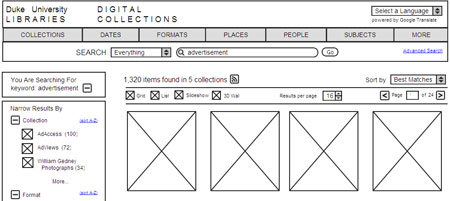
As we continue our redesign, we’re getting some really helpful feedback on our mockups for item pages. By all means, keep it coming! Here are some new prototypes for our search results screens, as well as our analysis of our current search results and examples of others systems we like. What do you think?
Prototypes
There are five examples here; some are searching across all collections and others are searching within a single collection. Particular areas of interest for us: location of the ‘Narrow by’ facets, display of results for matching digital collections or matching digital exhibits, collection branding & info.
Analysis
View this feedback (Search Results (Cross-Collection): Existing Interface) on Notable
Here’s what we have learned about our search interface from our various evaluation methods:
Web Analytics
- About 75% of searches are within-collection searches; 25% are cross-collection.
- The majority of searches are for various topics, though many users search for items from a particular decade (“1920s”), format (“advertisements”), or collection (“Gamble”).
- Some users attempt to retrieve every item possible through search (“*”, “all”, “a”)
Usability Tests (Spring 2008)
- Users found it easy to narrow results using the facets on left, though some wanted this section to be more legible.
- Users were able to easily toggle between the grid and list views of results.
- Users were only moderately successful distinguishing searches within a single collection versus searching across all collections.
- Most users didn’t understand that they could remove their “narrow by” selections in the breadcrumb trail.
Feedback Forms and Other User Feedback
- It’s unclear what the difference is between the “search this collection” box versus the “search all collections” box.
- Searching should enable people to discover more Duke content & collections beyond the items that are in this particular system.
Interviews with our Collection Sponsors
Most highly desired improvements:
- Provide an Advanced Search option.
- Return collections in search results in addition to items.
- Return our digital exhibits in search results.
- Better distinguish intra- and cross-collection searching.
- Support the exploration of a particular format (images, video) or time period (1960s) regardless of the ‘collection’.
- Have persistent navigation where users can explore broad categories from any page.
- Enable users to navigate from one item to the next in a search result.
- Let users mark items for later use (shopping cart).
- Connect people to Duke’s relevant resources outside of this system that match the keyword searches. Especially important in ‘no results found’ screen.
- See all feedback (Duke library staff access only)
CIT’s Ideas for Helping our Collections be Used for Instruction
- Enable users to create their own collections of items.
- Provide a slideshow view.
- Be able to search our collections from within other systems like WordPress (Flickrpress model).
Other Ideas from the Implementation Team
Here are some additional ideas we’ve had in our implementation team discussions:
- Add search term highlighting (to present the matching keyword in context), especially for texts
- Provide navigable visualizations of results (timelines, maps)
- Spell-check (Did you mean?) feature
- RSS feed for search results
- Enable a blank search to retrieve every object in the system (or collection)
Inspiring Examples
Below are a few example sites that provide compelling and inspiring solutions to some of the design challenges we’re facing. See the whole set, with annotations, at Notable.
View this feedback (Flickr) on Notable


This is very interesting and useful, it woudl be great if everyone could read the report. Do you have plans to make the report accessible?
Thanks, Joyce (NCSU Libraries)
Thanks, Joyce. We’ve been using this blog to share our progress and our analysis one step at a time, in lieu of a traditional report. We hope this approach will help keep the process transparent along the way to all, as well as encourage engaging discussions about targeted areas of the design. The link here to ‘all feedback’ goes to a page of our internal project wiki called ‘Report’ which currently contains a long, but organized list of *all* of the feedback we heard in the interviewing phase. In other words, this blog post may be a better report, since it’s distilled, concise, and shows the most frequently expressed feedback. Though I’ll email you the text of the unabridged version in hopes that you’ll find it helpful…
Just one comment, I think that the ability to retrieve all records with just hitting the search button is a wise way to go. It is something we planned for and is used a surprising amount in the Portal to Texas History.
Hi Sean,
* like facets, etc. on the right with results on left (design D)
* like “search [search term] in…” box
* like the twitter/blog/etc. stuff that is below the horizontal rule.
* like the tabbed results by type as shown in design B
* like “You are searching for” box from design E
* I realize that the collection branding is important to collection sponsors; however, the search results pages that omit this box seem so much cleaner and look like they would make it easier for patrons to spot key information like facets — presumably a patron could click through to more collection/branding info if they wanted to as per the link shown in the “You are searching for” box on design E. I am under the impression that most patrons are more focused on finding and viewing items than on seeing branding information.
* retrieving every item through a blank search box, an *, etc. would be great.
Cheers,
Tom