On March 20, from 3:30pm to 5:30pm, Data and GIS Services will be hosting an Open House to celebrate recent upgrades to our computer lab and to announce the finalists and winners of the recent Data Visualization Contest.
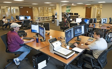
Since the end of the summer, Data and GIS Services has enjoyed periodic upgrades to the computer lab, starting with a refresh of all of the machines and an expansion from 8 machines to 12. Each machine now boasts two 24″ monitors, a 4-core 3.5 GHz processor, 16GB RAM, 1TB of open storage for projects in progress, and an extensive list of GIS, statistical, and visualization software packages.
In addition to the new machines, the lab space has just been enhanced with a 50″ display and conference table to support small group instructional sessions. For advanced topics and sessions using software packages that can be installed on individuals’ laptops, the new display will allow Data and GIS Services staff to expand instructional opportunities and meet additional needs of the Duke community.
The finalists and winners of the recent data visualization contest are developing poster versions of their submissions. These posters will hang in the Data and GIS Services lab and will be unveiled at the open house.
Data and GIS and Perkins Libraries are happy to sponsor DataFest 2013 (March 22-24, 2013). In its second year, DataFest “is a data analysis competition where teams of up to five undergraduates have a weekend to attack a large and complex dataset.” See the DataFest 2012 page for examples of projects and tools.
Apply your data skills and represent Duke in this year’s competition!
ArcGIS Online is a service that allows for storage and sharing of spatial data and maps. In contrast to many other web based GIS services, ArcGIS Online accepts geocoded text-based data and shapefiles, which allows users to share and present work built in ArcGIS Desktop.
Members of the Duke community can register for two different version of ArcOnline. Public access to the service grants access that allows basic file storage and digital mapping. Duke-sponsored access facilitates sharing files within the Duke community and provides a higher threshold for storing and processing ArcGIS files online. Access to the Duke version is available on request for Duke affiliates with a valid Duke email at askdata@duke.edu.
Loading and Processing Data
Duke-sponsored access allows users to import and work with text-based data sets containing more than 250 features or shapefiles containing more than 1,000 features online. Data sets that exceed these thresholds must be published as Feature Services, which can done at the time of upload or any point thereafter. A Feature Service is basically an object that can be brought into a map and differs from a file, which can be uploaded for storage, but cannot be imported into a map.
Figure 1: Geolocation in ArcGIS Online
In addition, Duke sponsored access will allow you to use data shared by other members of the Duke community, which expands the data available beyond those data sources shared with the public and by members of groups to which you belong, both available in either version. Users with modest data needs and users that prefer use ArcGIS Desktop to create maps will find the public version suitable in most cases. Users with larger datasets and those that will collaborate and present maps online will find Duke-sponsored access much more helpful.ArcGIS Online provide two entry points for the uploading of data and the production of maps. The first is entered when “My Content” is clicked. This section lists all of the items that have been uploaded and produced by the user. There are two key types of items listed, files and data sources. Files, including text files and shapefiles, are items that can be stored and shared, but are not accessible by the mapping interfaces. By contrast, data sources, the most common of which are Feature Services and Web Maps, can be seen by the mapping interfaces and incorporated into new maps.
Duke sponsored access provides the ability to convert geocoded text files and shapefiles into data sources at the time of upload or any point thereafter. By contrast, the public version does not allow users to create Feature Services, but does allow for the creation of Web Maps data sources from text files containing fewer than 250 features or shapefiles containing fewer than 1,000 features. Data sets exceeding these thresholds will require Duke sponsored access to visualize online.
Mapping
The second section of ArcGIS Online is the “Map” section, which opens the map viewer, one of the two mapping tools available in ArcGIS Online. The map viewer allows for the creation of Web Maps, which can be shared online and saved as data sources for new maps. Both versions of ArcGIS Online will allow for the upload of data sources directly into the viewer, the inclusion of public and group data to which the user has access, and the inclusion of data sources previously created by the user.
Figure 2: Customized styling in Map Viewer
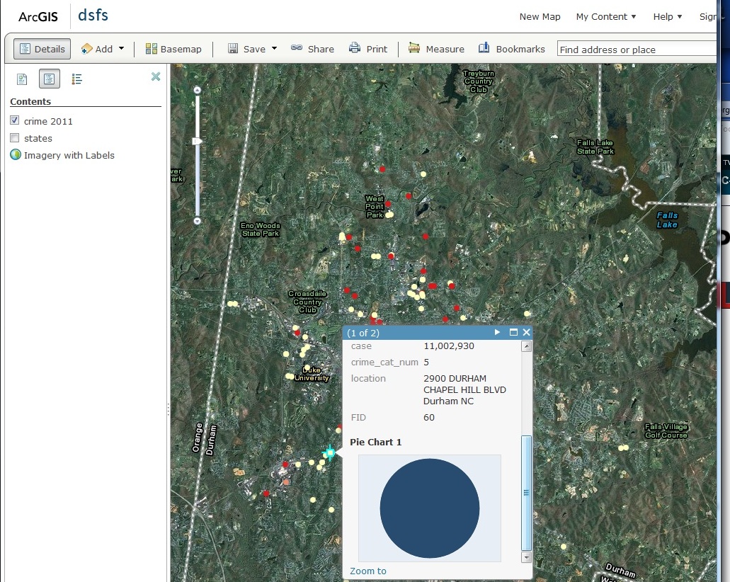
Once saved, the map can be accessed in the “My Content” section and opened in either map viewer or Explorer, the second mapping tool available.Map viewer allows you to add data from files, web services, and allows for the creation of editable layers. Many styling modifications like color classification of features and customization of the attribute popup window are possible. This map displays a customized popup with an added pie chart based on, in this case, a single feature.
Explorer contains the same basic set of features, but it also contains a presentation mode, where slide stills can be taken and arranged for presentation. Again, this map displays a styled popup as well as customized county-level styling based on an attribute.
Sharing Data and Maps
Saved maps can be shared by embeddable script or by link. The map as a data source can also be shared with the public, with members of any groups to which the user belongs, and with the Duke community as a whole (“Duke University and Medical Center –NSOE”).
Figure 3: Presentation mode in Explorer
Conclusion
Online sharing of data and collaboration is a relatively new need that multiple tools are working to fulfill. ArcGIS Online is an excellent option, particularly when online viewing is an important goal. If your online visualization needs are modest, and if you generally prefer to produce maps and edit shapefiles on ArcGIS Desktop, the public version may fulfill your needs. But if the feature restrictions noted above prove prohibitive, Duke sponsored access will provide the flexibility needed for most applications.
Clean your data with Google Refine. Use digital maps to explore the present and past. Analyze data with R or Stata. Visualize your research with one of our data visualization courses. The Data and GIS Workshops offer a range of research strategies for data based questions. Register online for our courses or schedule a session for your course by emailing askdata@duke.edu
Are you a current Duke University undergraduate or graduate student? Have you used data visualization in a past or current research project to help solve a problem, tell a story, or highlight an interesting trend? Write up a short description and you’ll have a submission for the contest and a chance to win a $500 technology prize.
As mentioned in the fall – with 12 workstations with dual 24″ monitors and 16 gigs of memory, the new Data and GIS lab is ready to take on the most challenging statistical, mapping, and visualization research projects. The new lab also features a flatbed scanner for projects moving from print to digital data. Lab hours are the same hours as Perkins Library (almost 24/7).
Puzzled by data management planning? Not sure what to include in your grants data management plan? Data and GIS has launched a guide that supports researchers looking for advice on data management plans now required by several granting agencies. The guide provides examples of sample plans, key concepts involved in writing a plan, and contact information for groups on campus providing data management advice.
Come visit us in Perkins 226 for a consultation or contact us online (email: askdata@duke.edu or twitter: duke_data OR duke_vis). Our consultants are available weekdays 8-5 by appointment or offer drop in hours as well We look forward to working with you on your next data driven project.
The Data & GIS Services department is hosting a data visualization contest this winter!
Are you a current Duke University undergraduate or graduate student? Have you used data visualization in a past or current research project to help solve a problem, tell a story, or highlight an interesting trend? Write up a short description and you’ll have a submission for the contest and a chance to win a $500 technology prize!
The final deadline for submissions is January 20, 2013. For more details, see the full contest site.
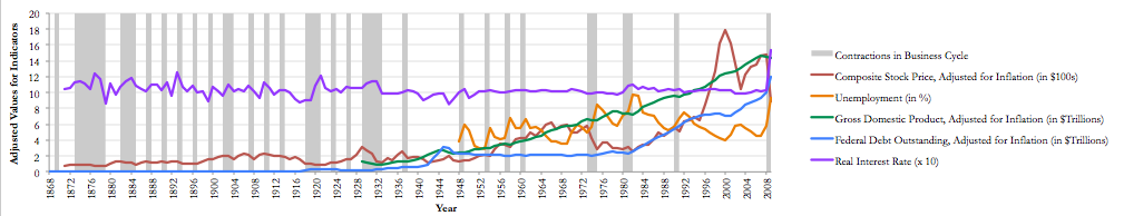
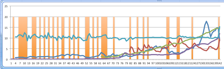
Time series data is easy to display as a line chart, but drawing an interesting story out of the data may be difficult without additional description or clever labeling. One option, however, is to add regions to your time series charts to indicate historical periods or visualization binary data.
Here is an example where a chart of annual U.S. national economic indicators has been enhanced with regions that also indicate contractions in the U.S. business cycle – roughly speaking, economic recessions.
To create this chart, all of the indicators were averaged by year and, where necessary, adjusted for inflation using a conversion factor. Download the time series data Excel file for the data and the chart to follow along.
First, to set up the basic line chart, hold Ctrl (PC) or Cmd (Mac) while you select the following columns:
D (stock price index over CF…)
E (avg. annual unemployment…)
G (GDP over CF…)
I (debt over CF…)
K (interest rate * 10)
L (years economy is in decline)
Youll notice that the columns are color coded. Some colors apply to multiple columns; this is because the values that appear on the chart have been calculated by transforming the raw data in some way. Each line on the final chart thus corresponds to one or more columns of data used to produce the values. Transforming the values helps us by normalizing the values (i.e., adjusting for inflation) or scaling the data series itself (making it possible to see the relationships between many different indicators on a single graph, despite wide variations in the ranges of values).
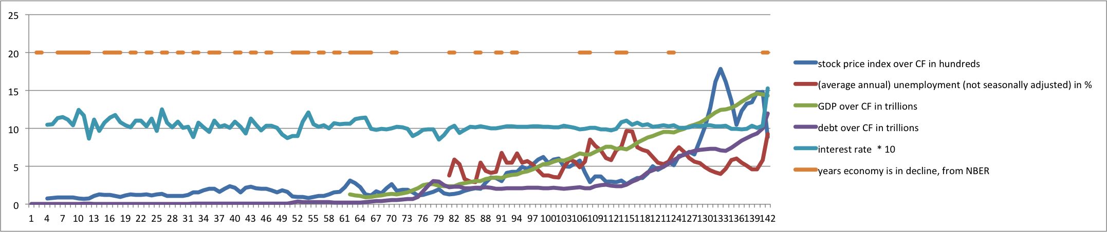
When we select the six columns above and insert a line chart, we get a rather ugly line chart.
We’ll make several changes to improve this:
Change the “years… in decline” series to an area chart
Select and adjust the x axis labels and ticks
Adjust the y axis range
Customize the color, label, and order of the data series
The basic mechanism of the colored regions on the chart is to use Excel’s “area chart” to create rectangular areas. The area chart essentially takes a line chart and fills the area under the line with a color. If we have a continuous horizontal line as a data series, we will create a large colored rectangle on the chart. To have breaks in the rectangle, we simply need to leave some of the years blank (without values in the cells). To select the appropriate values for column L, we first found the maximum value for the other data series and determined that a value of 20 would create bars starting above the other data series.
To produce the colored regions that indicate contractions in the business cycle, we take the series that was created from column L and turn it into an area chart.
Right-click on any data point in the series or on the legend entry
Select “Change Series Chart Type…”
Select the standard Area chart from the ribbon
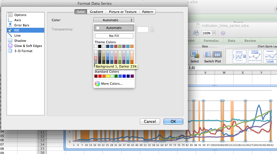
The chart now fills in the area under the original lines with a default fill color.
At this point, you can right click on the series again, select “Format Data Series…”, and change the Fill color to a light gray.
Next, we tell the x axis what the correct labels are (the “Year” column) and have the labels show up every 4 years. (Our data series start on an election year, so the labels will always appear on election years.)
Right click inside the chart somewhere and select “Select Data…”
Select any of the data series in the “Series” list, then go over to the “Category (X) axis labels” box and select the “Year” column. Click “OK”.
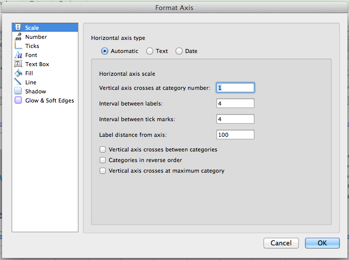
Right-click on the x axis and select “Format Axis…”.
Under “Scale”:
Change the default interval between labels from 3 to 4
Change the interval between tick marks to 4 as well
Uncheck the box next to “Vertical axis crosses between categories”
Under “Text Box”, select the text direction of “Rotate to 90 deg Counterclockwise”. Click “OK”.
The x axis should have appropriate year labels now. The y axis can similarly be adjusted to show just the range of values we’re most interested in.
Right-click on the axis and select “Format Axis…”.
Under “Scale”, unselect the check box next to “Maximum:” and change the value to 20.
The rest of the changes are simply formatting changes. Right-click on the individual data series to change the colors, line widths, etc. Use the formatting options or the Chart tools on the Excel ribbon to change the font of any text, adjust the grid lines, add labels and titles, etc. The data series names in the legend can be adjusted by using the “Select Data…” option and typing in custom text in the “Name” field.
The final product should have colored regions and look something like the chart below.
In another post, we will show how to spice this chart up even more using Adobe Illustrator.
Visualize your data, analyze your results, map your statistics, and find the data you need! Come visit us in Perkins 226 (second floor Perkins) for a consultation or contact us online (email: askdata@duke.edu or twitter: duke_data OR duke_vis). We look forward to working with you on your next data driven project.
With 12 workstations with dual 24″ monitors and 16 gigs of memory, the new Data and GIS lab is ready to take on the most challenging statistical, mapping, and visualization research projects. The new lab also features a flatbed scanner for projects moving from print to digital data. Lab hours are the same hours as Perkins Library (almost 24/7).
Learn about data management planning. Apply text mining strategies to understand your documents. Visualize your data with Tableau Public, or map your results using ArcGIS or Google Earth Pro. A new series of workshops connects traditional statistical, geospatial, and visualization tools with web based options. Register online for our courses or schedule a session for your course by emailing askdata@duke.edu
If you missed last fall’s Bloomberg service – Duke Libraries in pleased to announce the installation of three Bloomberg financial terminals in the Data and GIS Lab in 226 Perkins. The terminals provide the latest news and financial data and include an application that makes it easy to export data to Excel. Access is restricted to all current Duke affiliates. Training on Bloomberg is currently being planned for the last week of September. Please email askdata@duke.edu to reserve a space at the training session.
Data and GIS has launched a new guide that provides guidance for researchers looking for advice on data management plans now required by several granting agencies. The guide provides examples of sample plans, key concepts involved in writing a plan, and contact information for groups on campus providing data management advice. In addition, we offer individual consultations with researchers on data management planning.
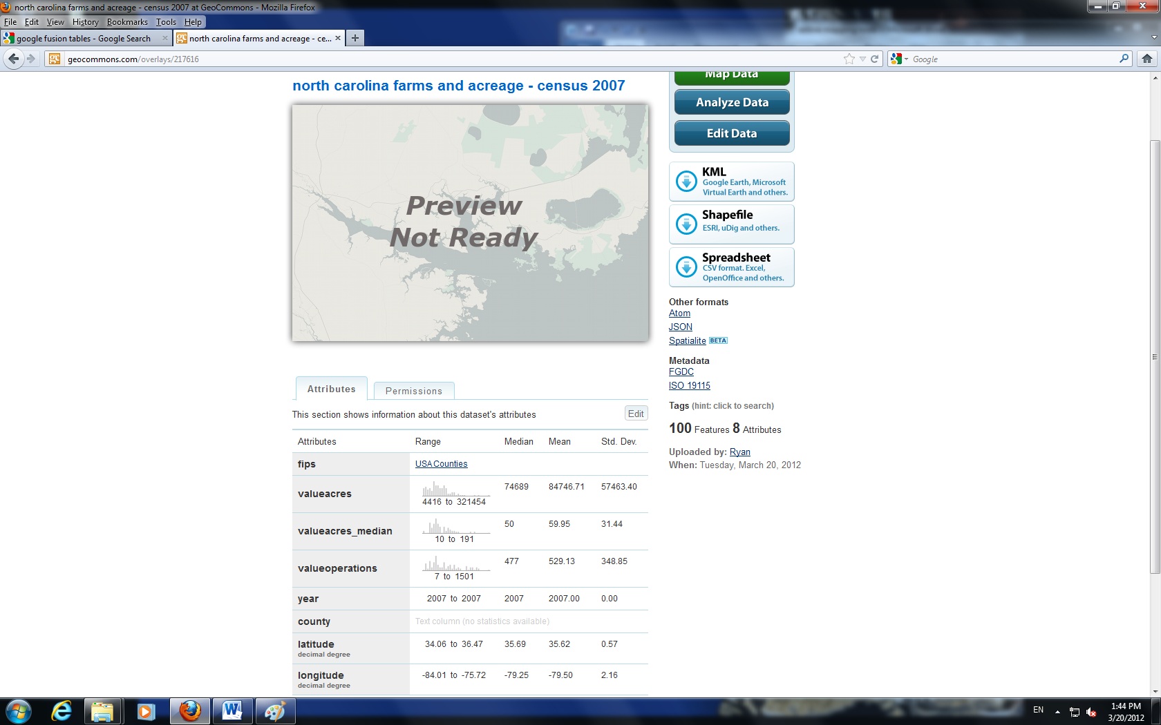
Visualizing spatial data can be challenging. Specialized software tools like ArcGIS produce excellent results, but often seem complex for relatively simple tasks. Several online tools have emerged recently that provide relatively easy alternatives for the display of spatial data. In this post, we examine GeoCommons, a web based tool for presenting spatial data in detail. (Go to this guide to see a comparison chart of packages and features, and see this Duke University Libguide for a more detailed review of GeoCommons.)
GeoCommons is an online mapping application that easily imports a variety of data formats, including geospatial data, and quickly produces sharable maps. In contrast to other mapping tools, GeoCommons contains several categorization algorithms, such as quantile classification and classification based on the standard deviation of the sample that assist with the construction of informative maps. CSV files and ArcGIS shapefiles are two of the most widely used file formats compatible with GeoCommons.
GeoCommons is very easy to use and contains some of the display features contained in high-end GIS suites. Creation of new variables tied to geographies can be tricky, so it’s advised to either upload data and map in final form or to first identify the layer to which you will upload and join a complete data set.
Geocoding
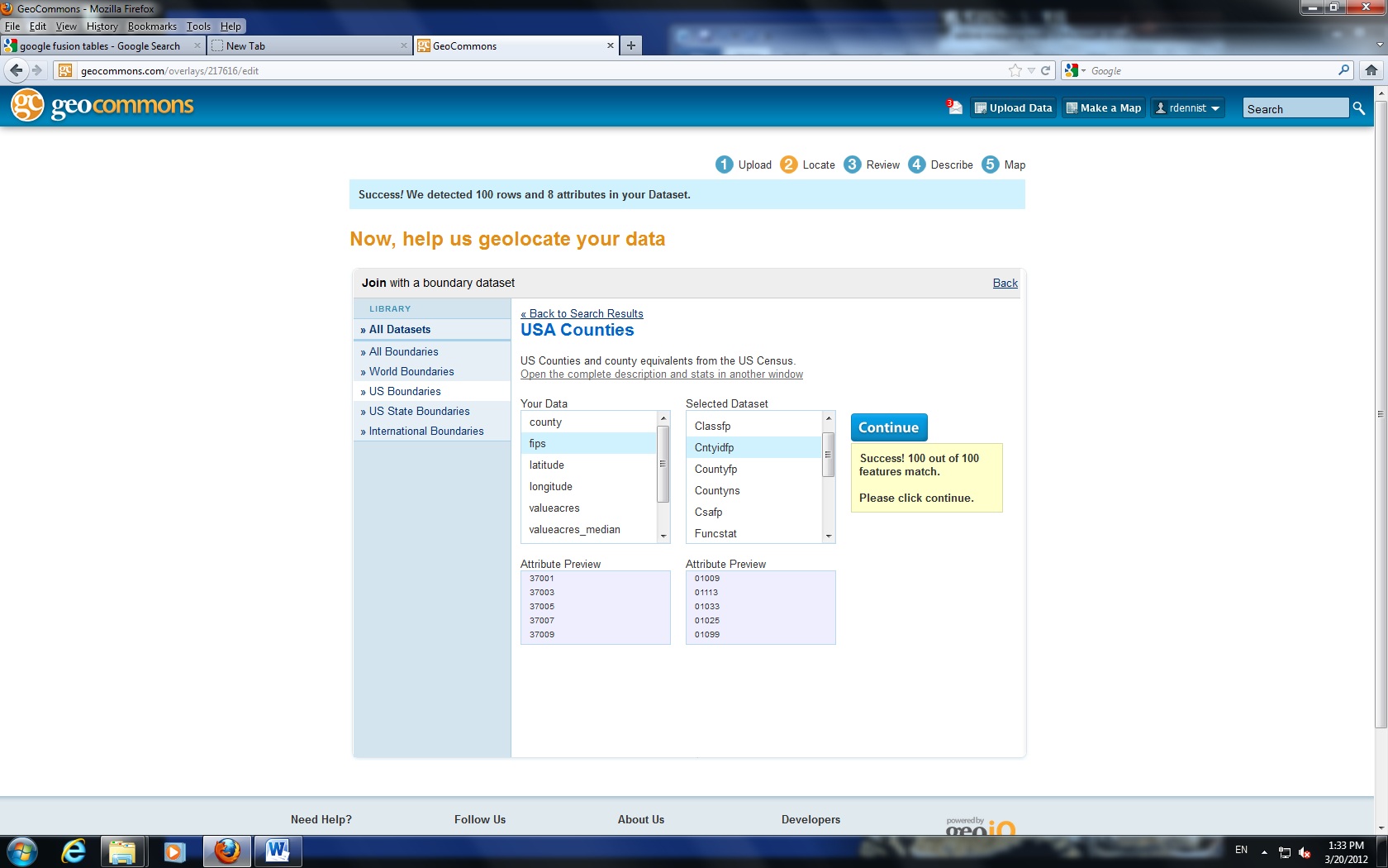
Figure 1
To begin geocoding, upload a file. Gecommons has the capability to recognize spatially encoded data. Some formats may require user assistance.
If you’ve uploaded data that contains latitude and longitude coordinates, choose this option. In my case, I had county FIPS codes that uniquely identified each county. Selecting US Boundaries to the left, then USA Counties, I was able to successfully preview how well my FIPS codes matched the layer (Figures 1 and 2). A variety of other boundary types are available. The key is to have in your data a unique identifier that identifies each record in the same manner as an available geocoding layer.
Figure 2
Review the geocoding results and select Continue to proceed.
Mapping
Geocommons offers some nice built in features that assist with categorizing measures. The application will produce summary statistics for numeric fields (Figure 3), which gives you a quick picture of your sample and can assist with how to categorize the data. Click the “Make a Map” button to proceed to the interactive interface.
Figure 3
Also note the filter tab, which allows you to screen out groups of cases. For example, I may request a minimum number of farms to screen out urban counties.
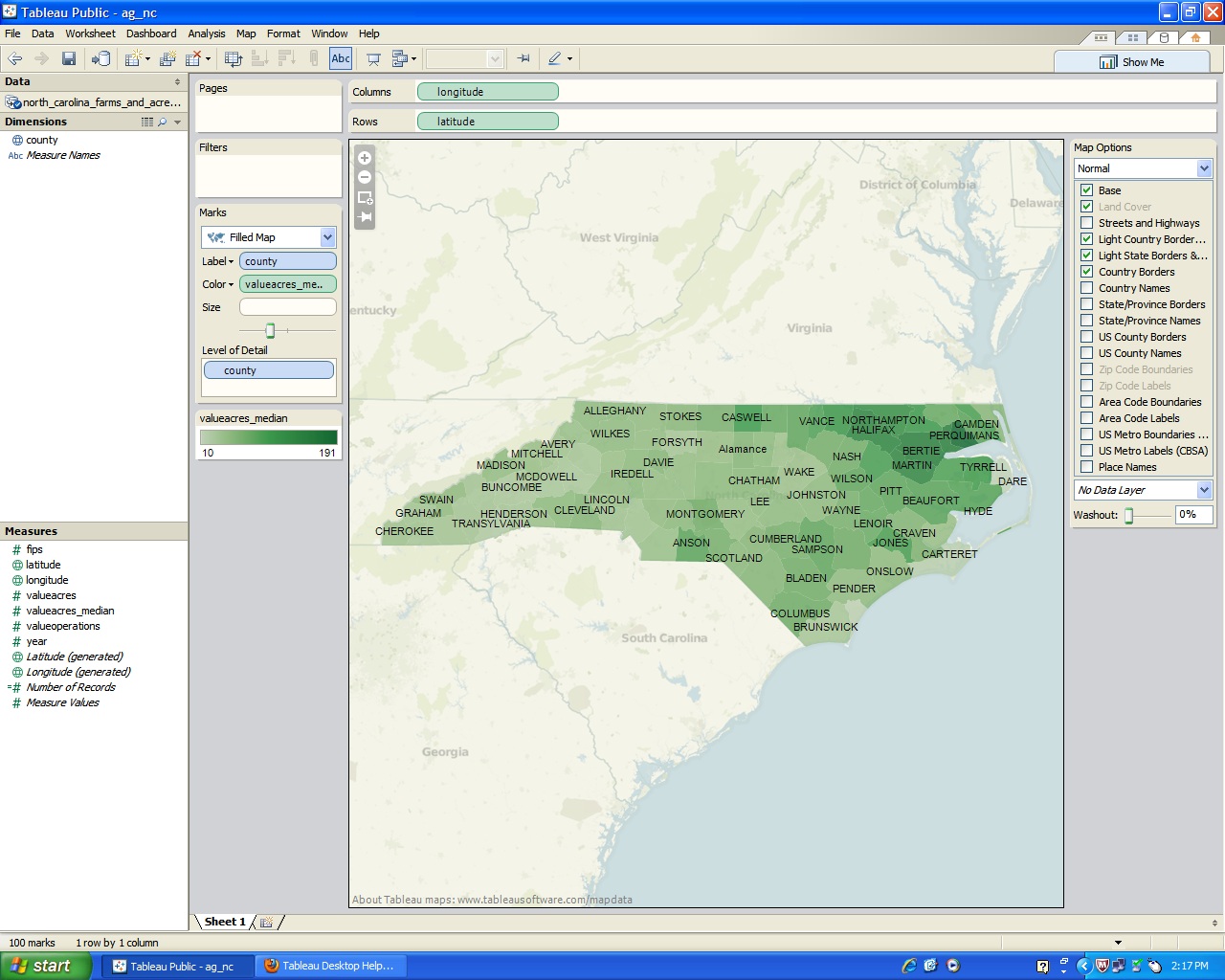
Figure 4 shows a standard choropleth map portraying median number of acres per farm by county for North Carolina in 2007. In this example, I have classified counties into five groups using standard deviations to group counties.
Sharing
Figure 4
GeoCommons contains a wide variety of ways to share data (accessed through the About section). Posting to Twitter, Facebook, and an array of other social media sites is possible with a few short clicks. You can directly email a link to the map along with a short personal message right out of the application.For those who wish to post to a web page, GeoCommons provides two ways to insert a map, through a <div> tag and through an iframe. All code is generated for copy and paste into your page.
To access a version of this map, simply follow this link.
Finally, GeoCommons will produce a PNG image and a KML document for download. The image export feature appears to be relatively new and does take trial-and-error to align correctly. In addition, it does not appear to include any base layers or legends in the output, only the data layer.
Other Notes
When using standard deviation and maximum breaks methods for grouping observations, double check the category definitions by changing the number of categories and the resulting changes to the definitions for the new groups. This will help to confirm whether data are grouped appropriately and exactly what the definitions for each category are.
Data visualization has a long history, but disciplines employ visualization for different purposes and with varying levels of complexity. Visualizations can be compelling or confusing, engaging or enraging. For researchers without prior experience with visualization, the cost of incorporating new techniques into an existing research program may be daunting.
The Data & GIS Services Department of Perkins Library can help with data visualization at various scales and in any discipline. Angela Zoss, Duke’s new full-time Data Visualization Coordinator, has arrived and is available for consultation. Her role will be to provide visualization support for the Duke University community and to help centralize visualization resources and infrastructure.
In addition to the existing mapping services and visualization workshops that have been offered for some time, this fall will bring new visualization workshops, instructional material, and web resources to assist with various components of the research process (e.g., data processing and analysis, software selection, post production). Look for information not only on producing visualizations but also on opportunities for showcasing visualizations and research across campus. Our new visualization twitter feed (@duke_vis) will also be used to circulate tutorials, example visualizations, and other news and events related to visualization.
There is no better time to start exploring what visualization can offer! Stop by Perkins during our walk-in hours or send an email to askdata@duke.edu for consultation, or get in touch with Angela directly to learn more about the new visualization services.
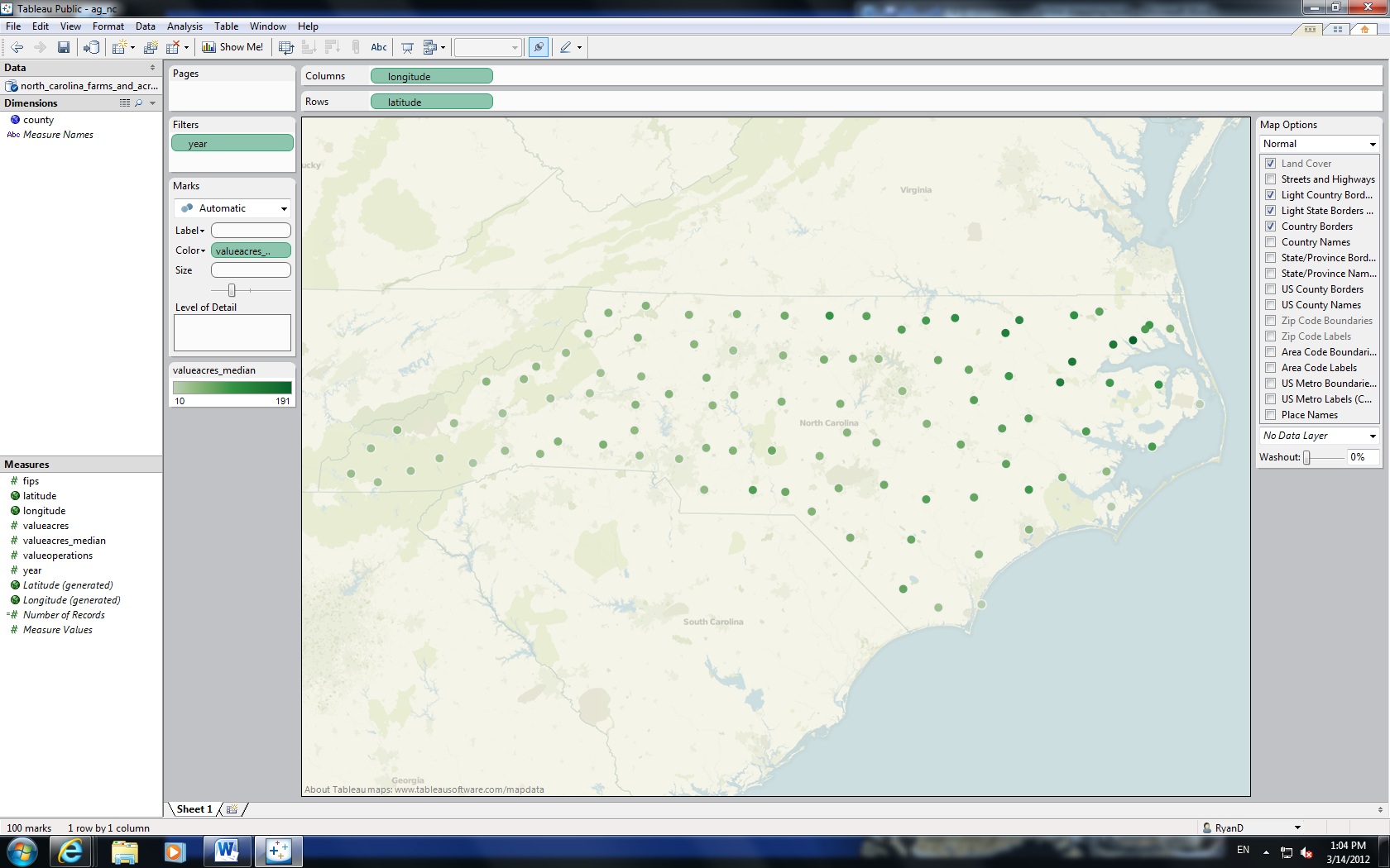
Visualizing spatial data can be challenging to learn. Specialized software tools like ArcGIS produce excellent results, but often seem complex for relatively simple tasks. Several online tools have emerged recently and provide relatively easy alternatives for the display of spatial data. In this ongoing series of alternatives, we review Tableau Public 7 in detail. Go to this guide to see a comparison chart of packages and features, and see this Duke University Libguide for a more detailed review of Tableau 6.1.
Tableau Public is a free software application that allows you to easily map data and share maps through email or web pages by embeddable script. To use Tableau, you must download and install a free desktop application. Tableau Public also requires a free registration to share visualizations created in the software.
Tableau is designed to look and feel like a standard spreadsheet application. Geographic mapping is accomplished by dragging your coordinate fields and dropping them into the columns and rows fields (see Figure 1). In Tableau 7, you may also select “Filled Map” under the Marks panel, and select a geographic identifier for the “Level of Detail” field (see Figure 2). Once done, add the variable to color by to the color field. In these examples, more intense colors indicate larger median farm size, measured in acres.
Figure 2
Geocoding
Tableau generates new fields that hold coordinate data as it imports and geocodes your data. If you wish to create filled maps (states, counties, etc.) in Tableau 7, you must additionally have geographic identifiers that are unique for each case. In Figure 2, the initial map only contained 50 polygons, as 50 North Carolina counties were uniquely named within the United States.
Had I also included a state field, unique identification would have been automatic, but Tableau allowed me to define the state for each case, and lucky for me, I only had North Carolina data.
The geocoding options are extensive. The following list is not exhaustive: area codes, FIPS codes, county/state/country names, ZIP codes, and ISO country codes. Of course, any coordinate data will work for point data.
Sharing
Sharing on a web page is accomplished through embeddable Javascript. Sadly, I was unable to get Tableau to work within WordPress, but you may see a live version of this map by following this link.
Other Notes
Tableau is very easy to use, provided your data is reasonably clean. With geographic data, be certain to either have something that uniquely identifies each entity or have latitudes and longitudes. It is preferable to err on the side of including more identification fields rather than less (i.e. including state names in addition to counties).
Also be aware that Tableau is not backward-compatible. For example, the workbook used in this example was initially created in Tableau 6.1, modified in Tableau 7, but failed to open once I moved back to Tableau 6.1. However, irrespective of version, you will be able to see any visualizations produced in any version.