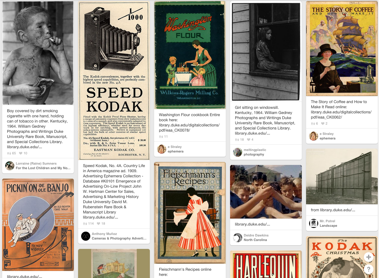
In a recent feature on their blog, our colleagues at NCSU Libraries posted some photographs of dogs from their collections. Being a person generally interested in dogs and old photographs, I became curious where dogs show up in Duke’s Digital Collections. Using very unsophisticated methods, I searched digital collections for “dogs” and thought I’d share what I found.
Of the 60 or so collections in Digital Collections 19 contain references to dogs. The table below lists the collections in which dogs or references to dogs appear most frequently.
As you might guess, not all the results for my search were actually photographs of dogs. Many from the advertising collections were either advertisements for dog food or hot dogs. There were quite a few ads and other materials where the word “dog” was used idiomatically. The most surprising finding to me was number of songs that are about or reference dogs. These include, “Old Dog Tray” and “The Whistler and His Dog” from Historic American Sheet Music, as well as “A Song for Dogs” and “Bull Dog an’ de Baby” from American Song Sheets.
Here’s a sampling of some photographs of dogs from Digital Collections, and a few cats as well.
Today we will take a detailed look at how the Duke Chronicle, the university’s beloved newspaper for over 100 years, is digitized. Since our scope of digitization spans nine decades (1905-1989), it is an ongoing project the Digital Production Center (DPC), part of Digital Projects and Production Services (DPPS) and Duke University Libraries’ Digital Collections Program, has been chipping away at. Scanning and digitizing may seem straightforward to many – place an item on a scanner and press scan, for goodness sake! – but we at the DPC want to shed light on our own processes to give you a sense of what we do behind the scenes. It seems like an easy-peasy process of scanning and uploading images online, but there is much more that goes into it than that. Digitizing a large collection of newspapers is not always a fun-filled endeavor, and the physical act of scanning thousands of news pages is done by many dedicated (and patient!) student workers, staff members, and me, the King Intern for Digital Collections.
Pre-Scanning Procedures
Large format 1940s Chronicles in over-sized archival box
Many steps in the digitization process do not actually occur in the DPC, but among other teams or departments within the library. Though I focus mainly on the DPC’s responsibilities, I will briefly explain the steps others perform in this digital projects tango…or maybe it’s a waltz?
Each proposed project must first be approved by the Advisory Council for Digital Collections (ACDC), a team that reviews each project for its strategic value. Then it is passed on to the Digital Collections Implementation Team (DCIT) to perform a feasibility study that examines the project’s strengths and weaknesses (see Thomas Crichlow’s post for an overview of these teams). The DCIT then helps guide the project to fruition. After clearing these hoops back in 2013, the Duke Chronicle project started its journey toward digital glory.
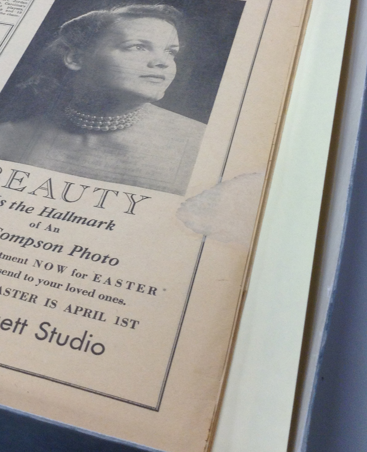
We pull 10 years’ worth of newspapers at a time from the University Archives in Rubenstein Library. Only one decade at a time is processed to make the 80+ years of Chronicle publications more manageable. The first stop is Conservation. To make sure the materials are stable enough to withstand digitizing, Conservation must inspect the condition of the paper prior to giving the DPC the go-ahead. Because newspapers since the mid-19th century were printed on cheap and very acidic wood pulp paper, the pages can become brittle over time and may warrant extensive repairs. Senior Conservator, Erin Hammeke, has done great work mending tears and brittle edges of many Chronicle pages since the start of this project. As we embark on digitizing the older decades, from the 1940s and earlier, Erin’s expertise will be indispensable. We rely on her not only to repair brittle pages but to guide the DPC’s strategy when deciding the best and safest way to digitize such fragile materials. Also, several volumes of the Chronicle have been bound, and to gain the best digital image scan these must be removed from their binding. Erin to the rescue!
Conservation repair on a 1940s Chronicle pageConservation repair to a torn 1940s Chronicle ad
1950s Duke Chronicle digitization guide
Now that Conservation has assessed the condition and given the DPC the green light, preliminary prep work must still be done before the scanner comes into play. A digitization guide is created in Microsoft Excel to list each Chronicle issue along with its descriptive metadata (more information about this process can be found in my metadata blog post). This spreadsheet acts as a guide in the digitization process (hence its name, digitization guide!) to keep track of each analog newspaper issue and, once scanned, its corresponding digital image. In this process, each Chronicle issue is inspected to collect the necessary metadata. At this time, a unique identifier is assigned to every issue based on the DPC’s naming conventions. This identifier stays with each item for the duration of its digital life and allows for easy identification of one among thousands of Chronicle issues. At the completion of the digitization guide, the Chronicle is now ready for the scanner.
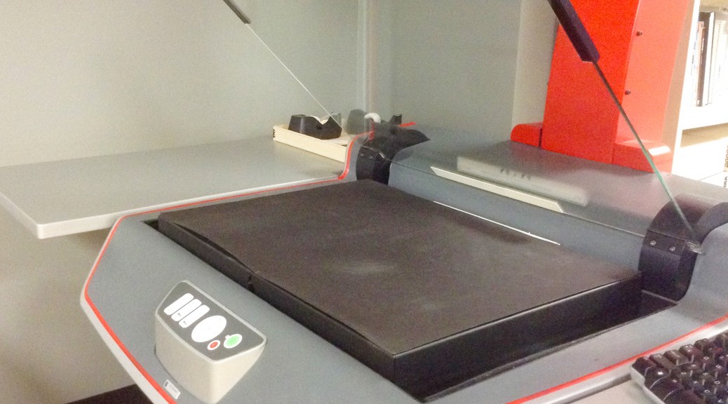
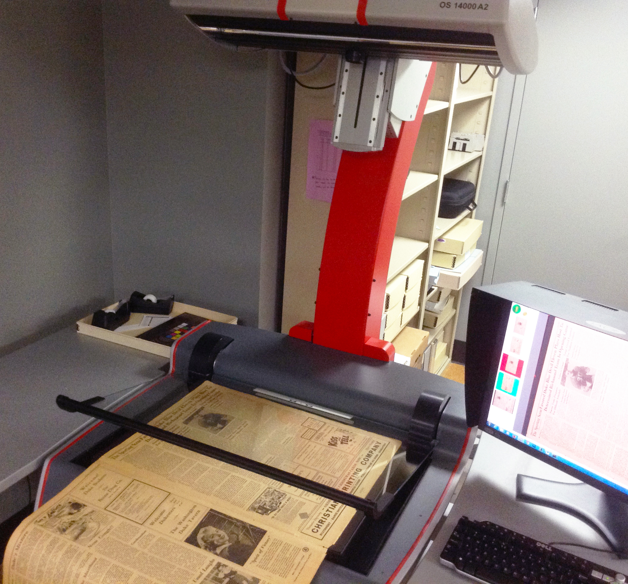
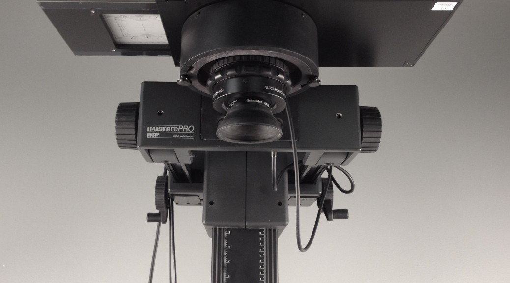
The DPC’s Zeutschel OS 14000 A2
The Scanning Process
With all loose unbound issues, the Zeutschel is our go-to scanner because it allows for large format items to be imaged on a flat surface. This is less invasive and less damaging to the pages, and is quicker than other scanning methods. The Zeutschel can handle items up to 25 x 18 inches, which accommodates the larger sized formats of the Chronicle used in the 1940s and 1950s. If bound issues must be digitized, due to the absence of a loose copy or the inability to safely dis-bound a volume, the Phase One digital camera system is used as it can better capture large bound pages that may not necessarily lay flat.
Folders each containing multiple page images of one Chronicle issue
For every scanning session, we need the digitization guide handy as it tells what to name the image files using the previously assigned unique identifier. Each issue of the newspaper is scanned as a separate folder of images, with one image representing one page of the newspaper. This system of organization allows for each issue to become its own compound object – multiple files bound together with an XML structure – once published to the website. The Zeutschel’s scanning software helps organize these image files into properly named folders. Of course, no digitization session would be complete without the initial target scan that checks for color calibration (See Mike Adamo’s post for a color calibration crash course).
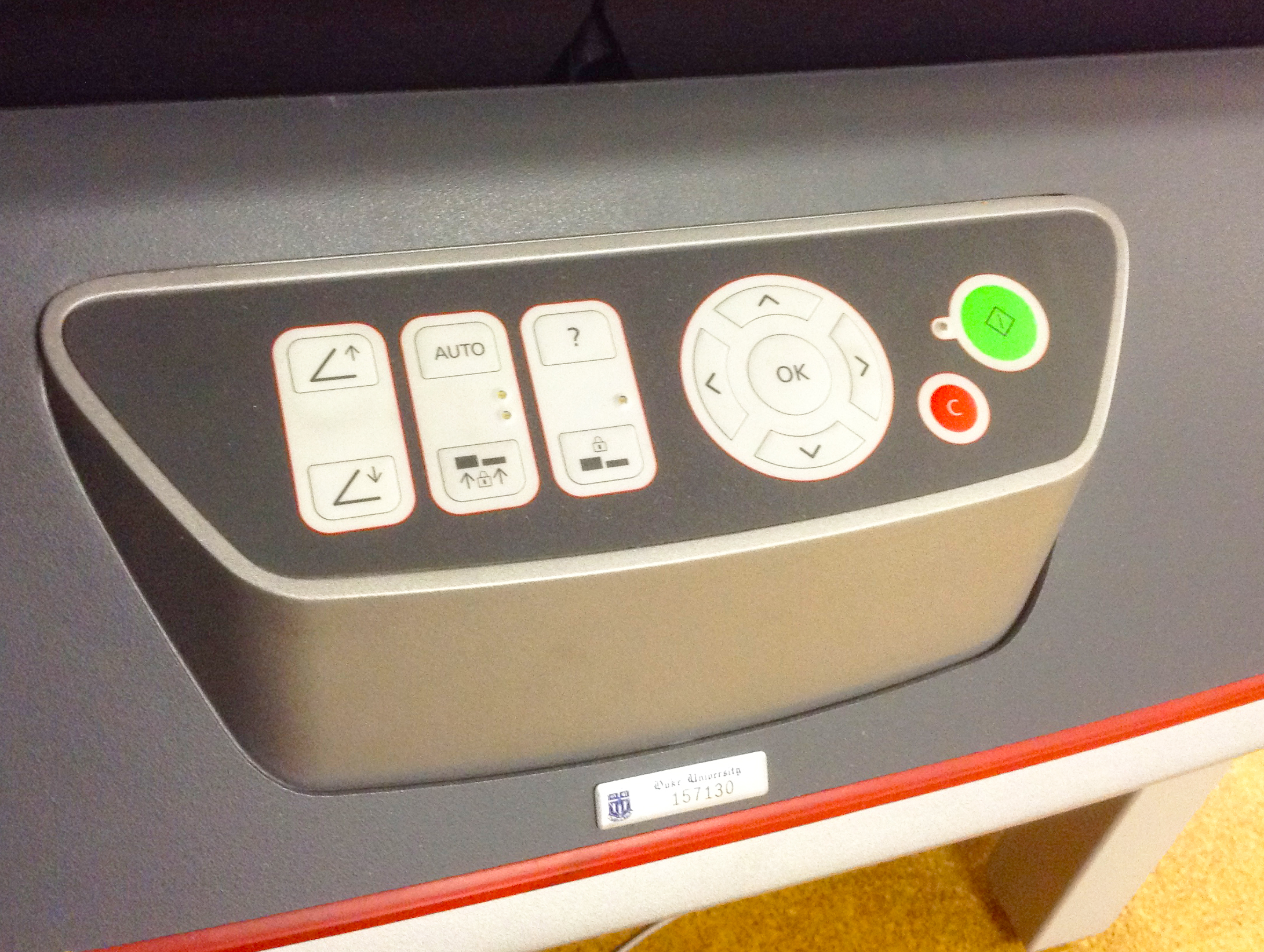
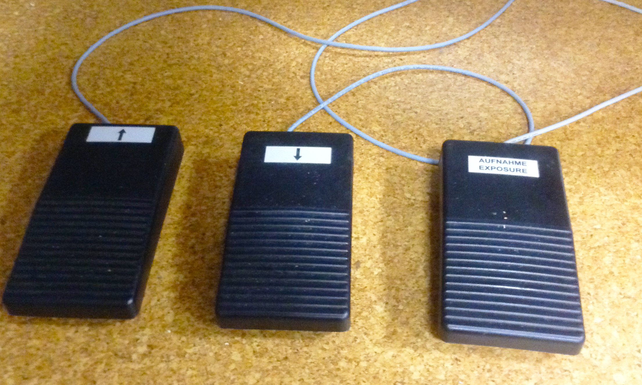
The Zeutschel’s control panel of buttonsThe Zeutschel’s optional foot pedals
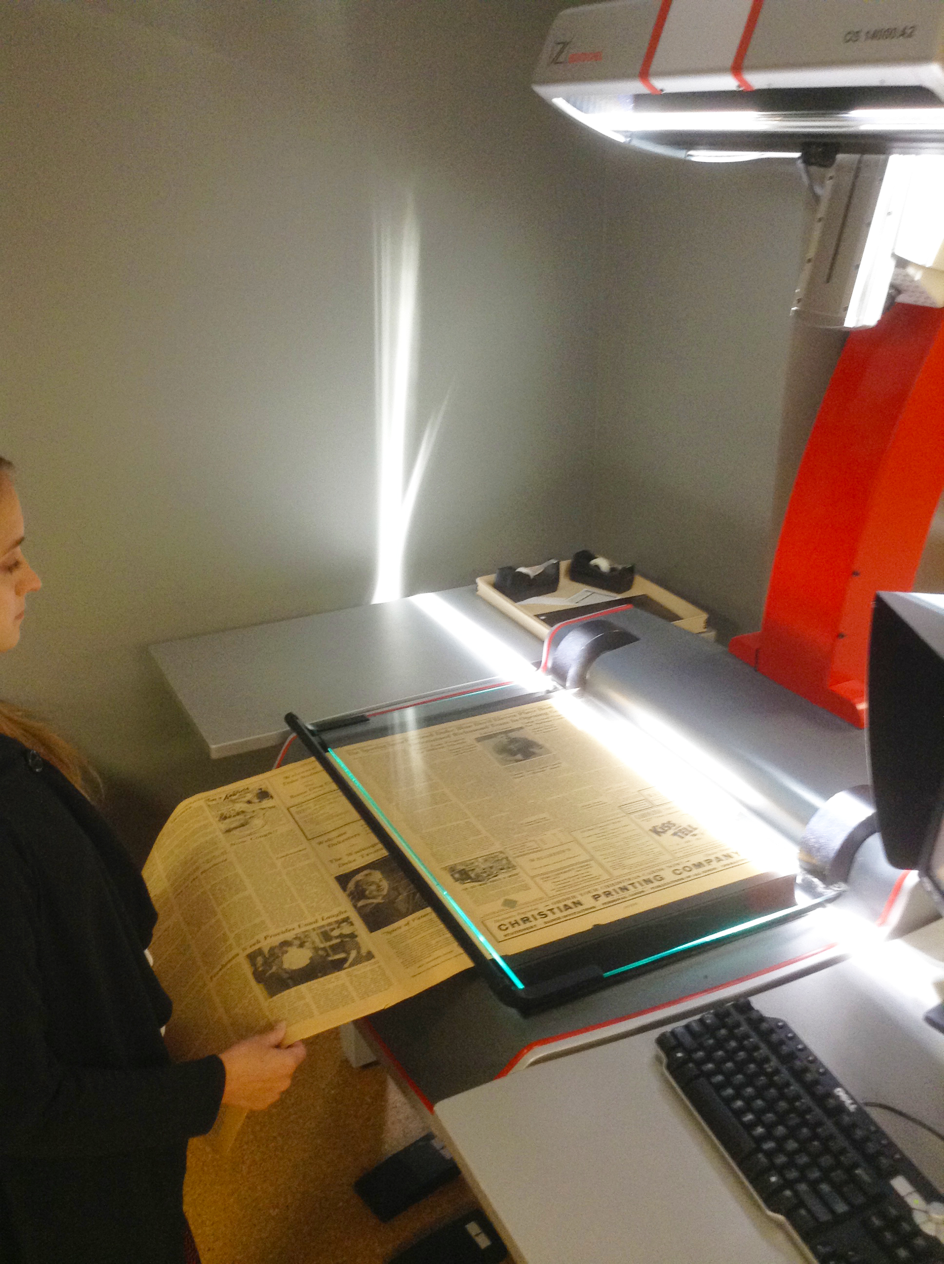
The scanner’s plate glass can now be raised with the push of a button (or the tap of a foot pedal) and the Chronicle issue is placed on the flatbed. Lowering the plate glass down, the pages are flattened for a better scan result. Now comes the excitement… we can finally press SCAN. For each page, the plate glass is raised, lowered, and the scan button is pressed. Chronicle issues can have anywhere from 2 to 30 or more pages, so you can image this process can become monotonous – or even mesmerizing – at times. Luckily, with the smaller format decades, like the 1970s and 1980s, the inner pages can be scanned two at a time and the Zeutschel software separates them into two images, which cuts down on the scan time. As for the larger formats, the pages are so big you can only fit one on the flatbed. That means each page is a separate scan, but older years tended to publish less issues, so it’s a trade-off. To put the volume of this work into perspective, the 1,408 issues of the 1980s Chronicle took 28,089 scans to complete, while the 1950s Chronicle of about 482 issues took around 3,700 scans to complete.
A 1940s Chronicle page is placed on the flatbed for scanning
Scanning in progress of the 1940s Chronicle pageTarget image opened in Adobe Photoshop for color calibration
Every scanned image that pops up on the screen is also checked for alignment and cropping errors that may require a re-scan. Once all the pages in an issue are digitized and checked for errors, clicking the software’s Finalize button will compile the images in the designated folder. We now return to our digitization guide to enter in metadata pertaining to the scanning of that issue, including capture person, capture date, capture device, and what target image relates to this session (subsequent issues do not need a new target scanned, as long as the scanning takes place in the same session).
Now, with the next issue, rinse and repeat: set the software settings and name the folder, scan the issue, finalize, and fill out the digitization guide. You get the gist.
Post-Scanning Procedures
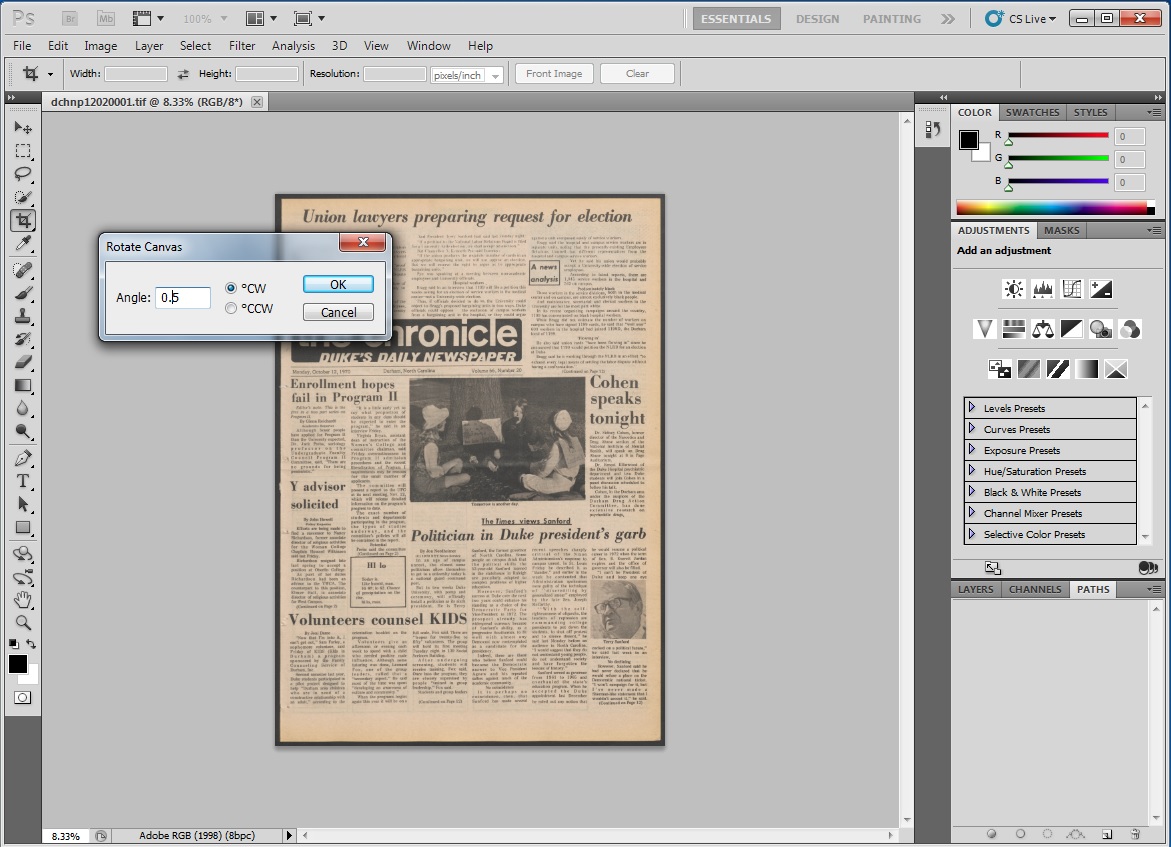
Rotating an image in Adobe Photoshop
We now find ourselves with a slue of folders filled with digitized Chronicle images. The next phase of the process is quality control (QC). Once every issue from the decade is scanned, the first round of QC checks all images for excess borders to be cropped, crooked images to be squared, and any other minute discrepancy that may have resulted from the scanning process. This could be missing images, pages out of order, or even images scanned upside down. This stage of QC is often performed by student workers who diligently inspect image after image using Adobe Photoshop. The second round of QC is performed by our Digital Production Specialist Zeke Graves who gives every item a final pass.
At this stage, derivatives of the original preservation-quality images are created. The originals are archived in dark storage, while the smaller-sized derivatives are used in the CONTENTdm ingest process. CONTENTdm is the digital collection management software we use that collates the digital images with their appropriate descriptive metadata from our digitization guide, and creates one compound object for each Chronicle issue. It also generates the layer of Optical Character Recognition (OCR) data that makes the Chronicle text searchable, and provides an online interface for users to discover the collection once published on the website. The images and metadata are ingested into CONTENTdm’s Project Client in small batches (1 to 3 years of Chronicle issues) to reduce the chance of upload errors. Once ingested into CONTENTdm, the items are then spot-checked to make sure the metadata paired up with the correct image. During this step, other metadata is added that is specific to CONTENTdm fields, including the ingest person’s initials. Then, another ingest must run to push the files and data from the Project Client to the CONTENTdm server. A third step after this ingest finishes is to approve the items in the CONTENTdm administrative interface. This gives the go-ahead to publish the material online.
Hold on, we aren’t done yet. The project is now passed along to our developers in DPPS who must add this material to our digital collections platform for online discovery and access (they are currently developing Tripod3 to replace the previous Tripod2 platform, which is more eloquently described in Will Sexton’s post back in April). Not only does this improve discoverability, but it makes all of the library’s digital collections look more uniform in their online presentation.
Then, FINALLY, the collection goes live on the web. Now, just repeat the process for every decade of the Duke Chronicle, and you can see how this can become a rather time-heavy and laborious process. A labor of love, that is.
I could have narrowly stuck with describing to you the scanning process and the wonders of the Zeutschel, but I felt that I’d be shortchanging you. Active scanning is only a part of the whole digitization process which warrants a much broader narrative than just “push scan.” Along this journey to digitize the Duke Chronicle, we’ve collectively learned many things. The quirks and trials of each decade inform our process for the next, giving us the chance to improve along the way (to learn how we reflect upon each digital project after completion, go to Molly Bragg’s blog post on post-mortem reports).
If your curiosity is piqued as to how the Duke Chronicle looks online, the Fall 1959-Spring 1970 and January 1980-February 1989 issues are already available to view in our digital collections. The 1970s Chronicle is the next decade slated for publication, followed by the 1950s. Though this isn’t a comprehensive detailed account of the digitization process, I hope it provides you with a clearer picture of how we bring a collection, like the Duke Chronicle, into digital existence.
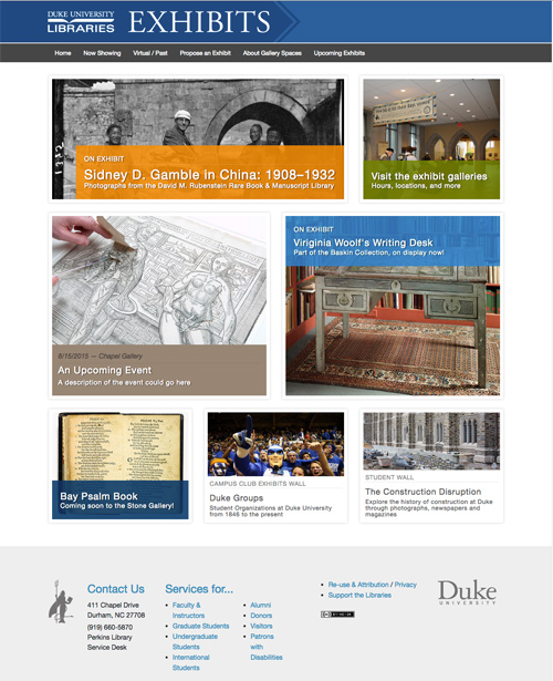
One project we’ve been working on recently in the Digital Projects Department is a revamped Library Exhibits website that will launch in concert with the opening of the newly renovated Rubenstein Library in August. The interface is going to focus on highlighting the exhibit spaces, items, and related events. Here’s a mockup of where we hope to be shortly:
On a somewhat related note, I recently traveled to Italy and was able to spend an afternoon at the Venice Biennale, which is an international contemporary art show that takes place every other year. Participating artists install their work across nearly 90 pavilions and there’s also a central gallery space for countries that don’t have their own buildings. It’s really an impressive amount of work to wander through in a single day and I wasn’t able to see everything, but many of the works I did see was amazing. Three exhibits in particular were striking to me.
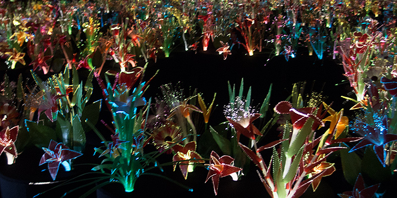
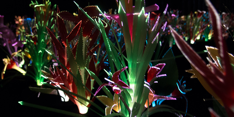
Garden of Eden
The first I’ll highlight is the work of Joana Vasconcelos, titled Il Giardino dell’Eden, which was housed in a silver tent of a building from one of the event sponsors, Swatch (the watch company). As I entered I was immediately met with a dark and cool space, which was fantastic on this particularly hot and humid day. The room was filled with an installation of glowing fiber optic flowers that pulsated with different patterns of color. It was beautiful and super engaging. I spent a long time wandering through the pathway trying to take it all in.
Autonomous Trees
Another engrossing installation was housed in the French Pavilion; Revolutions by Celeste Boursier-Mougenot. I walked into a large white room where a tree with a large exposed rootball was sitting off to the side. There were deep meditative tones being projected from somewhere close by. I noticed people were lounging in the wings of the space, so I wandered over to check it out for myself. What looked like a wooden bleacher of sorts actually turned out to be made of some sort of painted foam. So as I stumbled and laughed when I tried to first walk on it, like many others who came into the space later, I plopped down to soak in the exhibit. I noticed the deep tones were subtly rhythmic and they definitely gave off a meditative vibe, so it was nice to relax a bit after a long day of walking. But then I noticed the large tree was not where it had been when I first entered the room. It was moving, but very slowly. Utterly interesting. It almost seemed to levitate. I’d really like to know how it worked (there were also two more trees outside the pavilion that moved in the same way). Overall it was a fantastic experience.
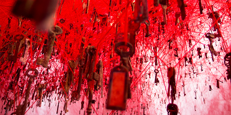
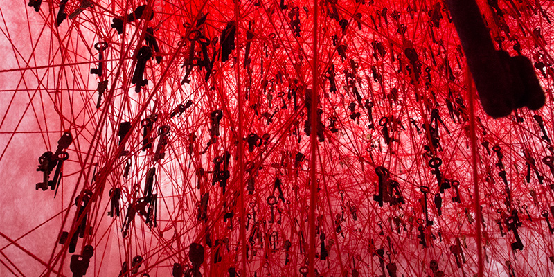
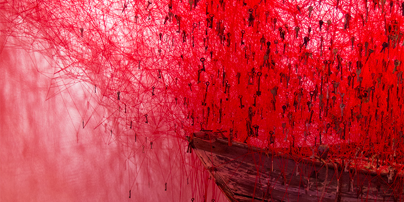
Red Sea of Keys
My favorite installation was in the Japanese Pavilion; The Key in the Hand by Chiharu Shiota. The space was filled with an almost incomprehensible number of keys dangling from entangled red yarn suspended from the ceiling of the room. There were also a few small boats positioned around the space. My first instinct was that I was standing underneath a red sea. It’s really hard to describe just how much ‘red’ there actually is in the space. The intricacy of the threads and the uniqueness of almost every key I looked at was simply mind blowing. I think my favorite part of the exhibit was nestled in a corner of the room where an iPad sat looping a time compressed video of the installation of the work. It was uniquely satisfying to watch it play out and come together over and over. I’m not sure how to tap into that experience for exhibits in the library, but it’s something we can certainly aim for!
Rachel Ingold (Curator for the History of Medicine Collections at the Rubenstein Library) and I co-presented yesterday at the TRLN Annual Conference 2015 in Chapel Hill, NC:
Sean Aery, Digital Projects Developer, Duke Rachel Ingold, Curator for the History of Medicine Collections, Duke
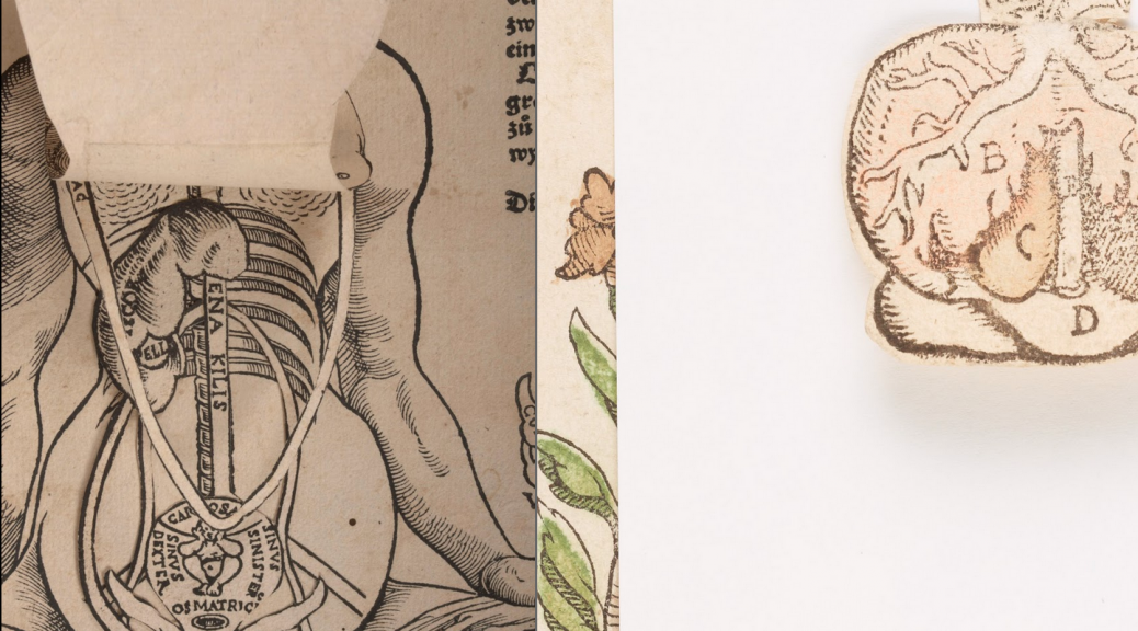
Duke’s Digital Collections program recently published a remarkable set of 16th-17th century anatomical fugitive sheets from The Rubenstein Library’s History of Medicine Collections. These illustrated sheets are similar to broadsides, but feature several layers of delicate flaps that lift to show inside the human body. The presenters will discuss the unique challenges posed by the source material including conservation, digitization, description, data modeling, and UI design. They will also demonstrate the resulting digital collection, which has already earned several accolades for its innovative yet elegant solutions for a project with a high degree of complexity.
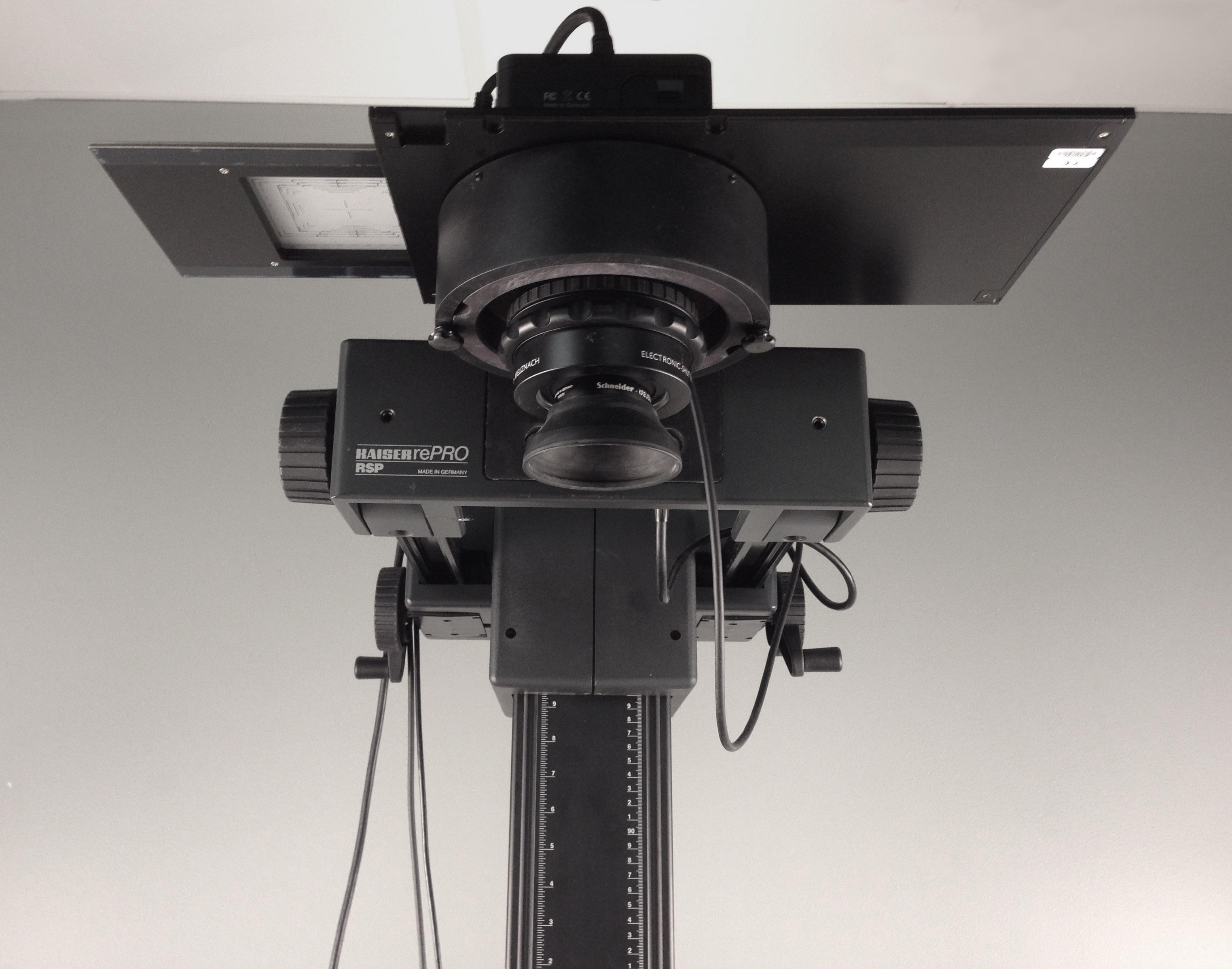
One of the most tedious and time-consuming tasks we do in the Digital Production Center is cropping and straightening still image files. Hired students spend hours sitting at our computers, meticulously straightening and cropping extraneous background space out of hundreds of thousands of photographed images, using Adobe Photoshop. This process is neccessary in order to present a clean, concise image for our digital collections, but it causes delays in the completion of our projects, and requires a lot of student labor. Auto cropping software has long been sought after in digital imaging, but few developers have been able to make it work efficiently, for all materials. The Digital Production Center’s Zeutschel overhead scanner utilizes auto cropping software, but the scanner can only be used with completely flat media, due to its limited depth of field. Thicker and more fragile materials must be photographed using our Phase One digital camera system, shown above.
Capture One’s Cultural Heritage software includes the auto crop feature.
Recently, Digital Transitions, who is the supplier of Phase One and it’s accompanying Capture One software, announced an update to the software which includes an auto crop and straightening feature. The new software is called Capture One Cultural Heritage, and is specifically designed for use in libraries and archival institutions. The auto crop feature, previously unavailable in Capture One, is a real breakthrough, and there are several options for how to use it.
First of all, the user can choose to auto crop “On Capture” or “On Crop.” That is, the software can auto crop instantly, right after a photograph has been taken (On Capture), or it can be applied to the image, or batch of images, at a later time (On Crop). You can also choose between auto cropping at a fixed size, or by the edge of the material. For instance, if you are photographing a collection of posters that are all sized 18” x 24,” you would choose “Fixed Size” and set the primary crop to “18 x 24,” or slightly larger if you want your images to have an outer border. The software recognizes the rectangular shape, and applies the crop. If you are photographing a collection of materials that are a variety of different sizes, you would choose “Generic,” which tells the software to crop wherever it sees a difference between the edge of the material and the background. “Padding” can be used to give those images a border.
The Digital Production Center’s Phase One camera system.
Because Capture One utilizes raw files, the auto crops are non-destructive edits. One benefit of this is that if your background color is close to the color of your material, you can temporarily adjust the contrast of the photograph in order to darken the edges of the object, thus enhancing the delineation between object and background. Next apply the auto crop, which will be more successful due to it’s ability to recognize the newly-defined edges of the material. After the crops are applied, you can reverse the contrast adjustment, thus returning the images to their original state, while still keeping the newly-generated crops.
Temporarily increasing the contrast of your images can help the auto crop feature find the edges of the object.
Like a lot of technological advances, reliable auto cropping seemed like a fantasy just a few years ago, but is now a reality. It doesn’t work perfectly every time, and quality control is still necessary to uncover errors, but it’s a big step forward. The only thing disconcerting is the larger question facing our society. How long will it be before our work is completely automated, and humans are left behind?
My colleague Sean wrote two weeks ago about the efforts a group of us in the library are making towards understanding the scholarly impacts of Duke Digital Collections. In this post, I plan to continue the discussion with details about the survey we are conducting as well as share some initial results.
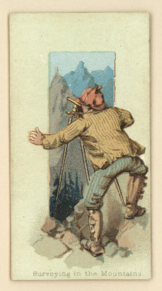
Surveying can be perilous work!
After reviewing the analytics and Google Scholar data Sean wrote about, our working group realized we needed more information. Our goal in this entire assessment process has been to pull together scholarly use data which will inform our digitization decisions, priorities, technological choices (features on the digital collections platform), and to help us gain an understanding of if and how we are meeting the needs of researcher communities. Analytics gave us clues, but we still didn’t some of the fundamental facts about our patrons. After a fervent discussion with many whiteboard notes, the group decided creating a survey would get us more of the data we were looking for. The resulting survey focuses on the elemental questions we have about our patrons: who are they, why are they visiting Duke Digital Collections, and what are they going to do with what they find here.
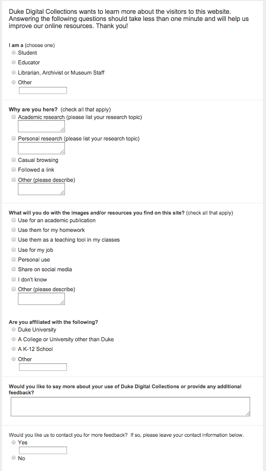
The Survey
Creating the survey itself was no small task, but after an almost endless process of writing, rewriting, and consultations with our assessment coordinator we settled on 6 questions (a truely miniature survey). We considered the first three questions (who, why, what) to be most important, and we intended the last three to provide us with additional information such as Duke affiliation and allow a space for general feedback. None of the questions were considered “required” so respondents could answer or skip whatever they wanted; we also included space for respondents to write-in further details especially when choosing the “other” option.
Our survey in its completed form.
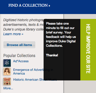
The survey launched on April 30 and remains accessible by hovering over a “feedback” link on every single Digital Collection webpage. Event tracking analytics show that 0.29% of the patrons that hover over our feedback link click through to the survey. An even smaller number have actually submitted responses. This has worked out to 56 responses at an average rate of around 1 per day. Despite that low click through rate, we have been really pleased with the number of responses we have had so far. The response rate remains steady, and we have already learned a lot from even this small sample of visitor data. We are not advertising the survey or promoting it, because our target respondents are patrons who find us in the course of their research or general Internet browsing.
Hovering over the help us box reveals expectations and instructions for survey participants.
Initial Results
Before I start discussing our results, please note that what I’m sharing here is based on initial responses and my own observations. No one in digital collections has thoroughly reviewed or analyzed this data. Additionally, this information is drawn from responses submitted between April 30 – July 8, 2015. We plan to keep the survey online into the academic year to see if our responses change when classes are in session.
With that disclaimer now behind us, let’s review results by question.
Questions 1 and 4: Who are you?
Since we are concerned with scholarly oriented use more than other types in this exercise, the first question is intended to sort respondents primarily by academic status. In question 4, respondents are given the chance to further categorized their academic affiliation.
Question 1 Answers
# of Responses
%
Student
14
25%
Educator
10
18%
Librarian, Archivist or Museum Staff
5
9%
Other
26
47%
55
100
Of the respondents who categorized themselves as “other” in question 1, 11 clarified their otherness by writing their identities in the space provided. Of this 11, 4 associated themselves with music oriented professions or hobbies, and 2 with fine arts (photographer and filmmaker). The remaining 5 could not be grouped easily into categories.
As a follow up later in the survey, question 4 asks respondents to categorize their academic affiliation (if they had one). The results showed that 3 respondents are affiliated with Duke, 12 with other colleges or universities and 9 with a K-12 school. Of the write-in responses, 3 listed names of universities abroad, and 1 listed a school whose level has not been identified.
Question 2: Why are you here?
We can tell from our analytics how people get to us (if they were referred to us via a link or sought us out directly), but this information does not address why visitors come to the site. Enter question 2.
Question 2 Answers
# of Responses
%
Academic research
15
28
Casual browsing
15
28
Followed a link
9
17%
Personal research
24
44%
Other
6
11%
54
The survey asks that those who select academic research, personal research, and other to write-in their research topic or purpose. Academic research topics submitted so far primarily revolve around various historical research topics. Personal research topics reflect a high interest in music (specific songs or types of music), advertising, and other various personal projects. It is interesting to note that local history related topics have been submitted under all three categories (academic, personal and other). Additionally, non-academic researchers seem to be more willing to share sharing their specific topics; 19 of 24 respondents listed their topics as compared to 7 out of 15 academic researchers.
Question 3: What will you do with the images and/or resources you find on this site?
To me, this question has the potential to provide some of the most illuminating information from our patrons. Knowing how they use the material helps us determine how to enhance access to the digitized objects and what kinds of technology we should be investing in. This can also shed light on our digitization process itself. For example, maybe the full text version of an item will provide more benefit to more researchers than an illustrated or hand-written version of the same item (of course we would prefer to offer both, but I think you see where I am going with this).
In designing this question, the group decided it would be valuable to offer options for the those who share items due to their visual or subject appeal (for example, the Pinterest user), the publication minded researcher, and a range of patron types in between.
Question 3 Answers
# of Responses
%
Use for an academic publication
3
6%
Share on social media
10
19%
Use them for homework
8
15%
Use them as a teaching tool in my classes
5
9%
Personal use
31
58%
Use for my job
2
4%
Other
10
19%
53
The 10 “other” respondents all entered subsequent details; they planned to share items with friends and family (in some way other than on social media), they also wanted to use the items they found as a reference, or were working on an academic pursuit that in their mind didn’t fit the listed categories.
Observations
As I said above, these survey results are cursory as we plan to leave the survey up for several more months. But so far the data reveals that Duke Digital collections serves a wide audience of academic and non-academic users for a range of purposes. For example, one respondent uses the outdoor advertising collections to get a glimpse of how their community has changed over time. Another is concerned with US History in the 1930s, and another is focused on music from the 1900s.
The next phase of the the assessment group’s activities is to meet with researchers and instructors in person and talk with them about their experiences using digital collections (not just Duke’s) for scholarly research or instruction. We have also been collecting examples of instructors who have used digital collections in their classes. We plan to create a webpage with these examples with the goal of encouraging other instructors to do the same. The goal of both of these efforts is to increase academic use of the digital collections (whether that be at the K-12 or collegiate level).
Just like this survey team, we stand at the ready, waiting for our chance to analyze and react to our data!
Of course, another next step is to keep collecting this survey data and analyze it further. All in all, it has been truly exciting to see the results thus far. As we study the data in more depth this Fall, we plan to work with the Duke University Library Digital Collections Advisory Team to implement any new technical or policy oriented decisions based on our conclusions. Our minds are already spinning with the possibilities.
Over the last few months, we’ve been doing some behind-the-scenes re-engineering of “the way” we publish digital objects in finding aids (aka “collection guides”). We made these changes in response to two main developments:
The transition to ArchivesSpace for managing description of archival collections and the production of finding aids
A growing need to handle new types, or classes, of digital objects in our finding aid interface (especially born-digitalelectronic records)
Background
While the majority of items found in Duke Digital Collections are published and accessible through our primary digital collections interface (codename Tripod), we have a growing number of digital objects that are published (and sometimes embedded) in finding aids.
Finding aids describe the contents of manuscript and archival collections, and in many cases, we’ve digitized all or portions of these collections. Some collections may contain material that we acquired in digital form. For a variety of reasons that I won’t describe here, we’ve decided that embedding digital objects directly in finding aids can be a suitable, often low-barrier alternative to publishing them in our primary digital collections platform. You can read more on that decision here.
Screenshot showing digital objects embedded in the Alexander H. Stephens Papers finding aid
EAD, ArchivesSpace, and the <dao>
At Duke, we’ve been creating finding aids in EAD (Encoded Archival Description) since the late 1990s. Prior to implementing ArchivesSpace (June 2015) and its predecessor Archivists Toolkit (2012), we created EAD through some combination of an XML editor (NoteTab, Oxygen), Excel spreadsheets, custom scripts, templates, and macros. Not surprisingly, the evolution of EAD authoring tools led to a good deal of inconsistent encoding across our EAD corpus. These inconsistencies were particularly apparent when it came to information encoded in the <dao> element, the EAD element used to describe “digital archival objects” in a collection.
As part of our ArchivesSpace implementation plan, we decided to get better control over the <dao>–both its content and its structure. We wrote some local best practice guidelines for formatting the data contained in the <dao> element and we wrote some scripts to normalize our existing data before migrating it to ArchivesSpace.
Classifying digital objects with the “use statement.”
In June 2015, we migrated all of our finding aids and other descriptive data to ArchivesSpace. In total, we now have about 3400 finding aids (resource records) and over 9,000 associated digital objects described in ArchivesSpace. Among these 9,000 digital objects, there are high-res master images, low-res use copies, audio files, video files, disk image files, and many other kinds of digital content. Further, the digital files are stored in several different locations–some accessible to the public and some restricted to staff.
In order for our finding aid interface to display each type of digital object properly, we developed a classification system of sorts that 1) clearly identifies each class of digital object and 2) describes the desired display behavior for that type of object in our finding aid interface.
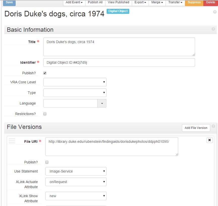
In ArchivesSpace, we store that information consistently in the ‘Use Statement’ field of each Digital Object record. We’ve developed a core set of use statement values that we can easily maintain in a controlled value list in the ArchivesSpace application. In turn, when ArchivesSpace generates or exports an EAD file for any given collection that contains digital objects, these use statement values are output in the DAO role attribute. Actually, a minor bug in the ArchivesSpace application currently prevents the use statement information from appearing in the <dao>. I fixed this by customizing the ArchivesSpace EAD serializer in a local plugin.
Screenshot from ArchivesSpace showing digital object record, file version, and use statement
Snippet of EAD generated from ArchivesSpace showing <dao> encoding
Every object its viewer/player
The values in the DAO role attribute tell our display interface how to render a digital object in the finding aid. For example, when the display interface encounters a DAO with role=”video-streaming” it knows to queue up our embedded streaming video player. We have custom viewers and players for audio, batches of image files, PDFs, and many other content types.
Here are links to some finding aids with different classes of embedded digital objects, each with its own associated use statement and viewer/player.
The last example above illustrates the curious case of electronic records. The term “electronic records” can describe a wide range of materials but may include things like email archives, disk images, and other formats that are not immediately accessible on our website, but must be used by patrons in the reading room on a secure machine. In these cases, we want to store information about these files in ArchivesSpace and provide a convenient way for patrons to request access to them in the finding aid interface.
Within the next few weeks, we plan to implement some improvements to the way we handle the description of and access to electronic records in finding aids. Eventually, patrons will be able to view detailed information about the electronic records by hovering over a link in the finding aid. Clicking on the link will automatically generate a request for those records in Aeon, the Rubenstein Library’s request management system. Staff can then review and process those requests and, if necessary, prepare the electronic records for viewing on the reading room desktop.
Conclusion
While we continue to tweak our finding aid interface and learn our way around ArchivesSpace, we think we’ve developed a fairly sustainable and flexible way to publish digital objects in finding aids that both preserves the archival context of the items and provides an engaging user-experience for interacting with the objects. As always, we’d love to hear how other libraries may have tackled this same problem. Please share your comments or experiences with handling digital objects in finding aids!
[Credit to Lynn Holdzkom at UNC-Chapel Hill for coining the phrase “The Tao of the DAO”]
Our Digital Collections program aspires to build “distinctive digital collections that provide access to Duke’s unique library and archival materials for teaching, learning, and research at Duke and worldwide.” Those are our primary stated objectives, though the reach and the value of putting collections online extends far beyond. For instance, these uses might not qualify as scholarly, but we celebrate them all the same:
Regardless of how much value we assign to different kinds of uses, determining the impact of our work is a hard problem to solve. There are no simple instruments to measure our outcomes, and the measurements we do take can at times feel uncertain, as if taken of a moving object with a wildly elastic ruler. Some helpful resources are out there, of both theoretical and practical varieties, but focusing on what matters most remains a challenge.
Back to our mission: how much are our collections actually used for the scholarly purposes we trumpet–teaching, learning, and research–versus other more casual uses? How do we distinguish these uses within the data we collect? Getting clearer answers could help us in several areas. First, what should we even digitize? What compelling stories of user engagement could be told to illustrate the value of the collections? How might we drum up more interest in the collections within scholarly communities?
Some of my Duke colleagues and I began exploring these questions this year in depth. We’ll have much more to report later, but already our work has uncovered some bits of interest to share. And, of course, we’ve unearthed more questions than answers.
Analytics
Like many places, we use a service called Google Analytics to track how much our collections are accessed. We use analytics to understand what kinds of things that we digitize resonate with users online, and to to help us make informed improvements to the website. Google doesn’t track any personally identifiable data (thankfully); data is aggregated to a degree where privacy is protected yet site owners can still see generally where their traffic comes from.
For example, we know that on average1, our site visitors view just over 5 pages/visit, and stay for about 3.5 minutes. 60.3% of visitors bounce (that is, leave after seeing only one page). Mobile devices account for 20.1% of traffic. Over 26% of visits come from outside the U.S. The most common way a visit originates is via search engine (37.5%), and social media traffic—especially from Facebook—is quite significant (15.7% of visits). The data is vast; the opportunities for slicing and dicing it seem infinite. And we’ll forever grapple with how best to track, interpret, report, and respond to the things that are most meaningful to us.
Scholarly Traffic
There are two bits of Analytics data that can provide us with clues about our collections’ use in scholarly environments:
Traffic on scholarly networks (a filtered view of ISPs)
Referrals from scholarly pages (a filtered view of Referrer paths)
Tracking these figures (however imperfect) could help us get a better sense for the trends in the tenor of our audience, and help us set goals for any outreach efforts we undertake.
Traffic on Scholarly Networks
One key clue for scholarly use is the name of visitors’ Internet Service Provider (ISP). For example, a visit from somewhere on Duke’s campus has an ISP “duke university,” a NYC public school “new york city public schools,” and McGill University (in Canada) “mcgill university.” Of course, plenty of scholarly work gets done off-campus (where an ISP is likely Time Warner, Verizon, AT&T, etc.), and not all network traffic that happens on a campus is actually for scholarly purposes. So there are the usual caveats about signal and noise within the data.
Alas, we know that over the past calendar year1, we had:
11.7% of our visits (“sessions”) from visitors on a scholarly network (as defined in our filters by: ISP name has universit*, college*, or school* in it)2.
74,724 visits via scholarly networks
4,121 unique scholarly network ISPs
Referrals from Course Websites or Online Syllabi on .Edu Sites
Are our collections used for teaching and learning? How much can we tell simply through web analytics?
A referral happens when someone gets to our site by following a link from another site. In our data, we can see the full web address of any referring pages. But can we infer from a site URL whether a site was a course website or an online syllabus–pages that’d link to our site for the express purpose of teaching? We can try.
In the past year, referrals filtered by an expression3 to isolate course sites and syllabi on .Edu sites
It’s hard to confidently assert that this data is accurate, and indeed many of the pages can’t be verified because they’re only accessible to the students in those classes. But regardless, a look at the data through this lens does occasionally help discover real uses for actual courses and/or generate leads for contacting instructors about the ways they’ve used the collections in their curriculum.
Other Methods
We know web analytics are just a single tool in a giant toolbox for determining how much our collections are contributing to teaching, learning, and research. One technique we’ve tried is using Google Scholar to track citations of collections, then logged and tagged those citations using Delicious. For instance, here are 70 scholarly citations for our Ad*Access collection. Among the citations are 30 articles, 19 books, and 10 theses. 26 sources cited something from the collection as a primary source. This technique is powerful and illuminates some interesting uses. But it unfortunately takes a lot of time to do well.
We’ve also recently launched a survey on our website that gathers some basic information from visitors about how they’re using the collections. And we have done some outreach with instructors at Duke and beyond. Stay tuned for much more as we explore the data. In the meantime, we would love to hear from others in the field how you approach answering these very same questions.
Notes
Data from July 1, 2014 – June 26, 2015.
We had first looked at isolating scholarly networks by narrowing to ISP network domains ending in “.edu” but upon digging further, there are two reasons why the ISP name provides better data. 1) .EDUs are only granted to accredited postsecondary institutions in the U.S., so visits from international universities or middle/high schools wouldn’t count. 2) A full 24% of all our visits have unknowable ISP network domains: “(not set)” or “unknown.unknown,” whereas only 6.3% of visits have unknown ISP names.
Full referrer path: blackboard|sakai|moodle|webct|schoology|^bb|learn|course|isites|syllabus|classroom|^class.|/class/|^classes.|/~CLASS/
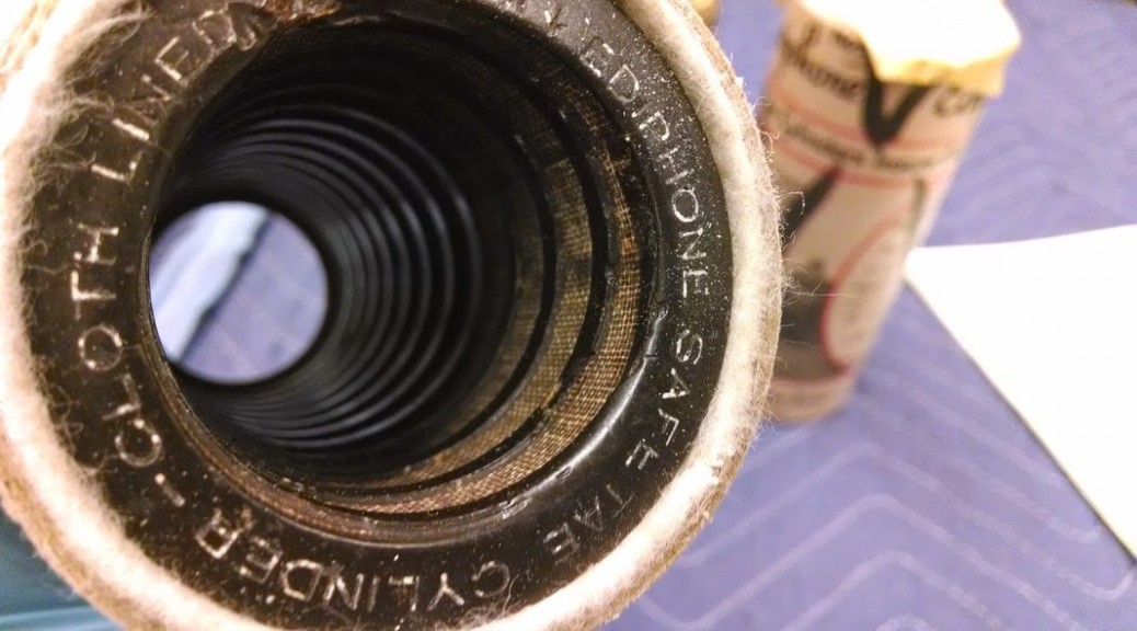
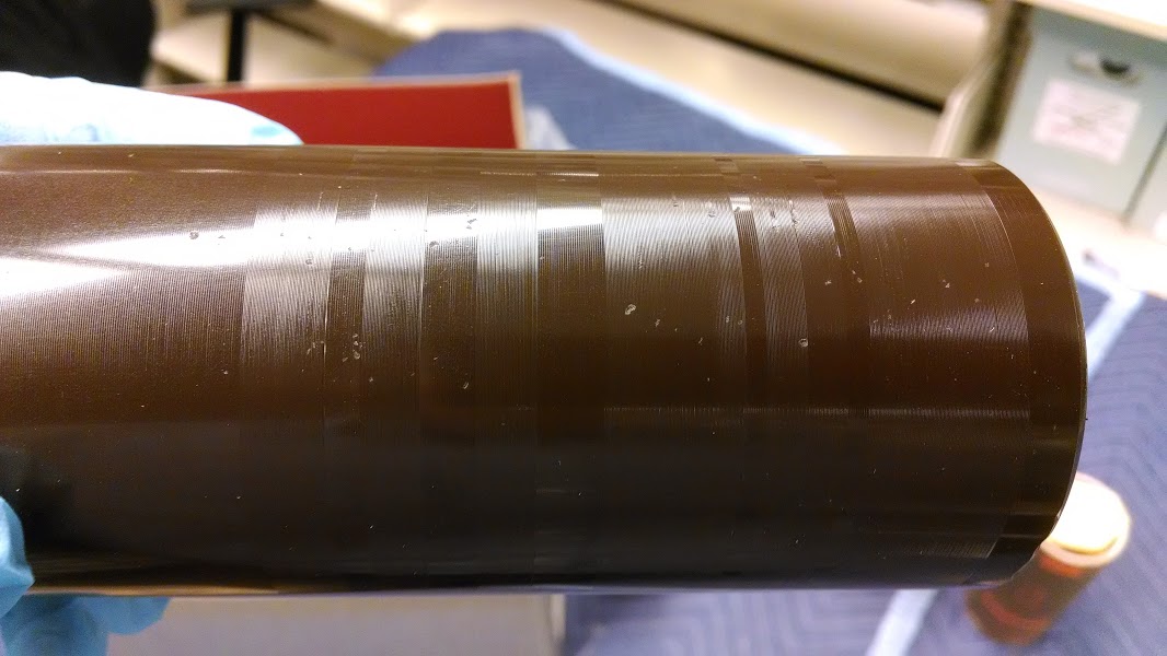
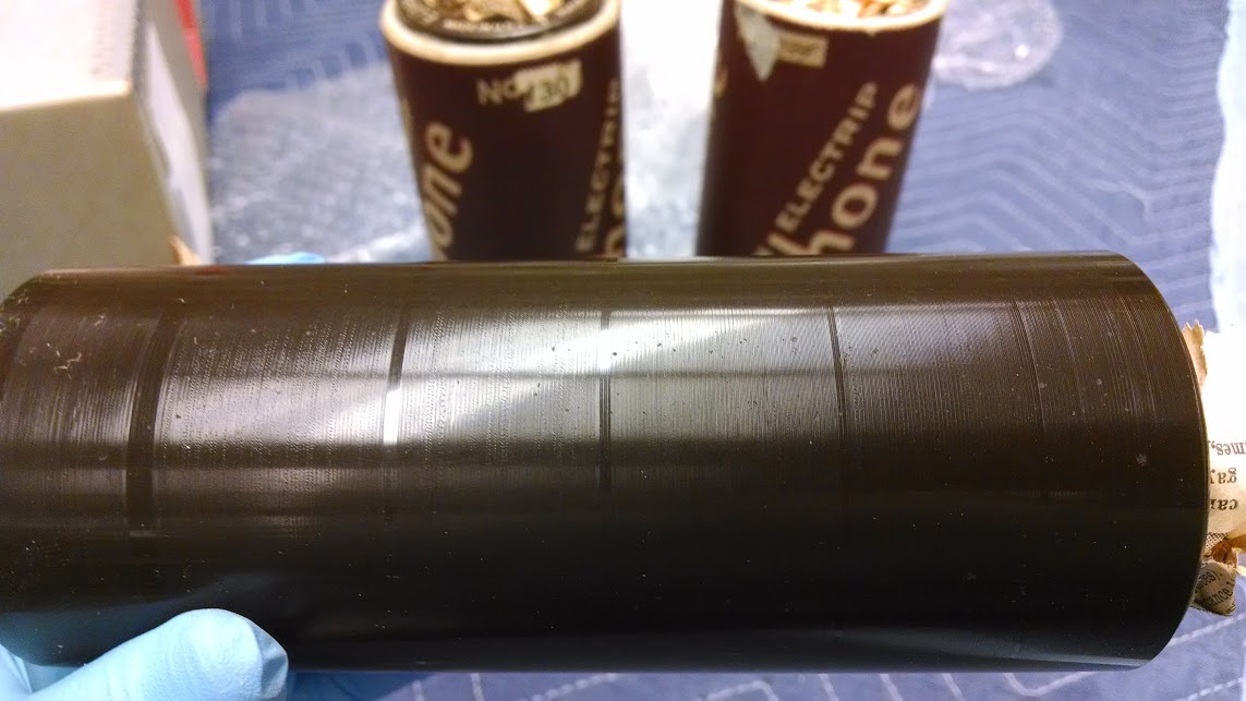
My last several posts have focused on endangered–some would say obsolete–audio formats: open reel tape, compact cassette, DAT, and Minidisc. In this installment, we travel back to the dawn of recorded sound and the 20th Century to investigate some of the earliest commercial recording media. Unlike the formats above, which operate on post-WW2 magnetic and optical technology, these systems carved sound waves into stone (or, more accurately, wax) behind strictly acousto-mechanical principles.
Thomas Edison is credited as inventing the first phonograph (“soundwriter”) on July 18, 1877. It consisted of tinfoil wrapped around a hand-cranked metal cylinder. Sound waves would be funneled through a horn, causing a stylus to vibrate and indent a groove around the outside of the cylinder. The cylinder could be played by reversing the procedure: By retracing the groove with the stylus, the sound would be amplified back through the horn and heard as a rough approximation of the original sound.
Alexander Graham Bell quickly improved the innovation by introducing wax as a superior material for the cylinders and using a needle to scratch the sound waves into their surface. He called his device the “Graphophone”. By 1888, Edison had also adopted wax as the preferred medium for recorded cylinders and a patent-sharing agreement was signed. In 1889, the wax cylinder because the first commercially marketed audio medium.
Initially, the cylinders were installed in the ancestors of jukeboxes in public places. Drop a coin into the slot, and the machine would magically dispense a song, monologue, or comedy routine. The technology was soon adapted for home use. Consumers could purchase prerecorded cylinders to play on their machines. Perhaps more amazingly, they could buy a home recording attachment and cut their own content onto the wax.
[PAUSE—shift from PLAY to RECORD mode]
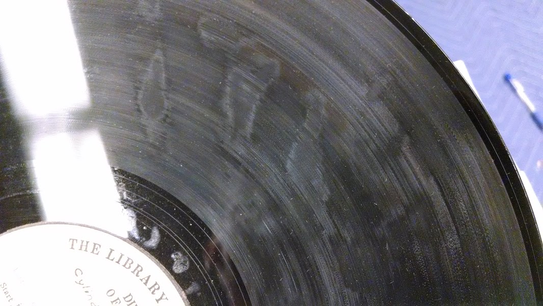
Biographical and Historical Note
Frank Clyde Brown (1870-1943) served as a Professor of English at Trinity College, Duke University, from 1909 until his death. A native of Virginia, he received his Ph.D. at the University of Chicago in 1908. While at Duke University he served in many capacities, including being chairman of his department, University Marshal, and Comptroller of the University during its initial construction. These aspects of his life are chronicled in his papers held by the Duke University Archives.
This collection of materials, however, is concerned with activities to which he devoted equal time and energy, the organization of the North Carolina Folklore Society in 1913 and his personal effort to gather and record the nuances and culture of “folk” of North Carolina and its near neighbors, which occupied him from 1912 until his death. Under the impetus of a 1912 mailing from John A. Lomax, then President of the American Folklore Society, Brown as well as other faculty members and other citizens in North Carolina, became interested in folklore and organized the North Carolina Folklore Society in 1913, with Brown as secretary-treasurer. As secretary-treasurer of this organization from its inception until his death, he provided the organizational impetus behind the Society. Through his course in folklore at Duke, he also sent class after class out to gather the folklore of their locales, both during their studies and afterward. And virtually every summer he could be found in the most remote parts of the state, with notebook and recorder — first a dictaphone employing cylinders, and later a machine employing aluminum discs provided for his use by the University. The result, by 1943, was a collection of about 38,000 written notes on lore, 650 musical scores, 1400 songs vocally recorded, and numerous magazine articles, student theses, books, lists, and other items related to this study. The material originated in at least 84 North Carolina counties, with about 5 percent original in 20 other states and Canada, and came from the efforts of 650 other contributors besides Brown himself.
[STOP]
[POWER OFF]
Thanks to our Audiovisual Archivist, Craig Breaden, for the excellent photos and unused title suggestion (“The Needle and the Damage Done”). Future posts will include updates on work with the Frank C. Brown Collection, other audio collections at Duke, and the history of sound recording and reproduction.
Children are smoking in two of my favorite images from our digital collections.
One of them comes from the eleven days in 1964 that William Gedney spent with the Cornett family in Eastern Kentucky. A boy, crusted in dirt, clutching a bent-up Prince Albert can, draws on a cigarette. It’s a miniature of mawkish masculinity that echoes and lightly mocks the numerous shots Gedney took of the Cornett men, often shirtless and sitting on or standing around cars, smoking.
At some point in the now-distant past, while developing and testing our digital collections platform, I stumbled on “smoking dirt boy” as a phrase to use in testing for cases when a search returns only a single result. We kind of adopted him as an unofficial mascot of the digital collections program. He was a mini-meme, one we used within our team to draw chuckles, and added into conference presentations to get some laughs. Everyone loves smoking dirt boy.
It was probably 3-4 years ago that I stopped using the image to elicit guffaws, and started to interrogate my own attitude toward it. It’s not one of Gedney’s most powerful photographs, but it provokes a response, and I had become wary of that response. There’s a very complicated history of photography and American poverty that informs it.
Screen shot from a genealogy site discussion forum, regarding the Cornett family and William Gedney’s involvement with them.
While preparing this post, I did some research into the Cornett family, and came across the item from a discussion thread on a genealogy site, shown here in a screen cap. “My Mother would not let anyone photograph our family,” it reads. “We were all poor, most of us were clean, the Cornetts were another story.” It captures the attitudes that intertwine in that complicated history. The resentment toward the camera’s cold eye on Appalachia is apparent, as is the disdain for the family that implicitly wasn’t “clean,” and let the photographer shoot. These attitudes came to bear in an incident just this last spring, in which a group in West Virginia confronted traveling photographers whom they claimed photographed children without permission.
The photographer Roger May has undertaken an effort to change “this visual definition of Appalachia.” His “Looking at Appalachia” project began with a series of three blog posts on William Gedney’s Kentucky photographs (Part 1, Part 2, Part 3). The New York Times’ Lens blog wrote about the project last month. His perspective is one that brings insight and renewal to Gedney’s work
Gedney’s photographs have taken on a life as a digital collection since they were published on the Duke University Libraries’ web site in 1999. It has become a high-use collection for the Rubenstein Library; that use has driven a recent project we have undertaken in the library to re-process the collection and digitize the entire corpus of finished prints, proof prints, and contact sheets. We expect the work to take more than a year and produce more than 20,000 images (compared to the roughly 5000 available now), but when it’s complete, it should add whole new dimensions to the understanding of Gedney’s work.
Another collection given life by its digitization is the Sidney Gamble Photographs. The nitrate negatives are so flammable that the library must store them off site, making access impossible without some form of reproduction. Digitization has made it possible for anyone in the world to experience Gamble’s remarkable documentation of China in the early 20th Century. Since its digitization, this collection has been the subject of a traveling exhibit, and will be featured in the Photography Gallery of the Rubenstein Library’s new space when it opens in August.
The photograph of the two boys in the congee distribution line is another favorite of mine. Again, a child is seen smoking in a context that speaks of poverty. There’s plenty to read in the picture, including the expressions on the faces of the different boys, and the way they press their bowls to their chests. But there are two details that make this image rich with implicit narrative – the cigarette in the taller boy’s mouth, and the protective way he drapes his arm over the shorter one. They have similar, close-cropped haircuts, which are also different from the other boys, suggesting they came from the same place. It’s an immediate assumption that the boys are brothers, and the older one has taken on the care and protection of the younger.
Still, I don’t know the full story, and exploring my assumptions about the congee line boys might lead me to ask probing questions about my own attitudes and “visual definition” of the world. This process is one of the aspects of working with images that makes my work rewarding. Smoking dirt boy and the congee line boys are always there to teach me more.
Notes from the Duke University Libraries Digital Projects Team