We are shouting it from the roof tops: The migration from Fedora 3 to Fedora 4 is complete! And Digital Repository Services are not the only ones relieved. We appreciate the understanding that our colleagues and users have shown as they’ve been inconvenienced while we’ve built a more resilient, more durable, more sustainable preservation platform in which to store and share our digital assets.
We began the migration of data from Fedora 3 on Monday, May 23rd. In this time we’ve migrated roughly 337,000 objects in the Duke Digital Repository. The data migration was split into several phases. In case you’re interested, here are the details:
Collections were identified for migration beginning with unpublished collections, which comprise about 70% of the materials in the repository
Collections to be migrated were locked for editing in the Fedora 3 repository to prevent changes that inadvertently won’t be migrated to the new repository
Collections to be migrated were passed to 10 migration processors for actual ingest into Fedora 4
Objects were migrated first. This includes the collection object, content objects, item objects, color targets for digital imaging, and attachments (objects related to, but not part of, a collection like deposit agreements
Then relationships between objects were migrated
Last, metadata was migrated
Collections were then validated in Fedora 4
When validation is complete, collections will be unlocked for editing in Fedora 4
Presto! Voila! That’s it!
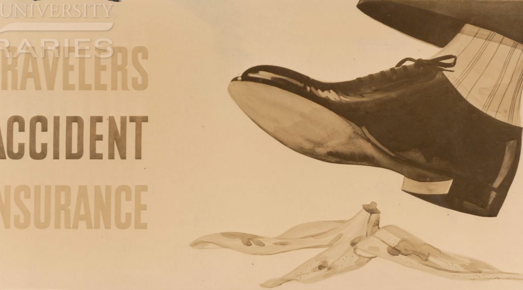
While our customized version of the Fedora migrate gem does some validation of migrated content, we’ve elected to build an independent process to provide validation. Some of the validation is straightforward such as comparing checksums of Fedora 3 files against those in Fedora 4. In other cases, being confident that we’ve migrated everything accurately can be much more difficult. In Fedora 3, we can compare checksums of metadata files while in Fedora 4 object metadata is stored opaquely in a database without checksums that can be compared. The short of it is that we’re working hard to prove successful migration of all of our content and it’s harder than it looks. It’s kind of like insurance- protecting us from the risk of lost or improperly migrated data.
We’re in the final phases of spiffing up the Fedora 4 Digital Repository user interface, which is scheduled to be deployed the week of July 11th. That release will not include any significant design changes, but is simply compatible with the new Fedora 4 code base. We are planning to release enhancements to our Data & Visualizations collection, and are prioritizing work on the homepage of the Duke Digital Repository… you will likely see an update on that coming up in a subsequent blog post!
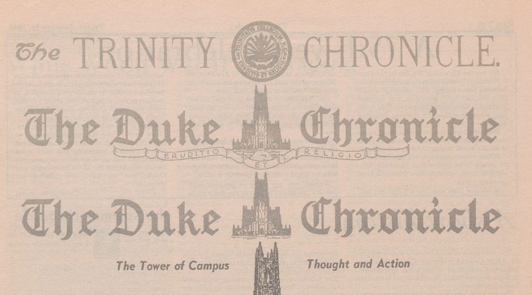
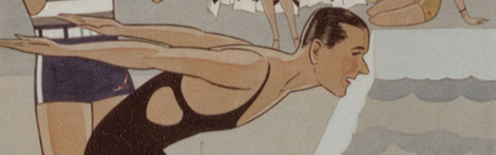
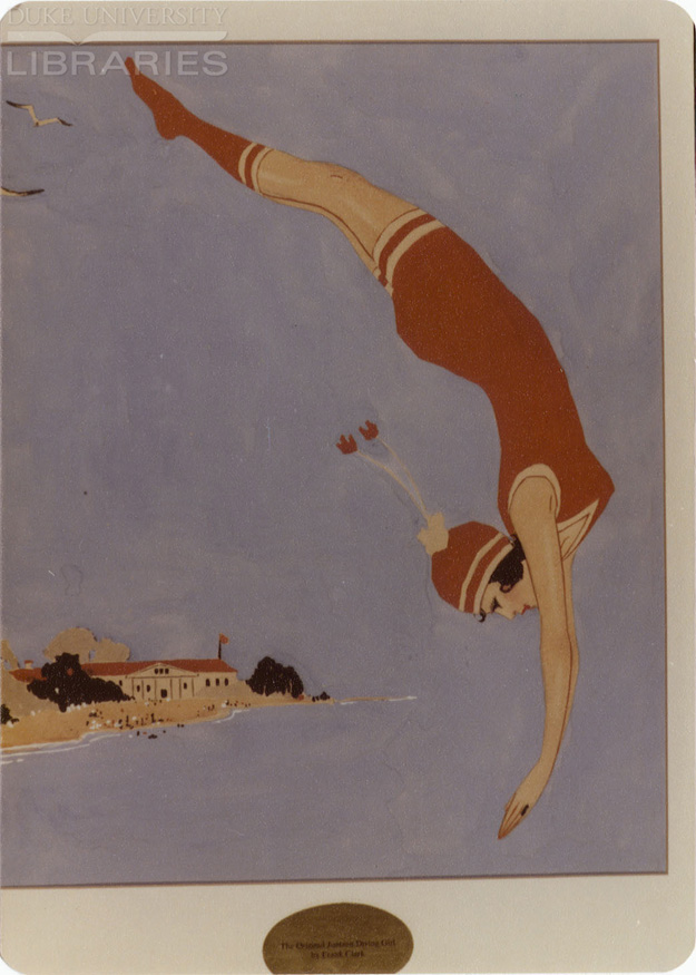
The 1905 to 1939 Chronicle issues are now live online at the Duke Chronicle Digital Collection. This marks the completion of a multi-year project to digitize Duke’s student newspaper. Not only will digitization provide easier online access to this gem of a collection, but it will also help preserve the originals held in the University Archives. With over 5,600 issues digitized and over 63,000 pages scanned, this massive collection is sure to have something for everyone.
The ever issue of the Trinity Chronicle from December 1905!
The first two decades of the Chronicle saw its inception and growth as the student newspaper under the title The Trinity Chronicle. In the mid-1920s after the name change to Duke University, the Chronicle followed suit. In Fall of 1925, it officially became The Duke Chronicle.
The Nineteen-teens saw the growth of the university, with new buildings popping up, while others burned down – a tragic fire decimated the Washington Duke Building.
Back in 1931, our Carolina rivalry focussed on football not basketball
In the shadow of the Great Depression, the 1930s at Duke was a time to unite around a common cause – sports! Headlines during this time, like decades to follow, abounded with games, rivalries, and team pride.
Take the time to explore this great resource, and see how Duke and the world has changed. View it through the eyes of student journalists, through advertisements and images. So much occurred from 1905 to 1989, and the Duke Chronicle was there to capture it.
Post contributed by Jessica Serrao, former King Intern for Digital Collections.
In the Digital Production Center, many of the videotapes we digitize have “bars and tone” at the beginning of the tape. These are officially called “SMPTE color bars.” SMPTE stands for The Society of Motion Picture and Television Engineers, the organization that established the color bars as the North American video standard, beginning in the 1970s. In addition to the color bars presented visually, there is an audio tone that is emitted from the videotape at the same time, thus the phrase “bars and tone.”
SMPTE color bars
The purpose of bars and tone is to serve as a reference or target for the calibration of color and audio levels coming from the videotape during transmission. The color bars are presented at 75% intensity. The audio tone is a 1kHz sine wave. In the DPC, we can make adjustments to the incoming signal, in order to bring the target values into specification. This is done by monitoring the vectorscope output, and the audio levels. Below, you can see the color bars are in proper alignment on the DPC’s vectorscope readout, after initial adjustment.
Color bars in proper alignment with the Digital Production Center’s vectorscope readout. Each letter stands for a color: red, magenta, blue, cyan, green and yellow.
We use Blackmagic Design’s SmartView monitors to check the vectorscope, as well as waveform and audio levels. The SmartView is an updated, more compact and lightweight version of the older, analog equipment traditionally used in television studios. The Smartview monitors are integrated into our video rack system, along with other video digitization equipment, and numerous videotape decks.
The Digital Production Center’s videotape digitization system.
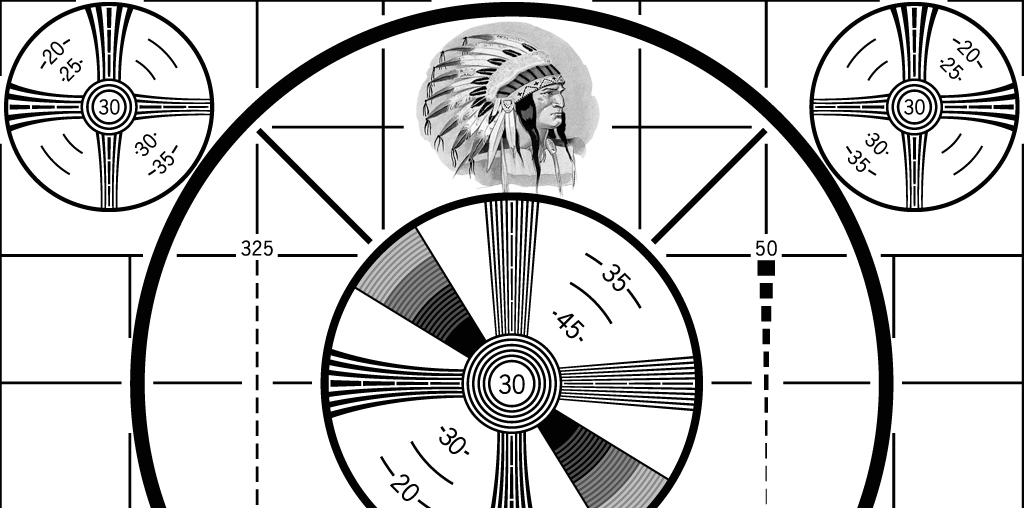
If you are old enough to have grown up in the black and white television era, you may recognize this old TV test pattern, commonly referred to as the “Indian-head test pattern.” This often appeared just before a TV station began broadcasting in the morning, and again right after the station signed off at night. The design was introduced in 1939 by RCA. The “Indian-head” image was integrated into a pattern of lines and shapes that television engineers used to calibrate broadcast equipment. Because the illustration of the Native American chief contained identifiable shades of gray, and had fine detail in the feathers of the headdress, it was ideal for adjusting brightness and contrast.
The Indian-head test pattern was introduced by RCA in 1939.
When color television debuted in the 1960’s, the “Indian-head test pattern” was replaced with a test card showing color bars, a precursor to the SMPTE color bars. Today, the “Indian-head test pattern” is remembered nostalgically, as a symbol of the advent of television, and as a unique piece of Americana. The master art for the test pattern was discovered in an RCA dumpster in 1970, and has since been sold to a private collector. In 2009, when all U.S. television stations were required to end their analog signal transmission, many of the stations used the Indian-head test pattern as their final analog broadcast image.
In previous posts I have referred to the FADGI standard for still image capture when describing still image creation in the Digital Production Center in support of our Digital Collections Program. We follow this standard in order to create archival files for preservation, long-term retention and access to our materials online. These guidelines help us create digital content in a consistent, scalable and efficient way. The most common cited part of the standard is the PPI guidelines for capturing various types of material. It is a collection of charts that contain various material types, physical dimensions and recommended capture specifications. The charts are very useful and relatively easy to read and understand. But this standard includes 93 “exciting” pages of all things still image capture including file specifications, color encoding, data storage, physical environment, backup strategies, metadata and workflows. Below I will boil down the first 50 or so pages.
Full disclosure. Perkins Library and our digitization program didn’t start with any part of these guidelines in place. In fact, these guidelines didn’t exist at the time of our first attempt at in-house digitization in 1993. We didn’t even have an official digitization lab until early 2005. We started with one Epson flatbed scanner and one high end CRT monitor. As our Digital Collections Program has matured, we have been able to add equipment and implement more of the standard starting with scanner and monitor calibration and benchmark testing of capture equipment before purchase. We then established more consistent workflows and technical metadata capture, developed a more robust file naming scheme, file movement and data storage strategies. We now work hard to synchronize our efforts between all of the departments involved in our Digital Collections Program. We are always refining our workflows and processes to become more efficient at publishing and preserving Digital Collections.
Dive Deep. For those of you who would like to take a deep dive into image capture for cultural heritage institutions, here is the full standard. For those of you who don’t fall into this category, I’ve boiled down the standard below. I believe that it’s necessary to use the whole standard in order for a program to become stable and mature. As we did, this can be implemented over time.
Boil It Down. The FADGI standard provides a tiered approach for still image capture, from 1 to 4 stars, with four stars being the highest. The 1 and 2 star tiers are used when imaging for access and tiers 3 and 4 are used for archival imaging and preservation at the focus.
The physical environment: The environment should be color neutral. Walls should be painted a neutral gray to minimize color shifts and flare that might come from a wall color that is not neutral. Monitors should be positioned to avoid glare on the screens (This is why most professional monitors have hoods). Overhead lighting should be around 5000K (Tungsten, florescent and other bulbs can have yellow, magenta and green color shifts which can affect the perception of the color of an image). Each capture device should be separated so that light spillover doesn’t affect another capture device.
Monitors and Light boxes and viewing of originals: Overhead light or a viewing booth should be set up for viewing of originals and should be a neutral 5000K. A light box used for viewing transmissive material should also be 5000K.
Digital images should be viewed in the colorspace they were captured in and the monitor should be able to display that colorspace. Most monitors display in the sRGB colorspace. However, professional monitors use the AdobeRGB colorspace which is commonly used in cultural heritage image capture. The color temperature of your monitor should be set to the Kelvin temperature that most closely matches the viewing environment. If the overhead lights are 5000K, then the monitor’s color temperature should also be set to 5000K.
Calibrating packages that consist of hardware and software that read and evaluate color is an essential piece of equipment. These packages normalize the luminosity, color temperature and color balance of a monitor and create an ICC display profile that is used by the computer’s operating system to display colors correctly so that accurate color assessment can be made.
Capture Devices: The market is flooded with capture devices of varying quality. It is important to do research on any new capture device. I recommend skipping the marketing schemes that tout all the bells and whistles and just stick to talking to institutions that have established digital collections programs. This will help to focus research on the few contenders that will produce the files that you need. They will help you slog through how many megapixels are necessary, what lens are best for which application, what scanner driver is easiest to use while balanced with getting the best color out of your scanner. Beyond the capture device, other things that come into play are effective scanner drivers that produce the most accurate and consistent results, upgrade paths for your equipment and service packages that help maintain your equipment.
Capture Specifications: I’ll keep this part short because there are a wide variety of charts covering many formats, capture specifications and their corresponding tiers. Below I have simplified the information from the charts. These specification hover between tier 3 and 4 mostly leaning toward 4.
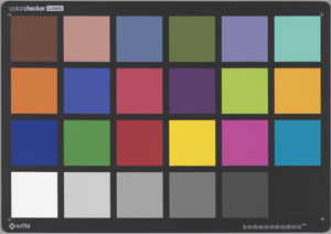
Always use a FADGI compliant reference target at the beginning of a session to ensure the capture device is within acceptable deviation. The target values differ depending on which reference targets are used. Most targets come with a chart representing numerical value of each swatch in the target. Our lab uses a classic Gretagmacbeth target and our acceptable color deviation is +/- 5 units of color.
Our general technical specs for reflective material including books, documents, photographs and maps are:
Master File Format: TIFF
Resolution: 300 ppi
Bit Depth: 8
Color Depth: 24 bit RGB
Color Space: Adobe 1998
These specifications generally follow the standard. If the materials being scanned are smaller than 5×7 inches we increase the PPI to 400 or 600 depending on the font size and dimensions of the object.
Our general technical specs for transmissive material including acetate, nitrate and glass plate negatives, slides and other positive transmissive material are:
Master File Format: TIFF
Resolution: 3000 – 4000 ppi
Bit Depth: 16
Color Depth: 24 bit RGB
Color Space: Adobe 1998
These specifications generally follow the standard. If the transmissive materials being scanned are larger than 4×5 we decrease the PPI to 1500 or 2000 depending on negative size and condition.
Recommended capture devices: The standard goes into detail on what capture devices to use and not to use when digitizing different types of material. It describes when to use manually operated planetary scanners as opposed to a digital scan back, when to use a digital scan back instead of a flatbed scanner, when and when not to use a sheet fed scanner. Not every device can capture every type of material. In our lab we have 6 different devices to capture a wide variety of material in different states of fragility. We work with our Conservation Department when making decisions on what capture device to use.
General Guidelines for still image capture
Do not apply pressure with a glass platen or otherwise unless approved by a paper conservator.
Do not use vacuum boards or high UV light sources unless approved by a paper conservator.
Do not use auto page turning devices unless approved by a paper conservator.
For master files, pages, documents and photographs should be imaged to include the entire area of the page, document or photograph.
For bound items the digital image should capture as far into the gutter as practical but must include all of the content that is visible to the eye.
If a backing sheet is used on a translucent piece of paper to increase contrast and readability, it must extend beyond the edge of the page to the end of the image on all open sides of the page.
For master files, documents should be imaged to include the entire area and a small amount beyond to define the area.
Do not use lighting systems that raise the surface temperature of the original more than 6 degrees F(3 degrees C)in the total imaging process.
When capturing oversized material, if the sections of a multiple scan item are compiled into a single image, the separate images should be retained for archival and printing purposes.
The use of glass or other materials to hold photographic images flat during capture is allowed, but only when the original will not be harmed by doing so. Care must be taken to assure that flattening a photograph will not result in emulsion cracking, or the base material being damaged. Tightly curled materials must not be forced to lay flat.
For original color transparencies, the tonal scale and color balance of the digital image should match the original transparency being scanned to provide accurate representation of the image.
When scanning negatives, for master files the tonal orientation may be inverted to produce a positive The resulting image will need to be adjusted to produce a visually-pleasing representation. Digitizing negatives is very analogous to printing negatives in a darkroom and it is very dependent on the photographer’s/ technician’s skill and visual literacy to produce a good image. There are few objective metrics for evaluating the overall representation of digital images produced from negatives.
The lack of dynamic range in a film scanning system will result in poor highlight and shadow detail and poor color reproduction.
No image retouching is permitted to master files.
These details were pulled directly from the standard. They cover a lot of ground but there are always decisions to be made that are uniquely related to the material to be digitized. There are 50 or so more pages of this standard related to workflow, color management, data storage, file naming and technical metadata. I’ll have to cover that in my next blog post.
The FADGI standard for still image capture is very thorough but also leaves room to adapt. While we don’t follow everything outlined in the standard we do follow the majority. This standard, years of experience and a lot of trial and error have helped make our program more sound, consistent and scalable.
Audiovisual materials account for a significant portion of Duke’s Digital Collections. All told, we now have over 3,400 hours of A/V content accessible online, spread over 14,000 audio and video files discoverable in various platforms. We’ve made several strides in recent years introducing impactful collections of recordings like H. Lee Waters Films, the Jazz Loft Project Records, and Behind the Veil: Documenting African American Life in the Jim Crow South. This spring, the Duke Chapel Recordings collection (including over 1,400 recordings) became our first A/V collection developed in the emerging Duke Digital Repository platform. Completing this first phase of the collection required some initial development for A/V interfaces, and it’ll keep us on our toes to do more as the project progresses through 2019.
A video interface in the Duke Chapel Recordings collection.
Preparing A/V for Access Online
When digitizing audio or video, our diligent Digital Production Center staff create a master file for digital preservation, and from that, a single derivative copy that’s smaller and appropriately compressed for public consumption on the web. The derivative files we create are compressed enough that they can be reliably pseudo-streamed (a.k.a. “progressive download”) to a user over HTTP in chunks (“byte ranges”) as they watch or listen. We are not currently using a streaming media server.
Here’s what’s typical for these files:
Audio. MP3 format, 128kbps bitrate. ~1MB/minute.
Video. MPEG4 (.mp4) wrapper files. ~17MB/minute or 1GB/hour.
The video track is encoded as H.264 at about 2,300 kbps; 640×480 for standard 4:3.
The audio track is AAC-encoded at 160kbps.
These specs are also consistent with what we request of external vendors in cases where we outsource digitization.
The A/V Player Interface: JWPlayer
Since 2014, we have used a local instance of JWPlayer as our A/V player of choice for digital collections. JWPlayer bills itself as “The Most Popular Video Player & Platform on the Web.” It plays media directly in the browser by using standard HTML5 video specifications (supported for most intents & purposes now by all modern browsers).
In the Duke Digital Repository and our archival finding aids, we’re now using the latest version of JWPlayer. It’s got a modern, flat aesthetic and is styled to match our color palette.
JW Player displaying inline video for the Jazz Loft Project Records collection guide.
Playlists
Here’s an area where we extended the new JWPlayer with some local development to enhance the UI. When we have a playlist—that is, a recording that is made up of more than one MP3 or MP4 file—we wanted a clearer way for users to navigate between the files than what comes out of the box. It was fairly easy to create some navigational links under the player that indicate how many files are in the playlist and which is currently playing.
A multi-part audio item from Duke Chapel Recordings.
Captions & Transcripts
Work is now underway (by three students in the Duke Divinity School) to create timed transcripts of all the sermons given within the recorded services included in the Duke Chapel Recordings project.
We contracted through Popup Archive for computer-generated transcripts as a starting point. Those are about 80% accurate, but Popup provides a really nice interface for editing and refining the automated text before exporting it to its ultimate destination.
Caption editing interface provided by Popup Archive
One of the most interesting aspects of HTML5 <video> is the <track> element, wherein you can associate as many files of captions, subtitles, descriptions, or chapter information as needed. Track files are encoded as WebVTT; so we’ll use WebVTT files for the transcripts once complete. We’ll also likely capture the start of a sermon within a recording as a WebVTT chapter marker to provide easier navigation to the part of the recording that’s the most likely point of interest.
JWPlayer displays WebVTT captions (and chapter markers, too!). The captions will be wonderful for accessibility (especially for people with hearing disabilities); they can be toggled on/off within the media player window. We’ll also be able to use the captions to display an interactive searchable transcript on the page near the player (see this example using Javascript to parse the WebVTT). Our friends at NCSU Libraries have also shared some great work parsing WebVTT (using Ruby) for interactive transcripts.
The Future
We have a few years until the completion of the Duke Chapel Recordings project. Along the way, we expect to:
add closed captions to the A/V
create an interactive transcript viewer from the captions
work those captions back into the index to aid discovery
add a still-image extract from each video to use as a thumbnail and “poster frame” image
offer up much more A/V content in the Duke Digital Repository
A broadside is a single-sheet notice or advertisement, often textual rather than pictorial. The historical type of broadsides called ephemera (the Latin word, inherited from Greek, referred to things that do not last long) are temporary documents created for a specific purpose and intended to be thrown away.
The Broadsides and Ephemera Collection (David M. Rubenstein Rare Book & Manuscript Library, Duke University) captures written and printed materials of widespread and short-lived use; items, such as event announcements, letters, tickets, posters, social notices, or printouts on current political affairs whose impact was not meant to sustain the test of time. These are the materials that I want to bring to your attention.
The collection includes items from more than 28 countries. The material is quite heterogeneous in terms of content and historical periods. From the Viceroyalty of Peru, to the tensions between Japanese and American soldiers in the early 1940s in the Philippines, one feels a bit like a time traveler without much of a compass, navigating across a sea of material of daunting complexity. After the first scroll through the many rows and tabs in the collection’s Excel sheet, I began questioning, amidst gallons of coffee, the romantic view of the cataloging librarian as a detective of knowledge long lost. Voltaire’s words at the beginning of The Age of Louis XIV regained strength: “Not everything that is done deserves recording”.
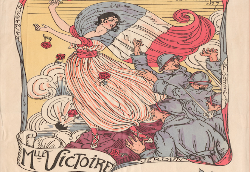
Feria de Abril 1932. Sevilla ( Spring Festival 1932)
Yet, as I delved deeper into the collection, I quickly discovered that Ephemera provides a unique window to understand much about the working of human communities all over the world. In fact, the range of common themes emerging is sort of striking given its geographical and temporal scope. It is actually fun. Let me focus on three themes that consistently emerge across the different sections of the international broadsides.
Ephemera work first as a record of the basic organization of social communities. In these instances art becomes a tool to highlight key moments in the everyday life of very diverse communities. The contrast between the 1932 poster for the “Feria de Abril” in Seville, Spain and the 1946 University of Oxford’s Almanac is very telling in this regard. The former serves to mark the most important week in any given year in Seville’s life: around Easter, the city turns into a mixture of art, devotion, and excess in a perfectly balanced and stratified way (different sectors, businesses and social classes get together to party at night after taking part in the parades or processions thanking and honoring the patrons/matrons of the different churches in the city).
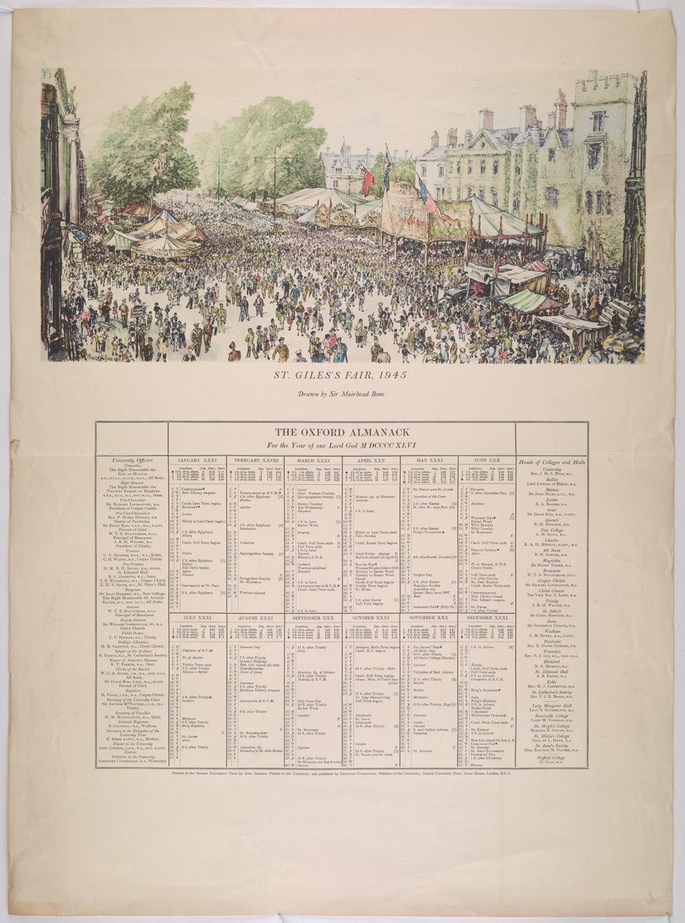
The Oxford Almanac, for the year of our Lord God MDCCCCXLVI.
The Almanac provides a list of the head of colleges and the university calendar, making public the key milestones in the life of the university. While the purpose and activities highlighted by these two items could not be more different, their basic function is the same. Both convey useful knowledge about the life of two cities driven by very different pursuits. I know where I would rather study, but it is also quite clear where one ought to go to have some real fun.
Order for taking off the Chimney-Money. In this document is addressed the suppression by the king of the hearth tax in England, and the reaction of the citizens, very grateful of have being liberated from this onerous duty.
A second function of the sort of items included in the international broadsides is to offer a glimpse of political and social relations in many different places. The records on England, for instance, include a letter from subjects to the new King, William of Orange, thanking him for the removal of a the “hearth tax” in 1689, or a piece capturing neatly the scope and goals of the chartist movement in their quest for universal male suffrage, the secret ballot, and annual Parliament elections among other things.
Birmingham Reform petition, part of a working-class movement for political reform in Britain, called Chartism.
The contrast between these two documents (William of Orange order for taking off the Chimney-Money, and the Birmingham Reform Petition) captures nicely the road traveled in England from the Glorious Revolution at the end of the 17th century, to the forefront of economic and political modernization in the 19th century, when the Chartism took place.
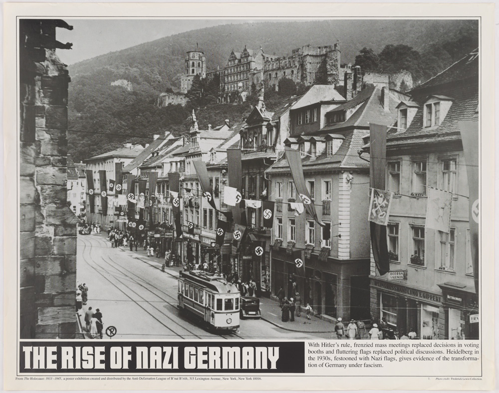
On a grimmer note, the records on Germany capture effectively the rise of the National Socialist German Workers’ Party (commonly referred to in English as the Nazi Party) in the interwar period in cities like Heidelberg, and the consequences that ensued in terms of mass casualties for ones or exile for others.
Heidelberg in 1930, festooned with Nazi flags, giving evidence of the transformation of Germany under fascism.
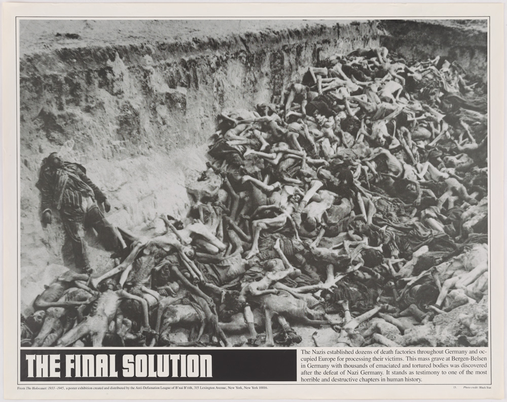
Photograph of a mass grave at Bergen-Belsen concentration camp in Germany with thousand of emanciated and tortured bodies.
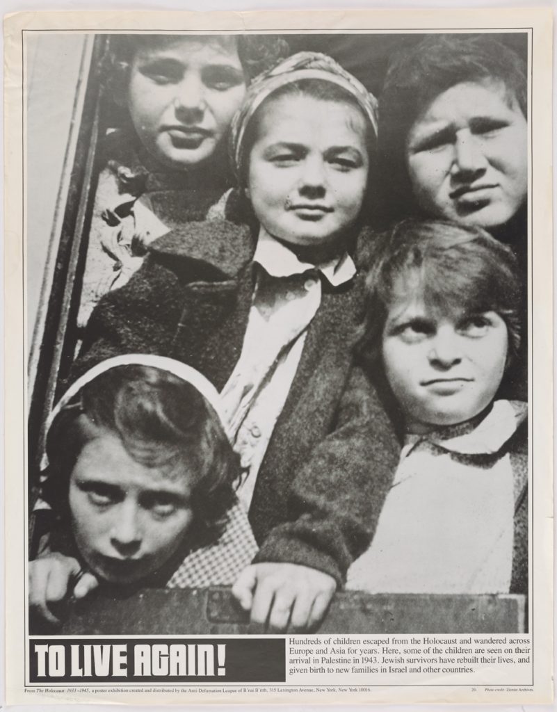
To live again! Photograph of Jewish children, survivors, arriving to Palestine.
But the richest and most comprehensive theme that gives coherence to the records across different countries is the one of war and political persuasion/propaganda. Persuasion comes in very different forms. It can be intellectually driven and directed to small circles: the English records feature letters from American activists to English political philosophers such as John Stuart Mill in a quest for support for the anti-slavery movement. Or it can be emotionally driven and directed to broad populations. It is in this particular variety of ephemera where Duke’s International Broadsides Collection really shines.
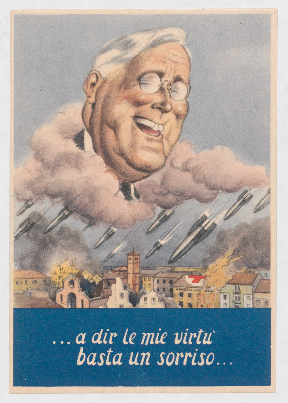
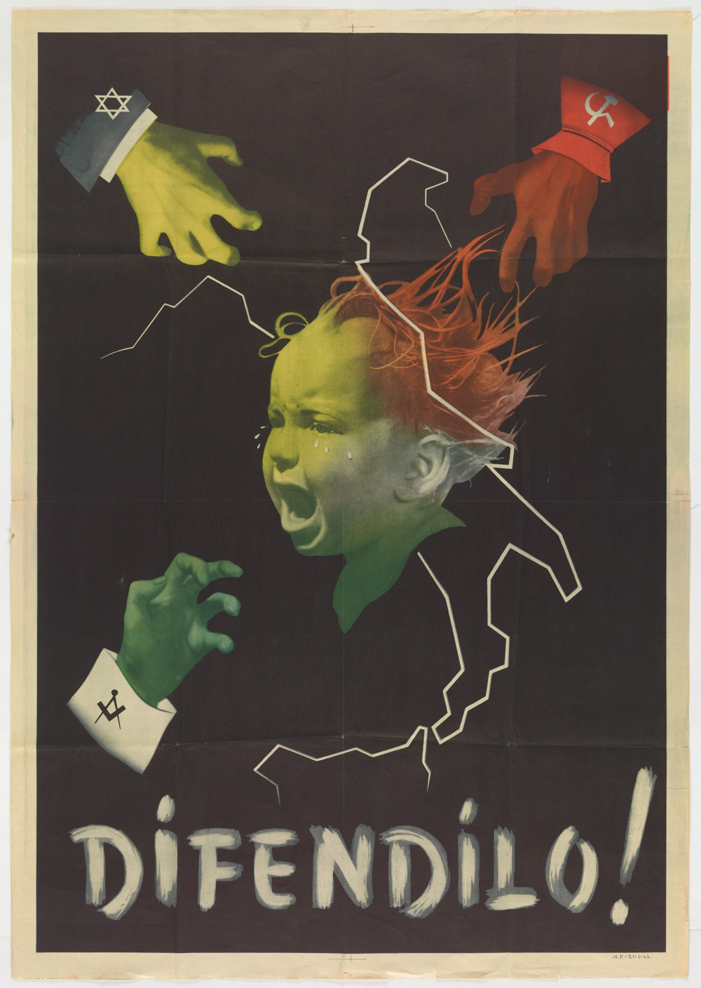
Italiani, l’inverno è alle porte (Italians, winter is coming.)… a dir le mie virtu basta un sorriso…. (…a smile is enough to show my virtues…)Difendilo! (Defend it!) Fascist propaganda poster, alludes at the need to protect the Italian children from the dangers of Communism, Judaism and Freemasonry.
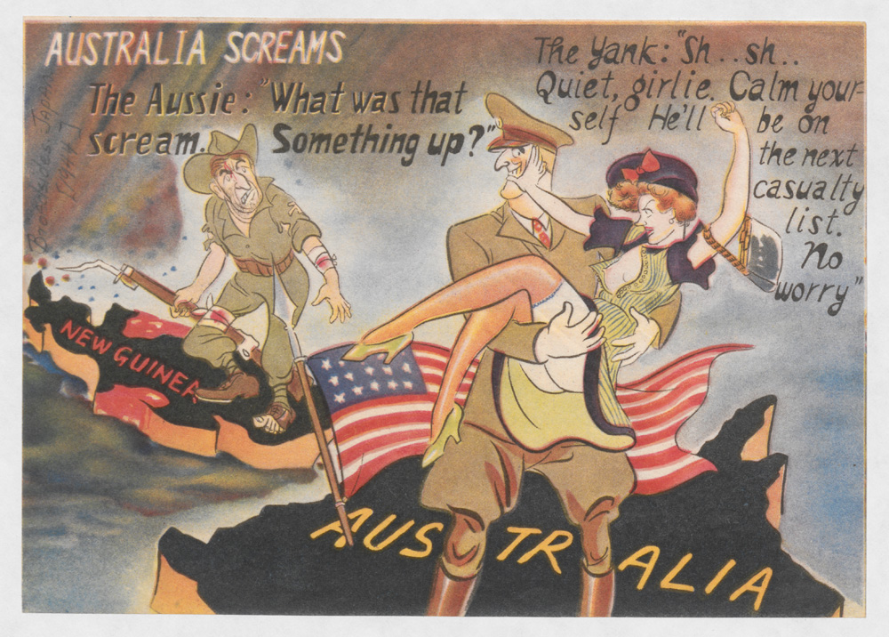
The records contain dozens of art manifestations from pro-Axis actors in Italy, Germany, and Japan, as well as efforts from the British and U.S. armies to undermine the morale and support of Japanese troops in the Philippines after 1945. Among the former, who knew that the motto of House Stark in Game of Thrones (Winter is coming) was to be found in a piece of political propaganda from Italian fascists against the Allies? Or that Franklin Delano Roosevelt’s virtuous smile was wider the more missiles fell on the Italian cities? Or that the good children of Italy were at risk of being pulled apart by the three evils of Communism, Judaism and Freemasonry? Or that the Australian soldiers would do better to return home to protect their women from the American soldiers’ predatory behavior? Australia screams. Japanese anti-American leaflet trying to persuade the Australians to go home because the American soldiers staged in Australia were seducing their wives.
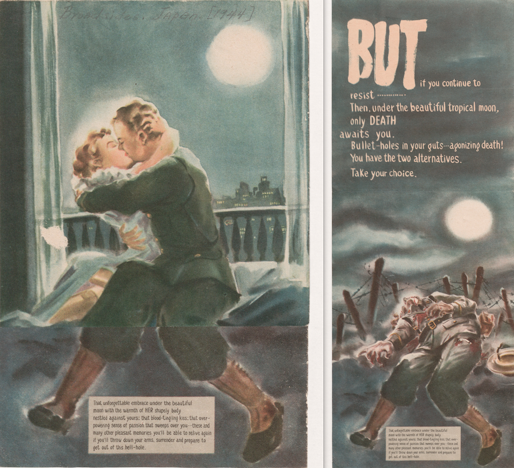
Finally, another good example is this tricky Japanese leaflet. At first, it appears to show just an soldier and his wife embracing under the beautiful moon, but when it is unfolded, although we can still see the soldier’s undamaged legs, we see that he is dead on the battlefield near a barbed wire.
This Japanese war propaganda leaflet shows a soldier and his wife embracing under the beautiful moon… ….but when the leaflet is unfolded, you still see the soldier’s undamaged legs, however he is dead on the battlefield near a barbed wire.
Regardless of their goals, values, and motives, and our views about them, it is remarkable to observe how all parties involved use popular forms of art and imagery to appeal to their constituencies’ worst fears and prejudices about the other and to present themselves as the more humane side.
As you can see there is much to learn and enjoy by delving in collections such as the international broadsides. Along the process, the metadata librarian confronts an important trade-off between efficiency and usefulness, between speed in processing and detail in the amount of information provided for the prospective user. If we want the collection to be useful for students and scholars, it is necessary to provide a minimum of contextual information for them to be able to locate each item and make the best of it. Yet in many instances this proves a challenging task, one that may well require hours, if not days, of digging into every possible angle that may prove helpful. At the extreme, this is bound to pose too much of a burden in terms of processing time. At this point, I do not have a magic formula to balance this trade-off but I tend to lean on the side of providing as much detail as required for a proper understanding of each piece. Otherwise, the digitally processed item will fail to meet Voltaire’s criteria for what deserves to be recorded. A record in a vacuum, whether in bites or ink, hardly allows users to appreciate those “little things” that, as Conan Doyle’s axiom has it, “are infinitely the most important”.
Wouldn’t you rather read a post featuring pictures of cats from our digital collections than this boring item about a migration project that isn’t even really explained? Detail from Hugh Mangum photographs – N318.
While I would really prefer to cat-blog my merry way into the holiday weekend, I feel duty-bound to follow up on my previous posts about the digital collections migration project that has dominated our 2016.
Meanwhile, we are working closely with our colleagues in Digital Repository Services to facilitate a whole other migration, from Fedora 3 to 4, and onto a new storage platform. It’s the great wheel in which our own wheel is only the wheel inside the wheel. Like the wheel in the sky, it keeps on turning. We don’t know where we’ll be tomorrow, though we expect the platform migration to be completed inside of a month.
A poster like this, with the added phrase “Friday’s coming,” used to hang in one of the classrooms in my junior high. I wish we had that poster in our digital collections.
Last time, I wrote hopefully of the needle moving on the migration of digital collections into the new platform, and while behind the scenes the needle is spasming toward the FULL side of the gauge, for the public it still looks stuck just a hair above EMPTY. We have two batches of ten previously published collections ready to re-launch when we roll over to Fedora 4, which we hope will be in June – one is a group of photography collections, and the other a group of manuscripts-based collections.
In the meantime, the work on migrating the digital collections and building a new UI for discovery and access absorbs our team. Much of what we’ve learned and accomplished during this project has related to the migration, and quite a bit has appeared in this blog.
Our Metadata Architect, Maggie Dickson, has undertaken wholesale remediation of twenty years’ worth of digital collections metadata. Dealing with date representation alone has been a critical effort, as evidenced by the seriesofposts by her and developer Cory Lown on their work with EDTF.
Sean Aery has posted about his work as a developer, including the integration of the OpenSeadragon image viewer into our UI. He also wrote about “View Item in Context,” four words in a hyperlink that represent many hours of analysis, collaboration, and experimentation within our team.
I expect, by the time the wheel has completed another rotation, and it’s my turn again to write for the blog, there will be more to report. Batches will have been launched, features deployed, and metadata remediated. Even more cat pictures will have been posted to the Internet. It’s all one big cycle and the migration is part of it.
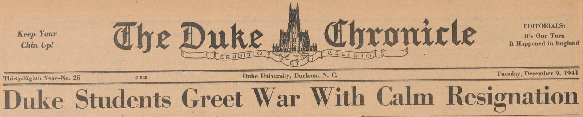
The Digital Projects and Production Services is excited to announce that the 1940s and 1950s Chronicle are now digitized and accessible online at the Duke Chronicle Digital Collection. These two new decades represent the next installment in a series of releases, which now completes a string of digitized Chronicles spanning from 1940 to 1989.
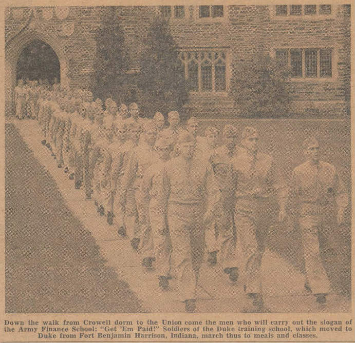
Headline from December 9, 1941Army Finance Officers living at Duke, September 16, 1942
The 1940s and 1950s took Americans from WWII atrocities and scarcities to post-war affluence of sprawling suburbias, mass consumerism, and the baby boom. It marked a time of changing American lifestyles—a rebound from the Great Depression just ten years before. At Duke, these were decades filled with dances and balls and Joe College Weekends, but also wartime limitations.
Omicron Delta Kappa Fraternity Symbol, November 22, 1940
A year before the Japanese bombed Pearl Harbor, Duke lost its president of thirty years, William Preston Few. The Chronicle reported Few to be “a remarkable man” who “worked ceaselessly towards [Duke University’s] growth” during a time when it was “a small, practically unheard-of college.” While Duke may have been relatively small in 1940, it boasted a good number of schools and colleges, and a lively social scene. Sorority and fraternity events abounded in the 1940s and 1950s. So, too, did fights to overhaul the fraternity and sorority rushing systems. Social organizations and clubs regularly made the Chronicle’s front page with their numerous events and catchy names, like Hoof ‘n’ Horn, Bench ‘n’ Bar, and Shoe ‘n’ Slipper. These two decades also saw milestone celebrations, like the Chronicle’s 50th anniversary and the 25th Founders’ Day celebration.
Duke captures the wrong ram, November 13, 1942
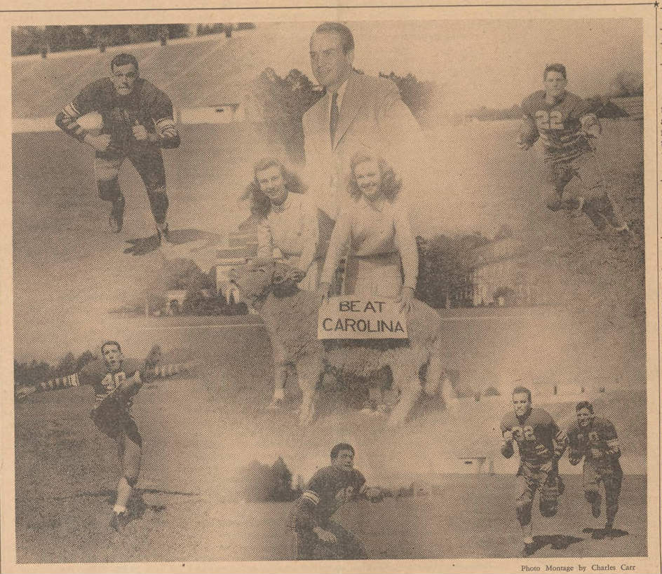
Sports was another big headliner. In 1942, Duke hosted the Rose Bowl. Usually played in Pasadena, California, the game was moved to Durham for fear of a Japanese attack on the West Coast during World War II. The 1940s also saw the rivalry between Duke and UNC escalate into violent outbursts. Pranks became more destructive and, in 1945, concerned student leaders pleaded for a “cease-fire.” Among the pranks were cases of vandalism and theft. In 1942, Duke “ramnappers” stole what they believed to be Carolina’s ram mascot, Rameses. It was later discovered they heisted the wrong ram. In 1949, unknown assailants painted the James B. Duke statuein Carolina blue, and Duke administration warned students against retaliation. As one article from 1944 informs us, the painting of Duke property by UNC rivals was not a new occurrence, and if a Carolina painting prankster was captured, the traditional punishment was a shaved head. In an attempt to reduce the vandalism and pranks, the two schools’ student governments introduced the Victory Bell tradition in 1948 to no avail. The pranks continued into the 1950s. In 1951, Carolina stole the Victory Bell from Duke, which was returned by police to avoid a riot. It was again stolen and returned in 1952 after Duke’s victory over Carolina. That year, the Chronicle headline echoed the enthusiasm on campus: BEAT CAROLINA! I urge you to explore the articles yourself to find out more about these crazy hijinks!
The articles highlighted here are only the tip of the iceberg. The 1940s and 1950s Chronicles are filled with entertaining and informative articles on what Duke student life was like over fifty years ago. Take a look for yourself and see what these decades have to offer!
The SNCC Digital Gateway is a collaborative, Mellon-funded project to document the history and legacy of the Student Nonviolent Coordinating Committee on a digital platform. One of the challenges of this undertaking is the physical distance between many of the project partners. From Washington, D.C. to St. Cloud, MN and Durham, NC to Rochester, NY, the SNCC veterans, scholars, librarians, and staff involved in the SNCC Digital Gateway Project are spread across most of the country. We’ve had collaborators call in anywhere from grocery stores in Jacksonville to the streets of Salvador da Bahia. Given these arrangements and the project’s “little d” democracy style of decision-making, communication, transparency, and easy access to project documents are key. The digital age has, thankfully, given us an edge on this, and the SNCC Digital Gateway makes use of a large selection of digital platforms to get the job done.
Say hello to Trello, an easy-to-use project management system that looks like a game of solitaire. By laying cards in different categories, we can customize our to-do list and make sure we have a healthy movement between potential leads, what’s slated to be done, and items marked as complete. We always try to keep our Trello project board up-to-date, making the project’s progress accessible to anyone at anytime.
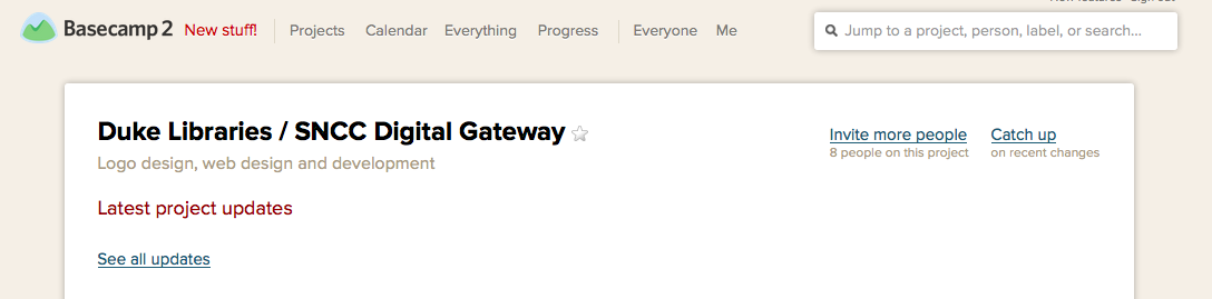
While we use Trello for as a landing board for much of our internal communication, Basecamp has come in handy for our work with Digital Projects and our communication with the website’s design contractor, Kompleks Creative. Basecamp allows us to have conversations around different pieces of project development, as we provide feedback on design iterations, clarify project requirements, and ask questions about the feasibility of potential options. Keeping this all in one place makes this back-and-forth easy to access, even weeks or months later.
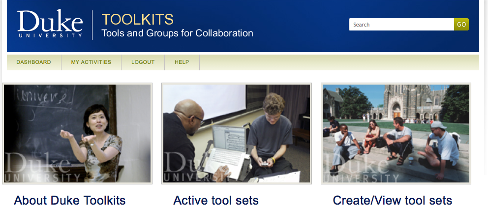
Much of the project’s administrative documents fall into Box, a platform available through Duke that is similar to Dropbox but allows for greater file security. With Duke Toolkits, you can define a project and gain access to a slew of handy features, one of which is a project designation within Box (giving you unlimited space). That’s right, unlimited space. So, apart from allowing us to organize all of the many logistical and administrative documents in a collective space, Box is able to rise to the challenge of large file sharing. We use Box as a temporary landing platform through which we send archival scans, videos, audio recordings, and other primary source material to project partners.
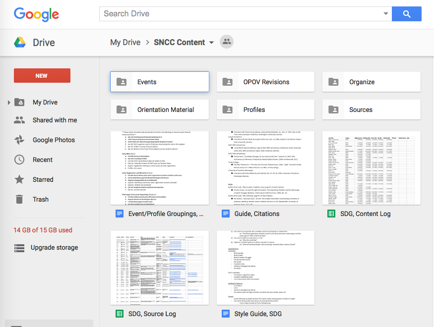
With the student project team, we’re also producing hundreds of pages worth of written content and look to Google Drive as our go-to for organization, access, and collaborative editing. Upon the completion of a set of drafts, we hold a workshop session where other members of the project team comment, critique, and contribute their knowledge. After a round of edits, drafts then go to SNCC veteran and former journalist Charlie Cobb, who puts red pen to paper (figuratively). With one more round of fact-checking and source logging, the final drafts are ready for the website.
And who doesn’t like to see the face of who they’re talking to? We make good use of Skype and Google Hangouts for long distance calls, and Uber Conference when we need to bring a lot of people into the conversation. And finally, an ongoing volley of e-mails, texts, and phone calls between individual project partners helps keep us on the same page.
While non-exhaustive, these are some of the digital platforms that have helped us get to where we are today and maintain communication across continents in this intergenerational and interdisciplinary collaboration.
Back in the fall, we convened a Metadata Task Group (which I chair) charged, in part, with defining, overseeing, and performing the work necessary to remediate Duke University Libraries’ digital collections metadata in preparation for migration from our old technical platform to the Duke Digital Repository. This involved an intensive analysis and review of our existing metadata field usage, and documentation of that analysis as well as recommendations for remediation. Before we truly engaged with this work, however, we defined a set of guiding principles to provide ourselves with a context for completing our tasks.
The first guiding principle we defined was that of Fitness for Purpose. As applied to metadata work, fitness for purpose entails that metadata be appropriate for user and system needs, both now and, in as much as it can be predetermined, in the future. This is an overarching principle which informs subsequent guiding principles. It seems like a pretty basic concept, but I think it is all too easy to lose sight of who will be using the collections we create metadata for (which is a difficult question to answer anyways), and of course, it’s always important to ensure that the metadata specifications take into account the technical environment in which it will live.
Our next guiding principle is Broad Applicability. Over the past 20 years, digital collections at Duke were developed often in an ad hoc way, each digital collection’s metadata specifications being created in a somewhat isolated fashion. Now that we have a dedicated staff person (me!) to take a comprehensive look at metadata practices at DUL, we are very interested in developing guidelines and specifications that can be applied broadly, across a variety of collections and materials. This is especially important considering the breadth and variety of collections that will live together in the Duke Digital Repository.
Along with Broad Applicability, Broad Shareability is equally important. With the formation of metadata aggregators such as the Digital Public Library of America, the possibilities for sharing our metadata and thus our resources broadly is much greater than in the past, and therefore metadata must be remediated, created, and mapped to widely used standards in ways that allow for clear, meaningful sharing. As much as possible, we are aligning our metadata practices with the DPLA’s Metadata Application Profile.
And, of course, our guiding principles wouldn’t be complete without a nod toward the future: our last principle is that we be Forward-Thinking. Change is a constant when working with metadata/digital resources, and so we must do our best to develop recommendations and guidelines that allow for this eventuality, e.g., adopting standards and practices that have the greatest staying power and allow for the adoption of new technologies. Specifically, we should be aware of linked data technologies and make recommendations that are linked-data aware and/or ready.
At the outset of this project it had felt a little bit like, “well, duh”, to develop these broad guiding principles, but at 6+ months in, I am really glad we took the time to define them – I have referred back to them periodically as we tackle each task in our charge, and find them helpful not just when communicating outside our group but as a way to provide a sort of intellectual context internally as well.
Notes from the Duke University Libraries Digital Projects Team