
Just over one year ago, Duke University Library’s Web Experience team charged a new subgroup – the Discovery Strategy Team – with “providing cohesion for the Libraries’ discovery environment and facilitate discussion and activity across the units responsible for the various systems and policies that support discovery for DUL users.” Jacquie Samples, head of the Metadata and Discovery Strategy Department in our Technical Services Unit, and I teamed up to co-chair the group, and we were excited to take on this critical work along with 8 of our colleagues from across the libraries.
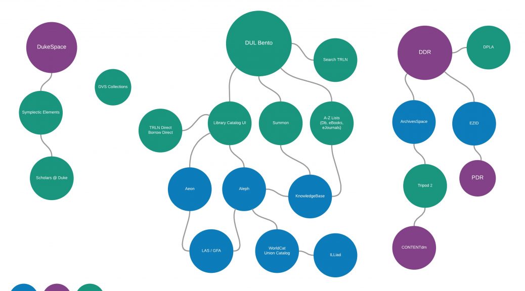
Our first task was one that had long been recognized as a need by many people throughout the library – to create an up-to-date visualization of the systems that underpin DUL’s discovery environment, including the data sources, data flows, connections, and technical/functional ownership for each of these systems. Our goal was not to depict an ideal discovery landscape but rather to depict things as they are now (ideal could come later).
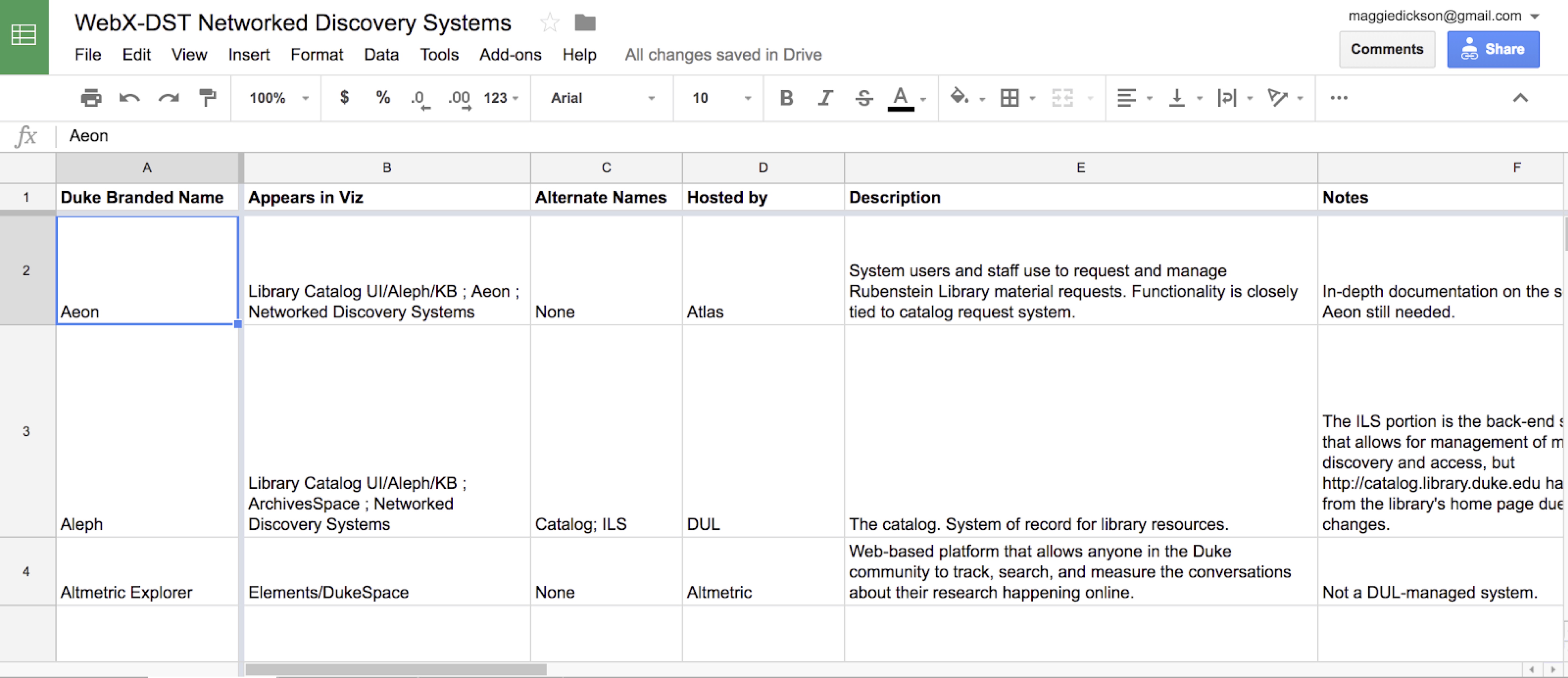
Before we could create a visualization of these systems and how they interacted, however, we realized we needed to identify what they were! This part of the process involved creating a giant laundry list of all of systems in the form of a google spreadsheet, so we could work on it collaboratively and iteratively. This spreadsheet became the foundation of the document we eventually produced, containing contextual information about the systems including:
- Name(s) of the system
- Description/Notes
- Host
- Path
- Links to documentation
- Technical & functional owners
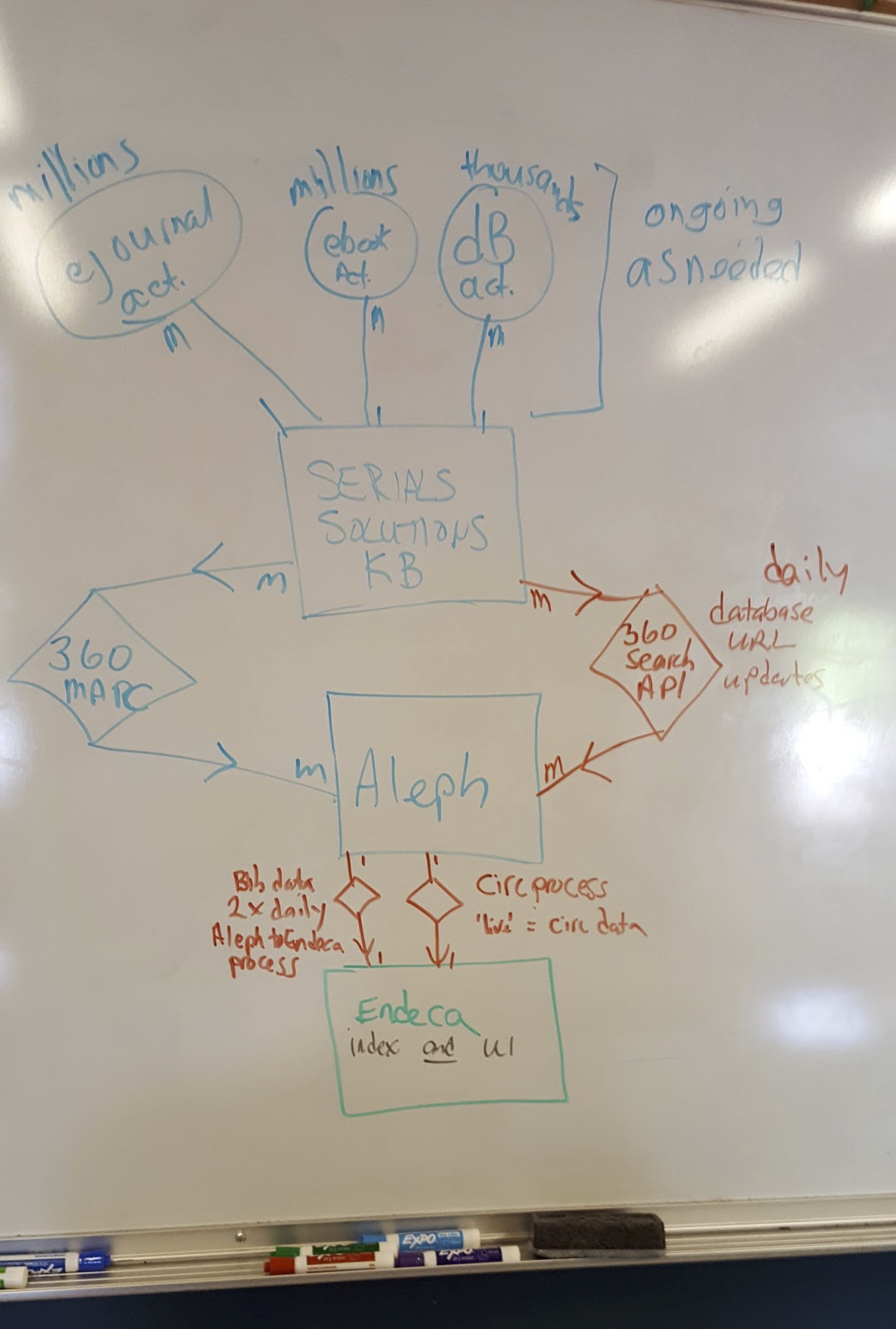
Once we had our list of systems to work from, we began the process of visualizing how they work here at DUL. Each meeting of the team involved doing a lot of drawing on the whiteboard as we hashed out how a given system works – how staff & other systems interact with it, whether processes are automated or not, frequency of those processes, among other attributes. At the end of these meetings we would have a messy whiteboard drawing like this one:
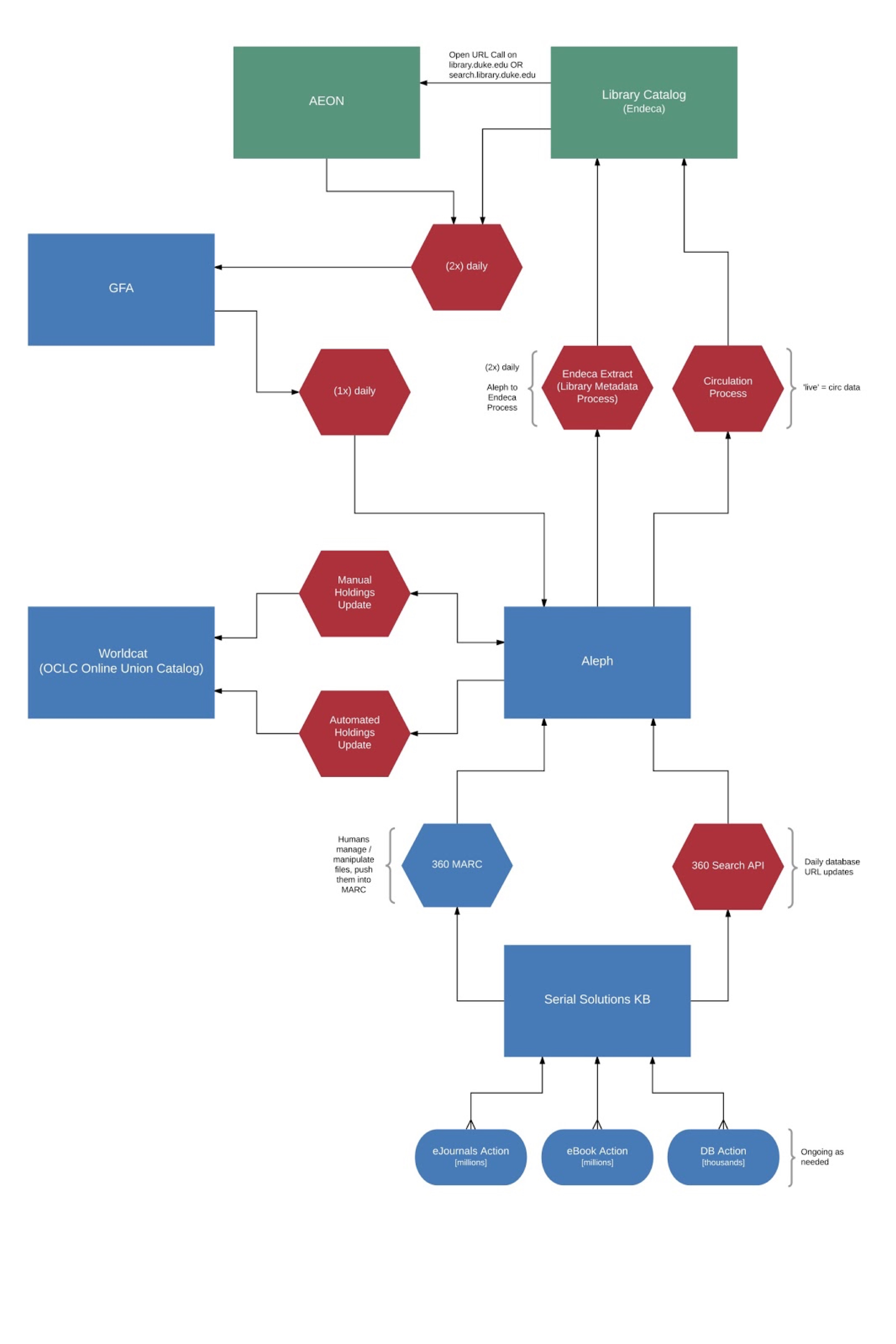
We were very lucky to have the talented (and patient!) developer and designer Michael Daul on the team for this project, and his role was to take our whiteboard drawings and turn them into beautiful, legible visualizations using Lucidchart:
Once we had created visualizations that represented all of the systems in our spreadsheet, and shared them with stakeholders for feedback, we (ahem, Michael) compiled them into an interactive PDF using Adobe InDesign. We originally had high hopes of creating a super cool interactive and zoomable website where you could move in and out to create dynamic views of the visualizations, but ultimately realized this wouldn’t be easily updatable or sustainable. So, PDF it is, which may not be the fanciest of vehicles but is certainly easily consumed.
We’ve titled our document ‘Networked Discovery Systems at DUL”, and it contains two main sections: the visualizations that graphically depict the systems, and documentation derived from the spreadsheet we created to provide more information and context for each system. Users can click from a high-level view of the discovery system universe to documentation pages, to granular views of particular ‘constellations’ of systems. Anyone interested in checking it out can download it from this link.
We’ve identified a number of potential use cases for this documentation, and hope that others will surface:
- New staff orientation
- Systems transparency
- Improved communication
- Planning
- Troubleshooting
We’re going to keep iterating and updating the PDF as our discovery environment shifts and changes, and hope that having this documentation will help us to identify areas for improvement and get us closer to achieving that ideal discovery environment.
One thought on “Mapping Duke University Libraries’ Discovery System Environment”
Comments are closed.