
We have learned a lot about how to improve our item pages and we’ve gathered great examples from around the web as inspiration. We’re now ready to share some wireframe prototypes.
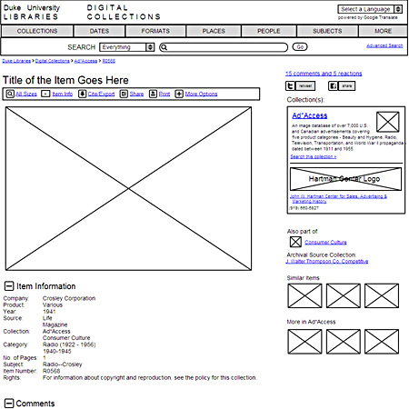
There are four different wireframe prototypes here. Use the ‘Jump To’ section at the top to look at versions A, B, C, and D. Preferences? Ideas? Concerns? Questions? Let us know what you think!
In addition to incorporating the feedback and ideas we’ve gathered so far, here are a few additional key things these designs attempt to address:
- Bring the objects to life by enabling comments and both encouraging and capturing discourse around them in other places on the web (like Twitter, blogs, Facebook). We’re looking at different services to help meet this objective.
- Add a main navigation bar to help people more easily browse for the kinds of things we know they often look for via searches.
- Increase engagement with the site from the item pages by providing enticing leads to related stuff, whether entire collections or individual objects. We want to see item pages less as destination pages, and more as jumping-off points to the rest of our content.
- Let items belong to multiple ‘collections’ though maintain strong context, branding, and contact info for the item’s primary collection.
- Help the site better serve an international audience. We’re considering using the Google Translate widget as one approach. You can see it in action at sites like the Museum of London and Powerhouse Museum.
- Incorporate new posts from our blog & Twitter account to keep fresh content on the page and encourage people to connect with us.
This is great! I’m now in a Digital Libraries class at Simmons GSLIS and we are just looking at ways to test website usability. I love the way you are sharing the process. Believe me, it helps the rest of us.
Off the cuff, I prefer version A because the “browse by” options are prominently featured. And although I appreciate having information about the larger collection, it clutters up the page. Not sure how you ccan solve that one.
Wow, your prototypes look great! I love how you have incorporated information gathered about user preferences and needs. I think that design C is the most compelling, followed by design A. From first glance of design C, I can see whether other users have interacted with the digital object. I think having the object title at the top makes it more prominent, and having a brief description of the larger collection gives context and draws users to some of the topics covered by that particular collection. Thank you for sharing — looking forward to seeing the finished look!
these are great mock-ups! at first glance, i like ‘a’ the best because it gives the object prominence while still incorporating links to more info about the collection and tools for citing, sharing, and other ways to use the object. it also looks a little sleeker. i also like the way you handled the right side of the screen in ‘d’ with twitter and fb options near links to collections info so that similar items can be seen with minimal scrolling. it will be interesting to hear what users have to say about them.
@Fran – Thanks! Sharing our design process on our blog has been beneficial to us, too. It has also been nice to try out some new tools–Notable and Mockingbird–to help communicate our work. For usability testing, we’re fortunate to have a new usability lab here in the library with Morae software. We’ll be putting that to good use for our project in early 2010.
We’re hoping to make our ‘Browse by’ options obvious and prominent on every page and are glad to hear feedback on where to best put those links.
With the collection info, our challenge is to give some context for the item–especially for visitors who arrive directly at the item page–without competing too much for real estate with the item itself.
@Audra – Thank you. That’s a good point: C does make it clearer whether an item has been commented on–whether on our site or elsewhere. That section gains prominence by pushing the collection information down slightly.
@Debra – Thanks. I think A is most similar in structure to our current layout and is the most minimalist approach of the four. The D mockup frees up space to the right at the expense of putting more info and context above the item.
I like that the item is prominently featured in “A”. It’s clear at a glance that the primary content column is devoted to information about the item, and the sidebar contains information about the collection holding the item and related items.
From a researching perspective, the reactions and comments would be useful but not so much that it should be more prominent than the collection data on the item itself.
The header design in “A” is also nice. With a clear flow of logic from “Duke” to “Digital Library Collections” to “Browsing”.
The only thing I’d really change is an actual search box for the current collection instead of a link to “search the current collection”.
It would also be nice if the various pieces of metadata below the item were links to searches for those terms.
On first glance, I like prototype A best — I like the rounded “browse by” navigation bar in the top right. All four work well, though — C would be my pick if you decide to have the nav bar stretch across the top of the page. Good luck!
Sean, these are all great mock-ups. They take advantage of many design elements that users already know from sites like Flickr and YouTube. Of all the mockups, I prefer design A for a few reasons: 1) the browse by options are more noticeable at the top of the screen and don’t span the entire page, which sort of distracts from the search box. 2) The collection info box at right provides nice context, whereas placing in in the banner as in D creates some confusion about what you’re searching and browsing. I also like the distinction between the primary collection and the “also part of…” collection in A.
Some design elements I like in C,D:
C) the “item info” link in the action bar jumps to metadata if users don’t initially notice the metadata below the fold. Also, there is a link to “comments and feedback” near the top, so users don’t have to scroll to provide feedback.
D) the Google translator appears at the top of the page.
Some general comments/questions:
1) Will the metadata be linked in the Item Description section?
2) How will unusually shaped items affect item page layout? I’m thinking of long and narrow newspaper clippings, negative strips, etc.)
3) How will we display multi-page items?
4) How can we display full-text of an item, or long descriptions?
Again, these mockups are all great. Thanks for all of your work.
@Stephen – Good point about the ‘Browse by’ options being in a natural flow. I’ve heard from others that the text ‘Browse by’ sets a better expectation for what’s going to happen when those links are clicked, too. One tradeoff for putting those in the upper-right is that we’d have to move the translate widget, but it’d also make the header not take up so much vertical space. The metadata values will indeed be linked (I just didn’t make them blue in the mockup).
@Emily – Great hearing feedback on the location of that navigation. It sounds as if people are in agreement that it’s a good idea to have it and now it’s more a matter of deciding where to put it.
@Noah – Good observation about the named-anchor links. ‘Item Info’ and the ‘Comments’ links would jump down to the corresponding parts of the page. That’ll be even more valuable when there’s a tall, narrow image; in that case, those sections might not be initially visible onscreen.
For pagination, we’ve got more exploring to do. We might use the Internet Archive bookreader and if so, the page would look something like this. Any suggestions for other tools are certainly welcome.
For full-text, we’ll need more discussions & prototypes. One possibility would be to have the full text of the object presented in a new section below the item info section. It might be truncated by default but can be expanded with a [+]. That section could also have a button to pop-out the full text in a browser window that can be dragged to wherever makes it easiest for a user to see the text & the digitized page side by side.
I’d have to go for C…it’s got the most info above the fold (but still doesn’t look too cluttered) and I like having the browse options in that navigation that spans the whole page. The browse option in design a looked to me like they would be missed…
I love the idea of having the little thumbnails of similar items in there. We’ve toyed with that idea but never got that far…
Thanks, Gretchen! We’ll see if we can pull off the similar items section. It’s a feature that isn’t critical or core to the app, but it’s a “nice-to-have” that’d help entice visitors to keep exploring. We like how the ‘Additional Resources’ section in your interface accomplishes that goal.
Hi Sean,
* Overall like the way Design B balances the various items on the page with patron usability and collection sponsor interests.
* like the way Design B includes some item information in upper right (above collection info) with link to more item information further down the page.
* like prominent Item title
* like “similar items” and “more in [collection]” sections.
* like “also part of [collection]” link
* like option bar (sizes, cite/export, share, print, etc.)
* like link to archival source collection
* like inclusion of Google Translate widget
* like including comments, blog posts, etc.
* like everything about design of masthead area above the breadcrumbs
* For search box, in addition to options to search everything and within current collection, could we experiment with option to search by item types?
Cheers,
Tom