Story Maps

Telling Stories with Maps

StoryMap Pic1“Story maps” are a popular method of telling place-themed stories and engaging with your audience over the web. Story maps are highly interactive, allowing users to follow along a path or time-line with links to content along the way. They’re also a great way to visualize current events and news topics in a way that brings perspective and context to important issues. As a student or researcher, you can use maps to tell a story about your research study area. In that sense, they can be a great tool for drawing attention to your work, and you could consider it another form of social media.

Creating a web map may seem like a challenge if you’ve never done it before, but there are several tools available online that can quickly and easily generate a story map. For this post, I’ll introduce you to two different types of story maps and suggest some free tools for creating your own.

Mapping Places or Events 

Story maps that cover a series of events are useful for contextualizing news events, giving an online tour, or linking to almost any kind of location specific information. Story maps of this style are fun to use because they typically provide both a map and multimedia content. The user accesses the information in an interactive format -which is a great way for your message to sink in!

For example, I created this story map that links historic building photos of the Construction of Duke University to their locations on a map.

View the full size map here.

Some applications for this type of story map are publishing information about research areas, adding new points of access for digital humanities, or documenting travel or a field expedition.

Thematic Maps

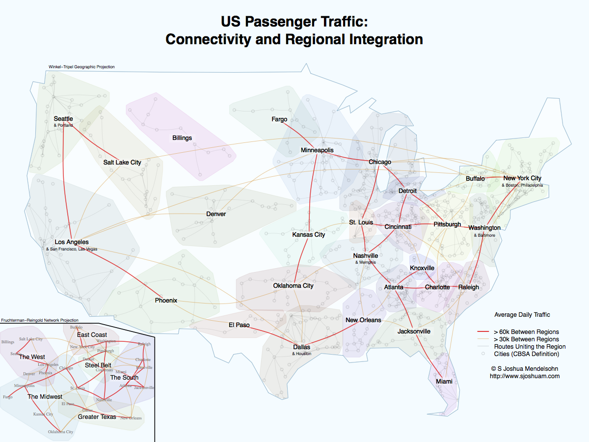
Another popular style of story map is one that presents a series of thematic maps. These types of maps often depict how changes have occurred over time in a place or perhaps the unfolding of a news event. Side-by-side comparison of maps can also be a visually interesting way to illustrate an important issue. An interesting comparison map might show US Census demographic data from different census years in a city to show how people have changed.

This map illustrates how manufacturing jobs have changed around Flint Michigan from 1990 to 2010.

Click here for full size.

There are also some really cool interactive features out there for this style of map like a tabbed viewer, a swipe or slide function between two different maps, and ESRI’s SpyGlass.

Create Your Own!

Some great tools are available to the Duke community and freely on the web that let you create these types of “story maps” with minimal training. Here are three tools you can use and what each does best…

StoryMap JS is a completely free and open access tool by the Knight Lab at Northwestern University. A Google account is necessary because StoryMap JS actually saves the maps you create in the recent folder of your Google Drive. StoryMap JS is incredibly easy to use, too. It has a very simple and intuitive interface that will let you start making your map in minutes. You can also use StoryMap JS for non-cartographic visual materials, and there is a cool off-shoot that allows your to instantly map 20 recent geo-tagged Instagram photos from any user account. Best Uses: Try using StoryMap JS when you’re telling a story that unfolds over a path or timeline. It’s also great for linking to media like photos or YouTube content.

Social Explorer You may have used Social Explorer before to gather US Census data, but you can also create thematic maps that you can share or embed in a website. With your Duke credentials, you have access to the Professional Edition. The data is pre-loaded, so you’re just a few clicks away from a beautifully shaded thematic map of US Census Data that you can share over the web. The map interface is user-friendly and has a “Change Layout” button at the bottom center that creates side-by-side and swipe comparison maps. You can also create an annotated presentation that let’s the user cycle through a series of maps. Here is a quick example of a map presentation I made in Social Explorer. Best Uses: Social Explorer’s best use is for mapping US Census data. The “Tell a Story” function allows you to join graphs and other media to your map and create interactive presentation slides.

ESRI ArcGIS Online For more advanced users, or just those looking for more customization options, ArcGIS Online offers an abundance of tools and templates for creating attractive and engaging map presentations. ArcGIS Online Story Maps require an account with ESRI. You can sign up for a free public account, or, for more advanced features, you can request a free organizational account that is available to the Duke community. To take advantage of all ArcGIS Online has to offer, you will need to familiarize yourself with the how to use it. Once you’ve made a few maps, you can load maps and multimedia content into any of ESRI’s Story Map Apps. Take a look at this gallery of to view some examples of what you can do with Story Maps in ArcGIS Online. Even though there is a bit of a learning curve to ArcGIS Online, the pay off is huge.

Here is a customized slider map I made using the Story Map Swipe App that shows changes in North Carolina’s Congressional District Boundaries following the 2012 redistricting. Use the slider to swipe between views.

View the full size map here.

Best Uses: Fully customized story maps of any type. Great for telling place-based stories and presenting a series of thematic maps complete with multimedia content.

I hope you enjoyed viewing some of these story maps! I’m sure you can see that there are many different uses for this type of media. If you’ve made a cool story map, feel free to share it with us in the comments!

Welcome to the Current Population Statistics on the Web

Duke University recently acquired access to the online version of its Current Population Statistics (CPS) CD-ROM collection to facilitate easy access to CPS data (Unicon’s CPS Utilities on the Web).  This blog post will walk through the basic data extraction process.  The interface is comparable to that provided by the CD, and users of this collection will find the interface and powerful.  Please note that the instructions provided on the web site are very important to read, particularly for those unfamiliar with the CPS CD version.

Create an Account

When you visit the Unicon site (http://unicon.com/), click the “CPS on Web” link to the left, then click the Register button.  You will have to enter some information to complete the registration process.

Once complete, submit the information.  Once the registration window closes, choose the CPS series (or month) you wish to query, and log in to the system.


1Navigation and Data Extraction

Once logged in, you will see a popup window like that shown in the image to the right.  For a typical data extraction, the following steps are advised.

1) First, click the Set Option button and chang4e the timeout to at least 300 seconds.  This will ensure successful data extraction.

2) Next, click the Make an Extraction button, followed by the Request Editor button on the next page.  You should see a page similar to that below (all variables used in your prior extraction will be listed).

23) Remove any variables you do not need.  Next, make certain the variable you wish to include is selected at the top and click “Add Variable(s).”  Alternatively, if you already know the names of the variables, you may type them into the boxes provided on the page.

4) Once all variables are added to the selection, click Continue.  On the following page, specify the output format for the dataset.  Once complete, be certain to select one or more years (at the top).  After you have selected years, click the Extract button.

5) On the following page, you will be presented with a list of variables by year.  As variables change across years in some cases, not all selected variables may be present for each year.  When selecting variables, checking the “View Documentation” checkbox at the top will allow for browsing of available years.


Other Useful Tools

– The Make a Table button allows for the construction of crosstabs of observations, means, and other statistics.  This is helpful if the goal is to locate variables for analysis or if there is a choice between two or more variables.

– The Make a Graph button is also useful for data exploration.  The program provides the ability to construct hsitograms, line charts, scatter ploys, pie charts, and bar charts.  Basic summaries of a variable can also be generated from this page.

– If your data need to be weighted to represent the US population, be certain to select the appropriate weight under the Apply Weights button before extraction.

– Subsets of individuals can also be produced under the Specify Universe button.  For example, a specific race or gender can be specified to reduce the sample to what you need.

Meet Data and Visualization Services

Data and Visualization Services LogoThe fall of 2014 marks the completion of the first five years of the libraries’ Data and GIS Services Department. In 2009, when Mark Thomas and I formed the department, the name accurately reflected our staffing and services as Mark focused on GIS-related issues and I focused on data-related issues. As an increasing number of scholars have embraced data-driven research over the last five years , our services and staff have grown to support an increasingly diverse set of research needs at Duke.

In 2010-2011 academic year, the Libraries launched services around data management and sharing plans in anticipation of new funding rules surrounding research data. In 2012, the library expanded data services in collaboration with OIT’s Research Computing to offer one of the first data visualization consulting positions in the country. In 2013 and 2014, we expanded services and staff to include consultations on research computing and big data.

At this year’s Data and GIS Services annual retreat, we decided that the time has come to change the name of the department to reflect the broader range of staff and consulting services available. While we continue to support our traditional dimensions of data and GIS research, we intend to support a range of data needs across the following five themes:

Data and Visualization Services Themes

Data Sources
Get the data you need. Data and Visualization Services consultants can help you locate and license a diverse range of data sources.  We also provide long term storage for Duke data collections through Duke’s institutional repository.

Data Storage and Management
Need help on a data management plan, want advice on archiving, or struggling with “big data” analytics?  We are happy to consult!

Data Cleaning and Analysis
From Google Refine to the command line, we can help with data cleaning and analysis.

Mapping and GIS
Mapping and spatial analysis remain a core service for the data and visualization program.

Data Visualization
Our data visualization service can help with the most effective way to represent your data for both analysis and communication.


We appreciate the research community’s support as we’ve grown over the last five years.  We look forward to working with you on a larger range of data challenges in the future!

Mapping in Google Spreadsheets

Screen Shot 2014-06-04 at 4.33.57 PM
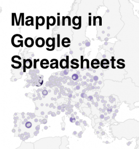
Here at Data & GIS Services, we love finding new ways to map things.  Earlier this semester I was researching how the Sheets tool in Google Drive could be used as a quick and easy visualization tool when I re-discovered its simple map functionality.  While there are plenty of more powerful mapping tools if you want to have a lot of features (e.g., ArcGIS, QGIS, Google Fusion Tables, Google Earth, GeoCommons, Tableau, CartoDB), you might consider just sticking with a spreadsheet for some of your simpler projects.

I’ve created a few examples in a public Google Sheet, so you can see what the data and final maps look like.  If you’d like to try creating these maps yourself, you can use this template (you’ll have to log into your Google account first, and then click on the “Use this template” button to get your own copy of the spreadsheet).

Organizing Your Data

The main thing to remember when trying to create any map or chart in a Google sheet is that the tool is very particular about the order of columns.  For any map, you will need (exactly) two columns.  According to the error message that pops up if your columns are problematic: “The first column should contain location names or addresses. The second column should contain numeric values.”

Of course, I was curious about what counts as “location names” and wanted to test the limits of this GeoMap chart.  If you have any experience with the Google Charts API, you might expect the Google Sheet GeoMap chart to work like the Geo Chart offered there.  In the spreadsheet, however, you have only a small set of options compared to the charts API.  You do have two map options — a “region” (or choropleth) map and a “marker” (or proportional symbol) map — but the choices for color shading and bubble size are built-in or limited.

Screen Shot 2014-06-04 at 4.36.54 PM
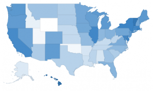
Region maps (Choropleths)

Region maps are fairly restrictive, because Google needs to know the exact boundary of the country or state that you’re interested in.  In a nutshell, a region map can either use country names (or abbreviations) or state names (or abbreviations).  The ISO 3166-1 alpha-2 codes seem to work exceptionally well for countries (blazing fast speeds!), but the full country name works well, too.  For US states, I also recommend the two letter state abbreviation instead of the full state name. If you ever want to switch the map from “region” to “marker”, the abbreviations are much more specific than the name of the state.  (For example, when I switch my “2008 US pres election” map to marker, Washington state turns into a bubble over Washington DC.)

Screen Shot 2014-06-04 at 4.37.57 PM
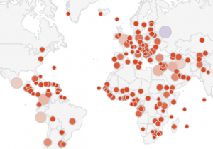
Marker maps (Proportional symbol maps)

Marker maps, on the other hand, allow for much more flexibility.  In fact, the marker map in Google Sheets will actually geocode street addresses for you.  In general, the marker map will work best if the first column (the location column) includes information that is as specific as possible.  As I mentioned before, the word “Washington” will go through a search engine and will get matched to Washington DC before Washington state.  Same with New York.  But the marker map will basically do the search on any text, so the spreadsheet cell can say “NY”, or “100 State Street, Ithaca, NY”, or even the specific latitude and longitude of a place. (See the “World Capitals with lat/lon” sheet; I just put latitude and longitude in a single column, separated with a comma.)  As long as the location information is in a single column, it should work, but the more specific the information is, the better.

Procedure

Screen Shot 2014-06-04 at 4.31.56 PMWhen you have your data ready and want to create a map, just select the correct two columns in your spreadsheet, making sure that the first one has appropriate location information and the second one has some kind of numerical data.  Then click on the “Insert” menu and go down to “Chart…”  You’ll get the chart editor.  The first screen will be the “Start” tab, and Google will try to guess what chart you’re trying to use.  It probably won’t guess a map on the first try, so just click on the “Charts” tab at the top to manually select a map.  Map is one of the lower options on the left hand side, and then you’ll be given a choice between the regions and markers maps.  After you select the map, you can either stick with the defaults or go straight to the final tab, “Customize,” to change the colors or to zoom your map into a different region.  (NB: As far as I can tell, the only regions that actually work are “World,” “United States,” “Europe,” and “Asia”.)

Screen Shot 2014-06-04 at 4.33.35 PMThe default color scale goes from red to white to green.  You’ll notice that the maps automatically have a “mid” value for the color.  If you’d rather go straight from white to a dark color, just choose something in the middle for the “mid” color.

And there you have it!  You can’t change anything beyond the region and the colors, so once you’ve customized those you can click “Update” and check out your map.  Don’t like something?  Click on the map and a little arrow will appear in the upper right corner.  Click there to open the menu, then click on “Advanced edit…” to get back to the chart editor.  If you want a bigger version of the map, you can select “Move to own sheet…” from that same menu.

Pros and Cons

So, what are these maps good for?  Well, firstly, they’re great if you have state or country data and you want a really quick view of the trends or errors in the data.  Maybe you have a country missing and you didn’t even realize it.  Maybe one of the values has an extra zero at the end and is much larger than expected.  This kind of quick and dirty map might be exactly what you need to do some initial exploration of your data, all while staying in a spreadsheet program.

Another good use of this tool is to make a map where you need to geocode addresses but also have proportional symbols.  Google Fusion Tables will geocode addresses for you, but it is best for point maps where all the points are the same size or for density maps that calculate how tightly clusters those points are.  If you want the points to be sized (and colored) according to a data variable, this is possibly the easiest geocoder I’ve found.  It’ll take a while to search for all of the locations, though, and there is probably an upper limit of a couple of hundred rows.

If this isn’t the tool for you, don’t despair!  Make an appointment through email (askdata@duke.edu) or stop in to see us (walk-in schedule) to learn about other mapping tools, or you can even check out these 7 Ways to Make a Google Map Using Spreadsheet Data.

Top 10 List – Data and GIS Edition

As we begin our summer in Data and GIS Services, we spend this post reflecting back on some of the services, software, and tools that made data work this spring more productive and more visible.  We proudly present our top 10 list for the Spring 2014 semster:

10. DMPTool
While we enjoy working directly with researchers crafting data management plans, we realize that some data management needs arise outside of consultation hours.  Fortunately, the Data Management Planning Tool (DMPTool) is there 24/7 to provide targeted guidance on data management plans for a range of granting agencies.

9. Fusion Tables
A database in the cloud that allows you to query and visualize your data, Fusion Tables has proven a powerful tool for researchers who need database functionality but don’t have time for a full featured database.  We’ve worked with many groups to map their data in the cloud; see the Digital Projects blog for an example.  Fusion Tables is a regular workshop in Data and GIS.

8. Open Refine
You could learn the UNIX command line and a scripting language to clean your data, but Open Refine opens data cleaning to a wider audience that is more concerned with simplicity than syntax.  Open Refine is also a regular workshop in Data and GIS.

7. R and RStudio
A programming language that excels at statistics and data visualization, R offers a powerful, open source solution to running statistics and visualizing complex data.  RStudio provides a clean, full-featured development environment for R that greatly enhances the analysis process.

6. Tableau Public
Need a quick, interactive data visualization that you can share with a wide audience?  Tableau Public excels at producing dynamic data visualizations from a range of different datasets and provides intuitive controls for letting your audience explore the data.

5. ArcOnline
ArcGIS has long been a core piece of software for researchers working with digital maps.  ArcOnline extends the rich mapping features of ArcGIS into the cloud, allowing a wider audience to share and build mapping projects.

4. Pandas
A Python library that brings data analysis and modeling to the Python scripting language, Pandas brings the ease and power of Python to a range of data management and analysis challenges.

3. RAW
Paste in your spreadsheet data, choose a layout, drag and drop your variables… and your visualization is ready.  Raw makes it easy to go from data to visualization using an intuitive, minimal interface.

2. Stata 13
Another core piece of software in the Data and GIS Lab (and at Duke), Stata 13 brought new features and flexibility (automatic memory management — “hello big data”) that were greatly appreciated by Duke researchers.

1. R Markdown
While many librarians tell people to “document your work,” R Markdown makes it easy to document your research data, explain results, and embed your data visualizations using a minimal markup language that works in any text editor and ties nicely into the R programming language.   For pulling it all together, R Markdown is number one in our top ten list!

We hope you’ve enjoyed the list!  If you are interested in these or other data tools and techniques, please contact us at askdata@duke.edu!

Duke welcomes Francesca Samsel, April 17-18

samselOn Thursday, April 17 and Friday, April 18, Duke University will host a visit from Francesca Samsel, a visual artist who uses technology to develop work on the fulcrum between art and science.  Francesca works as Research Assistant Faculty in the Computer Science department of the University of Texas at El Paso, is a Research Affiliate with the Center for Agile Technologies at the University of Texas at Austin, and is also a long-term collaborating partner with Jim Ahrens’ Visualization Research Team at Los Alamos National Labs.

Francesca will give two presentations during her visit.  A presentation on Thursday afternoon for the Media Arts + Sciences Rendezvous series will address the humanities community and present recommendations for work with scientists and visualization teams.  A presentation over lunchtime on Friday for the Visualization Friday Forum will describe a variety of collaborations with scientific teams and address the benefits that can come from incorporating artists into a scientific research team.

Francesca’s visit is sponsored by Information Science + Information Studies (ISIS), with additional support from Media Arts + Sciences.  We hope you can join us for one or both of the presentations!

Creating Mutually-Beneficial Multiple-Outcome Collaborations
Thursday, April 17
4:15 pm (talk starts at 4:30)
Smith Warehouse, Bay 10 classroom (2nd floor – enter through Bays 9 or 11)
Drinks and light snacks provided

Many artists draw on the scientific community as sources for their work. Research community are exploding with rich material connected to our contemporary lives.  Given that art – science collaborations require weeks, realistically months, in a lab, shoulder to shoulder with the scientists, access is a huge barrier.  Francesca Samsel will discuss her history of collaborations with visualization teams and scientists, what worked, what didn’t and how to get in the door.

An Artist, No Thanks! Employing Design and Color Theory to Increase Clarity, Perception and Depth within Scientific Visualization
Friday, April 18, 2014
12:00p.m. to 1:00p.m. (lunch provided)
Levine Science Research Center, Room D106 (near the Research Drive entrance), in conjunction with the Visualization Friday Forum
Live stream

Francesca Samsel will discuss her ongoing work with Los Alamos National Labs, Research Visualization Team and why they hired an artist to help them design the next generation of scientific visualization tools.  Their recent work focuses on developing algorithmically generated color maps to extract the maximum perceivable detail within exa-scale data sets. She will also discuss collaborations with the Visualization Division of the Texas Advanced Computing Center; hydrogeologists, neurologists, environmental research teams and more.

2_11BlGr2 copy

2014 Student Data Visualization Contest Winners

contest-reception-blog-01The second annual Duke Student Data Visualization Contest brought in another round of beautiful and insightful submissions from students across the university.  The judging panel of five members of the Duke community evaluated the submission based on insightfulness, broad appeal, aesthetics, technical merit, and novelty.  This year, the panel awarded a first place, second place, and two third place awards.

Each of these winners will be honored at a reception on Friday, April 4, from 2:00 p.m. to 4:00 p.m, in the Brandaleone Center for Data and GIS Services (Perkins 226).  They will each receive a poster version of their projects and an Amazon gift card.  The winners and other submissions to the contest will soon be featured on the Duke Data Visualization Flickr Gallery.

First place:

TrafficNetwork
US Passenger Traffic: Connectivity and Regional Integration, by S. Joshua Mendelsohn

Second place:

SennettDataVis
Mapping the 1968 Protest of the Venice Biennale, by Phia Sennett

Third place (tie):

Emily McLean - Relatedness between social groups of female baboons
Relatedness Between Social Groups of Female Baboons, by Emily McLean

Third place (tie):

Image_File_DATAVIS 2014
3D Visualization of Prostate Cancer in MRI and ARFI Imaging, by Tyler Glass

Please join us on the 4th to celebrate another year of exciting visualization work at Duke!

Scaling Support: Designing Data for a Growing Statistics Program

r_stats101
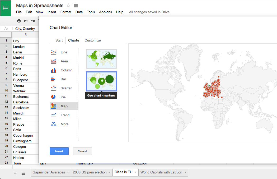
How do you support 57,860 online students learning R and statistics ?  Late last fall, Data and GIS Services shared this challenge with Professor Mine Çetinkaya-Rundel and the staff of CIT as we sought to translate Professor Çetinkaya-Rundel’s successful Statistics 101 course to a Coursera class on Data Analysis and Statistical Inference.  While Data and GIS Services has supported Statistics 101 students for several years identifying appropriate data and using the R statistical language for their assignments, the scale of the Coursera course introduced new challenges of trying to provide engaging data to a very large audience without having the opportunity to provide direct support to everyone in the class.

In our initial meetings with Professor Çetinkaya-Rundel, she requested that Data and GIS create data collections for the course that would provide easy access in R and would include a range of statistical measures that would appeal to the diverse audience in the class.  The first challenge — easy access to R — required some translation work.  While R excels in its flexibility, graphics, and statistical power, it lacks some of the built in data documentation features present in other statistical packages.  This project prompted Data and GIS to reconsider how to provide documentation and pre-formatted R data to an audience that would likely be unfamiliar with R and data documentation.

The second challenge — finding data that covered a wide range of interesting topics — proved much easier.  The General Social Survey with its diverse and engaging questions on a wide range of topics proved to be an easy choice for the class.  The American National Election Studies, also offered a diverse set of measures of public opinion that suited the course well.  With these challenges identified and addressed, we spent the end of 2013 selecting portions of the data for class (subsetting), abridging the data documentation for instructional use, and transforming the data to address its usage in an online setting (processing missing values for R, creating factor variables).

As Professor Çetinkaya-Rundel’s class launches on February 17th, this project has given us a new appreciation of providing data and statistical services in a MOOC while also building course materials that we are using in Statistics 101 at Duke.  While students begin the Coursera course on Data Analysis and Statistical Inference, students in Professor Kari Lock Morgan’s Statistics 101 class will use these data in their on-campus Duke course as well.  We hope that both collections will reduce some of the technological hurdles that often confront courses using R as well as improving statistical literacy at Duke and beyond.

Demystifying Data & GIS Services

Staff Expertise ChartConfused about Data & GIS Services?  Not sure what questions you should be asking us or what kind of services we provide?  Here’s one handy chart we’ve come up with to explain what exactly we cover in our consultations and workshops.

When it comes to picking what day to stop by our walk-in hours or knowing how much of the data life cycle our consultants cover, this graphic might be your first stop.  Whether it’s finding data, processing or analyzing that data, or mapping and visualizing that data, we have staff with expertise to help!

Still not sure who to approach or what kind of help you might need?  Just email askdata@duke.edu to get in touch with all of us at once.  Some questions can be answered quickly over email, but we’re also happy to schedule an appointment to talk in person.

Data and GIS Services Spring 2014 Workshop Series

DGSwkshpExplore network analysis, text mining, online mapping, data visualization, and statistics in our spring 2014 workshop series.  Our workshops provide a chance to explore new tools or refresh your memory on effective strategies for managing digital research.  Interested in keeping up to date with workshops and events in Data and GIS?  Subscribe to the dgs-announce listserv or follow us on Twitter (@duke_data).

Currently Scheduled Workshops

 Thu, Jan 9 2:00 PM – 3:30 PM  Data Management Plans – Grants, Strategies, and Considerations

 Mon, Jan 13 2:00 PM – 3:30 PM Webinar: Social Science Data Management and Curation

 Mon, Jan 13 3:00 PM – 4:00 PM Google Fusion Tables

 Tue, Jan 14 3:00 PM – 4:00 PM Open (aka Google) Refine 

 Wed, Jan 15 1:00 PM – 3:00 PM Stata for Research

 Thu, Jan 16 3:00 PM – 5:00 PM Analysis with R

 Tue, Jan 21 1:00 PM – 3:00 PM Introduction to ArcGIS

 Wed, Jan 22 1:00 PM – 3:00 PM ArcGIS Online

 Wed, Jan 22 3:00 PM – 4:00 PM Open (aka Google) Refine 

 Mon, Jan 27 2:00 PM – 3:30 PM Introduction to Text Analysis

 Wed, Jan 29 1:00 PM – 3:00 PM Analysis with R

 Thu, Jan 30 2:00 PM – 4:00 PM Stata for Research

 Mon, Feb 3 1:00 PM – 2:00 PM  Data Visualization on the Web

 Mon, Feb 3 2:00 PM – 3:00 PM  Data Visualization on the Web (Advanced)

 Tue, Feb 11 2:00 PM – 4:00 PM Using Gephi for Network Analysis and Visualization

 Wed, Feb 12 1:00 PM – 3:00 PM Introduction to ArcGIS

 Tue, Feb 18 2:00 PM – 3:30 PM Introduction to Tableau Public 8

 Tue, Feb 25 1:00 PM – 3:00 PM ArcGIS Online

 Thu, Feb 27 1:00 PM – 3:00 PM Historical GIS

 Mon, Mar 3 2:00 PM – 3:30 PM  Designing Academic Figures and Posters

 Tue, Mar 4 1:00 PM – 3:00 PM  Useful R Packages: Extensions for Data Analysis, Management, and Visualization