Category Archives: Uncategorized

Online Mapping Tools – GeoCommons

Visualizing spatial data can be challenging.  Specialized software tools like ArcGIS produce excellent results, but often seem complex for relatively simple tasks. Several online tools have emerged recently that provide relatively easy alternatives for the display of spatial data.  In this post, we examine GeoCommons, a web based tool for presenting spatial data in detail.  (Go to this guide to see a comparison chart of packages and features, and see this Duke University Libguide for a more detailed review of GeoCommons.)


GeoCommons (geocommons.com)

GeoCommons is an online mapping application that easily imports a variety of data formats, including geospatial data, and quickly produces sharable maps.  In contrast to other mapping tools, GeoCommons contains several categorization algorithms, such as quantile classification and classification based on the standard deviation of the sample that assist with the construction of informative maps.  CSV files and ArcGIS shapefiles are two of the most widely used file formats compatible with GeoCommons.

GeoCommons is very easy to use and contains some of the display features contained in high-end GIS suites.  Creation of new variables tied to geographies can be tricky, so it’s advised to either upload data  and map in final form or to first identify the layer to which you will upload and join a complete data set.


Geocoding

Figure 1

To begin geocoding, upload a file.  Gecommons has the capability to recognize spatially encoded data.  Some formats may require user assistance.

If you’ve uploaded data that contains latitude and longitude coordinates, choose this option.  In my case, I had county FIPS codes that uniquely identified each county.  Selecting US Boundaries to the left, then USA Counties, I was able to successfully preview how well my FIPS codes matched the layer (Figures 1 and 2).  A variety of other boundary types are available.  The key is to have in your data a unique identifier that identifies each record in the same manner as an available geocoding layer.

Figure 2

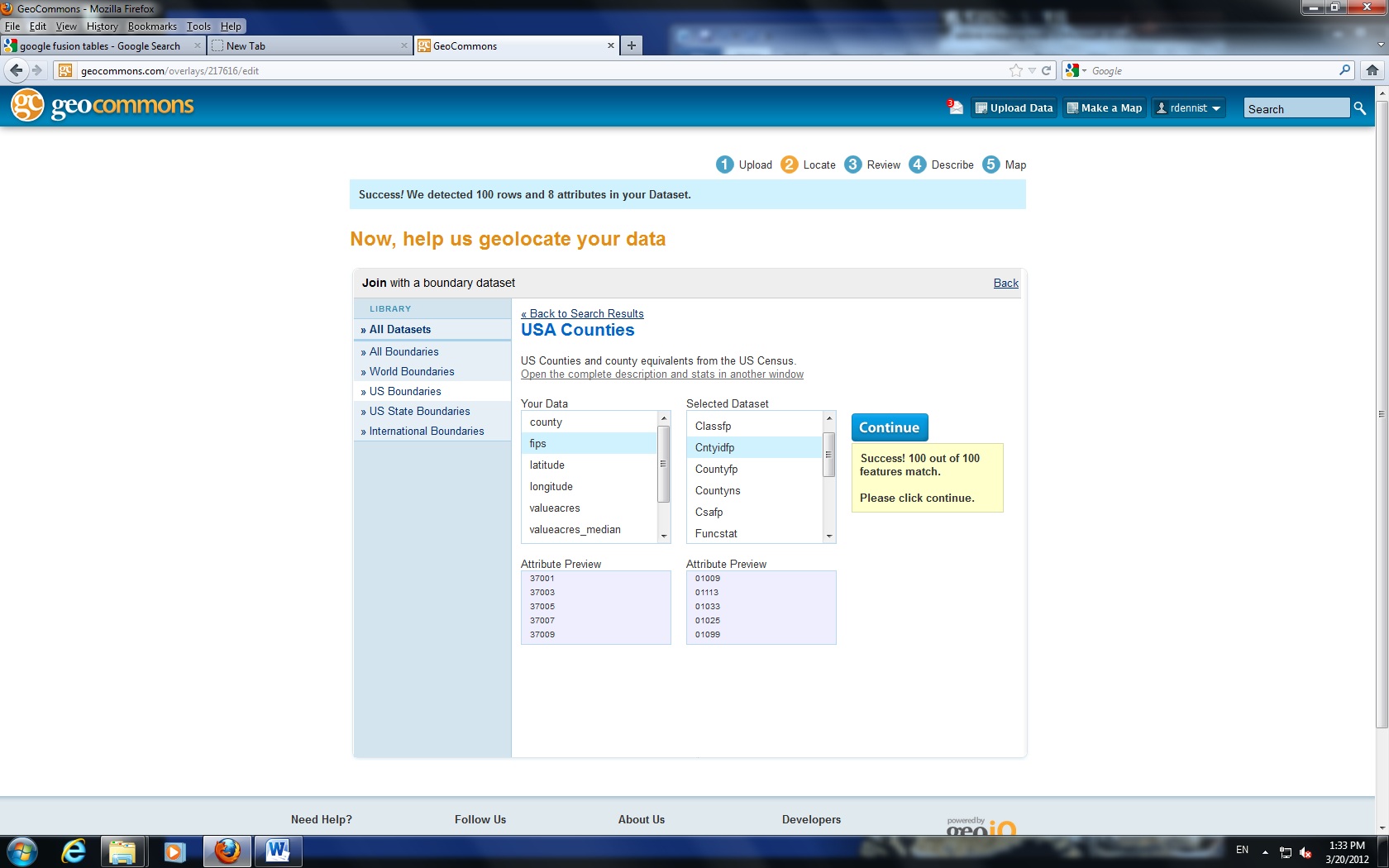
Review the geocoding results and select Continue to proceed.


Mapping

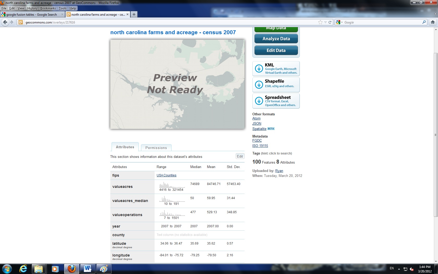
Geocommons offers some nice built in features that assist with categorizing measures.  The application will produce summary statistics for numeric fields (Figure 3), which gives you a quick picture of your sample and can assist with how to categorize the data.  Click the “Make a Map” button to proceed to the interactive interface.

Figure 3

Also note the filter tab, which allows you to screen out groups of cases.  For example, I may request a minimum number of farms to screen out urban counties.

Figure 4 shows a standard choropleth map portraying median number of acres per farm by county for North Carolina in 2007.  In this example, I have classified counties into five groups using standard deviations to group counties.


Sharing

Figure 4

GeoCommons contains a wide variety of ways to share data (accessed through the About section).  Posting to Twitter, Facebook, and an array of other social media sites is possible with a few short clicks.  You can directly email a link to the map along with a short personal message right out of the application.For those who wish to post to a web page, GeoCommons provides two ways to insert a map, through a <div> tag and through an iframe.  All code is generated for copy and paste into your page.

To access a version of this map, simply follow this link.

Finally, GeoCommons will produce a PNG image and a KML document for download.  The image export feature appears to be relatively new and does take trial-and-error to align correctly.  In addition, it does not appear to include any base layers or legends in the output, only the data layer.


Other Notes

When using standard deviation and maximum breaks methods for grouping observations, double check the category definitions by changing the number of categories and the resulting changes to the definitions for the new groups.  This will help to confirm whether data are grouped appropriately and exactly what the definitions for each category are.

Data and GIS Winter Newsletter 2012

Data driven teaching and research at Duke keeps growing and Perkins Data and GIS continues to increase support for researchers and classes employing data, GIS, and data visualization tools.  Whether your discipline is in the Humanities, Sciences, or Social Sciences, Perkins Data and GIS seeks to support researchers and students using numeric and geospatial data across the disciplines.

New Website for 2012
http://library.duke.edu/data/

You can find:

  • Online data or digital maps that you need for your project
  • A workshop on the latest software packages and digital tools

New workshops for 2012
http://library.duke.edu/data/news/index.html
Clean your data with Google Refine. Learn about data management planning. Visualize your data with Tableau Public, or map your results using ArcGIS or Google Earth Pro.  A new series of workshops connects traditional statistical, geospatial, and visualization tools with web based options.  Register online for our courses or schedule a session for your course by emailing askdata@duke.edu

  • StataReview                               (Statistics/Data Management)
  • Introduction to ArcGIS           (Geographic Information Systems / Data Visualization)
  • Data Management Planning  (Data Management/Grants)
  • Geocommons                            (Geographic Information Systems / Data Visualization)
  • Google Earth (Pro)                   (Geographic Information Systems / Data Visualization)
  • Google Refine                           (Data Management/Descriptive Statistics)
  • Tableau Public                          (Data Visualization)

Bloomberg (terminals) have arrived
http://blogs.library.duke.edu/data/2011/08/29/bloomberg-has-arrived/

Duke Libraries in pleased to announce the installation of three Bloomberg financial terminals in the Data and GIS Lab in 226 Perkins.  The terminals provide the latest news and financial data and include an application that makes it easy to export data to Excel.  Access is restricted to all current Duke affiliates.

Get help with Data Management Planning
http://library.duke.edu/data/guides/data-management/index.html

Data and GIS has launched a new guide that provides guidance for researchers looking for advice on data management plans now required by several granting agencies.  The guide provides examples of sample plans, key concepts involved in writing a plan, and contact information for groups on campus providing data management advice.

New Collections
http://library.duke.edu/data/collections/new.html
Explore the Indonesian Village Potential Statistics (PODES), look at household economic behavior in the Indian National Sample Survey, or explore historical digital maps of Europe- the Data and GIS collection collects research data sets and maps of interest to the Duke community covering a wide range of topics.

Support for Restricted Data Contracts and Restricted Data Licensing
Perkins Library has partnered with the Social Science Research Institute (SSRI) to support restricted data licensing with Paul Pooley as a restricted data specialist.  Paul is available  to work with researchers licensing restricted data and negotiating restricted data management plans.  Please contact Paul paul.pooley@duke.edu or askdata@duke.edu for more details.

Contact Us!askdata@duke.edu – twitter: duke_datahttp://library.duke.edu/data/hours.html

Joel Herndon
Head, Data and GIS Services
919-660-5946
Location: Room 227 Perkins
joel.herndon@duke.edu
Mark Thomas
Economics/GIS Librarian
919-660-5853
Location: Room 233 Perkins
mark.thomas@duke.edu
Teddy Gray
Biological Sciences Librarian
919-660-5971
Location: Room 233 Perkins
teddy.gray@duke.edu

Converting ArcGIS Layers to Google Earth (KML)

Converting ArcGIS layers to Google Earth allows others to easily see layers without specialized software.  Both ArcGIS and Google Earth Pro contain tools that allow conversion to and saving in KML format.
Note: Be certain you are allowed to share layers if they were not created by you.

Conversion using ArcGIS

  • First, open the layer that you wish to covert.
  • In the ArcToolbox window, expand “Conversion Tools,” then “To KML,” and select “Layer to KML.”
  • When the “Layer to KML” window appears, first select the shapefile or layer for the “Layer” box.
  • Next select a directory for the file to be created and provide a name for the file.
  • Finally, you must enter a number for the “Layer Output Scale.”  If your layer has a scale-dependent renderer, this setting allows you to export the KML at a specific level of resolution.  Otherwise, it has no effect, whatever the number.

For layers with many features, ArcGIS may produce a KML file that does not open in Google Earth due to errors.  There are two ways to solve this problem.

  • First, you can split your shapefile into several smaller shaepfiles.
  • Second, you can (usually) convert the shapefile to KML with Google Earth Pro.

Conversion using Google Earth Pro

  • First, open the shapefile with the Open command.  Be certain to change the file type to “ESRI Shapefile”.
  • When opened, you will receive a warning if your shapefile contains more than 2,500 items.  You will still possess the ability to import the entire file, but it may take some time.
  • You will be asked whether you wish to apply a style template to the document.  If you do so, you will be able to choose the attribute that contains the item name (for example, the address field or the street name field).
    Note: you don’t have to save the style template to select the name field.
  • Finally, right-click the layer added to the Temporary Places folder, and click “Save Place As.”  Provide a location and file name for the file to be created.

What’s hot in molecular biology databases

The journal Nucleic Acids Research has just published its 18th annual database issue. The current issue summarizes 96 new and 83 previously reviewed molecular biology databases, including GenBank, ENA, DDBJ, and GEO. Also included in the issue is an editorial advocating the creation of a “community-defined, uniform, generic description of the core attributes of biological databases,” which would be known as the BioDBCore checklist. Such a checklist would benefit both database users and provides: users would have a much easier time finding the appropriate resource and providers would be able to highlight specialized resources and the lesser known functionality of established databases.

Besides the databases reviewed in the current issue, Nucleic Acids Research maintains a select list of 1330 molecular biology databases that have been profiled in various database issues over the past 18 years.

Welcome!

Welcome to the Perkins Data and GIS blog!  Our goal is to highlight Duke research, collections, policies, and tools surrounding empirical
data and digital maps of interest to the research community.  We hope that this blog will serve as a catalyst to link researchers and resources across the Duke community and beyond!