The Data and Visualization Services (DVS) Department can help you locate and extract many types of data, including data about companies and industries. These may include data on firm location, aggregated data on the general business climate and conditions, or specific company financials. In addition to some freely available resources, Duke subscribes to a host of databases providing business data.
Directories of Business Locations
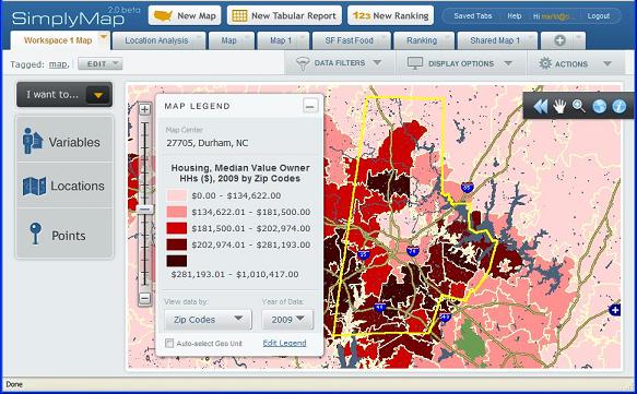
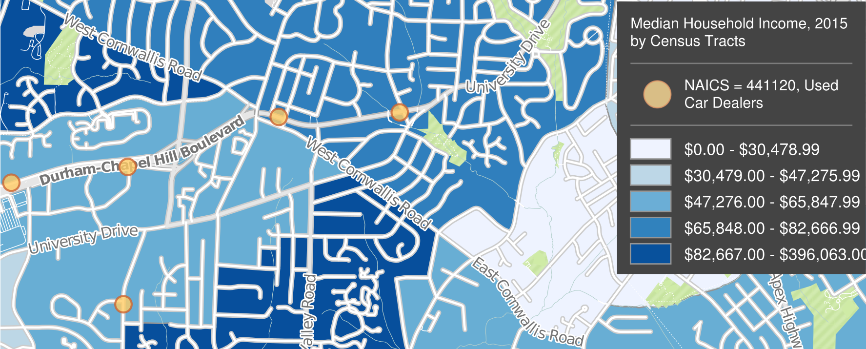
You may need to identify local outlets and single-location companies that sell a particular product or provide a particular service. You may also need information on small businesses (e.g., sole proprietorships) and private companies, not just publicly traded corporations or contact information for a company’s headquarters. A couple of good sources for such local data are the ReferenceUSA Businesses Database and SimplyAnalytics.
From these databases, you can extract lists of locations with geographic coordinates for plotting in GIS software, and SimplyAnalytics also lets you download data already formatted as GIS layers. Researchers often use this data when needing to associate business locations with the demographics and socio-economic characteristics of neighborhoods (e.g., is there a lack of full-service grocery stores in poor neighborhoods?).
When searching these resources (or any business data source), it often helps to use an industry classification code to focus your search. Examples are the North American Industry Classification System (NAICS) and the Standard Industrial Classification (SIC) (no longer revised, but still commonly used). You can determine a code using a keyword search or drilling down through a hierarchy.
Aggregated Business and Marketing Data
Government surveys ask questions of businesses or samples of businesses. The data is aggregated by industry, location, size of company, and other criteria and typically include information on the characteristics of each industry, such as employment, wages, and productivity.
Sample Government Resources
- Census Bureau: Economic Census
- Census Bureau: More surveys on Business and Industry
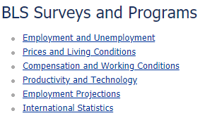 The US Bureau of Labor Statistics (BLS) collects a large amount of data through its surveys of businesses and is the agency that compiles official unemployment and inflation data. Some of the best portals to BLS data are its pages on Surveys and Programs, its Interface by Subject, and the BLS Data Finder.
- Library guide on US Economic Data: Economic Surveys
Macroeconomic indicators relate to the overall business climate, and a good source for macro data is Global Financial Data. Its data series includes many stock exchange and bond indexes from around the world.
Private firms also collect market research data through sample surveys. These are often from a consumer perspective, for instance to help gauge demand for specific products and services. Be aware that the numbers for small geographies (e.g., Census Tracts or Block Groups) are typically imputed from small nationwide samples, based on correlations with demographic and socioeconomic indicators. Examples of resources with such data are SimplyAnalytics (with data from EASI and Simmons) and Statista (mostly national-level data).
Firm-Level Data
You may be interested in comparing numbers between companies, ranking them based on certain indicators, or gathering time-series data on a company to follow changes over time. Always be aware of whether the company is a publicly traded corporation or is privately held, as the data sources and availability of information may vary.
For firm-level financial detail, public corporations traded in the US are required to submit data to the U.S. Securities and Exchange Commission (SEC).
Their EDGAR service is the source of the corporate financials repackaged by commercial data providers, and you might find additional context and narrative analysis with products such as Mergent Online, Thomson One, or S&P Global NetAdvantage. The Bloomberg Professional Service in the DVS computer lab contains a vast amount of data, news, and analysis on firms and economic conditions worldwide. You can find many more sources for firm- and industry-specific data from the library’s guide on Company and Industry Research, and of course at the Ford Library at the Fuqua School of Business.
All of these sources provide tabular download options.
For help finding any sort of business or industry data, don’t hesitate to contact us at askdata@duke.edu.