MATLAB is an integrated technical computing environment that combines numeric computation, advanced graphics and visualization, and a high-level programming language. Duke’s license agreement offers MATLAB licenses to faculty and staff for work or personal computers, as well as students through on-campus use. The Duke Office of Information Technology (OIT) maintains instructions on installing MATLAB at Duke. MATLAB is used by many communities at Duke, including Engineering, Econometrics, Medical Sciences, Computational Biology, and Business.
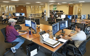
On Tuesday, June 18, OIT in partnership with Duke University Libraries will host a one-day course on MATLAB that focuses on using this software for Data Processing and Visualization. The course will cover importing data, organizing data, and visualizing data in a hands-on format (detailed outline). Seats are limited to 20; please register soon to reserve your spot.
MATLAB for Data Processing and Visualization
(outline)
Laura Proctor, Academic Training Engineer at MathWorks
Tuesday, June 18
8:30 a.m. to 4:30 p.m. (lunch break from 12:00 p.m. to 1:00 p.m., lunch not provided)
Library Computer Classroom, Bostock 023
Registration (seats limited to 20)
The course assumes some existing familiarity with MATLAB. New potential MATLAB users may want to attend an overview seminar on the software that will be held on Thursday, May 30. This overview will not be hands on, but it will include live demonstrations and examples of both MATLAB and Simulink, an environment for multi-domain simulation and model-based design.
Introduction to Data Analysis and Visualization with MATLAB & Simulink
(details and registration)
Mehernaz Savai, Applications Engineer at MathWorks
Thursday, May 30
1:00 p.m. to 4:00 p.m.
FCIEMAS Building, Schiciano Auditorium – side A
If you would like to begin learning to use MATLAB, MathWorks offers a self-directed MATLAB Fundamentals course, and the Duke library collection also includes several introductory MATLAB texts, such as MATLAB Primer and MATLAB: A Practical Approach.

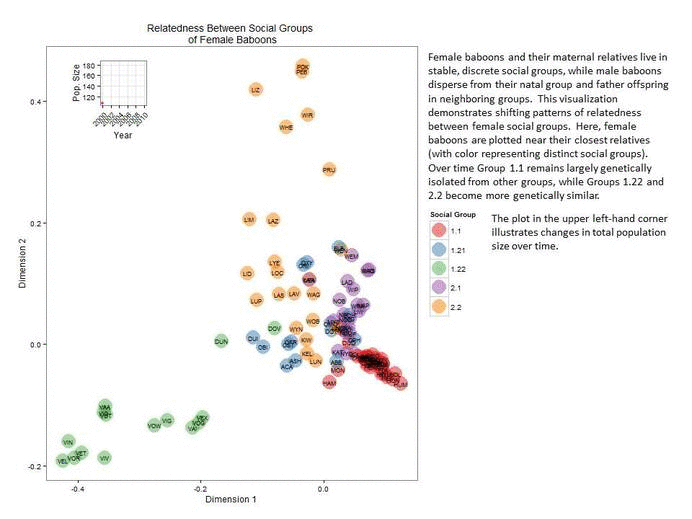
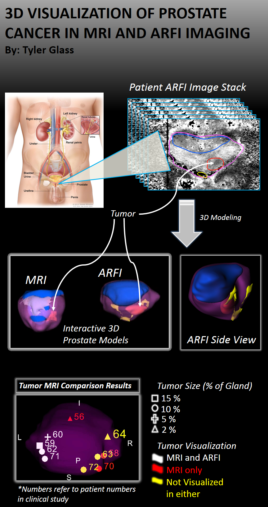
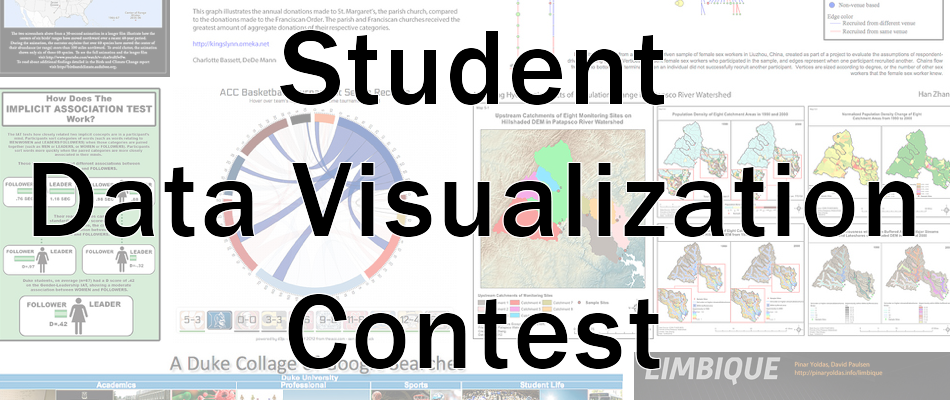
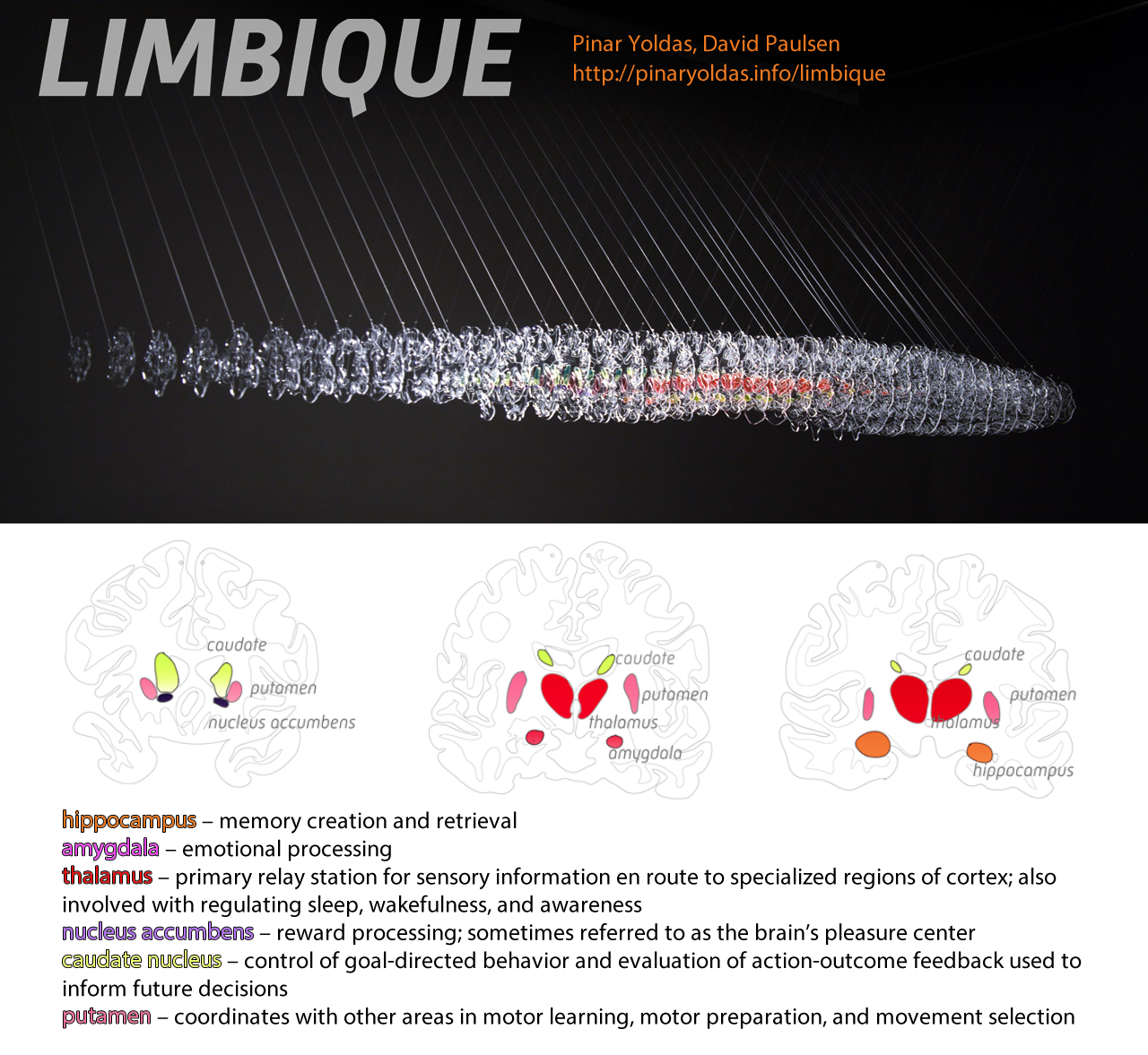
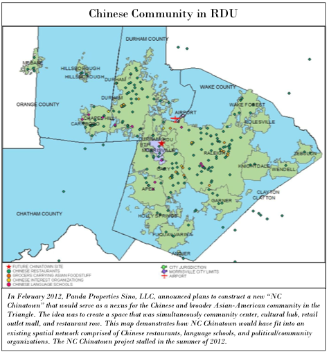
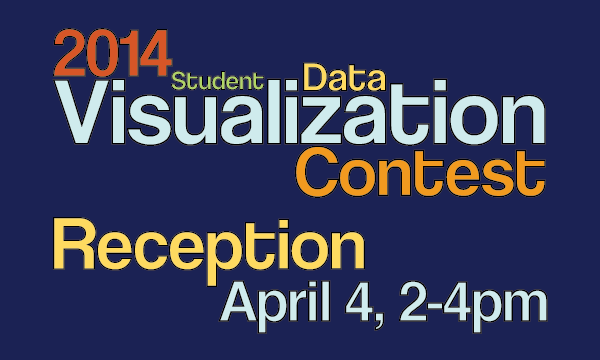 The second annual Duke Student Data Visualization Contest brought in another round of beautiful and insightful submissions from students across the university. The judging panel of five members of the Duke community evaluated the submission based on insightfulness, broad appeal, aesthetics, technical merit, and novelty. This year, the panel awarded a first place, second place, and two third place awards.
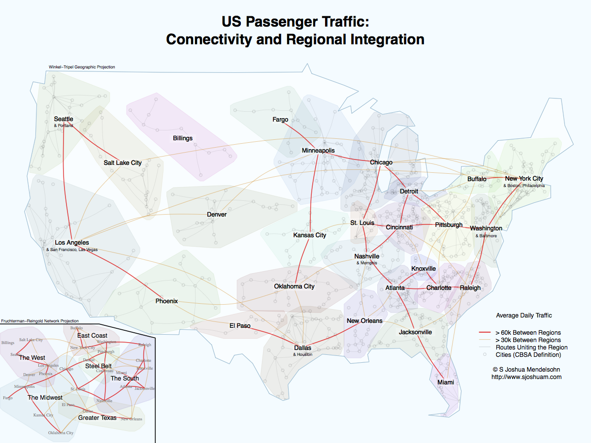


 On Friday, October 4, Dr. Christopher G. Healey will visit Duke University to speak at the

 On Thursday, April 4 and Friday, April 5, Duke University will host a visit from
  Exploring Text Entities
 Visualizing Semantics in Passwords
 Bubble Sets: Revealing Set Relations with Isocontours over Existing Visualizations

 DocuBurst: Visualizing Document Content using Language Structure