
This post comes from Erika Kociolek, a second year Master in Environmental Management student at the Nicholas School. The Data and GIS staff want to congratulate Erika on successfully defending her project!
 For about 4 months, I’ve been swimming in a proverbial sea of data related to hypoxia (low dissolved oxygen concentrations) and landings in the Gulf of Mexico brown shrimp fishery. I’m a second year master of environmental management (MEM) student at the Nicholas School, focusing on Environmental Economics and Policy. I’ve been working with my advisor, Dr. Lori Bennear, to complete my master’s project (MP), an analysis attempting to estimate the effect of hypoxia on landings and other economic outcomes of interest.
To do this, we are using data from the Southeast Monitoring and Assessment Program (SEAMAP), NOAA/NMFS, and a database of laws and policies related to brown shrimp that I compiled in Fall 2010. By running regressions that difference out all variation in catch except for that attributable to hypoxia, we can isolate its effect on economic outcomes of interest. I’ve found that catch, revenue, catch per unit effort, and revenue per unit effort are all larger in the presence of summer hypoxia. However, if we look at catch for different sizes of shrimp, we see that in the presence of summer hypoxia, catch of larger shrimp decreases and catch of smaller shrimp increases significantly.
Getting to the point of discussing results has required a bunch of data analysis, cleaning, management, and visualization. I used R, STATA, ArcGIS, and have even used video editing software to make dynamic graphics representing my results that have improved my own understanding of the raw data. As an example, the video below, showing the change in hypoxia over time (1997-2004), was created using ArcGIS 10.
http://youtu.be/2YfYBE_Fe7U
Note: The maps in the video above use data from the Southeast Monitoring and Assessment Program (SEAMAP).
Hypoxia is a dynamic and complex phenomenon, varying in severity, over time, and in space; hypoxia in Gulf waters is more severe and widespread in summer. The model I’m using actually takes advantage of this variation to obtain an estimate of the effect of hypoxia on catch and other economic outcomes. To show people the source of variation I’m exploiting, I created this video. These maps are drawing on data of dissolved oxygen concentrations and displaying it spatially.
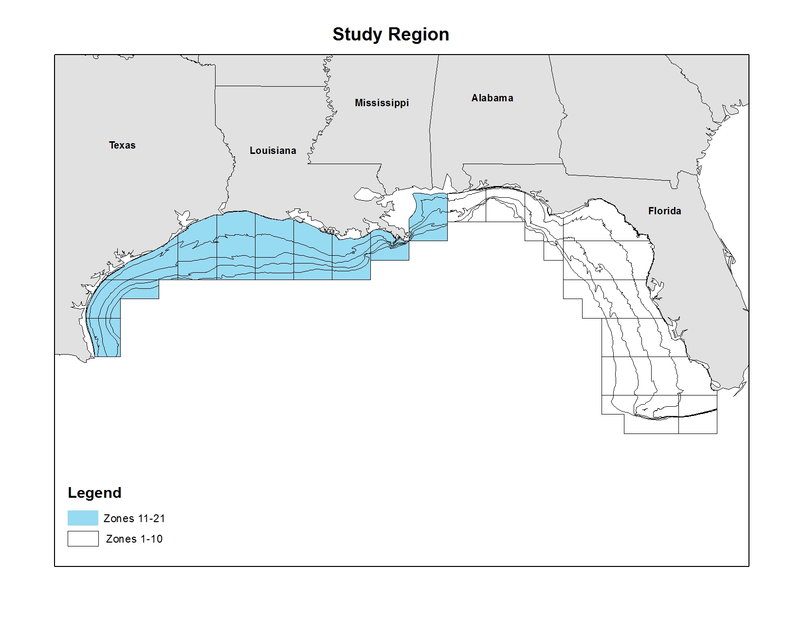
 We have dissolved oxygen measurements for most of the Gulf in the summer (June) and fall (December). Each subarea-depth zone (see related map) that changes from salmon shading (not hypoxic) to red (hypoxic), or vice-versa, is variation in hypoxia that the models I’m running use to get an estimate of the hypothesized effect.
Many thanks are due to my advisor, Dr. Bennear, as well as to the helpful folks at the Data/GIS lab, who have provided invaluable assistance with the data management and data visualization components of this project!
This research was funded by NOAA’s National Center for Coastal Ocean Science, Award #NA09NOS4780235.