This week, Digitization Specialist Mike Adamo will move on from Duke Libraries after 14 years to assume a new position as Digital Imaging Coordinator at the Libraries of Virginia Tech University. Mike has contributed so much to our Digital Collections program during his tenure, providing years of uncompromising still imaging services, stewardship in times of change for the Digital Production Center, as well as leadership of and then years of service on our Digital Collections Implementation Team. He has also been the lead digitization specialist on some of our most well known digital collections like the Hugh Mangum photographs, James Karales photographs and William Gedney collection.
In addition, Mike has been a principal figure on our Multispectral Imaging Team and has been invaluable to our development of this service for the library. He established the setup and led all MSI imaging sessions; collaborated cross-departmentally with other members on the MSI Team to vet requests and develop workflows; and worked with vendors and other MSI practitioners to develop best practices, documentation, and a preservation plan and service model for MSI services at Duke Libraries. He’s also provided maintenance for our MSI equipment, researching options for additional equipment as our program grew.
Side by side comparison of a papyri item under natural light and the same item after multispectral imaging and processing.
We are grateful to Mike for his years of dedication to the job at to the field of cultural heritage digitization as well as for the instrumental role he’s played in developing MSI Services at DUL. We offer a huge thank you to Mike for his work and wish him well in his future position!
Post contributed by Giao Luong Baker and Erin Hammeke
The ongoing tensions between academic institutions and publishers have been escalating the last few months, but those tensions have existed for many years. The term “Big Deal” has been coined to describe a long-standing, industry-wide practice of journal bundling that forces libraries to subscribe to unwanted and unneeded publications rather than paying more for a limited number of individual subscriptions. This is a practice you see in other industries – for example, cable packages that provide hundreds of channels, even if you only want one or two specific channels.
What is especially problematic in higher education is that academics produce and review the content that gets published in the journals (for free), and then the universities have to pay the publishers a subscription fee to access the content. Imagine if YouTube required a subscription fee to watch any videos, including the ones you had posted. It’s a system that makes research harder to access and inhibits global scientific progress, all so publishers can earn an enormous profit margin.
Right now, academic publishing is controlled by five publishers (the “Big Five”) – a monopoly that makes it very difficult for libraries to negotiate better deals. Only very large organizations or consortia, like the University of California, have been able to start pushing back against the system. It will likely take large shake-ups like this for any large changes to take hold, but it in the meantime there may be ways to situate ourselves for making better purchasing decisions.
At Duke, we often review our usage of specific journal titles as we prepare to make purchasing decisions. Usage data comes in a variety of forms, but the most popular are counts of Duke views and downloads that come directly from the publishers and the number of times Duke authors publish in or cite a particular journal. There are many other kinds of data that might be of interest, however, including Duke participation on editorial boards, usage differences across disciplines, and even whether or not the journal is fully open access. Blending various data sources and optimizing the search decisions for a given budget cycle can be overwhelming.
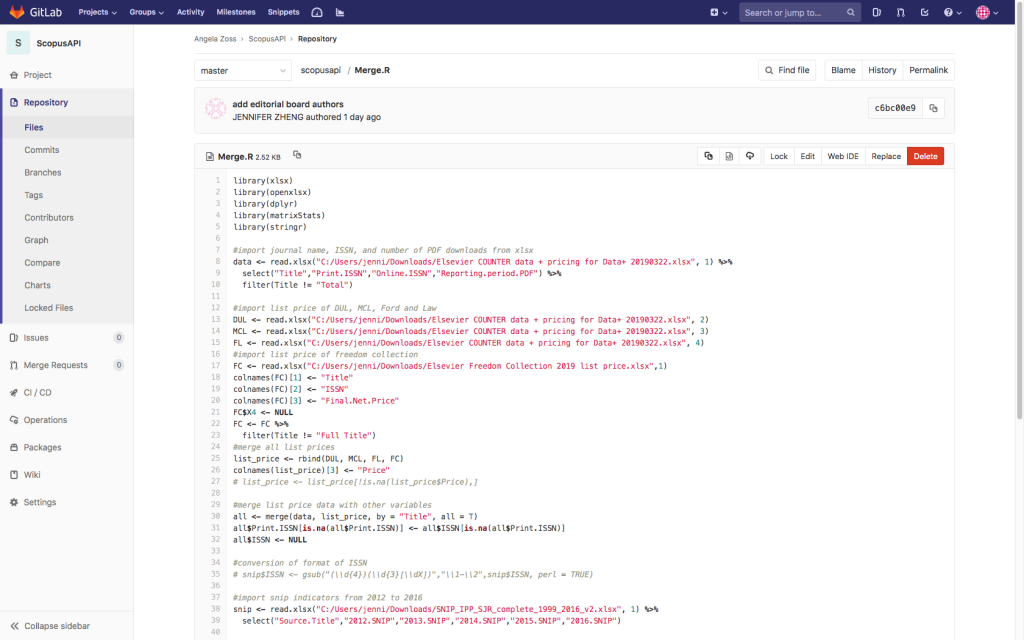
Last fall, Duke University Libraries decided to propose a project for Duke’s Data+ summer program – a summer research experience in data science for undergraduate students. Our project, “Breaking the Bundle: Analyzing Duke’s Journal Subscriptions“, focuses on Duke’s subscriptions to journals published by Elsevier. The program is in its third week, and our team of two incredibly-sharp undergraduates has been hard at work building and blending our datasets. Our goal by the end of summer is to have a proof-of-concept dashboard that lets collection managers adjust the weights of various usage measures to generate an ideal collection of journals for a particular budget.
It is still very early in the process, but the students have been hard at work and have made great progress. We decided it would be best to develop the analysis software and dashboard using R, a statistical computing project with a rich history and many helpful development tools. In addition to publisher-provided views and downloads, the students have been able to use websites and APIs to collect data on journal open access status, editorial boards, numbers of publications, and numbers of citations. All Data+ teams present publicly on the projects twice during the summer, and we hope to schedule a third talk for a library audience before the end of the program on August 2.
Just one of many files of R code generated for the project so far.
We look forward to seeing what the summer will bring! While this project is just one small step, automating the collection and analysis of journal usage will position us well, both for responsible purchases and for a hopefully-changing publishing landscape.
Looking for something to keep you company on your Summer vacation? Why not direct your devices to a Duke Digital collections! Seriously! Here are a few of the compelling collections we debuted earlier this Spring, and we have have more coming in late June.
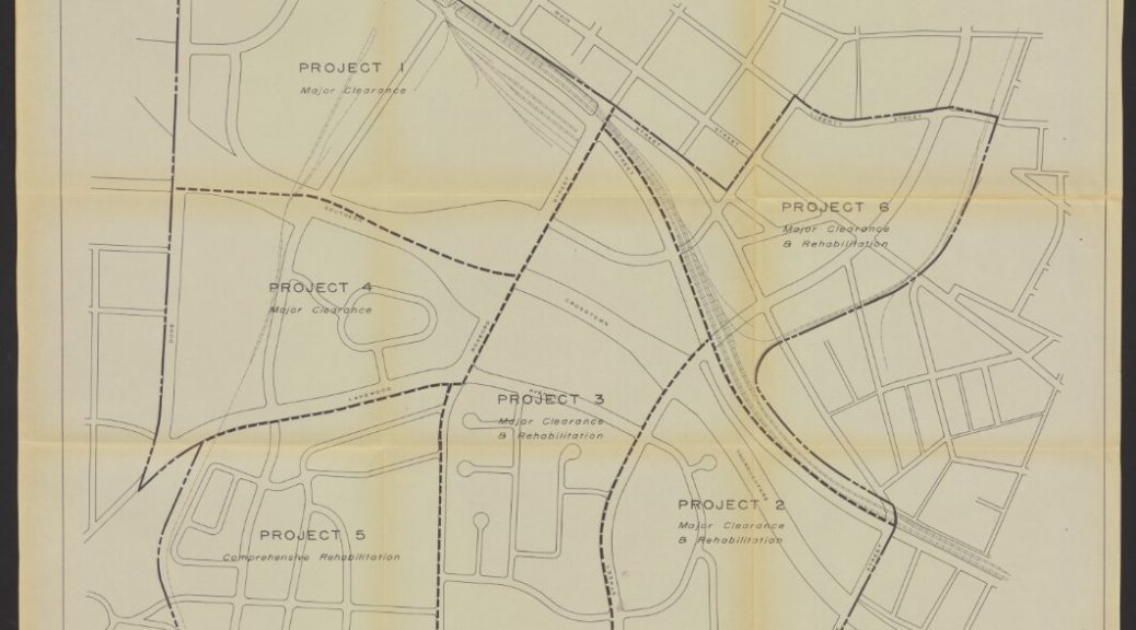
These maps and 2 volume report document Durham’s Hayti-Elizabeth st neighborhood infrastructure prior to the construction of the Durham Freeway, as well as the justifications for the redevelopment of the area. This is an excellent resource for folks studying Durham history and/or the urban renewal initiatives of the mid-20th century.
One map from “Hayti-Elizabeth Street renewal area : general neighborhood renewal plan, map 1”
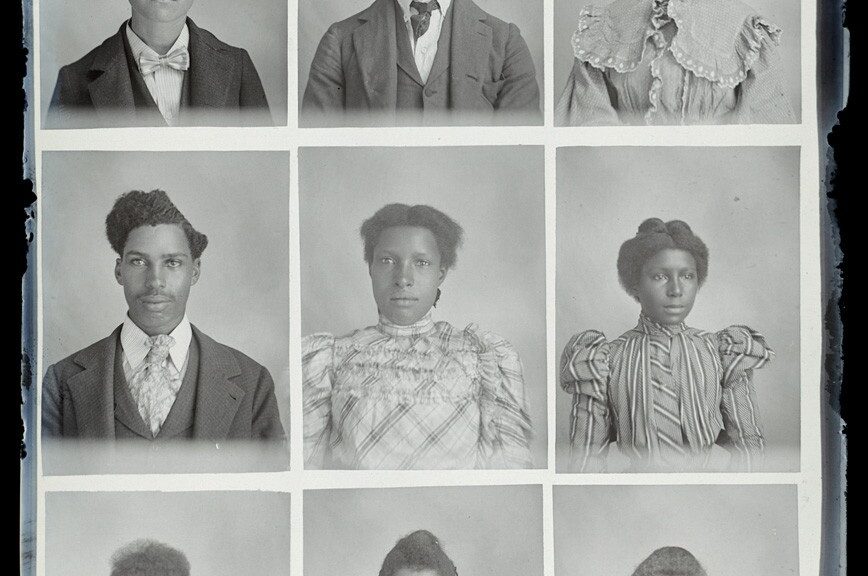
We launched 8 collections of photograph albums created by African American soldiers serving in the military across the world including Japan, Vietnam and Iowa. Together these albums help “document the complexity of the African American military experience” (Bennett Carpenter from his blog post, “War in Black and White: African American Soldiers’ Photograph Albums”).
One page from the African American soldier’s World War II photograph album of Munich, Germany
This photograph album contains pictures taken by Sir Percy Moleworth Sykes during his travels in a mountainous region of Central Asia, now the Xinjiang Uyghur Autonomous Region of China, with his sister, Ella Sykes. According to the collection guide, the album’s “images are large, crisp, and rich with detail, offering views of a remote area and its culture during tensions in the decades following the Russo-Turkish War”.
Our work never stops, and we have several large projects in the works that are scheduled to launch by the end of June. They are the first batch of video recordings from the Memory Project. We are busy migrating the incredible photographs from the Sydney Gamble collection – into the digital repository. Finally there is one last batch of Radio Haiti recordings on the way.
Keeping in touch
We launch new digital collections just about every quarter, and have been investigating new ways to promote our collections as part of an assessment project. We are thinking of starting a newsletter – would you subscribe? What other ways would you like to keep in touch with Duke Digital Collections? Post a comment or contact me directly.
Since my last post about our integrated library system (ILS), there’s been a few changes. First, my team is now the Library Systems and Integration Support Department. We’ve also added three business analysts to our team and we have a developer coming on board this summer. We continue to work on FOLIO as a replacement for our current ILS. So what work are we doing on FOLIO?
FOLIO is a community-sourced product. There are currently more than 30 institutions, over a dozen developer organizations, and vendors such as EBSCO and IndexData involved. The members of the community come together in Special Interest Groups (SIGs). The SIGs discuss what functionality and data is needed, write the user stories, and develop workflows so the library staff will be able to do their tasks. There are ten main SIGs, an Implementation Group, and Product and Technical Councils. Here at Duke, we have staff from all over the libraries involved in the SIGs. They speak up to be sure the product will work for Duke Libraries.
Features
The institutions planning to implement FOLIO in Summer 2020 spent April ranking 468 open features. They needed to choose whether the feature was needed at the time the institution planned to go live, or if they could wait for the feature to be added (one quarter later or one year later). Duke voted for 62% of the features be available at the time we go live with FOLIO. These features include things like default reports, user experience enhancements, and more detailed permission settings, to name a few.
Gaps
After the feature prioritization was complete, we conducted a gap analysis. The gap analysis required our business analysts to take what they’ve learned from conducting interviews with library staff across the University and compare it to what FOLIO can currently do and what is planned. The Duke Libraries’ staff who have been active on the SIGs were extremely helpful in identifying gaps. Some feature requests that came out of the gap analysis included making sure a user has an expiration date associated with it. Another was being able to re-print notices to patrons. Others had to do with workflow, for example, making sure that when a holdings record is “empty” (no items attached), that an alert is sent so a staff person can decide to delete the empty record or not.
Bees?
So where to the bees come into all of this? Well, the logo for FOLIO includes a bee!
The release names and logos are flowers. And we’re working together in a community toward a single goal – a new Library Services Platform that is community-sourced and works for the future of libraries.
Learn more about FOLIO@Duke by visiting our site: https://sites.duke.edu/folioatduke/. We’ve posted newsletters, presentations, and videos from the FOLIO project team.
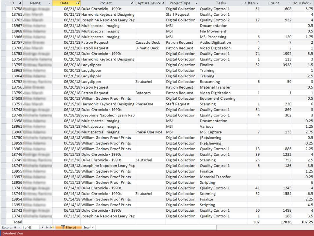
It takes a lot to build and publish digital collections as you can see from the variety and scope of the blog posts here on Bitstreams. We all have our internal workflows and tools we use to make our jobs easier and more efficient. The number and scale of activities going on behind the scenes is mind-boggling and we would never be able to do as much as we do if we didn’t continually refine our workflows and create tools and systems that help manage our data and work. Some of these tools are big, like the Duke Digital Repository (DDR), with its public, staff and backend interface used to preserve, secure, and provide access to digital resources, while others are small, like scripts built to transform ArchiveSpace output into a starter digitization guides. In the Digital Production Center (DPC) we use a homegrown tool that not only tracks production statistics but is also used to do project projections and to help isolate problems that occur during the digitization process. This tool is a relational database that is affectionately named the Daily Work Report and has collected over 9 years of data on nearly every project in that time.
A long time ago, in a newly minted DPC, supervisors and other Library staff often asked me, “How long will that take?”, “How many students will we need to digitize this collection?”, “What will the data foot print of this project be?”, “How fast does this scanner go?”, “How many scans did we do last year?”, “How many items is that?”. While I used to provide general information and anecdotal evidence to answer all of these questions, along with some manual hunting down of this information, it became more and more difficult to answer these questions as the number of projects multiplied, our services grew, the number of capture devices multiplied and the types of projects grew to include preservation projects, donor requests, patron request and exhibits. Answering these seemingly simple questions became more complicated and time consuming as the department grew. I thought to myself, I need a simple way to track the work being done on these projects that would help me answer these recurring common questions.
We were already using a FileMaker Pro database with a GUI interface as a checkout system to assign students batches of material to scan, but it was only tracking what student worked on what material. I decided I could build out this concept to include all of the data points needed to answer the questions above. I decided to use Microsoft Access because it was a common tool installed on every workstation in the department, I had used it before, and classes and instructional videos abound if I wanted to do anything fancy.
Enter the Daily Work Report (DWR). I created a number of discrete tables to hold various types of data: project names, digitization tasks, employee names and so on. These fields are connected to a datasheet represented as a form, which allowed for dropdown lists and auto filling for rapid and consistent entry of information.
At the end of each shift students and professionals alike fill out the DWR for each task they performed on each project and how long they worked on each task. These range from the obvious tasks of scanning and quality control to more minute tasks of derivative creation, equipment cleaning, calibration, documentation, material transfer, file movement, file renaming, ingest prep, and ingest.
Some of these tasks may seem minor and possibly too insignificant to record but they add up. They add up to ~30% of the time it takes to complete a project. When projecting the time it will take to complete a project we collect Scanning and Quality Control data from a similar project, calculate the time and add 30%.
Common Digitization Tasks
Task
Hours
Overall % of project
Scanning
406.5
57.9
Quality Control 1
133
19
Running Scripts
24.5
3.5
Collection Analysis
21
3
Derivative Creation
20.5
2.9
File Renaming
15.5
2.2
Material Transfer
14
2
Testing
12.5
1.8
Documentation
10
1.4
File Movement
9.75
1.4
Digitization Guide
7
1
Quality Control 2
6.75
1
Training
6
0.9
Quality Control 3
5.5
0.9
Stitching
3
0.4
Rescanning
1.5
0.2
Finalize
1.5
0.2
Troubleshooting
1.5
0.2
Conservation Consultation
1
0.1
Total
701
100
New Project Estimates
Using the Daily Work Report’s Datasheet View, the database can be filtered by project, then by the “Scanning” task to get the total number of scans and the hours worked to complete those scans. The same can be done for the Quality Control task. With this information the average number of scans per hour can be calculated for the project and applied to the new project estimate.
Gather information from an existing project that is most similar to the project you are creating the estimate for. For example, if you need to develop an estimate for a collection of bound volumes that will be captured on the Zeutschel you should find a similar collection in the DWR to run your numbers.
Gather data from an existing project:
Scanning
Number of scans = 3,473
Number of hours = 78.5
3,473/78.5 = 2/hr
Quality Control
Number of scans = 3,473
Number of hours = 52.75
3,473/52.75 = 8/hr
Apply the per hour rates to the new project:
Estimated number of scans: 7,800
Scanning: 7,800 / 44.2/hr = 176.5 hrs
QC: 7,800 / 68.8/hr = 113.4 hrs
Total: 290 hrs
+ 30%: 87 hrs
Grand Total: 377 hrs
Rolling Production Rate
When an update is required for an ongoing project the Daily Work Report can be used to see how much has been done and calculate how much longer it will take. The number of images scanned in a collection can be found by filtering by project then by the “Scanning” Task. That number can then be subtracted from the total number of scans in the project. Then, using a similar project to the one above you can calculate the production rate for the project and estimate the number of hours it will take to complete the project.
Scanning
Number of scans in the project = 7,800
Number of scans completed = 4,951
Number of scans left to do = 7,800 – 4,951 = 2,849
Scanning time to completion
Number of scans left = 2,849
2,849/42.4/hr = 2 hrs
Quality Control
Number of files to QC in the project = 7,800
Number of files completed = 3,712
Number of files left to do = 7,800 – 3,712 = 4,088
QC hours to completion
Number of scans left to scan = 4,088
4,088/68.8 = 4 hrs
The amount of time left to complete the project
Scanning – 67.2 hrs
Quality Control – 59.4 hrs
Total = 126.2 hrs
+ 30% = 38
Grand Total = 164.2 hrs
Isolate an error
Errors inevitably occur during most digitization projects. The DWR can be used to identify how widespread the error is by using a combination of filtering, the digitization guide (which is an inventory of images captured along with other metadata about the capture process), and inspecting the images. As an example, a set of files may be found to have no color profile. The digitization guide can be used to identify the day the erroneous images were created and who created them. The DWR can be used to filter by the scanner operator and date to see if the error is isolated to a particular person, a particular machine or a particular day. This information can then be used to filter by the same variables across collections to see if the error exists elsewhere. The result of this search can facilitate retraining, recalibrating of capture devices and also identify groups of images that need to be rescanned without having to comb through an entire collection.
While I’ve only touched on the uses of the Daily Work Report, we have used this database in many different ways over the years. It has continued to answer those recurring questions that come up year after year. How many scans did we do last year? How many students worked on that multiyear project? How many patron requests did we complete last quarter? This database has helped us do our estimates, isolate problems and provide accurate updates over the years. For such a simple tool it sure does come in handy.
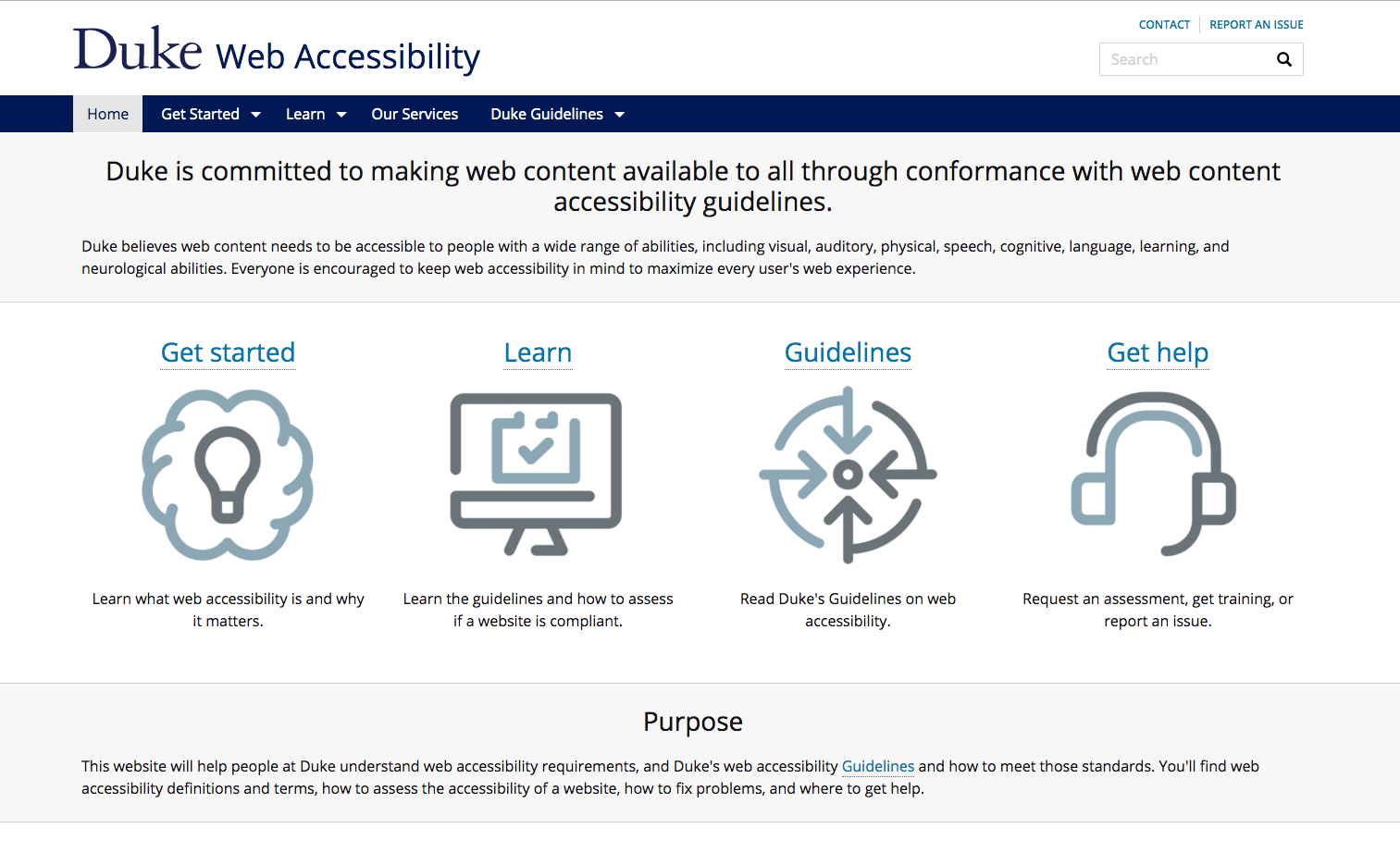
One of the biggest and most important barriers for us to tackle is the accessibility of our web content. Duke University’s Web Accessibility site sums it up well:
Duke believes web content needs to be accessible to people with a wide range of abilities, including visual, auditory, physical, speech, cognitive, language, learning, and neurological abilities.
The Duke Web Accessibility website is a tremendous resource for the Duke community.
As one of the largest research libraries in the U.S., we have a whole lot of content on the web to consider.
Our website alone comprises over a thousand pages with more than fifty staff contributors. The library catalog interface displays records for over 13 million items at Duke and partner libraries. Our various digital repositories and digital exhibits platforms host hundreds of thousands of interactive digital objects of different types, including images, A/V, documents, datasets, and more. The list goes on.
Any attempt to take a full inventory of the library’s digital content reveals potentially several million web pages under the library’s purview, and all that content is managed and rendered via a dizzying array of technology platforms. We have upwards of a hundred web applications with public-facing interfaces. We built some of these ourselves, some are community-developed (with local customizations), and others we have licensed from vendors. Some interfaces are new, some are old. And some are really old, dating all the way back to the mid-90s.
Ensuring that this content is equally accessible to everyone is important, and it is indeed a significant undertaking. We must also be vigilant to ensure that it stays accessible over time.
With that as our context, I’d like to highlight a few recent efforts in the library to improve the accessibility of our digital resources.
Style Guide With Color Contrast Checks
In January 2019, we launched a new catalog, replacing a decade-old platform and its outdated interface. As we began developing the front-end, we knew we wanted to be consistent, constrained, and intentional in how we styled elements of the interface. We were especially focused on ensuring that any text in the UI had sufficient contrast with its background to be accessible to users with low vision or color-blindness.
We tried out a few existing “living style guide” frameworks. But none of them proved to be a good fit, particularly for color contrast management. So we ended up taking a DIY approach and developed our own living style guide using Javascript and Ruby.
The library catalog’s living style guide dynamically checks for color contrast accessibility.
Here’s how it works. In our templates we specify the array of color variable names for each category. Then we use client-side Javascript to dynamically measure the hex & RGB values and the luminance of each color in the guide. From those figures, we return score labels for black and white contrast ratios, color-coded for WCAG 2.0 compliance.
This style guide is “living” in that it’s a real-time up-to-date reflection of how elements of the UI will appear when using particular color variable names and CSS classes. It helps to guide developers and other project team members to make good decisions about colors from our palette to stay in compliance with accessibility guidelines.
Audiovisual Captions & Interactive Transcripts
In fall 2017, I wrote about an innovative, custom-developed feature in our Digital Repository that renders interactive caption text for A/V within and below our media player. At that time, however, none of our A/V items making use of that feature were available to the public. In the months since then, we have debuted several captioned items for public access.
We extended these features in 2018, including: 1) exporting captions on-the-fly as Text, PDF, or original WebVTT files, and 2) accommodating transcript files that originated as documents (PDF, Word)
WebVTT caption files for A/V are rendered as interactive HTML transcripts and can be exported into text or PDF.
In the course of this assessment, we were able to identify (and then fix!) several accessibility issues in DukeSpace. I’ll share two strategies in particular from the guide that proved to be really effective. I highly recommend using them frequently.
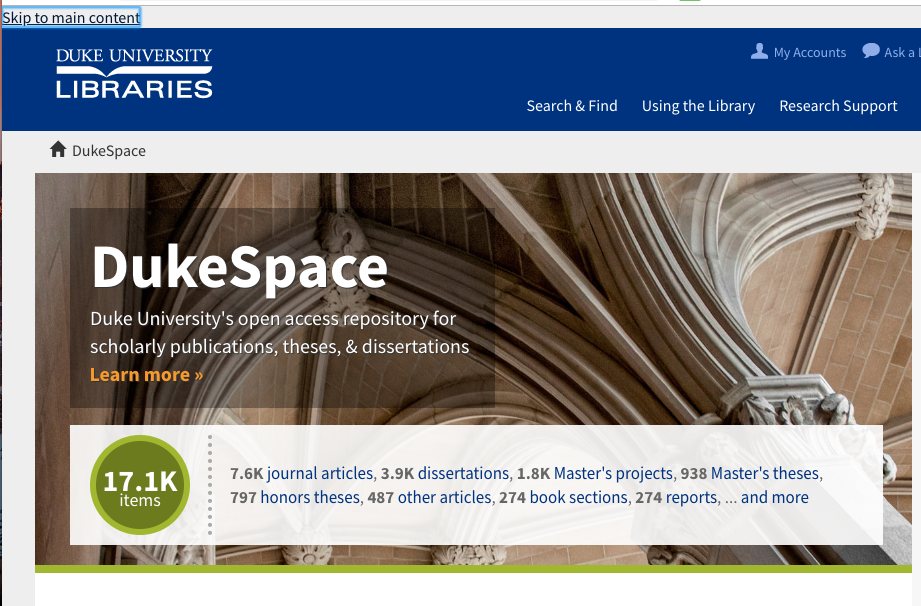
The Keyboard Test
How easy is it to navigate your site using only your keyboard? Can you get where you want to go using TAB, ENTER, SPACE, UP, and DOWN? Is it clear which element of the page current has the focus?
A “Skip to main content” feature in DukeSpace improves navigation via keyboard or assistive devices.
This test illuminated several problems. But with a few modest tweaks to our UI markup, we were able to add semantic markers to designate page sections and a skip to main content link, making the content much more navigable for users with keyboards and assistive devices alike.
A Browser Extension
If you’re a developer like me, chances are you already spend a lot of time using your browser’s Developer Tools pane to look under the hood of web pages, reverse-engineer UIs, mess with styles and markup, or troubleshoot problems.
The Deque Systems aXe Chrome Extension (also available for Firefox) integrates seamlessly into existing Dev Tools. It’s a remarkably useful tool to have in your toolset to help quickly find and fix accessibility issues. Its interface is clear and easy to understand. It finds and succinctly describes accessibility problems, and even tells you how to fix them in your code.
An image from the Deque aXe Chrome extension site showing the tool in action.
With aXe testing, we quickly learned we had some major issues to fix. The biggest problems revealed were missing form labels and page landmarks, and low contrast on color pairings. Again, these were not hard to fix since the tool explained what to do, and where.
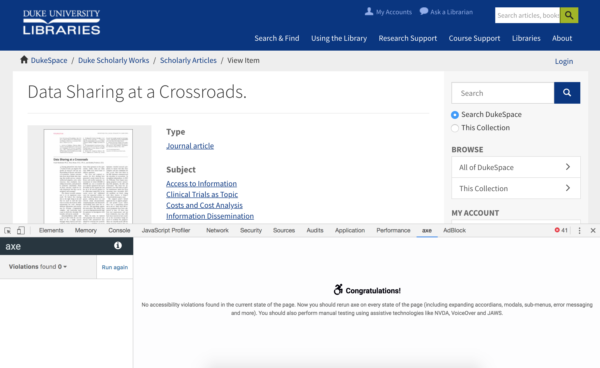
Turning away from DSpace for a moment, see this example article published on a popular academic journal’s website. Note how it fares with an automated aXe accessibility test (197 violations of various types found). And if you were using a keyboard, you’d have to press Tab over 100 times in order to download a PDF of the article.
UI for a published journal article in a publisher’s website after running the aXe accessibility test. Violations found: 197.
Open access copy of an article in DukeSpace: No accessibility violations found.
Here’s another example of an open access article in DukeSpace vs. its published counterpart in the website of a popular journal (PNAS). While the publisher’s site markup addresses many common accessibility issues, it still shows seven violations in aXe. And perhaps most concerning is that it’s completely unnavigable via a keyboard: the stylesheets have removed all focus styles from displaying.
Concluding Thoughts
Libraries are increasingly becoming champions for open access to scholarly research. The overlap in aims between the open access movement and web accessibility in general is quite striking. It all boils down to removing barriers and making access to information as inclusive as possible.
Our open access repository UIs may never be able to match all the feature-rich bells and whistles present in many academic journal websites. But accessibility, well, that’s right up our alley. We can and should do better. It’s all about being true to our values, collaborating with our community of peers, and being vigilant in prioritizing the work.
Look for many more accessibility improvements throughout many of the library’s digital resources as the year progresses.
In the audio world, we take our tools seriously, sometimes to an unhealthy and obsessive degree. We give them pet names, endow them with human qualities, and imbue them with magical powers. In this context, it’s not really strange that a manufacturer of professional audio interfaces would call themselves “Mark of the Unicorn.”
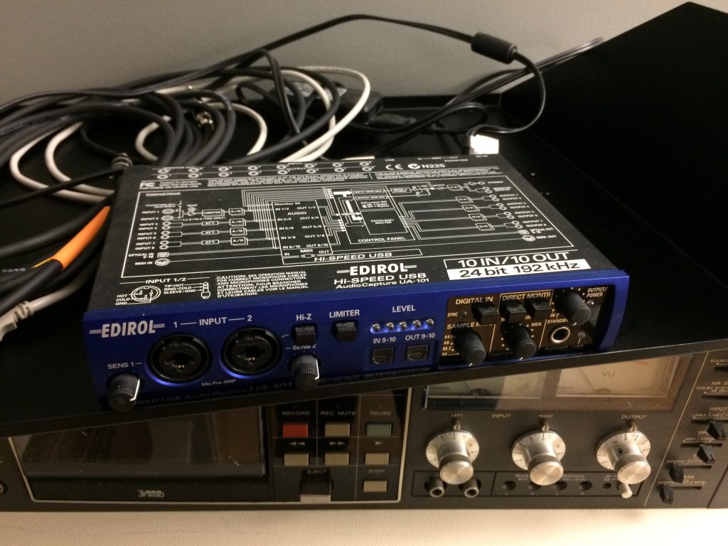
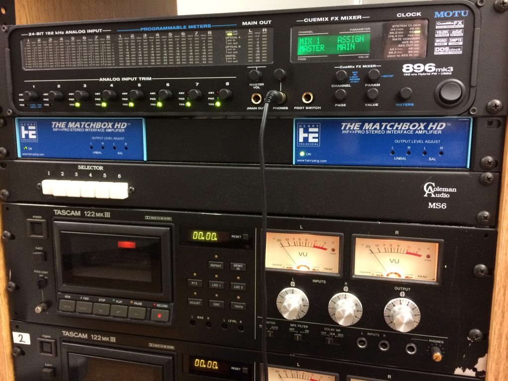
Here at the Digital Production Center, we recently upgraded our audio interface to a MOTU 896 mk3 from an ancient (in tech years) Edirol UA-101. The audio interface, which converts analog signals to digital and vice-versa, is the heart of any computer-based audio system. It controls all of the routing from the analog sources (mostly cassette and open reel tape decks in our case) to the computer workstation and the audio recording/editing software. If the audio interface isn’t seamlessly performing analog to digital conversion at archival standards, we have no hope of fulfilling our mission of creating high-quality digital surrogates of library A/V materials.
The Edirol enjoying its retirement with some other pieces of kit
While the Edirol served us well from the very beginning of the Library’s forays into audio digitization, it had recently begun to cause issues resulting in crashes, restarts, and lost work. Given that the Edirol is over 10 years old and has been discontinued, it is expected that it would eventually fail to keep up with continued OS and software updates. After re-assessing our needs and doing a bit of research, we settled on the MOTU 896 mk3 as its replacement. The 896 had the input, output, and sync options we needed along with plenty of other bells and whistles.
I’ve been using the MOTU for several weeks now, and here are some things that I’m liking about it:
Easy installation of drivers
Designed to fit into standard audio rack
Choice of USB or Firewire connection to PC workstation
Good visual feedback on audio levels, sample rate, etc. via LED meters on front panel
Clarity and definition of sound
The MOTU sitting atop the audio tower
I haven’t had a chance to explore all of the additional features of the MOTU yet, but so far it has lived up to expectations and improved our digitization workflow. However, in a production environment such as ours, each piece of equipment needs to be a workhorse that can perform its function day in and day out as we work our way through the vaults. Only time can tell if the Mark of the Unicorn will be elevated to the pantheon of gear that its whimsical name suggests!
A little over a week ago, I watched the searing and provocative TED talk by British journalist Carole Cadwalladr, “Facebook’s role in Brexit – and the threat to democracy.” It got me thinking about a few library things, which I thought might make for an interesting blog post. Then thinking about these library things took me down a series of rabbit holes, interconnecting and nuanced and compelling enough to chew up the entirety of the time I’d set aside for my turn in the Bitstreams blog rotation. There is no breezy, concise blog post that could pull them all together so I’m just going to do with it what I can with two of the maybe four or five rabbit holes that I fell into.
Cadwalladr took the stage at a TED conference sponsored by Facebook and Google, and spoke about her investigations into the role of Facebook and Cambridge Analytica in the Brexit vote in 2016. Addressing the big tech leaders present – the “Gods of Silicon Valley: Mark Zuckerberg, Sheryl Sandberg, Larry Page, Sergey Brin and Jack Dorsey” – she levelled a devastating j’accuse – “[W]hat the Brexit vote demonstrates is that liberal democracy is broken. And you broke it. This is not democracy — spreading lies in darkness, paid for with illegal cash, from God knows where. It’s subversion, and you are accessories to it.”
It was a courageous act, and Cadwalladr deserves celebration and recognition for it, even if the place it leaves us is a bleak one. As she would admit later, she felt massive pressure as she spoke. I had a number of reactions to her talk, but there was a line in particular got me thinking about library things. It occurred when she explained to that audience that “this entire referendum took place in darkness, because it took place on Facebook…, because only you see your news feed, and then it vanishes, so it’s impossible to research anything.” It provoked me to think about how we use “news feeds” – in the form of newspapers themselves – in the study of history, and the role that libraries play in preserving them.
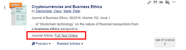
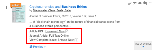
Duke University Libraries (DUL) is always searching for new ways to increase access and make discovery easier for users. One area users frequently have trouble with is accessing online articles. Too often we hear from students that they cannot find an article PDF they are looking for, or even worse, that they end up paying to get through a journal paywall. To address this problem, DUL’s Assessment and User Experience (AUX) Department explored three possible tools: LibKey Discovery, Kopernio, and Lean Library. After user testing and internal review, LibKey Discovery emerged as the best available tool for the job.
LibKey Discovery is a suite of user-friendly application programming interfaces (APIs) used to enhance the library’s existing discovery system. The APIs enable one-click access to PDFs for subscribed and open-source content, one-click access to full journal browsing via the BrowZine application, and access to cover art for thousands of journals. The tool integrates fully with the existing discovery interface and does not require the use of additional plug-ins.
According to their website, LibKey Discovery has the potential to save users thousands of clicks per day by providing one-click access to millions of articles. The ability to streamline processes enabling the efficient and effective discovery and retrieval of academic journal content prompted the AUX department to investigate the tool and its capabilities further. An internal review of the system was preceded by an introduction of the tool to Duke’s subject librarians and followed with a preliminary round of student-based user testing.
Current DUL discovery interfaceLibKey discovery interface
Pros
One-Click Article and Full Journal Access
Both the AUX staff and the subject librarians who performed an initial review of the LibKey Discovery tools were impressed with the ease of article access and full journal browsing. Three members of the AUX department independently reviewed LibKey’s features and concluded the system does provide substantial utility in its ability to reduce the number of clicks necessary to access articles and journals.
Streamlined Appearance
The tool streamlines the appearance and formatting of all journals, thus removing ambiguity in how to access information from different sources within the catalog. This is beneficial in helping to direct users to the features they want without having to search for points of access. The AUX department review team all found this helpful.
Seamless Integration
LibKey Discovery’s APIs integrate fully into the existing DUL discovery interface without the need for users to download an additional plug-in. This provides users the benefit of the new system without asking them to go through extra steps or make any changes to their current search processes. Aside from the new one-click options available within the catalog’s search results page, the LibKey interface is indistinguishable from the current DUL interface helping users to benefit from the added functionality without feeling like they need to learn a new system.
Cons
Cost
LibKey Discovery carries a relatively hefty price tag, so its utility to the end-user must be weighed against its cost. While internal review and testing has indicated LibKey Discovery has the ability to streamline and optimize the discovery process, it must be determined if those benefits are universal enough to warrant the added annual expenditure.
Inconsistency in Options
A potential downside to LibKey Discovery is lack of consistency in one-click options between articles. While many articles provide the option for easy, one-click access to a PDF, the full text online, and full journal access, these options are not available for all content. As a result, this may cause confusion around the options that are available for users and may diminish the overall utility of the tool depending on what percentage of the catalog’s content is exempt from the one-click features.
LibKey Discovery User Testing Findings
An initial round of user testing was completed with ten student volunteers in the lobby of Perkins Library in early April. Half of the users were asked to access an article and browse a full journal in the existing DUL system; the other half were asked to perform the same tasks using the LibKey Discovery interface.
Initial testing indicated that student users had a high level of satisfaction with the LibKey interface; however, they were equally satisfied with the existing access points in the DUL catalog. The final recommendations from the user testing report suggest the need for additional testing to be completed. Specifically, it was recommended that more targeted testing be completed with graduate-level students and faculty as a majority of the original test’s participants were undergraduate students with limited experience searching for and accessing academic journal issues and articles. It was concluded that testing with a more experienced user group would likely produce better feedback as to the true value of LibKey Discovery.
LibKey Summary
LibKey Discovery is a promising addition to Duke’s existing discovery system. It allows for streamlined, one-click article and full journal access without disrupting the look and feel of the current interface or requiring the use of a plug-in. Initial reviews of the system by library staff have been glowing; however, preliminary user testing with student participants indicated the need for additional testing to determine if LibKey’s cost is sufficiently offset by its utility to the user.
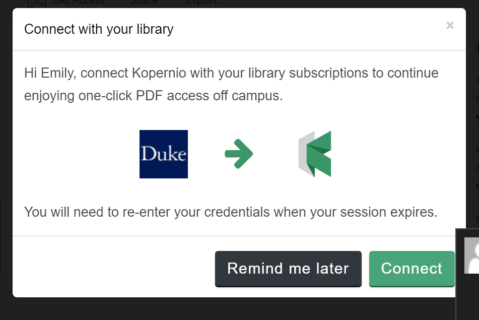
Kopernio is a free browser plug-in which enables one-click access to academic journal articles. It searches the web for OA copies, institutional repository copies, and copies available through library subscriptions. The tool is designed to connect users to articles on and off campus by managing their subscription credentials and automatically finding the best version of an article no matter where a user is searching.
Given the potential of this tool to help increase access and make discovery easier for students, the AUX department initiated an internal review process. Four members of the department independently downloaded the Kopernio plug-in, thoroughly tested it in a variety of situations, and shared their general and specific notes about the tool.
Pros
OA Content + Library Subscription
By its design, Kopernio has an advantage over other plug-in tools that serve a similar function (i.e. Unpaywall). When users first download Kopernio they are asked to register their subscription credentials. This information is saved in the plug-in so users can automatically discover articles available from OA sources, as well as library subscriptions. This is an advantage over other plug-ins that only harvest from freely available sources.
Kopernio sign-in page
Branding
Kopernio has highly visible and consistent branding. With bright green coloring, the plug-in stands out on a screen and attracts users to click on it to download articles.
One-Click
Kopernio is advertised as a “one-click” service, and it pays off in this respect. Using Kopernio to access articles definitely cuts down on the number of clicks required to get to an article’s PDF. The process to download articles to a computer was instantaneous, and most of the time, downloading to the Kopernio storage cloud was just as fast.
Cons
Creates New Pain Points
Kopernio’s most advertised strength is its ability to manage subscription credentials. Unfortunately, this strength is also a major data privacy weakness. Security concerns ultimately led to the decision to disable the feature which allowed users to access DUL subscriptions via Kopernio when off-campus. Without this feature, Kopernio only pulls from OA sources and therefore performs the same function that many other tools currently do.
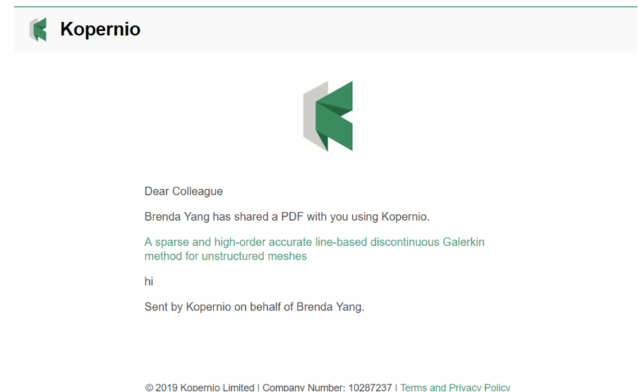
Similar to data privacy concerns, Kopernio also raises copyright concerns. One of Kopernio’s features is its sharing function. You can email articles to anyone, regardless of their university affiliation or if they have downloaded Kopernio already. We tested sending DUL subscription PDFs to users without Duke email addresses and they were able to view the full-text without logging in. It is unclear if they were viewing an OA copy of the article, or if they were seeing an article only meant for DUL authenticated users.
Sharing an article through Kopernio
Running the Kopernio plug-in noticeably slowed down browser speed. We tested the browser on several different computers, both on campus and off, and we all noticed slower browser speeds. This slow speed led Kopernio to be occasionally buggy (freezing, error messages etc.).
Buggy screen while using Kopernio
Many Features Don’t Seem Useful
When articles are saved to Kopernio’s cloud storage, users can add descriptive tags. We found this feature awkward to use. Instead of adding tags as you go along, users have to add a tag globally before they can tag an article. Overall, it seemed like more hassle than it was worth.
Kopernio automatically imports article metadata to generate citations. There were too many problems with this feature to make it useful to users. It did not import metadata for all articles that we tested, and there was no way to manually add metadata yourself. Additionally, the citations were automatically formatted in Elsevier Harvard format and we had to go to our settings to change it to a more common citation style.
Lastly, the cloud storage which at first seemed like an asset, was actually a problem. All articles automatically download to cloud storage (called the “Kopernio Locker”) as soon as you click on the Kopernio button. This wouldn’t be a problem except for the limited storage size of the locker. With only 100MB of storage in the free version of Kopernio, we found that after downloading only 2 articles the locker was already 3% full. To make this limited storage work, we would have to go back to our locker and manually delete articles that we did not need, effectively negating the steps saved by having an automatic process.
Lean Library is a similar tool to Kopernio. It offers users one-click access to subscription and open access content through a browser extension. In Fall 2018, DUL staff were days away from purchasing this tool when Lean Library was acquired by SAGE Publishing. DUL staff had been excited to license a tool that was independent and vendor-neutral and so were disappointed to learn about its acquisition. We have found that industry consolidation in the publishing and library information systems environment has lowered competition and resulted in negative experiences for researchers and staff. Further, we take the privacy of our users very seriously and were concerned that Lean Library’s alignment with SAGE Publishing will compromise user security. Whenever possible, DUL aims to support products and services that are offered independently from those with already dominant market positions. For these reasons, we opted not to pursue Lean Library further.
Conclusion
Of the three tools the AUX Department explored, we believe LibKey Discovery to be the most user-friendly and effective option. If purchased, it should streamline journal browsing and article PDF downloads without adversely affecting the existing functionality of DUL’s discovery interfaces.
It’s that time of year at the university when we’re working on our PEPs (Performance Evaluation and Planning forms) and I’m thinking about how grateful I am to have such smart staff who really care about their work, their colleagues, and the people they serve, as we advance technology across the libraries. In contrast to some corporate environments, the process here really does aim to help us improve, rather than rank us as a setup for “resource actions” (firings). This excellent article, The Feedback Fallacy by Marcus Buckingham and Ashley Goodall, reminds me to emphasize the things people do well, and encourage them to build on their strengths.
Attuned to ethical practices within organizations, I’m also excited about increasing awareness of ethics in the effects of the technologies we produce. Justin Sherman, co-founder of the Ethical Tech initiative here at Duke, did a stimulating talk at the Edge Workshop this month about ethical issues that surround technology, such as search engine bias, and AI tools that judges use to determine sentencing for crimes. Justin recommends this podcast, with Christopher Lydon on Open Source, called Real Education About Artificial Intelligence. Library staff are participating in the Kenan Institute for Ethics book club program (KIE), where the spring selection is Algorithms of Oppression: How Search Engines Reinforce Racism by Safiya Umoja Noble.
And, I’m pleased to exercise my hiring mantra, “smart people who care”, which has served me well for over 30 years, as we’re recruiting candidates with I/T and team leadership experience for a new position, Computing Services Supervisor.
Happy Spring!
Laura Cappelletti
Director, Information Technology Services
Notes from the Duke University Libraries Digital Projects Team

 This week, Digitization Specialist Mike Adamo will move on from Duke Libraries after 14 years to assume a new position as Digital Imaging Coordinator at the Libraries of Virginia Tech University. Mike has contributed so much to our Digital Collections program during his tenure, providing years of uncompromising still imaging services, stewardship in times of change for the Digital Production Center, as well as leadership of and then years of service on our Digital Collections Implementation Team. He has also been the lead digitization specialist on some of our most well known digital collections like the Hugh Mangum photographs, James Karales photographs and William Gedney collection.